A Big Chunk of Cheeky, Sustainable and Delicious Fun…
Montezuma’s Chocolates had grown organically through a middle England fan base. With an ambitious growth plan, they came to us to both amplify their quirky personality and reflect the sustainable ethos behind the brand on pack, to attract a more urban, ethical consumer.
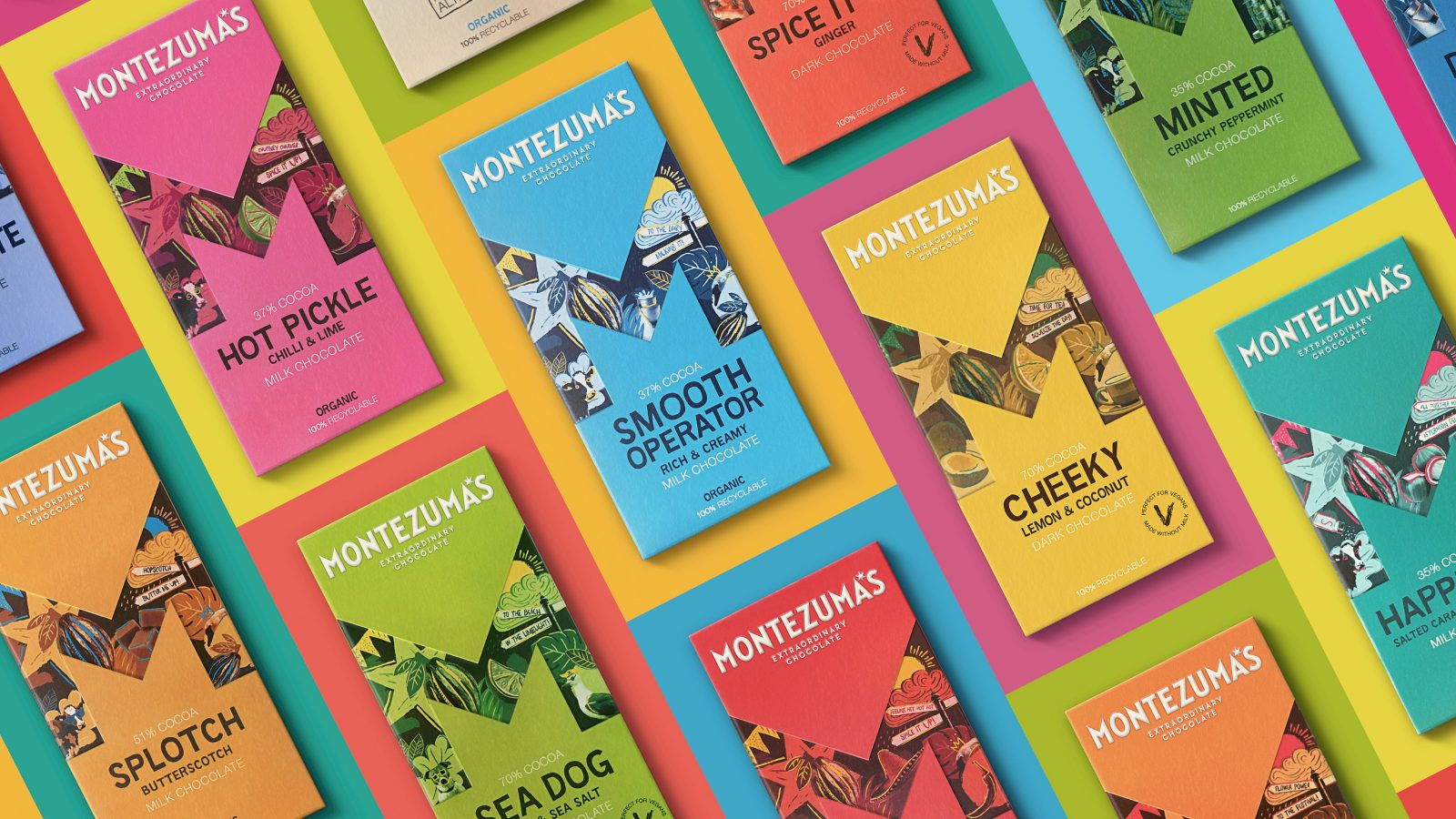
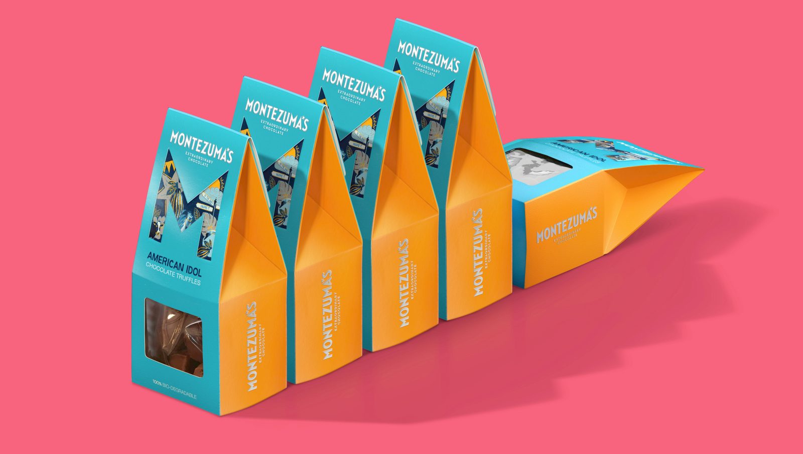
Our vibrant Montezuma’s big M identity playfully invites you to discover a wonderful world of extraordinary flavours whilst integrating a bit of eccentric British humour, through quirky icons & cheeky ‘innuendo’ naming.
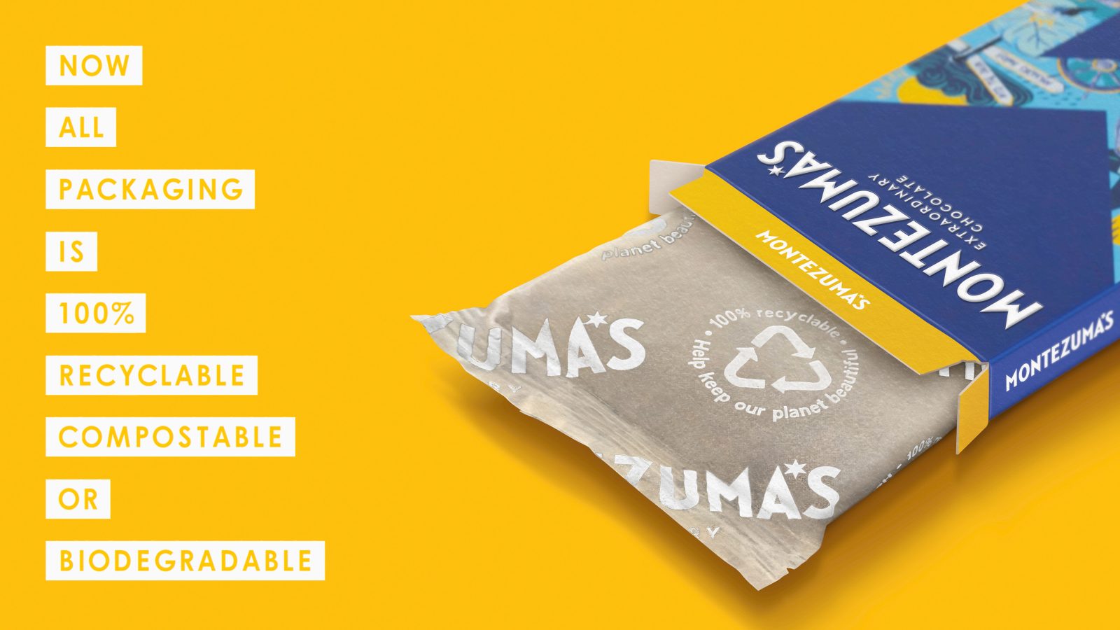
We then used our Conscious Design™ process to evaluate, challenge & specify the most eco-friendly materials & inks, create ‘smart’ creative cutter guides & ensure local supplier selection. Meaning that the packaging for Montezuma’s is now 100% recyclable, compostable or biodegradable. Making them the first British brand in the premium chocolate segment to do so.
The re-design has directly led to increased store listings, including more lines being added in John Lewis Partnership and just a few months ago, a dedicated branded wall bay in key Waitrose stores.
A Little More Detail…
Montezuma’s Chocolates was born out of its travel-mad founders, Helen and Simon’s vision to make their own handmade chocolates in a multitude of extraordinary flavours, using only ethically sourced ingredients. Since setting up shop in Brighton, their business had grown organically. But with increased investment and an ambitious plan for growth, centred around attracting more urban, ethical consumers from beyond their own stores, they came to us to re-focus and re-think its creative platform and visual identity on pack, whilst at the same time better reflecting the sustainable ethos behind the brand.
Through consumer research and working with the team at Montezuma’s, our creative platform became ‘Welcome to a World of Endless Discovery’; full of inviting exploration, hidden depths and wonderful surprises.
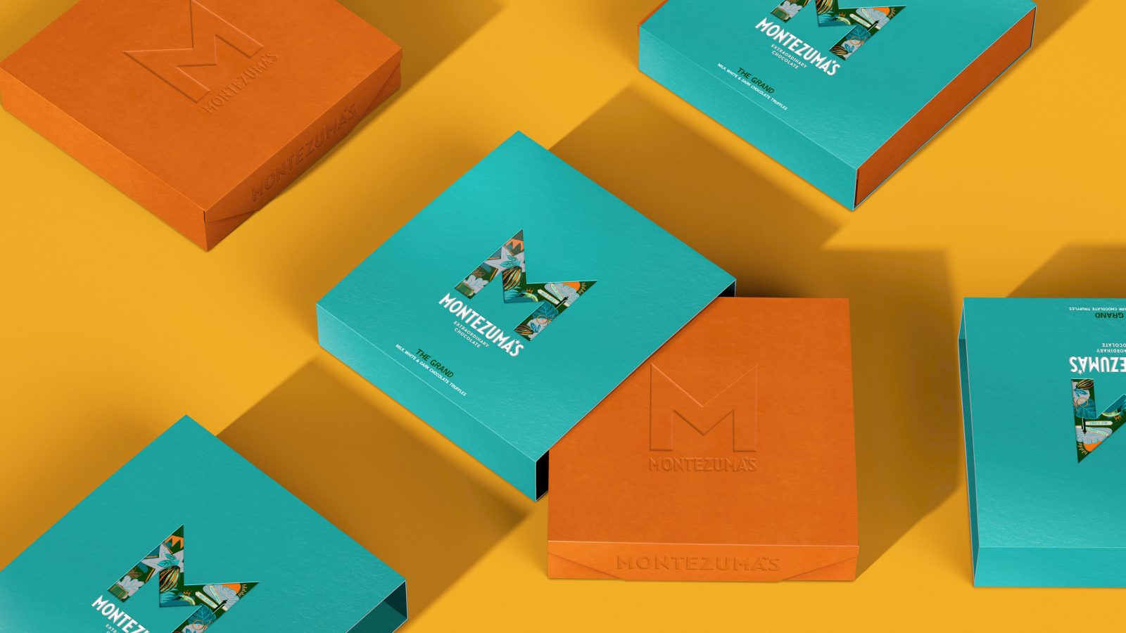
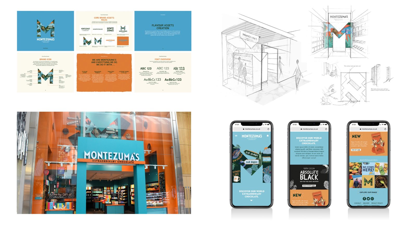
More than just ‘M for Montezuma’s’, our newly designed big M brand icon is a portal through which to explore the brand’s extraordinary world of flavours and much, much more; eclectic, hand-drawn illustrations allude to the crafted way the Montezuma’s team make their chocolate, whilst photographic elements keep things real and communicate their integrity in sourcing ingredients, with each individual part telling a different aspect of the Montezuma’s story. All with a very British twinkle in the eye!
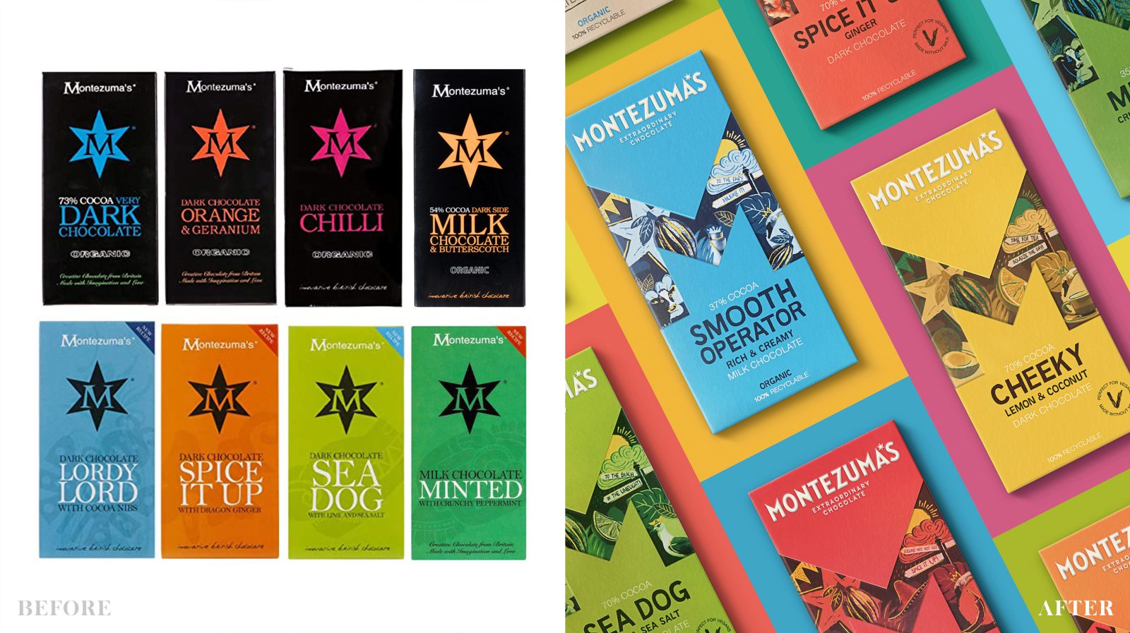
The unique wordmark is designed to reflect the sharp edges within the brand’s M icon, whilst a six-pointed star in place of the apostrophe in Montezuma’s is a reassuring nod to the old brand identity.
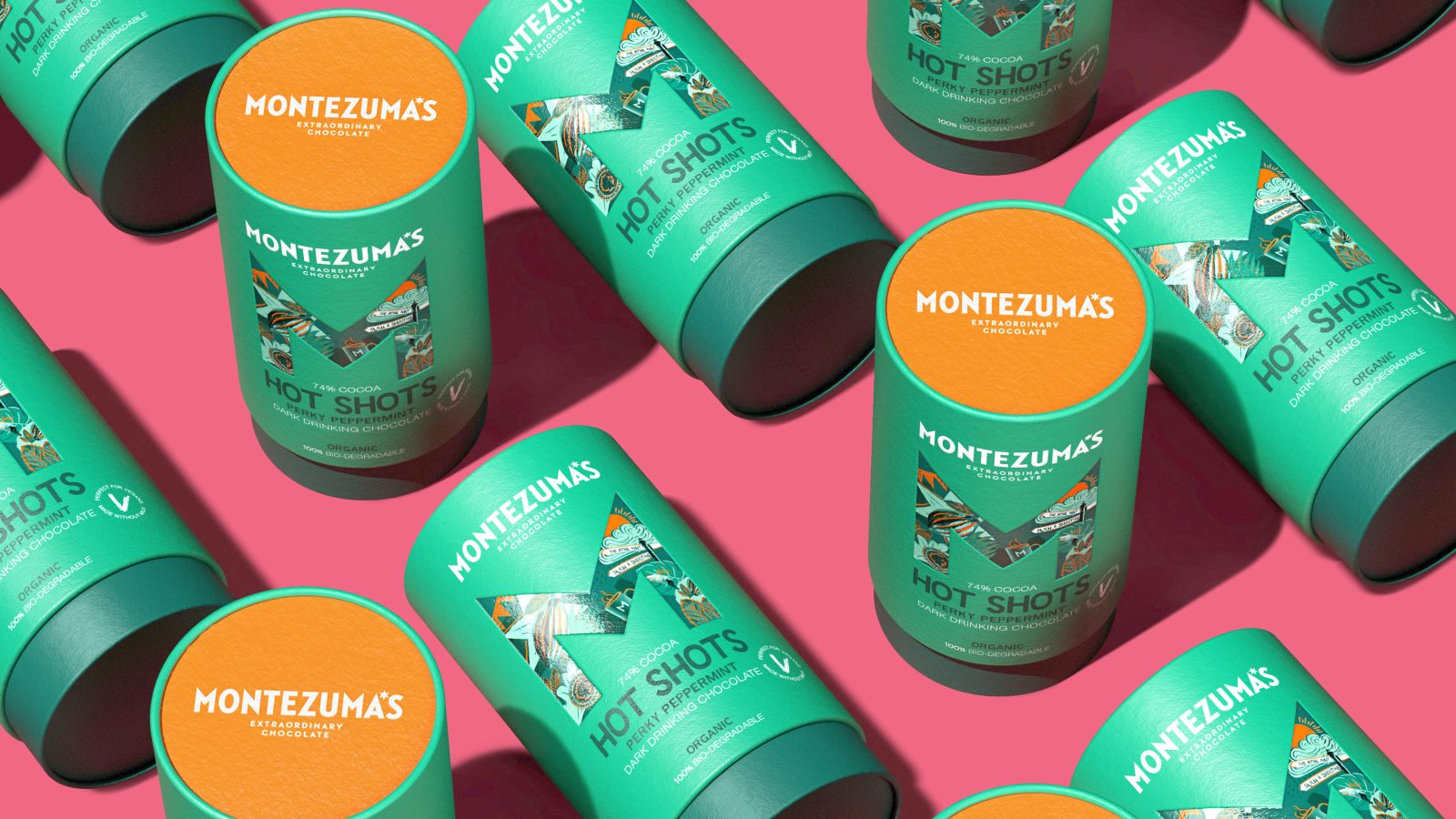
The central theme of discovery and variety is dramatically brought to life on pack through individual flavours having their own ‘M’ icon. Within each icon, the illustrations and colourways shift and change to tell the story of the flavour and bring to life quirky product names such as ‘Nutterscotch’, ‘Like No Udder’ and ‘Smooth Operator’. These are executed in a bespoke ‘Montezuma’s Sans’ typeface created to optimise legibility, whilst reflecting the hand-drawn approach within the illustrations.
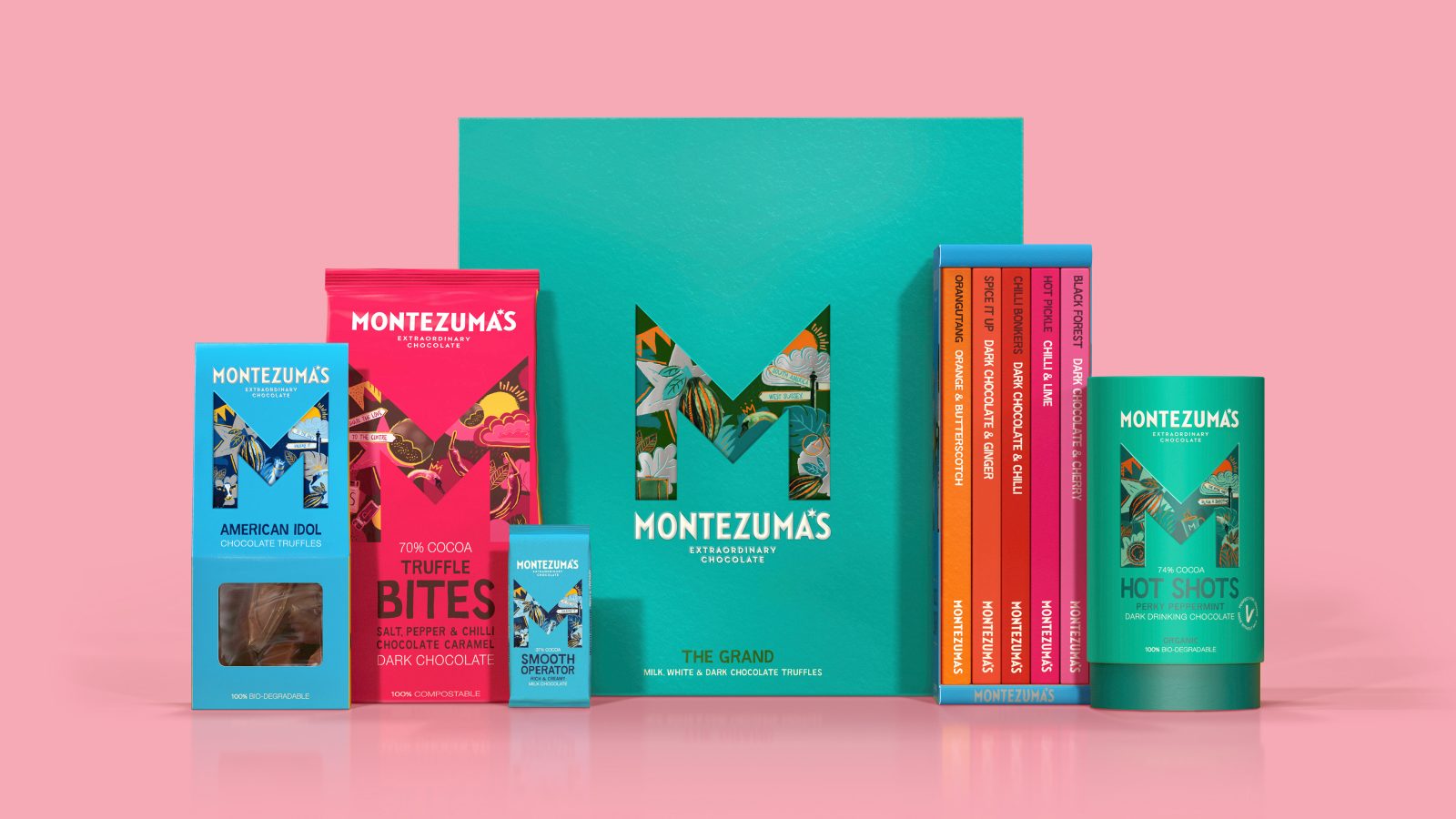
The result is a versatile and infinitely adaptable branding system that future-proofs Montezuma’s ever-expanding product range. We collected all our thinking into a Brand Playbook that is now being used to ensure everything from Instagram to new Montezuma’s stores tell the same extraordinary story.
An integral part of the brand redesign was to ensure that our packaging designs reflected the ethical and sustainable ethos behind the brand. We used our Conscious Design™ process to challenge & specify the most eco-friendly materials and processes possible:
The cartons for the core range of chocolate bars were created from FSC board with aqueous varnishes and glues, with no foiling, common finishes and ‘smart’ creative cutter guides used to minimise wastage of materials when printing and die-cutting. Inside, the bars moved from a hard-to-recycle, triplexed plastic-based, flow wrap material to being wrapped in widely recycled EVOH.
Several pieces of packaging in the range were optimised structurally:
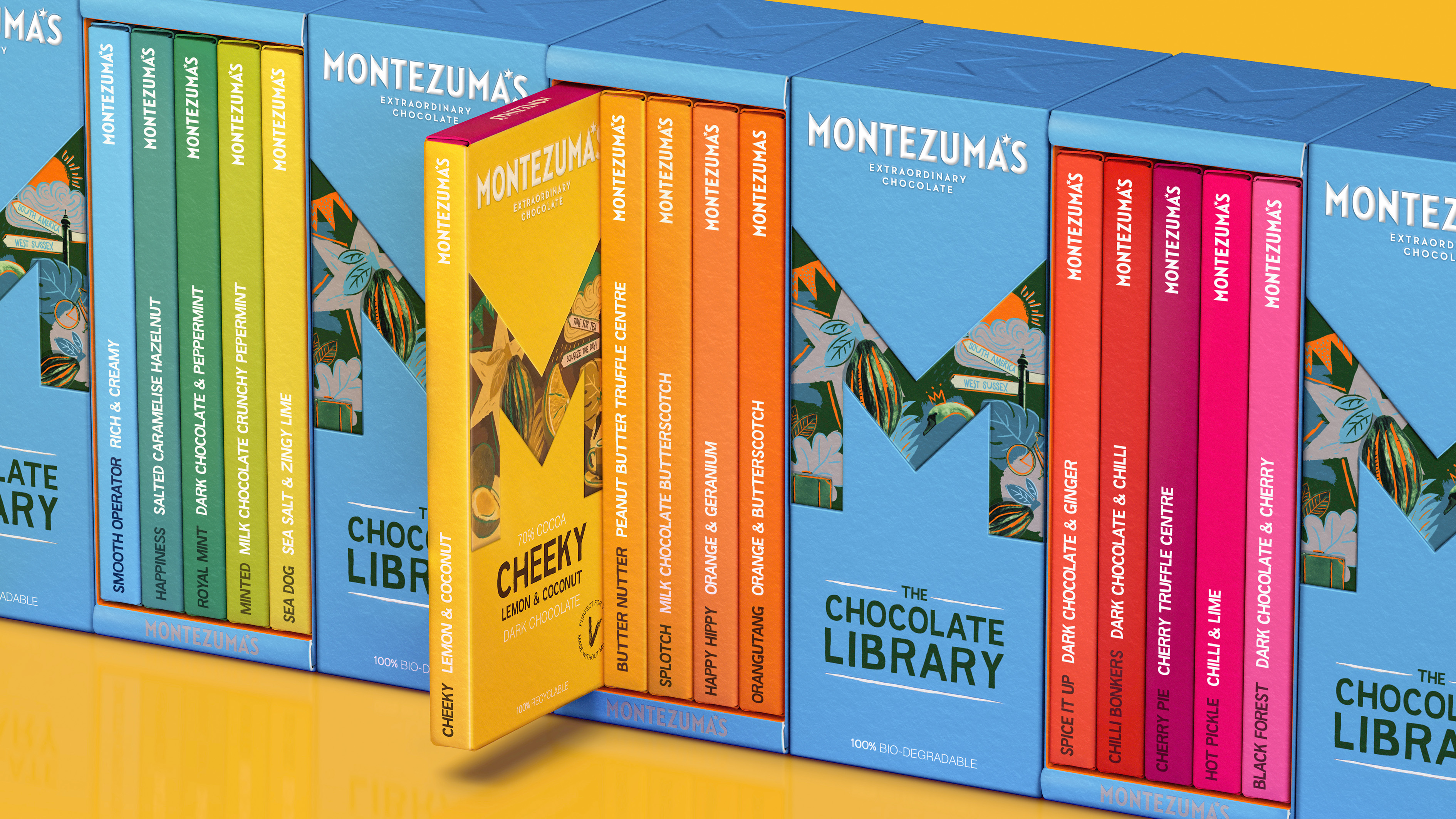
The Montezuma’s Library multi-pack now folds in on itself as a friction fit design to allow for printing on 1 side only. On the Truffle Bites pouches, the size of the window was reduced so plastic was not needed to keep the product in place; creating mono-material components for maximum ease of recyclability. Finally, ‘The Grand’ gift boxes now use ‘ a glue-less, mono-material folding box construction with a removable sleeve. Meaning less material used and easier to separate and recycle in the supply chain, post-consumer use.
Additionally, we worked with Montezuma’s to move their supply chain from the Far East to entirely within Europe. Bars were reduced from 100g to 90g and the gift cartons were changed from rigid boxes to folding board, lowering the material weight. With less transportation of packaging elements being shipped / air freighted globally and a lower overall weight, this has a positive outcome on their overall CO2 emissions.
All this means that the packaging for Montezuma’s is now 100% recyclable, compostable or biodegradable, making them the first British brand in the premium chocolate segment to do so.
Since launching, the redesign has received extremely positive feedback from consumers via social media and has led directly to increased store listings, including more lines being added in John Lewis Partnership and just a few months ago, dedicated branded wall bays in key Waitrose stores.
“We’re absolutely delighted with the new brand identity and packaging that Butterfly Cannon has created for us. It has given the brand a new lease of life and the response has been incredibly positive from both the trade and consumers. The design is bright, bold and quirky, yet still premium, reflecting the brand perfectly.”
Debbie Epstein, Marketing Director for Montezuma’s
CREDIT
- Agency/Creative: Butterfly Cannon
- Article Title: Montezuma’s Chocolate Packaging Redesign – A Big Chunk of Cheeky, Sustainable and Delicious Fun
- Organisation/Entity: Agency
- Project Type: Packaging
- Project Status: Published
- Agency/Creative Country: United Kingdom
- Agency/Creative City: London
- Keywords: WBDS Agency Design Awards 2022/23


