The Phoenicians were the greatest maritime people of antiquity.
From their cities, merchant ships set sail loaded with bronze and iron weapons; ceramics, ivory and glass; jewellery and embroidery; and, of course, timber from the famous Lebanese cedars.
In exchange, they received wheat, barley, olive oil, honey, gold, silver, iron, lead and wine, which they would trade again in other ports along the Mediterranean Sea. It was by the hands of the Phoenicians that wine reached the Southern Iberian Peninsula in the 8th century BC, transported in amphorae and clay. Later, they taught us to produce our own wine from our own wild grapes (or woodbine). They settled on the banks of the Arade River and remained there. They called this place Arvad, which means “Safe Haven” in their language. The vines that produced this wine are still there today.
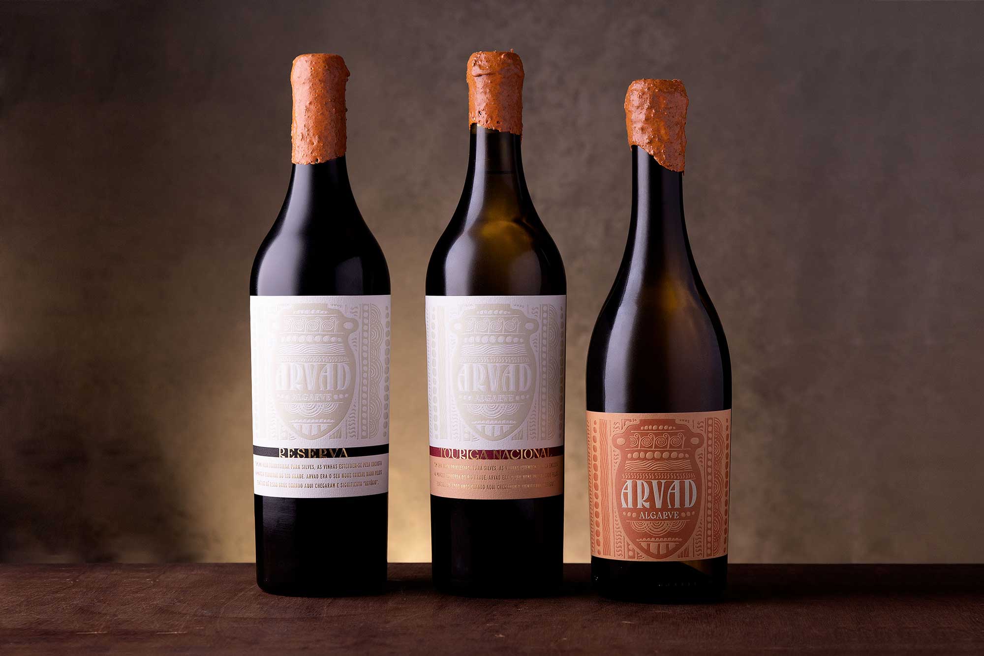
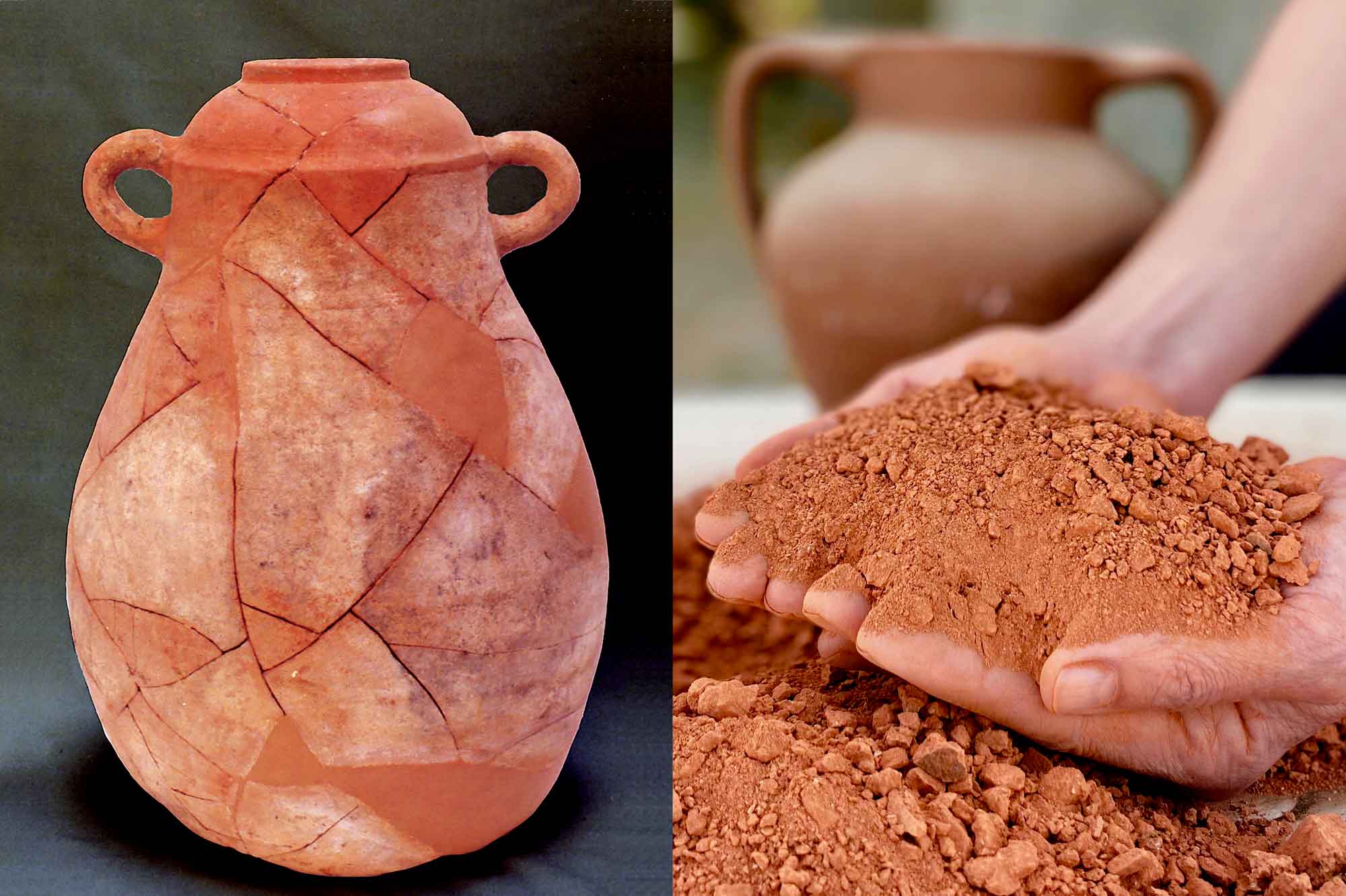
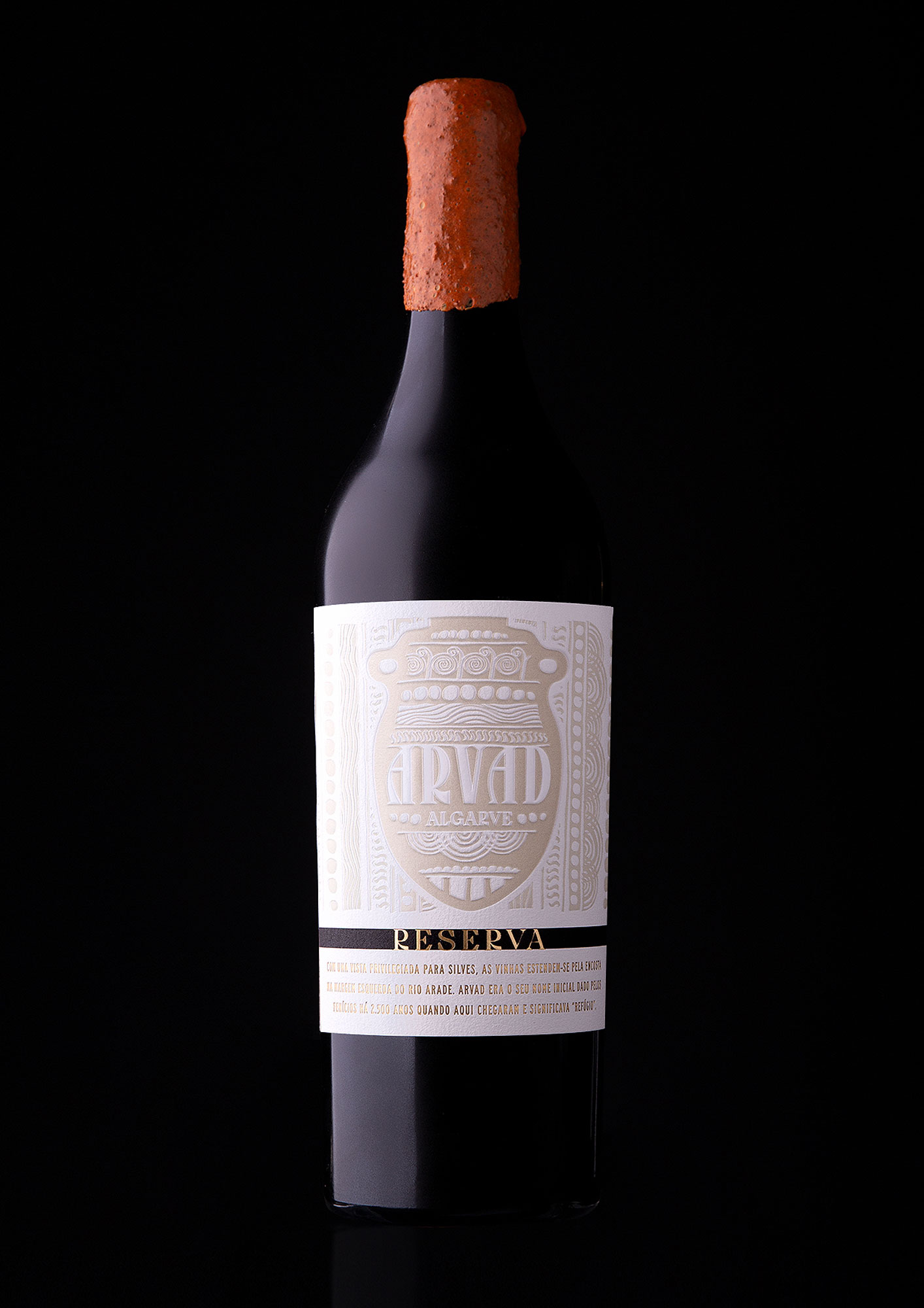
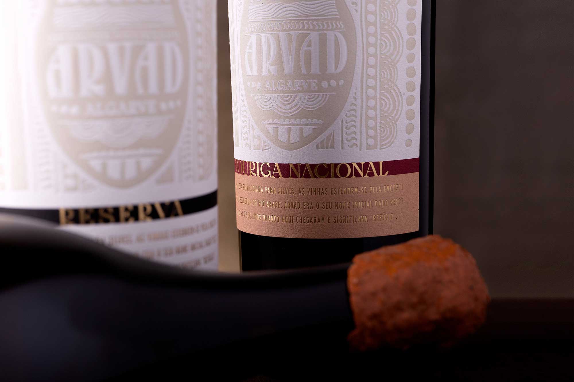
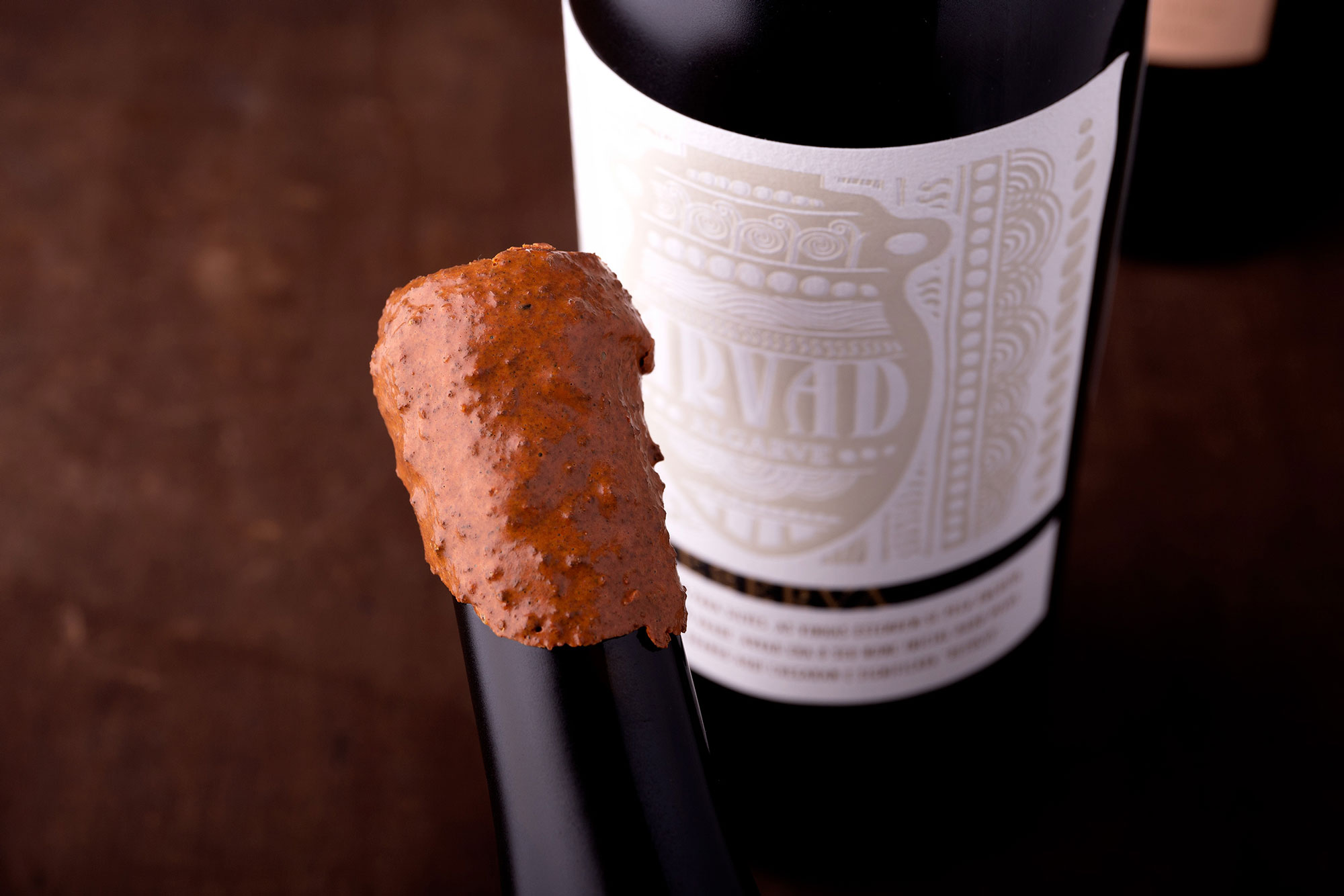
Using the shape of a Phoenician amphora as the central element for this wine’s image, we decorated the label with motifs inspired by the rich Phoenician art and lettering inspired by their alphabet. Symbolically, we ground clay and used it to make a paste with which we capped the bottles, to perpetuate that era and those people who brought us so many riches.
Arvad was born in 2016, on a property next to Arade river, overlooking Silves.
There are nine hectares of land, exposed to the winds from the North, which allows great daily thermal amplitudes. A Mediterranean climate with Atlantic influence, complemented by a calcareous clay soil, in which the weight of history is combined.
It was in this region that wine was introduced into Portuguese territory. Brought from the east by Phoenician travelers, took root in the Silves area, and through the word of exchange and discovery, became a ritual, as proof of civilization.
CREDIT
- Agency/Creative: RitaRivotti®
- Article Title: Arvad Wines Packaging Design by RitaRivotti
- Organisation/Entity: Agency
- Project Type: Packaging
- Project Status: Published
- Agency/Creative Country: Portugal
- Agency/Creative City: RitaRivotti®
- Market Region: Europe
- Project Deliverables: Packaging Design
- Format: Bottle
- Substrate: Glass, Pulp Paper
- Industry: Food/Beverage
- Keywords: branding; identity; packaging design; wine design; ritarivotti
-
Credits:
CEO & Creative Director: Rita Rivotti
Design: João Saúde


