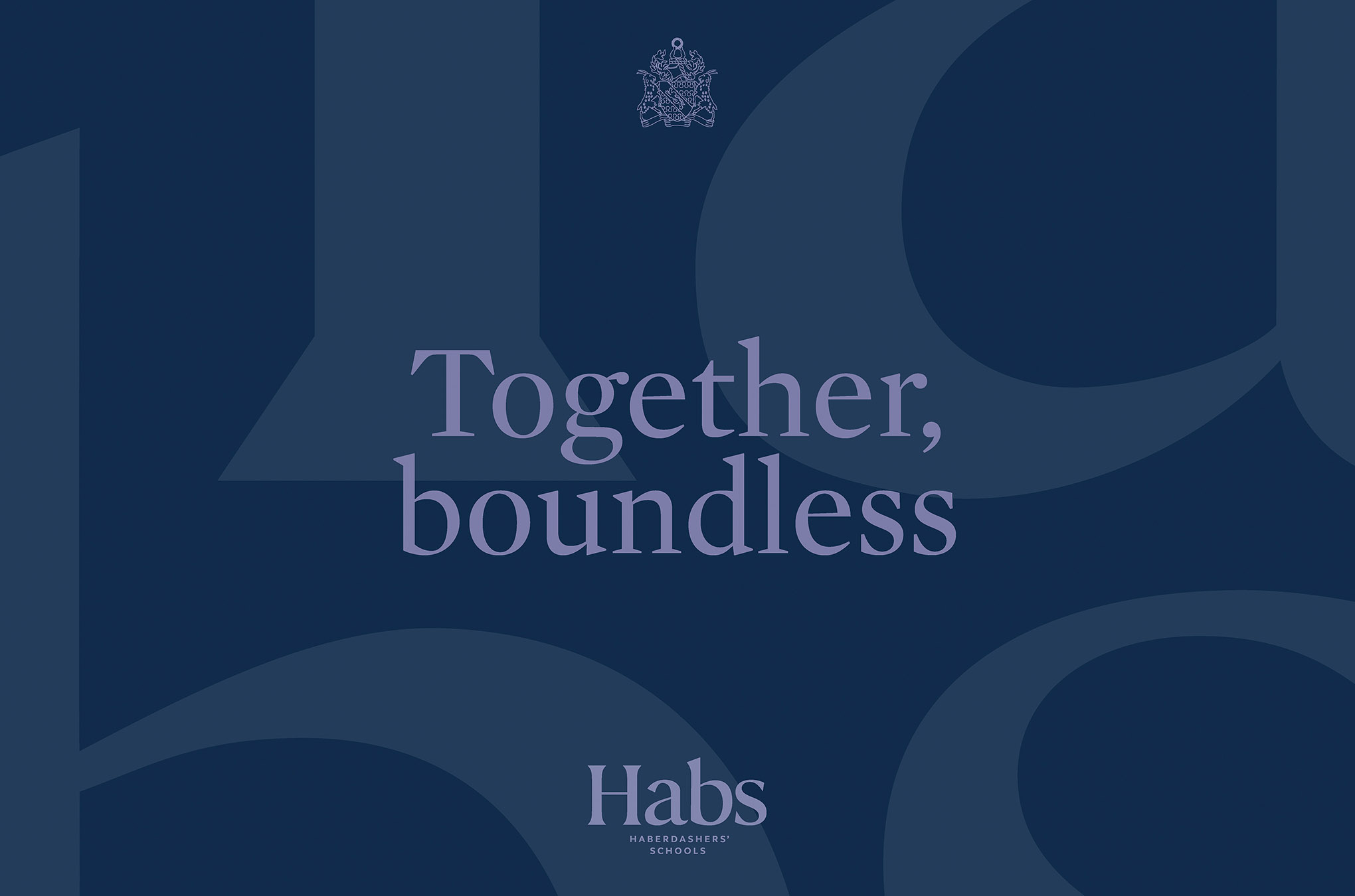
Hab’s Boys’ & Habs Girls’ are two outstanding leading independent day schools for students aged 4-18. Despite being based on the same 100-acre campus in Elstree, Hertfordshire for over 40 years, the schools have always worked separately. An ambitious ten-year redevelopment plan will now see the schools unite under one shared vision for the first time in history; to provide single sex education on a co-educational campus.
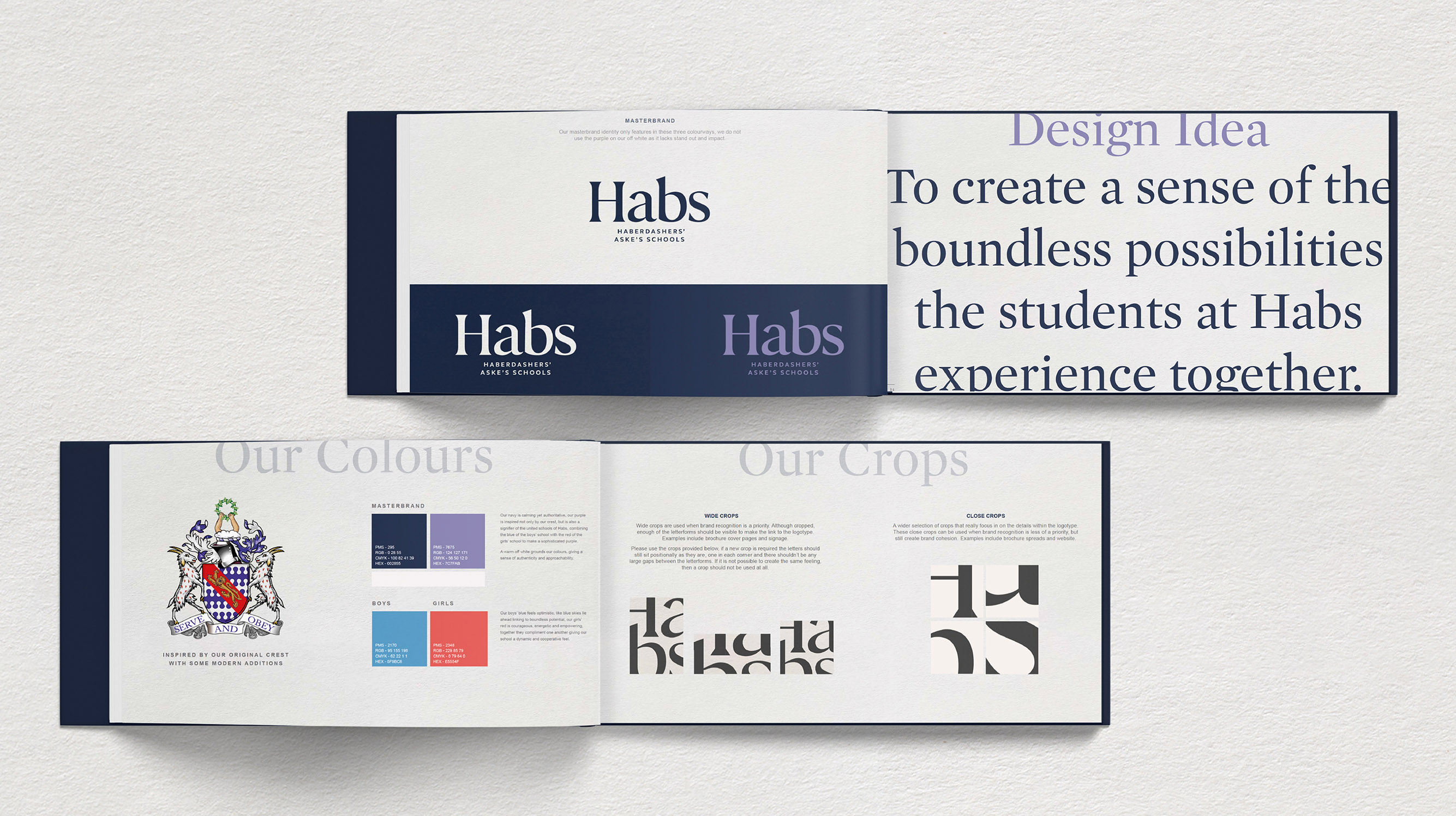
Looking to communicate this new era of closer collaboration, we worked with them to create a unifying narrative and brand identity that respected the schools’ history whilst bringing them into the 21st century. We also established a new tone of voice and created brand guidelines for digital and print.
Through a series of workshops with stakeholders from both schools, we first determined their shared values of “ambition, curiosity, courage, and community”, which would inform any decisions and actions they made together. These sessions also led to the schools’ joint strapline and rallying cry of ‘Together, Boundless’. Inspired by the space and openness of the schools’ grounds, it encapsulates the endless possibilities the schools strive to offer their students and their beyond-the-curriculum approach to teaching.
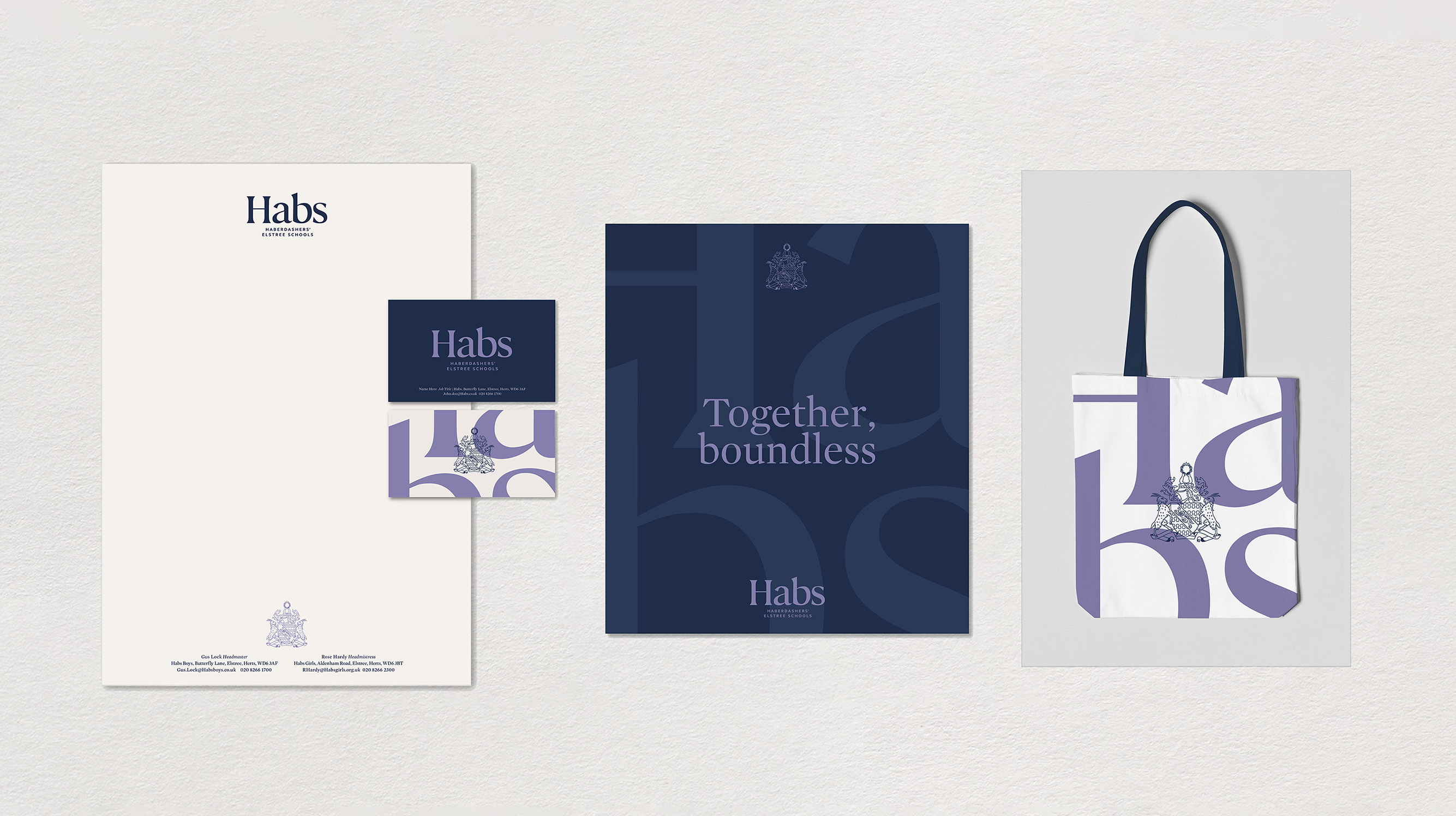
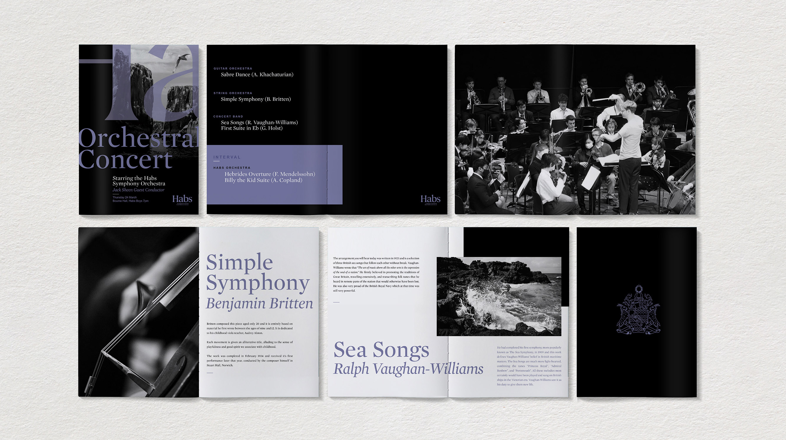
An insight to emerge was students and parents called the schools ‘Habs’, so we put this at the heart of a new master-brand identity that balances heritage & gravitas with modernity & inclusivity. The new wordmark has a sense of positive uplift through the curves and upward flicks of the bespoke typeface, inspired by the letter forms in the banner of the schools’ original crest. ‘Together, Boundless’ informed our overall visual identity, through a strong use of negative space; with typography and imagery that flows off the page or screen.
We chose a deep navy as a unifying masterbrand colour, with accents of red and blue taken from the girls and boys schools’ existing colour palettes for recognition. Building on the idea of ‘Together, Boundless’ the red and blue are blended together to create a new contemporary purple highlight for when the schools work together.
As a final touch we wanted to honour the heritage of Habs by retaining the schools’ historical crest. Redrawn and refined, it’s now used sparingly as a sign off to add gravitas on key pieces of communications. Tone of voice and brand guidelines ensure consistency across a wide range of internal and external facing applications.
Habs, Together, Boundless…
“With their expertise in creating aspirational brands, Butterfly Cannon were the perfect partner to embark on this momentous new chapter in the story of Haberdashers’ Elstree Schools. The new identity they created for us pays tribute to the past achievements and individual character of our schools, whilst embodying our aspirational ethos and shared future together.”
Avril Tooley, Director of Marketing & Culture at Haberdashers’ Elstree School

CREDIT
- Agency/Creative: Butterfly Cannon
- Article Title: Butterfly Cannon Create Unifying Brand Identity for Prestigious Haberdashers’ Elstree Schools
- Organisation/Entity: Agency
- Project Type: Identity
- Project Status: Published
- Agency/Creative Country: United Kingdom
- Agency/Creative City: London
- Market Region: Europe
- Project Deliverables: Art Direction, Brand Design, Brand Guidelines, Brand Identity, Brand Mark, Brand Redesign, Brand Rejuvenation, Brand Tone of Voice, Copywriting, Web Design
- Industry: Education
- Keywords: brand redesign, school
-
Credits:
Marketing Manager: Chris Joscelyne


