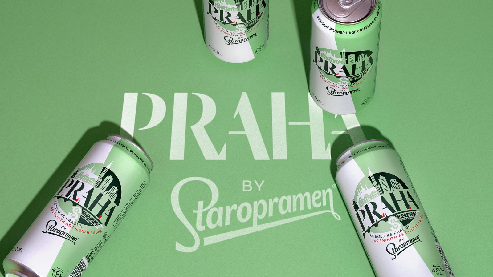
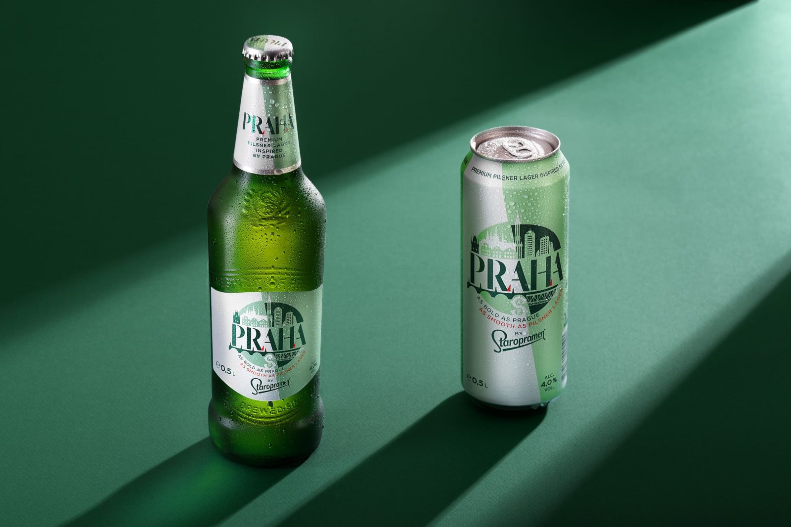
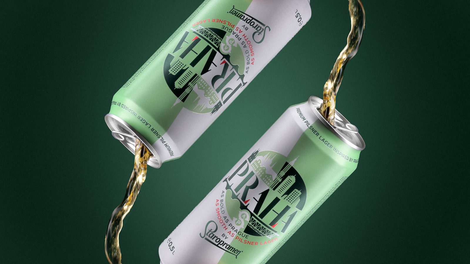
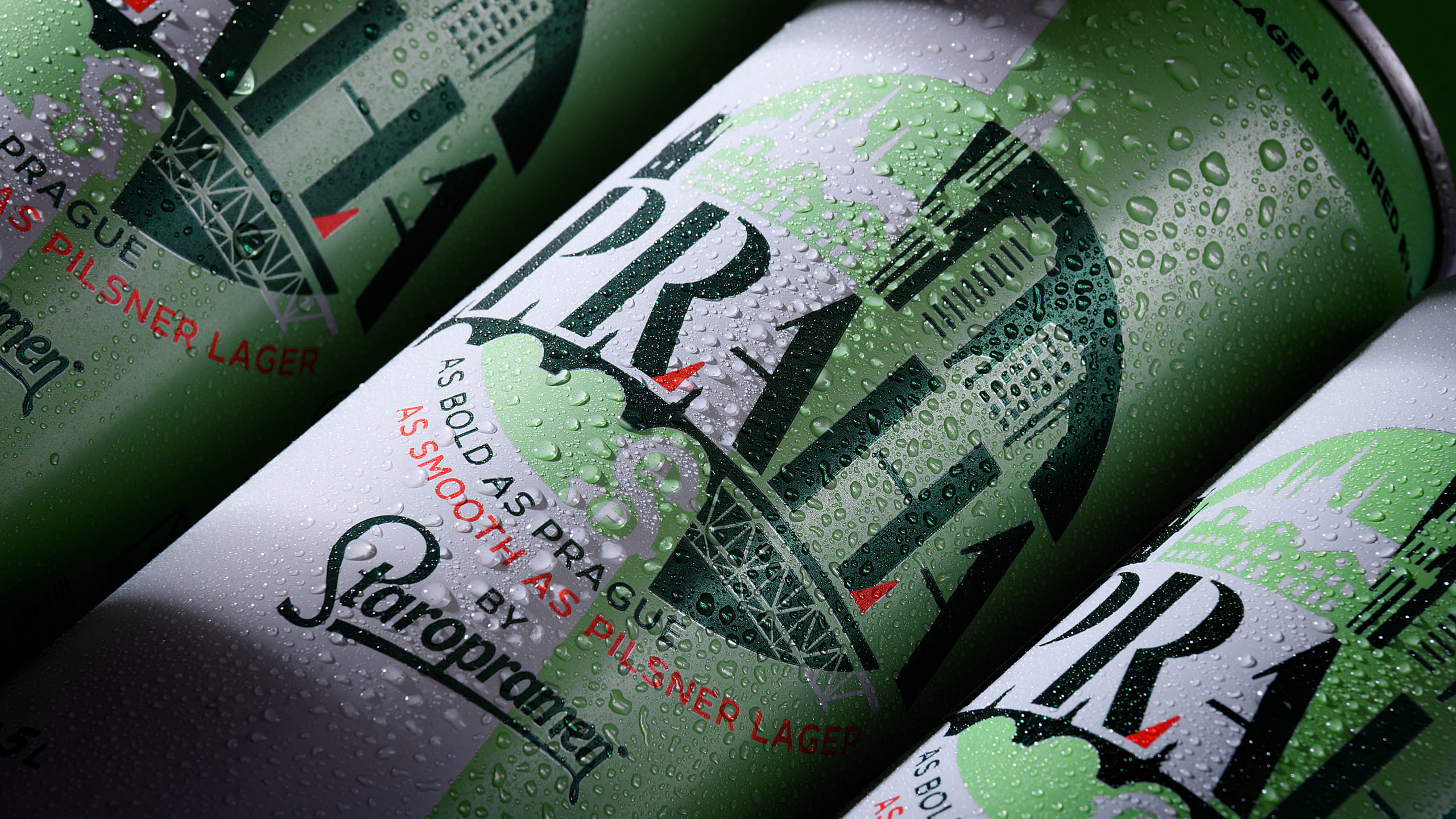
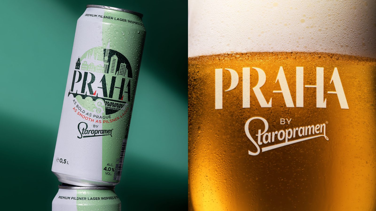
Staropramen tells a different yet true story of the famous city of Prague. Cocoon’s design captures the connection between the old and new face of this capital, just like how the product combines traditional brewing with a modern approach. This duality, combined smoothly into one, became the main theme for the packaging. A bold wordmark illustrates the two faces of Prague. Two colored areas split diagonally into halves create a minimal and modern introduce a unique visual style. The two green tones were selected to evoke freshness, but also be bold and less category-obvious.
At Cocoon, the Molson Coors team assigned us the task of creating a bold and modern brand identity for a new beverage called Praha by Staropramen. Following the increasing consumer demand for high-quality 10° plateaus, this brewing company decided to go for a bold beer concept. Praha offers a light 4% alcohol content with the rich-tasting experience of a lager brewed with respect to 19th-century traditions.
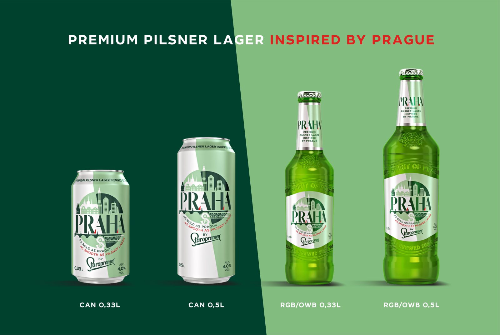
The beer’s namesake, Praha, also has two sides: the amazing and breathtaking historical heritage, and the modern face of a vibrant metropolis with unique architecture, culture and spirit. This duality, combined smoothly into one, became the main theme for the identity and packaging design. A bold wordmark is accompanied by a round symbol cut into halves, which illustrates the two faces of Prague. The diagonal cut helps convey the main idea but also introduces a strong visual style. Two coloured areas split diagonally into halves create a minimal and modern environment for the whole brandmark, which is a rather richly-illustrated central element.
The two green tones were selected to evoke freshness and taste appeal, but also to maintain a bold and less category-obvious feel from this sessionable beer. Both a can and bottle label were crafted to perfection. Additionally, a full identity system was developed for further roll-outs on any touchpoint for both on-trade and off-trade consumption.
CREDIT
- Agency/Creative: Cocoon Prague
- Article Title: Packaging Design for Praha Beer – Traditional Meets Bold by Cocoon Prague
- Organisation/Entity: Agency
- Project Type: Packaging
- Project Status: Published
- Agency/Creative Country: Czech Republic
- Agency/Creative City: Prague
- Industry: Food/Beverage
- Keywords: WBDS Agency Design Awards 2022/23
-
Credits:
Design Director: Evgeny Razzhivin
Designer: Evgeny Razzhivin, Sasha Sharavarau, Martin Zouhar
Account Manager: Tomas Vesely
Account Director: Ana Maselli
Artworkers: Robert Specian, Jana Klimentova
Visualizer: Petr Ludvik
Photography, video: Jose Sabino Jr.


