Best localization of an international brand – Ferrero CNY Gift Pack
Background and Challenge
As a traditional festival lasting for thousands of years, Chinese New Year (CNY) has always been quite an important occasion for all brands. As a well established Italian brand, the challenge to Ferrero was, how to maintain the brand’s well established international, premium, classic brand image, while at the same time, to fit well with CNY culture?
How to present the traditional CNY culture in a more modern way, that may be more preferred by current target audiences?
Design inspiration and solution
With having this task in mind, our design started from understanding Ferrero brand and the CNY culture.
As a brand rooted in China market for quite long time, Ferrero logo and its pralines are well recognized by consumers as well as its gold and classic look and feel.
On the other hand, to deeply connect with Chinese culture, our idea was to bring the Chinese festive essence to life so to resonate with consumers.
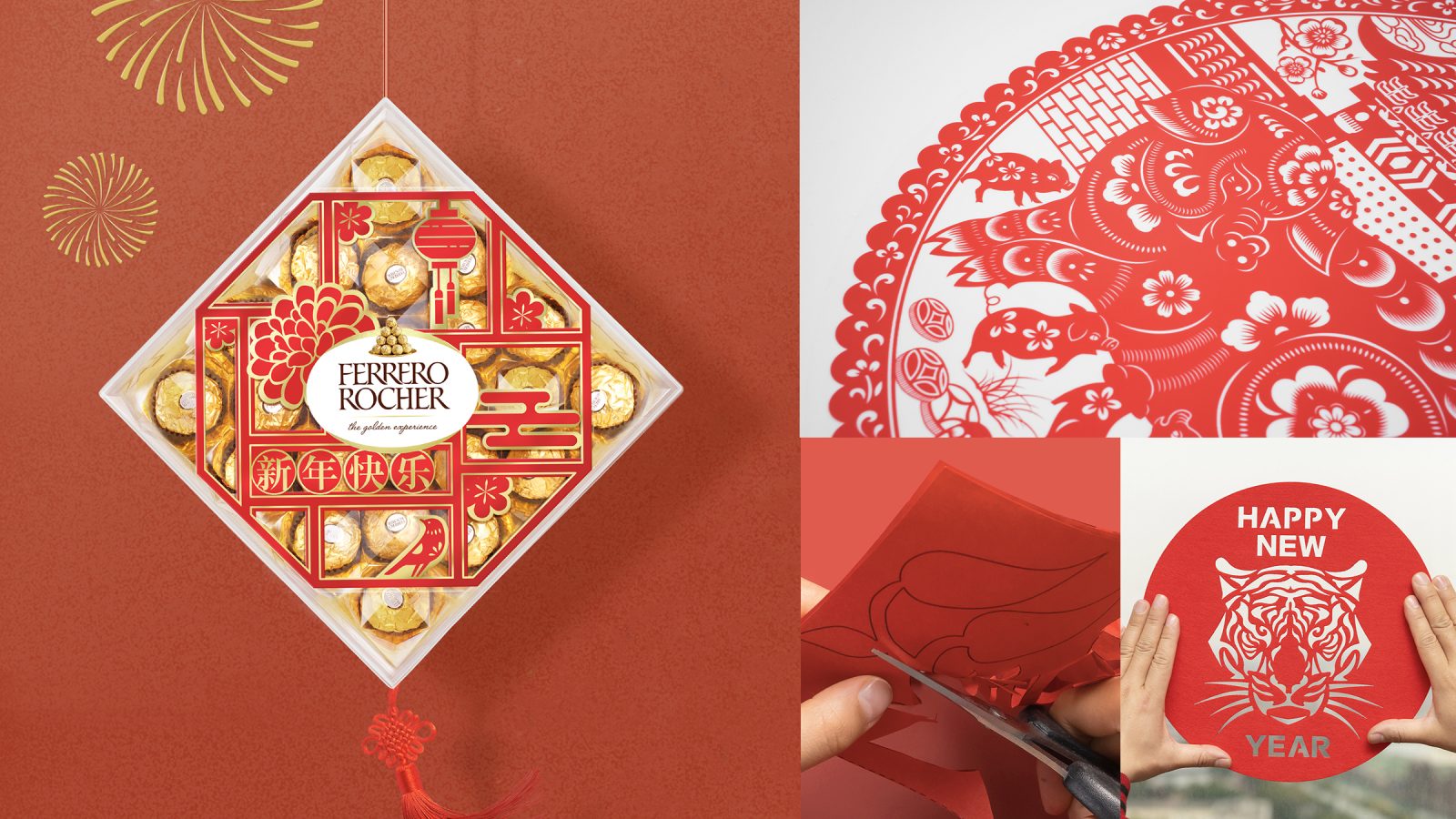
Among diverse festive elements, we discovered the paper cut crafts, which bears a long history and great meaning.
In the past, people liked to cut paper with scissors to create different characters so to form a joyful world, and it was usually sticked on the window to express our genuine feeling and best wish for the new year, which we feel it shared the same idea as Ferrero as a classic chocolate brand do – we are here to bridge you and your family, in this reunion occasion.
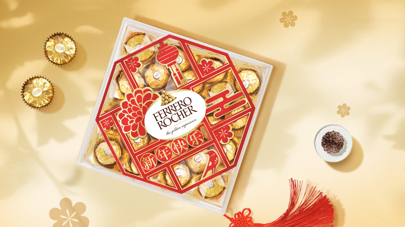
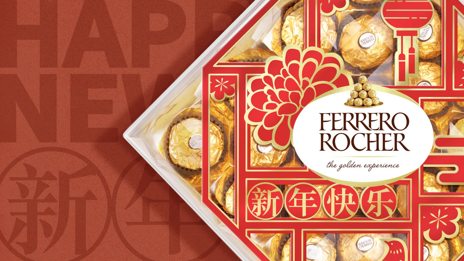
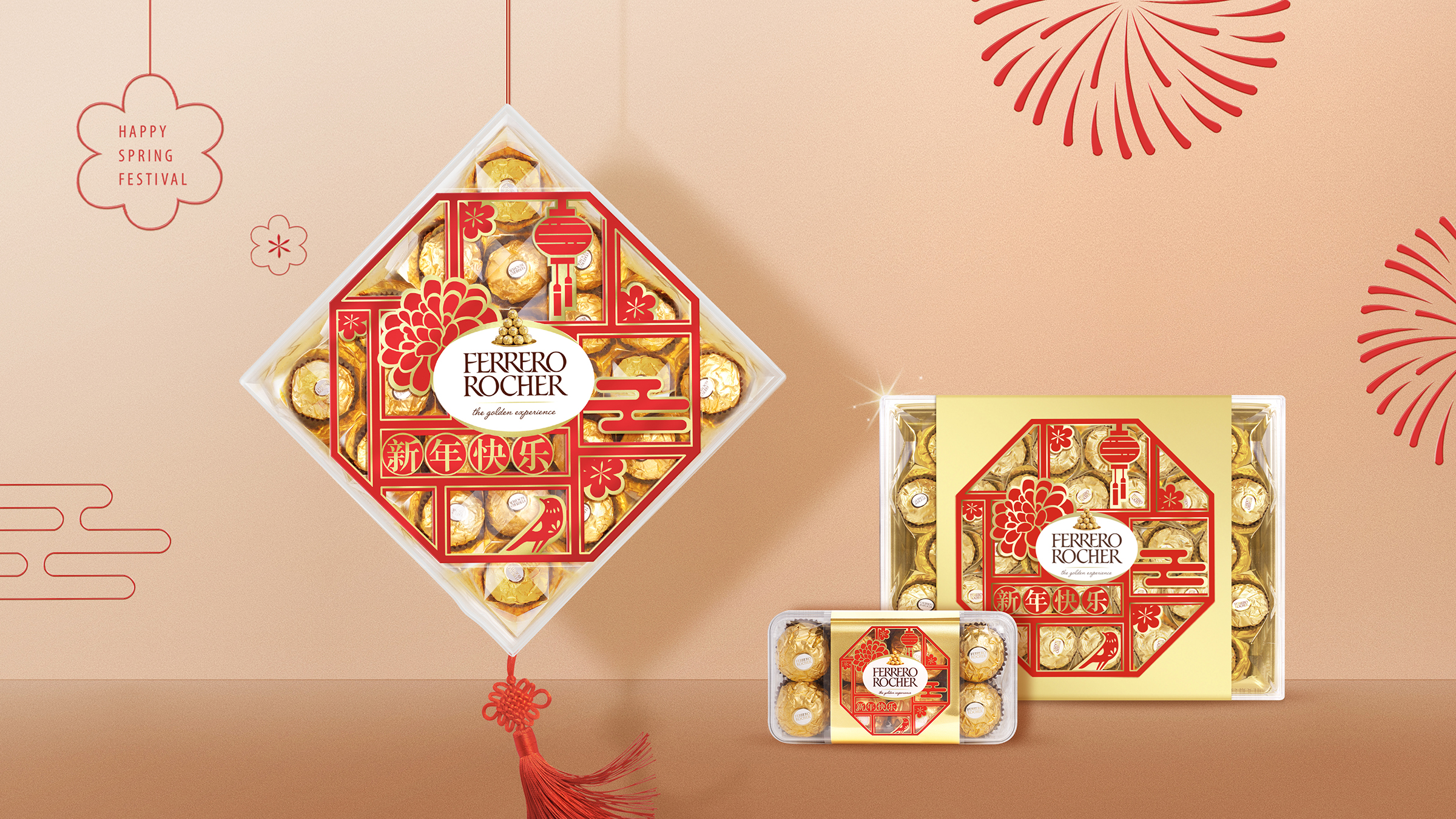
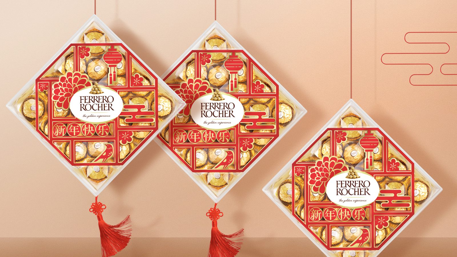
So different festive elements like peony, lantern, magpie are created in paper cut format as on the window, in which you can see through all shining and golden pralines. Ferrero logo is designed to put in the center, as the mark for the paper cut. It generated an invisible connection between Chinese culture and the brand, with fully leveraging the company’s signature gold color as well as New Year’s red, results in a more beloved and prominent brand.
Last but not least, we suggested one more way of presenting the products, instead of putting on shelf only, the way of hanging the products helped the brand shine on the shelf, this also echo with Chinese tradition of hanging auspicious item in the house to wish for good luck.
All of above thoughts put together, we created a pack that well resonated with Chinese consumers in CNY season. It helped not only the Ferrero brand to attract more attention, but also brought to life the CNY traditions to younger consumers. The brand recognition was well embraced by them, too.
CREDIT
- Agency/Creative: ShinyBay Design
- Article Title: Packaging Design For Ferrero 2020 CNY Gift Pack
- Project Type: Packaging
- Project Status: Published
- Agency/Creative Country: China
- Agency/Creative City: Shanghai
- Industry: Food/Beverage
- Keywords: WBDS Agency Design Awards 2022/23
-
Credits:
Creative Director: Heven He
Designer: Lisa Li
Designer: Nicole Zhang


