Overview
Xperia Travel is a travel agency has a vision to make the traveling more fun and with a real experience through their activities and packages.
They need to make sure that the people are experienced a new way of traveling without feeling exhausted and tired. We ask the client and he wants to be clear and choose that name to make sure that the brand perona is all about the experience and especially with traveling.
Concept
We’re here to create an experience that’s very personal, that shows the excitement we’re bringing to the table. We played with the personification of the activities where our customers are living the experience.
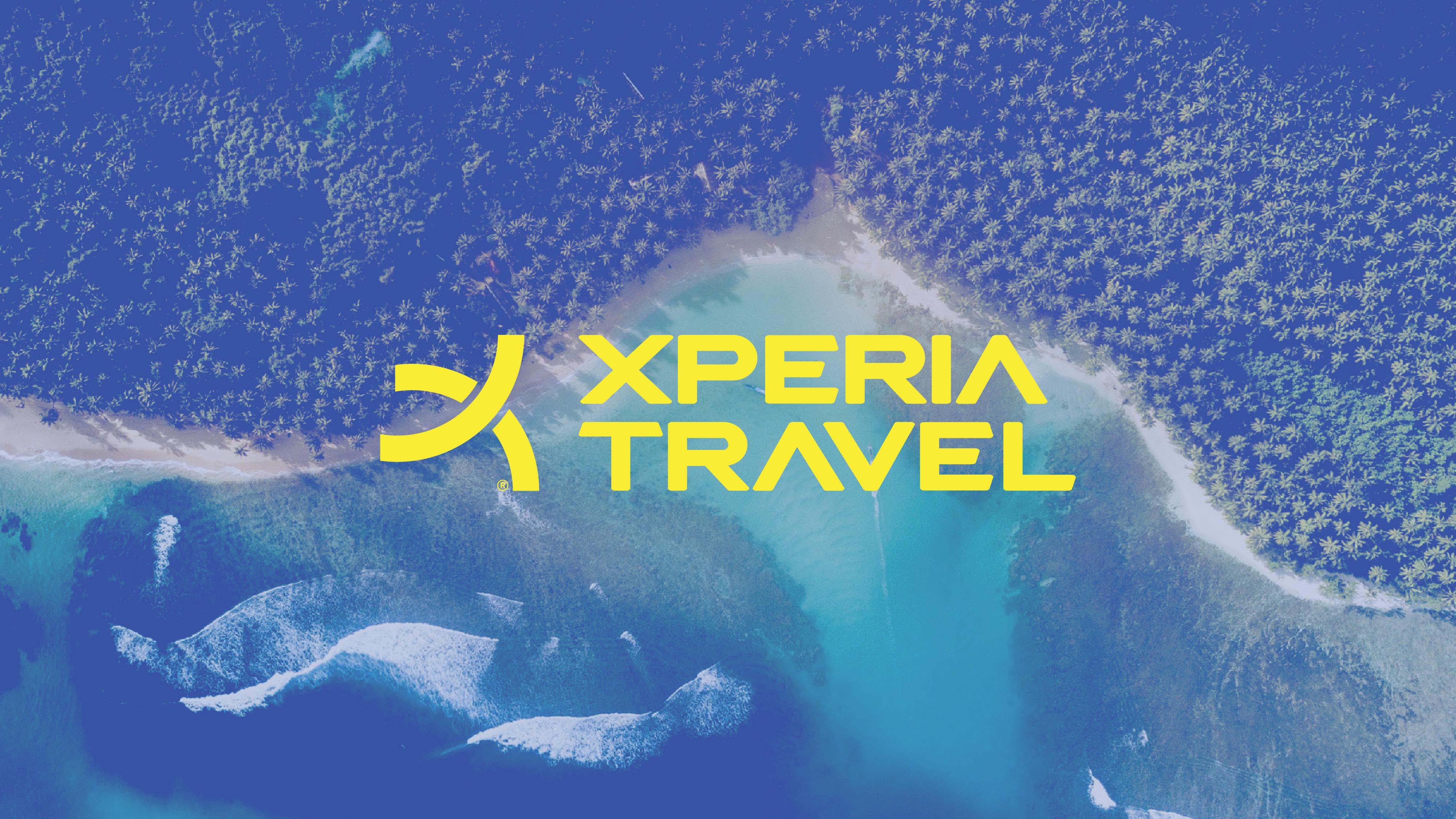
The typeface is modern to complement the brand concept.
Colors
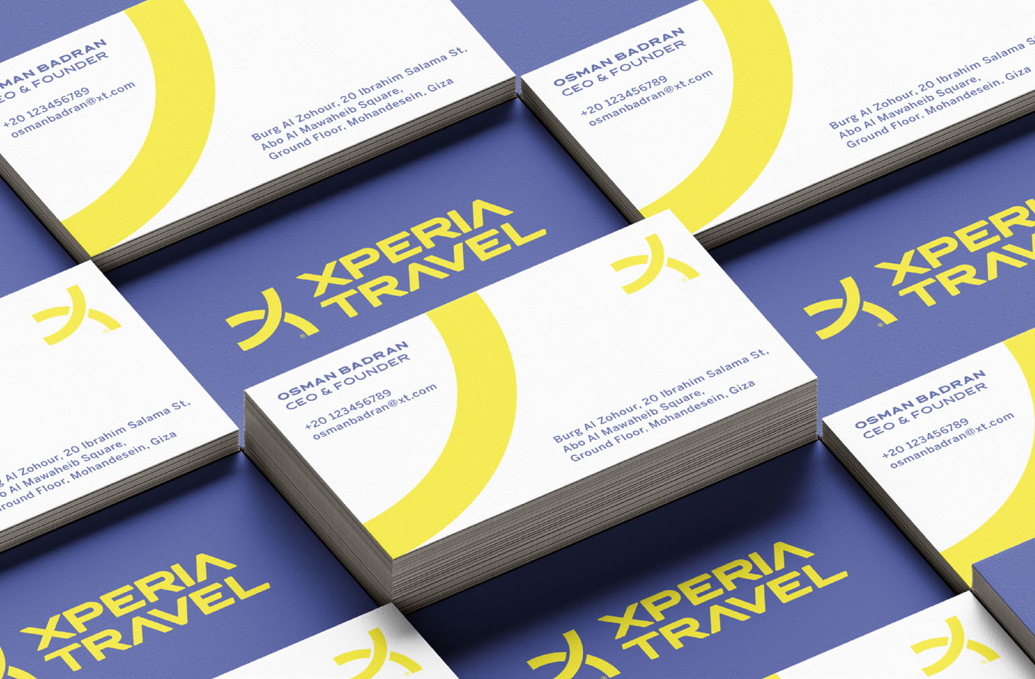
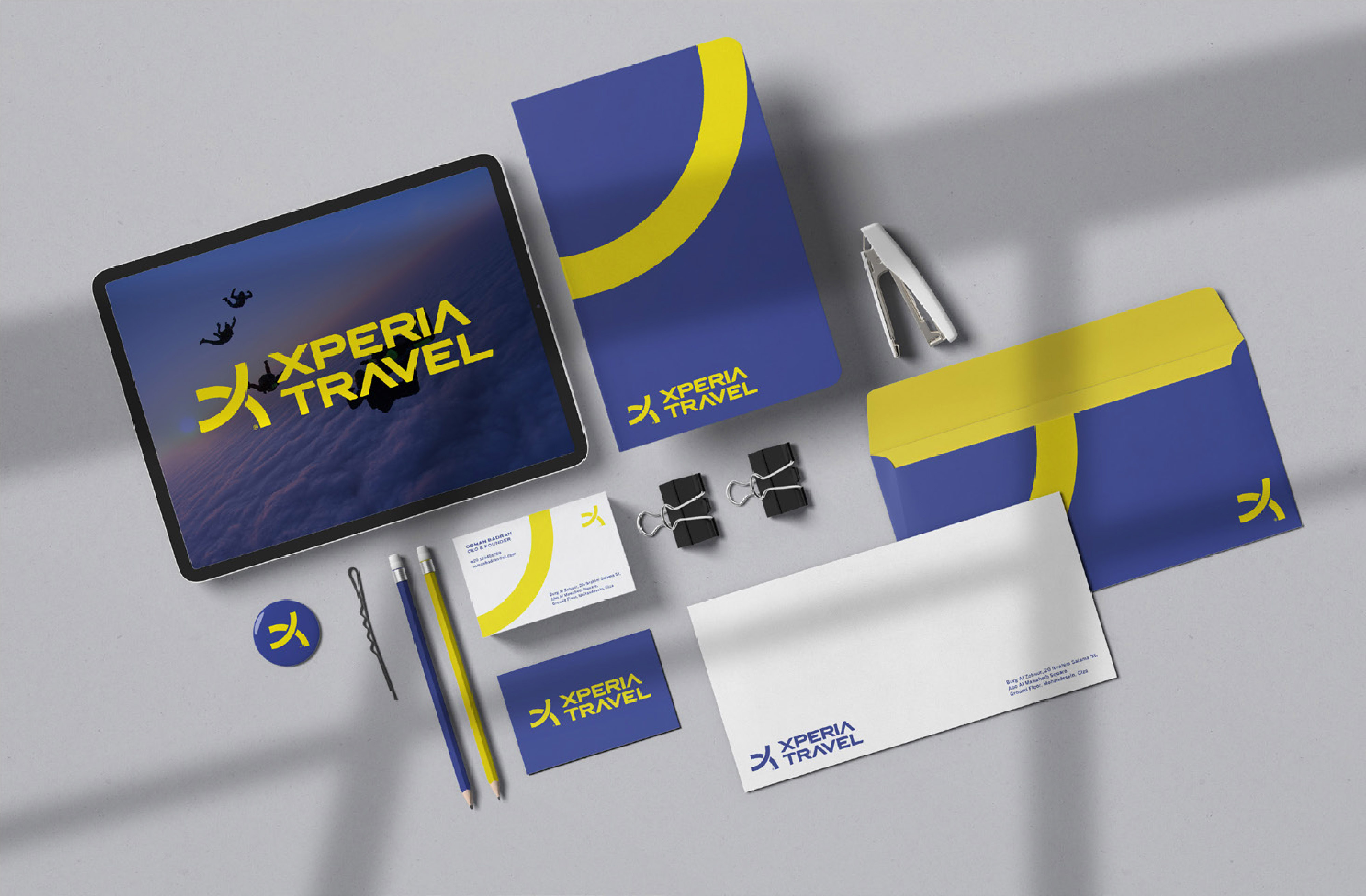
The color is best used for the brand main point of impact. And best used for the brand VL and other touchpoints. The blue is a vibe of trustworthy and community connections and the Yellow is for the fun and new experience that people live it.
Slogan
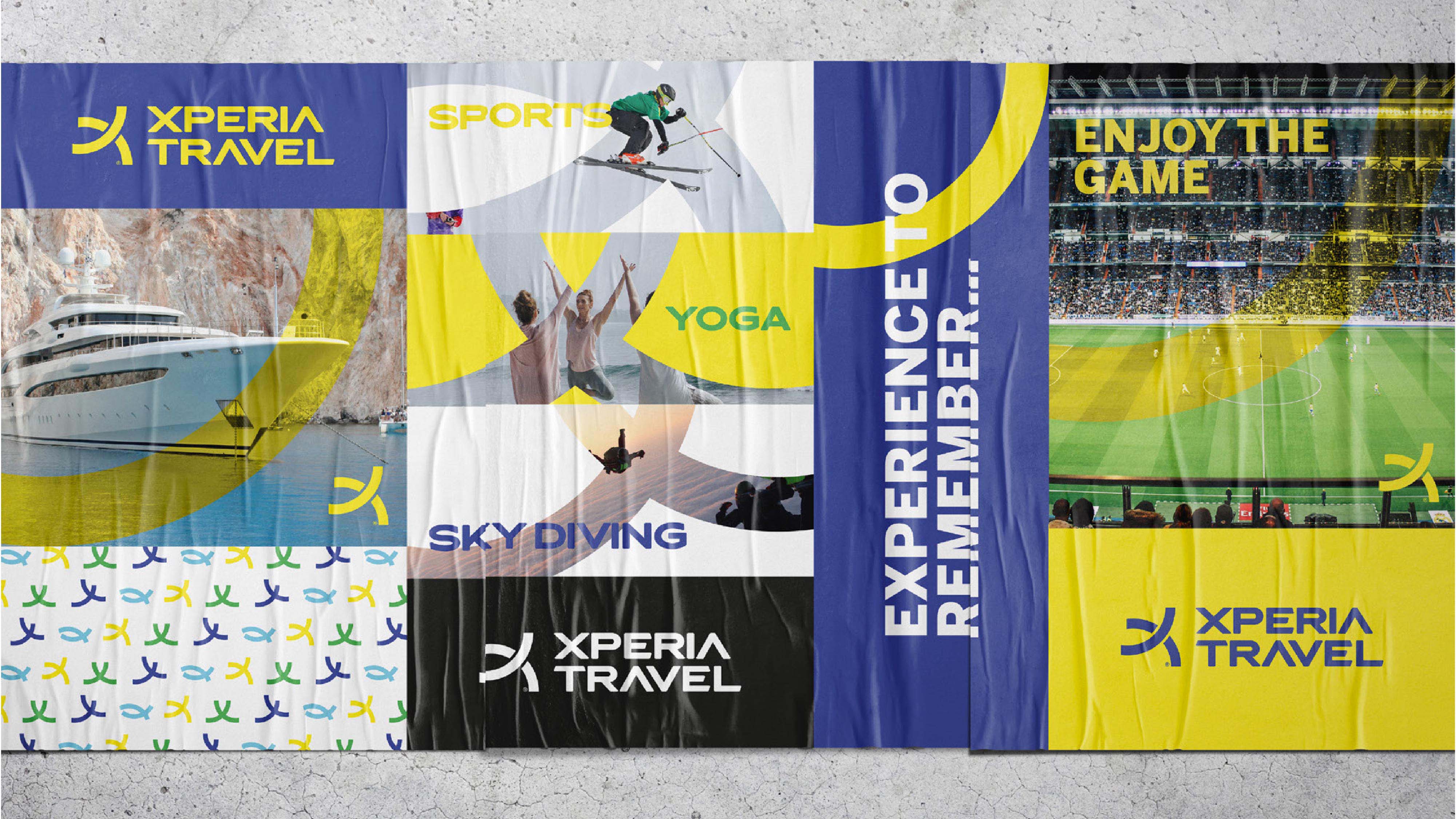
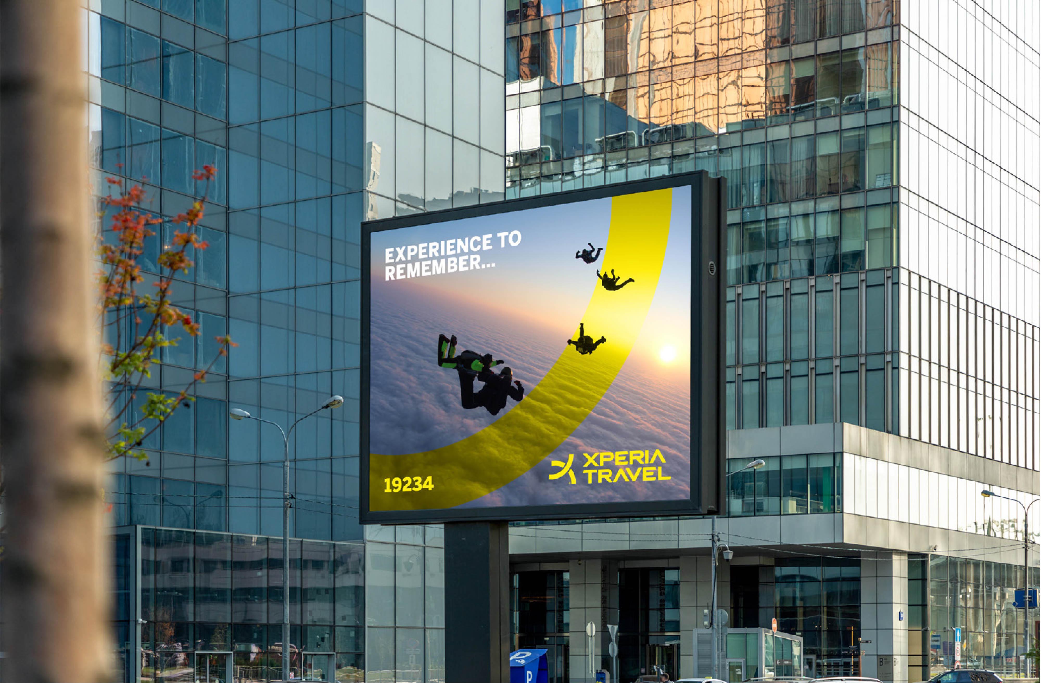
We need to make a voice that connected with people when they decided to go on a vacation and try something new a good experience so we came up with “Experience to remember” .
Iconography
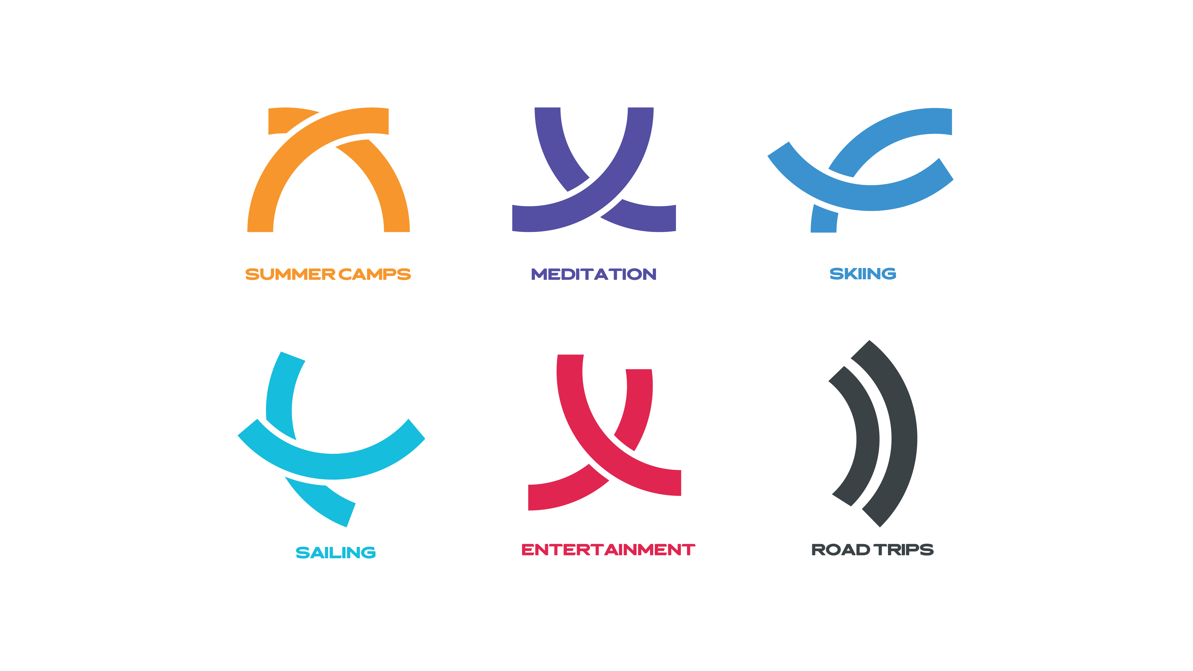
We make the whole icons from the logo to be dynamic like the real activities and experience that the people do it and feel it. Like the “X” is making a shape of person skiing and camping and so on.
Visual Language
We came up with a dynamic also and playful visuals for all applications to fit and give the brand the consistency that needs to be like what are they doing and their vision.

CREDIT
- Agency/Creative: The Brand Bees
- Article Title: Brand Design for Travel Agency Xperia Travel
- Organisation/Entity: Agency
- Project Type: Identity
- Project Status: Published
- Agency/Creative Country: Egypt
- Agency/Creative City: Giza
- Market Region: Middle East
- Project Deliverables: Brand Design, Brand Identity
- Industry: Entertainment
- Keywords: branding, brand, identity
-
Credits:
Creative Leader: Taimour Othman
Brand Designer: Mohamed Mosthfazan


