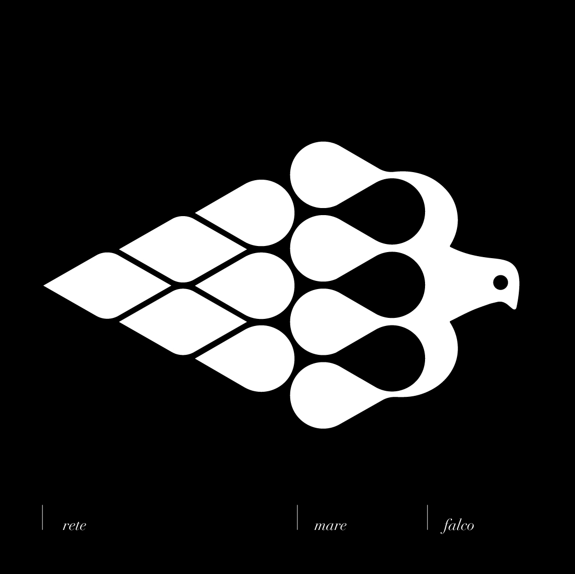
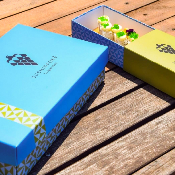
The Sparviero is the name of a fishing net, a sea hawk, but also a restaurant in Santa Maria di Castellabate, Abbasc ‘A Marina, in Cilento dialect. In the realization of the logo there are three main elements: fishing, the sky and the sea, which were united in a narrative pictogram, consisting of intuitive modules, readable from both verses: from sky to sea and from sea to sky. Patterns were then created for the packaging of the restaurant, sushi bar, take away and cuopperia, inspired by the typical bento boxes of Japan, the back of Neapolitan playing cards and fried cuoppi of straw paper.
I created patterns for the packaging of the restaurant, sushi bar, take away and cuopperia, letting ourselves be inspired by geometric formulas:
Cuopperia: a basic shape in repetition, which draws inspiration from the traditional shape of the cuoppi.
Sushi bar: silhouettes that take their cue from the prints of the classic Japanese tradition, in particular from the shapes of the Bento Boxes, the containers in which food is placed in Japan.
Restaurant: inspired by the back of classic Neapolitan cards, but in a modern and contemporary key.
The project is still in development, soon we will have all the new packaging coordinated with the essence of the sea and the local. The next step will be to create the coordinated for the hotel attached to the structure, the descent to the sea and the new bathing establishment. All coordinated with the symbol of you Lo Sparviero as the mother of everything.





CREDIT
- Agency/Creative: Manuele Altieri
- Article Title: Lo Sparviero Packaging Design
- Organisation/Entity: Freelance
- Project Type: Identity
- Project Status: Published
- Agency/Creative Country: Italy
- Agency/Creative City: Eboli
- Market Region: Europe
- Project Deliverables: Brand Creation
- Industry: Food/Beverage
- Keywords: Food, sushi, Beverage,
-
Credits:
Art Director: Manuele Altieri


