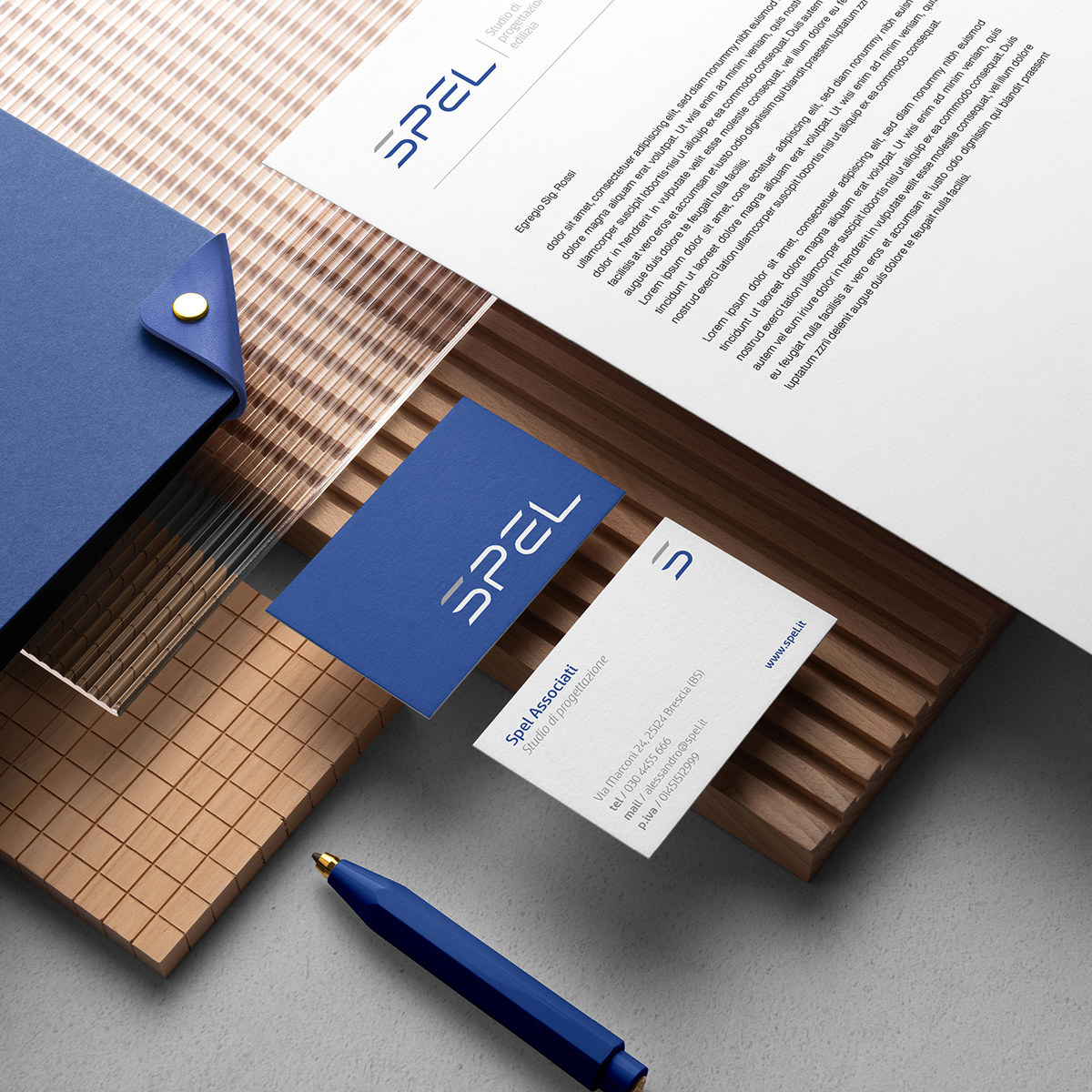
Considering the easy pronunciation and reading of the name SPEL, we opted for the study of a simple logo, without adding superfluous and useless elements that would complicate the perception of the logo itself.
A modern, fluid, personal character; conceptualized and purpose-built starting from 4 square modules and their sub-multiples, this is what the entire design of the brand is based on. Despite the interruption that would seem to make the logo incomplete, the font is smooth and easy to interpret. This “interruption” is none other than the graphic synthesis of the break with the previous experience and work activity, from which SPEL was born.
An angle of 45 degrees cuts the ends of the letters i in such a way as to create an effect of dynamism and modernism of the logo
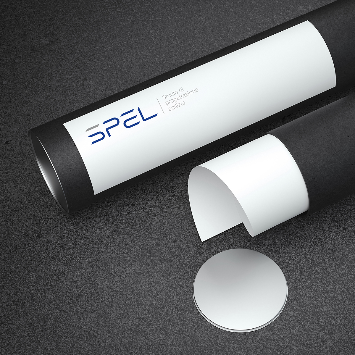
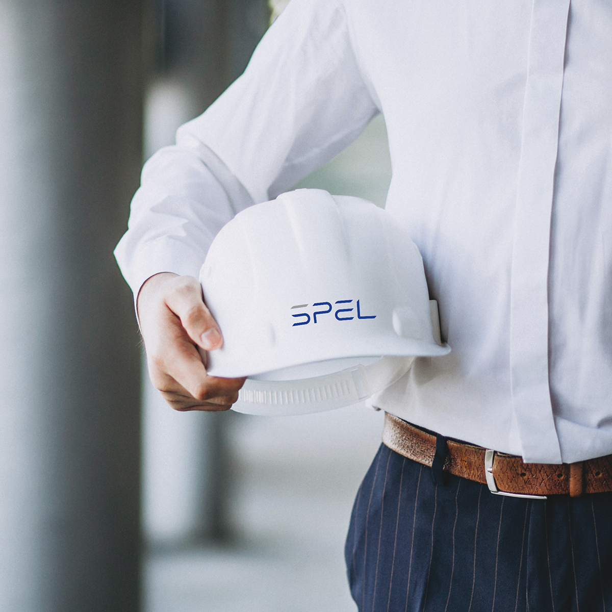
The letter “S”, taken separately, becomes a highly distinctive symbolic element, thanks to the separate line that completes the “S” at the top and which, thanks to the alternation of color, becomes the heart of memorability of the logo.
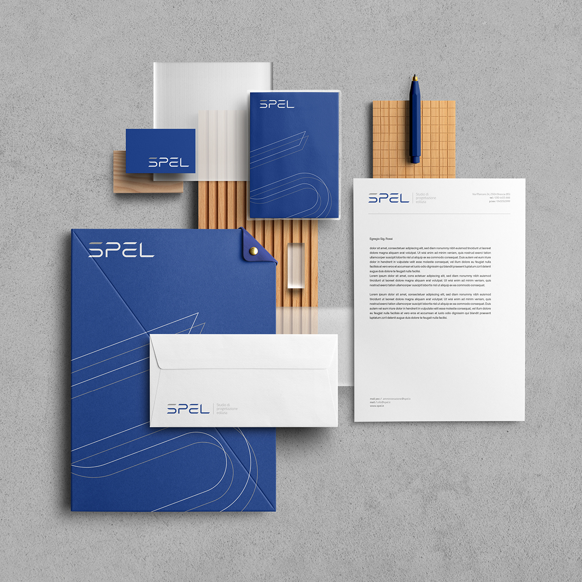
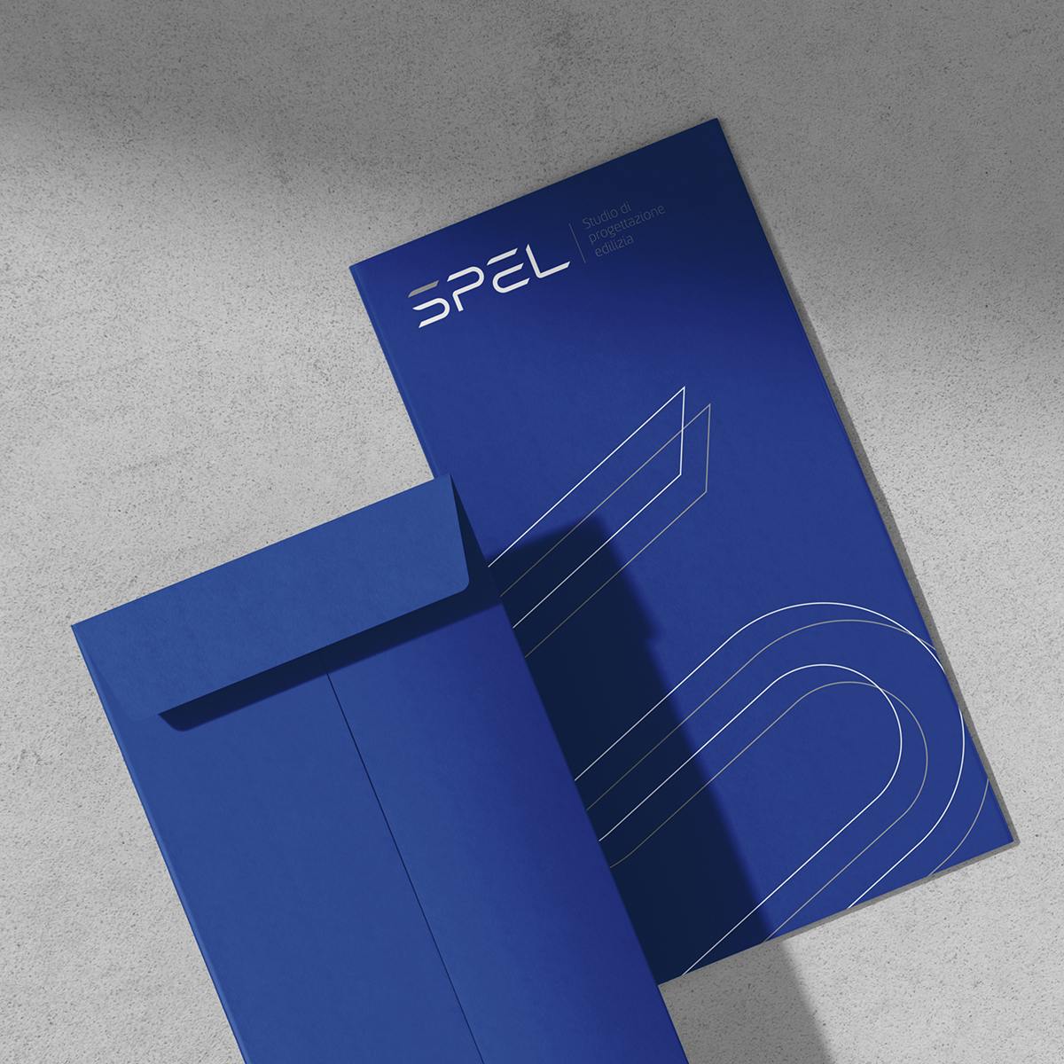
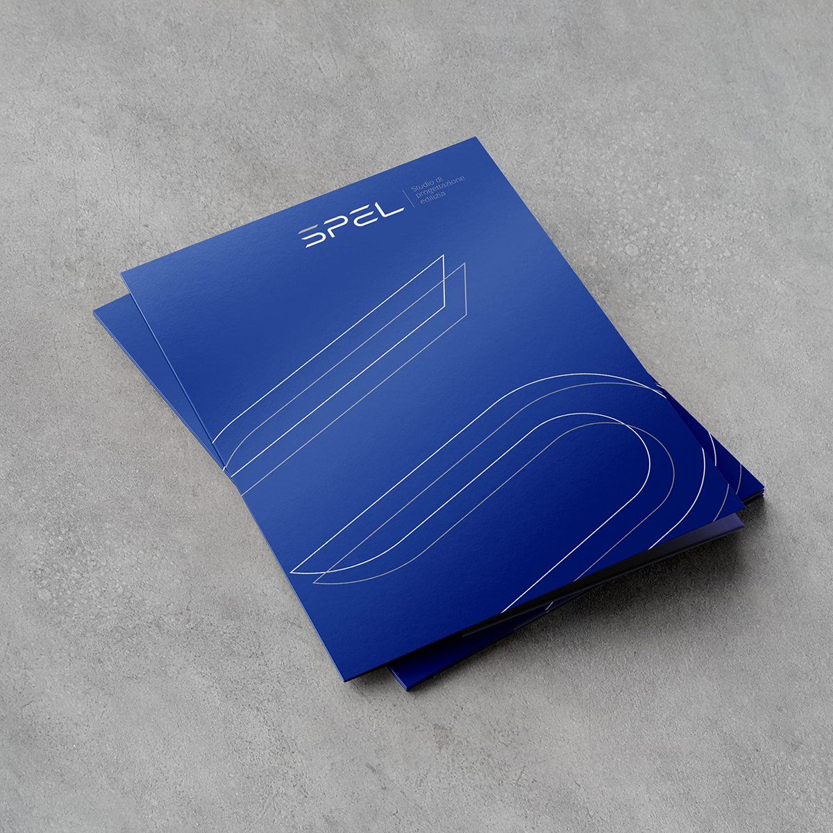
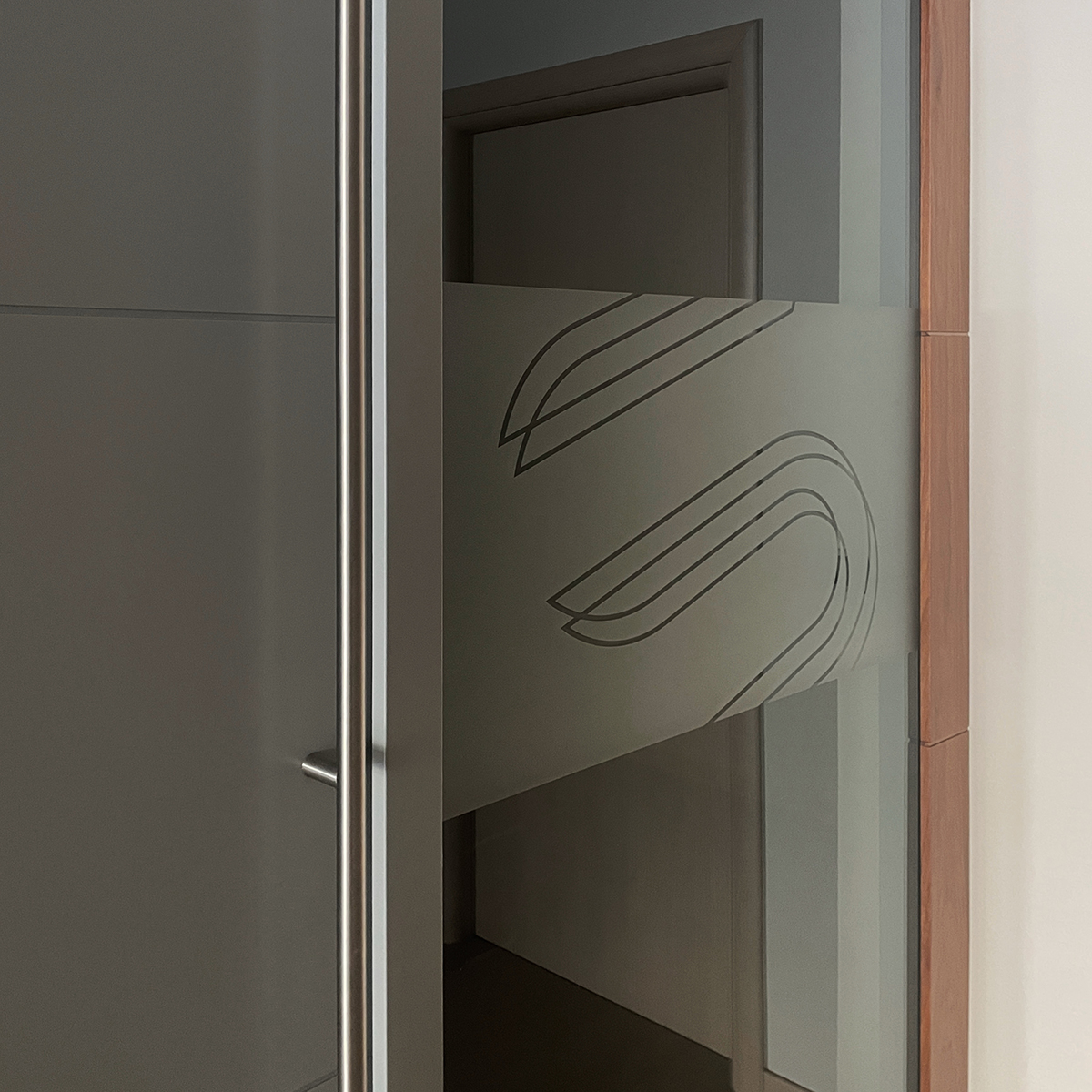
To identify printed and online communication materials – brochure or leaflet covers, folders, web banners, etc. – the letter “s” of the logotype doubles itself to become a dynamic and recognizable graphic element.
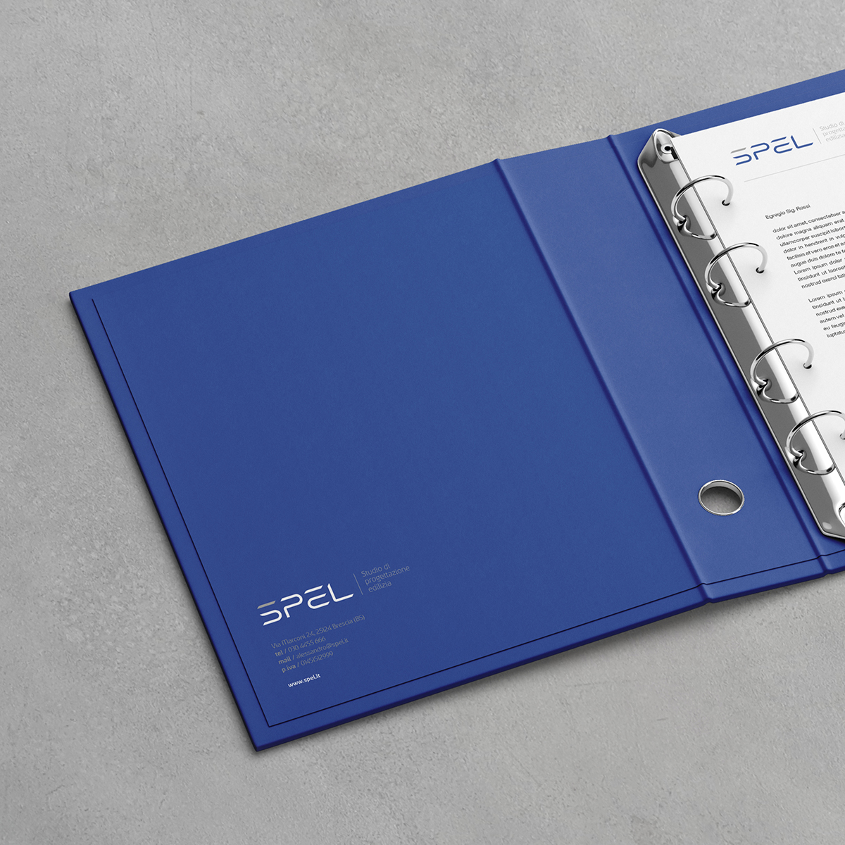
The identity typeface was chosen to consistently accompany the mark to specify the company’s business as a payoff.
The bright and glaring blue is in contrast with the gray color of the concrete – being a building design company – to create a hierarchy of reading and perceptions.
CREDIT
- Agency/Creative: Davide Berardi
- Article Title: Spel Brand Design
- Organisation/Entity: Freelance
- Project Type: Identity
- Project Status: Published
- Agency/Creative Country: Italy
- Agency/Creative City: Lumezzane
- Market Region: Europe
- Project Deliverables: Brand Identity, Logo Design
- Industry: Construction
- Keywords: construction, design, studio, logo, identity, corporate, branding
-
Credits:
Graphic Designer: Davide Berardi


