Brand design agency Taxi Studio unveils its latest work with the UK’s original gourmet burger brand, Byron, to elevate its market positioning and rejuvenate its brand experience.
Founded in 2007, Byron was one of the UK high street’s most successful burger pioneers. It broke the mould of the uninspired cookie-cutter diner, providing an eclectic menu of innovative burgers served in restaurants with specially curated interior design which paid homage to the individual quirks of the neighbourhood in which every restaurant resided.
Byron Burgers achieved a cult following. But the influx of new entrants into the market and the Covid-19 pandemic – which saw a boom in home deliveries – led the brand to rethink how its brand would stand out on digital platforms like Deliveroo, where brand experiences are homogenised and point of difference translates poorly. With the company changing ownership, there was also a need for Byron Burgers to preserve the brand equity that originally made it a resounding success, while navigating the tensions between the ‘old’ comforting and familiar Byron, and the ‘new’ Byron which appealed to a discerning digital-first customer.
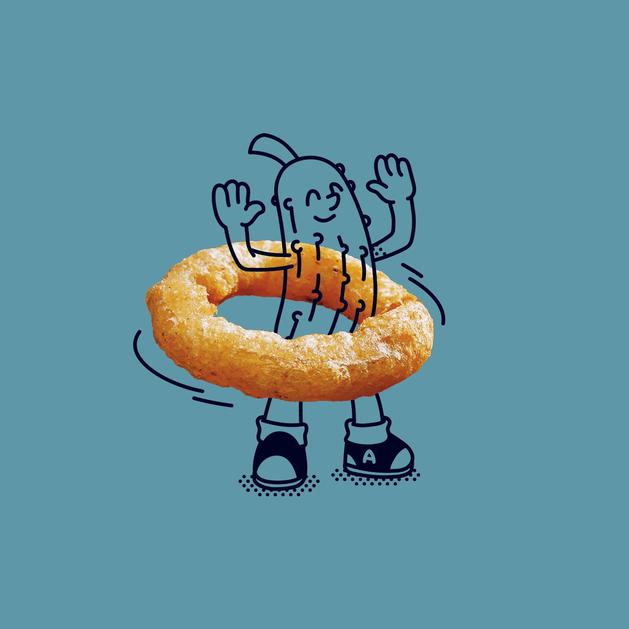
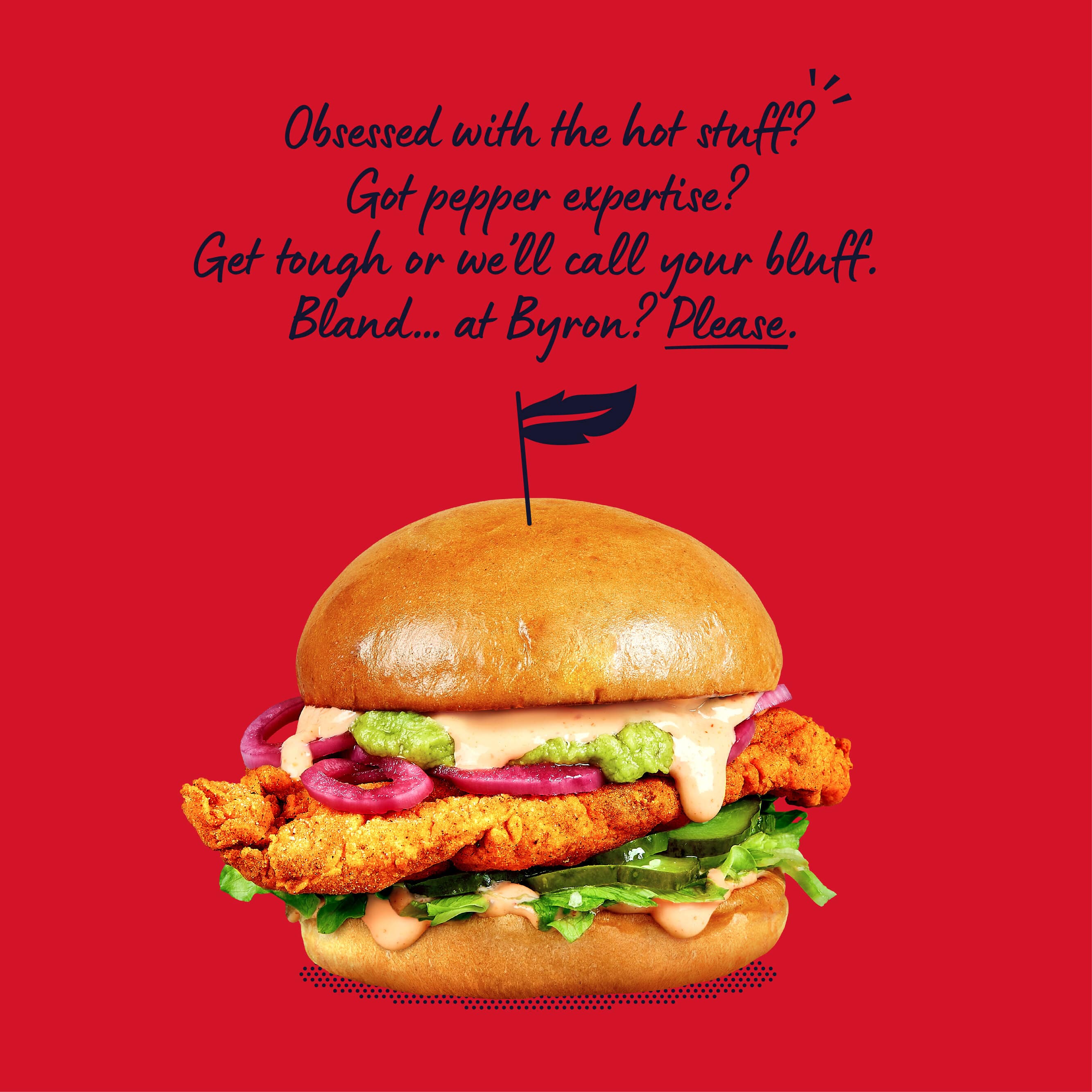
Taxi Studio was appointed by Byron Burgers to rejuvenate its entire brand expression, including: brand proposition and positioning, identity, tag line, tone of voice, poetry, menus, packaging, cast uniforms and role naming conventions, wall and poster art, product photography, website, and a suite of characters that represent the different profiles of burger eaters, most notably, OG – George the poetic pickle – Byron’s lyrical mascot. Taxi collaborated with Reed Words to produce a playful (and often rhyming) tone of voice, channelling the essence of famous, and highly controversial English poet – Lord Byron – bringing the brand and menu to life with wit, whimsy and mischief.
First, Taxi Studio worked on the creative platform, homing in on the idea of ‘burger artistry’ which reflected the flair and creativity poured into the burgers and dining experience itself. This saw a radical shift from the typically gratuitous burger depictions of oozy excess, towards positioning food as art and sustenance. The strapline, ‘Poetry in a bun’ was born from this, which nods to both Byron’s artistic flair and Lord Byron himself who, although was not the original inspiration behind the name, became the foundation for Taxi Studio’s rejuvenation.
Spencer Buck, Founder & CCO at Taxi Studio, comments: “Byron’s point of difference wasn’t translating as strongly as it could. The brand also needed to consolidate its disparate identity. Our task was to design a brand system that was flexible enough to work across both physical and digital touch points whilst respecting the eclecticism and design individuality of each Byron Burger diner. After digging deep into the history of Byron Burger we came across this quote from the brand’s [now departed] founder, Tom Byng: “It’s cool to name a burger joint after a bisexual romantic poet. And although we didn’t actually name it after him, there’s no harm in letting people think we did.” This was the moment of clarity for us. In his day, Byron was a rock-star – a mischief maker. So, we simply brought the essence of [Lord] Byron back to Byron.
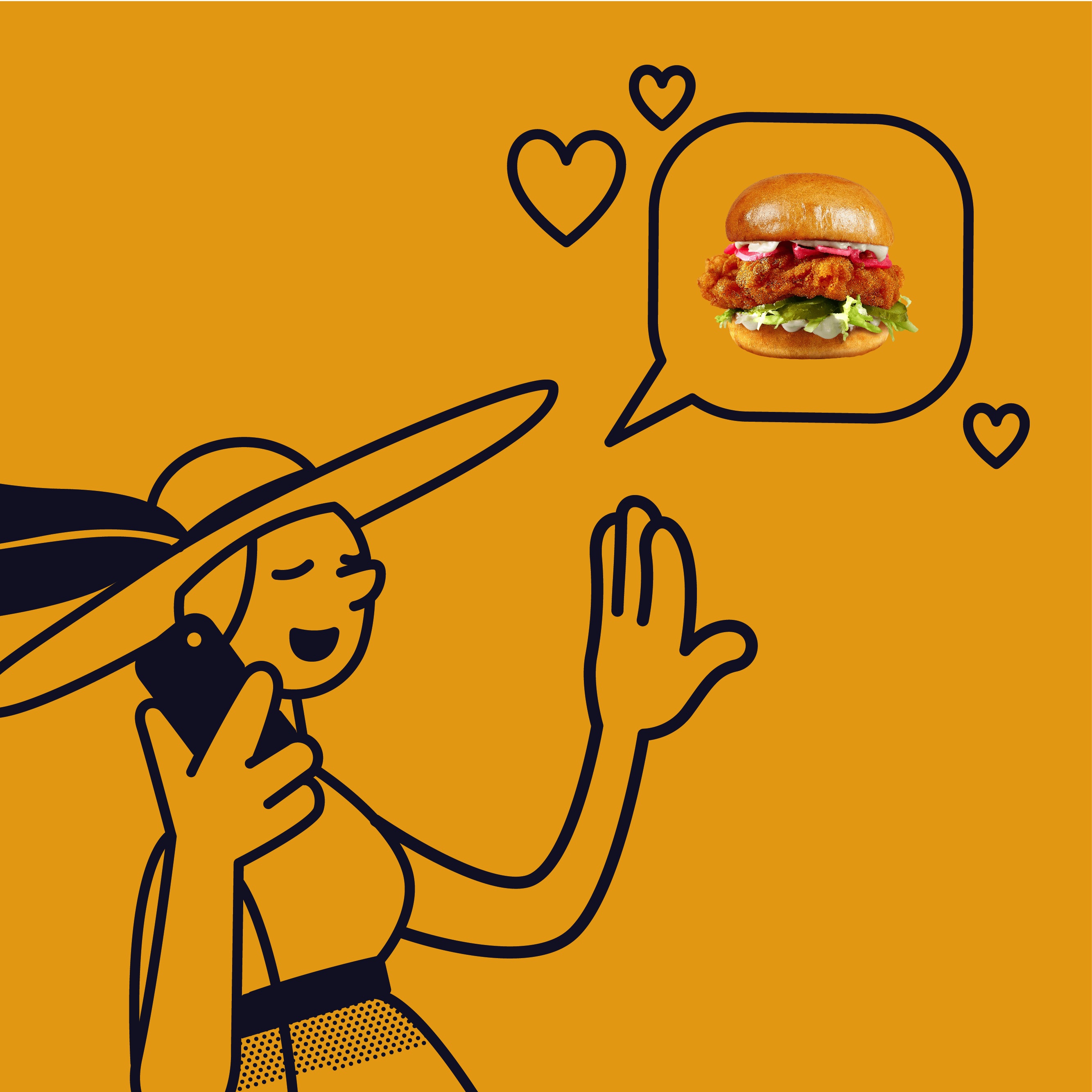
To maintain a level of continuity, Taxi took Byron Burger’s existing brand assets, which included a suite of random characters, and reimagined them to represent the diversity of customers. The ‘Byronistas’, as they are now known, are a family of mascots who live across the menu. Led by George – the dry-witted pickle who extols the perfection of Byron’s burgers.
Meanwhile, the brand’s colour palette was recast to denote the flavour profiles of burgers on the menu, aiding digital navigation and providing a more vibrant experience for customers.
Simran Sablok, Marketing & Sales Director at Famously Proper, comments: “Byron’s been through many pairs of creative hands during our decade and a half in the gourmet burger business – but no-one truly understood the potential for our brand until Taxi Studio came onboard with their unparalleled thinking, creativity, and craft. We are delighted with Byron’s new brand expression – and especially our resident, witty poet, OG (aka George, the poetic pickle).”
Byron Burger has 21 sites in the UK. Taxi’s brand expression system is in process of being rolled out nationally.


CREDIT
- Agency/Creative: Taxi Studio
- Article Title: Byron Burgers Appoints Taxi Studio to Rejuvenate Brand and Celebrate Artistry Behind Gourmet Burger Experience
- Organisation/Entity: Agency
- Project Type: Identity
- Project Status: Published
- Agency/Creative Country: United Kingdom
- Agency/Creative City: LONDON
- Market Region: Global
- Project Deliverables: Brand Design
- Industry: Hospitality
- Keywords: Byron Burger
-
Credits:
Marketing Lead: Lauren Adie


