


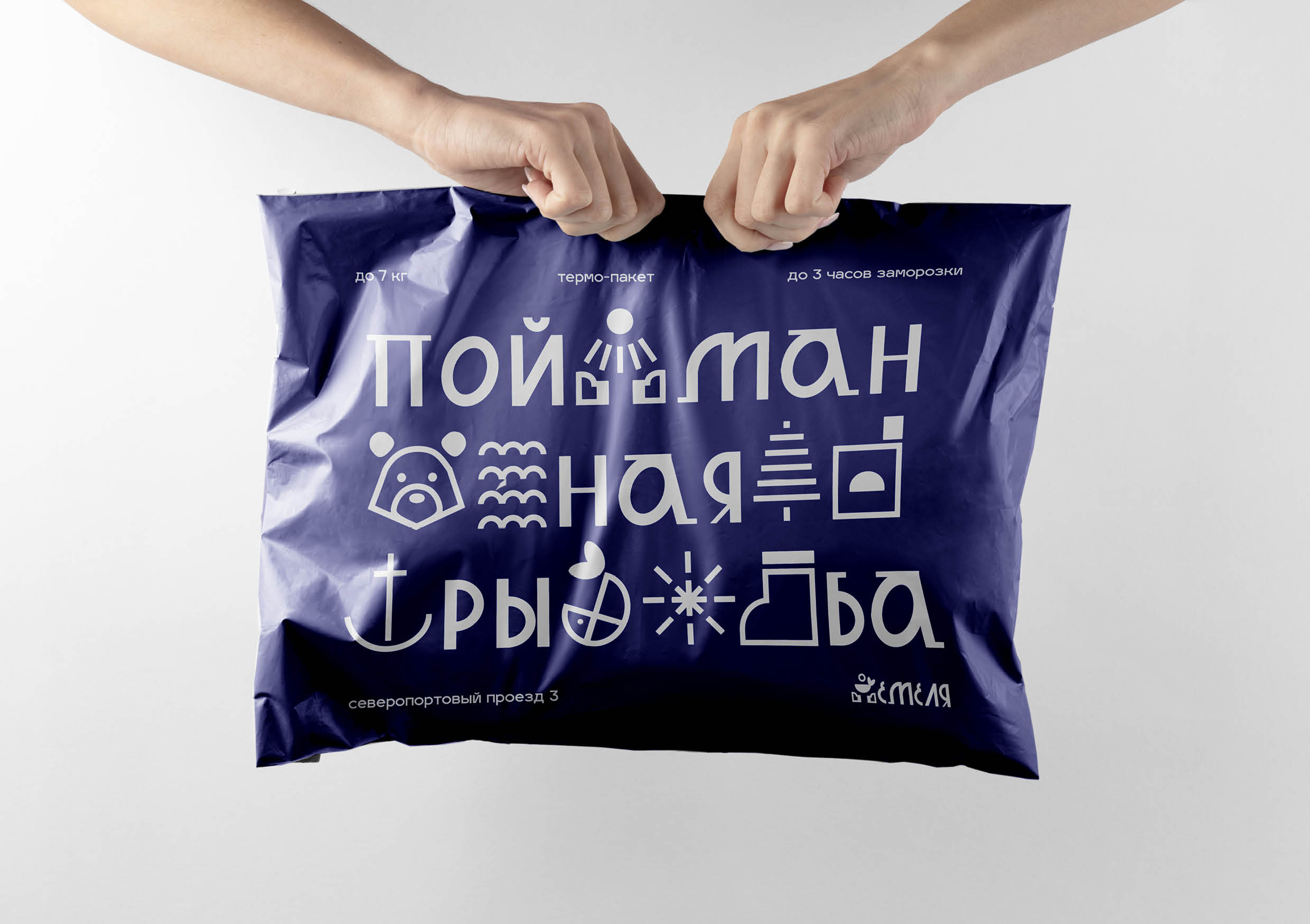
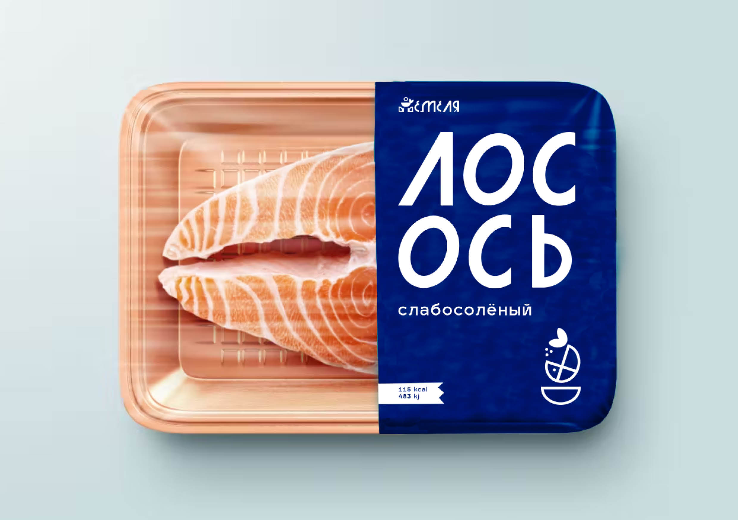
“Emelya” is an eco-farm in the premium segment for growing Siberian organic fish. The company’s ideology is based on such concepts as purity, freshness, traditionalism and simplicity. The main feature of “Emelya” is that it is aimed at men who want to buy the best fish for their family. The company provides the opportunity for men to feel like a “fisherman” in a modern city and catch a fish on their own. At the eco farm, you can not only buy freshly caught fish, but also go fishing and spend a weekend. The company also produces semi-finished fish products and supplies other stores with them.
While creating the style, the main inspiration was the proto-design, which refers to simplicity and traditionalism.
The name of the company was chosen for a reason. After studying Siberian and Russian traditions and origins for a long time, a well-known fairy tale was chosen. We refer to the traditional Russian fairy tale “By the pike’s will”, where Emelya is the main character who caught the fish very easily and simply.
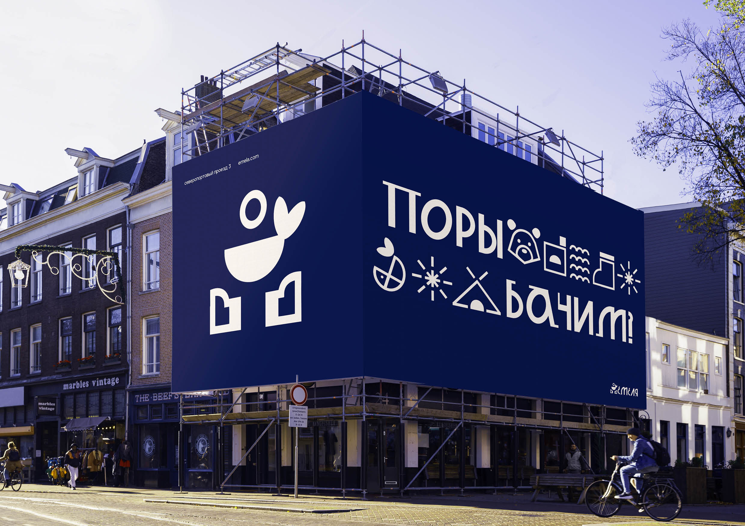
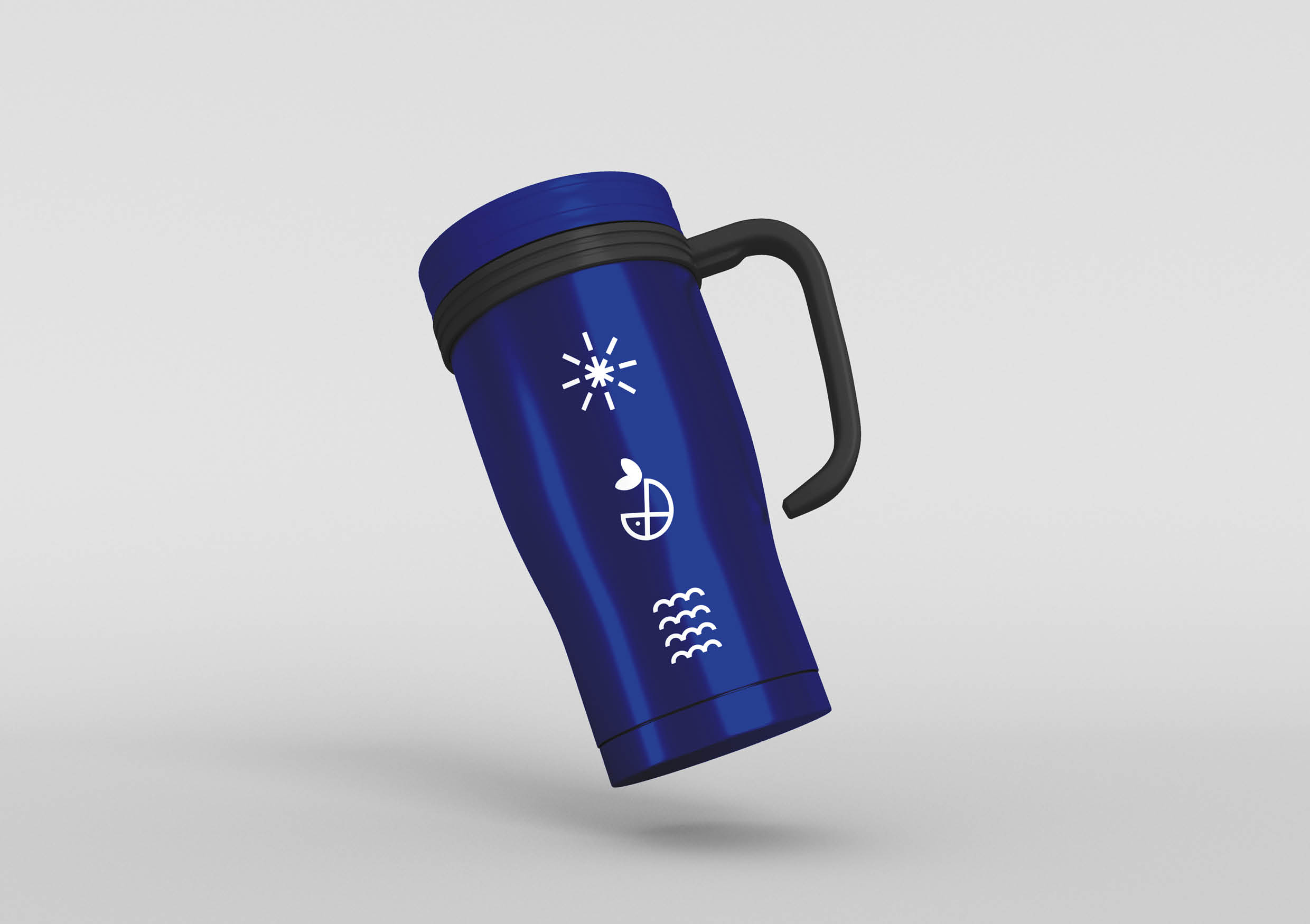
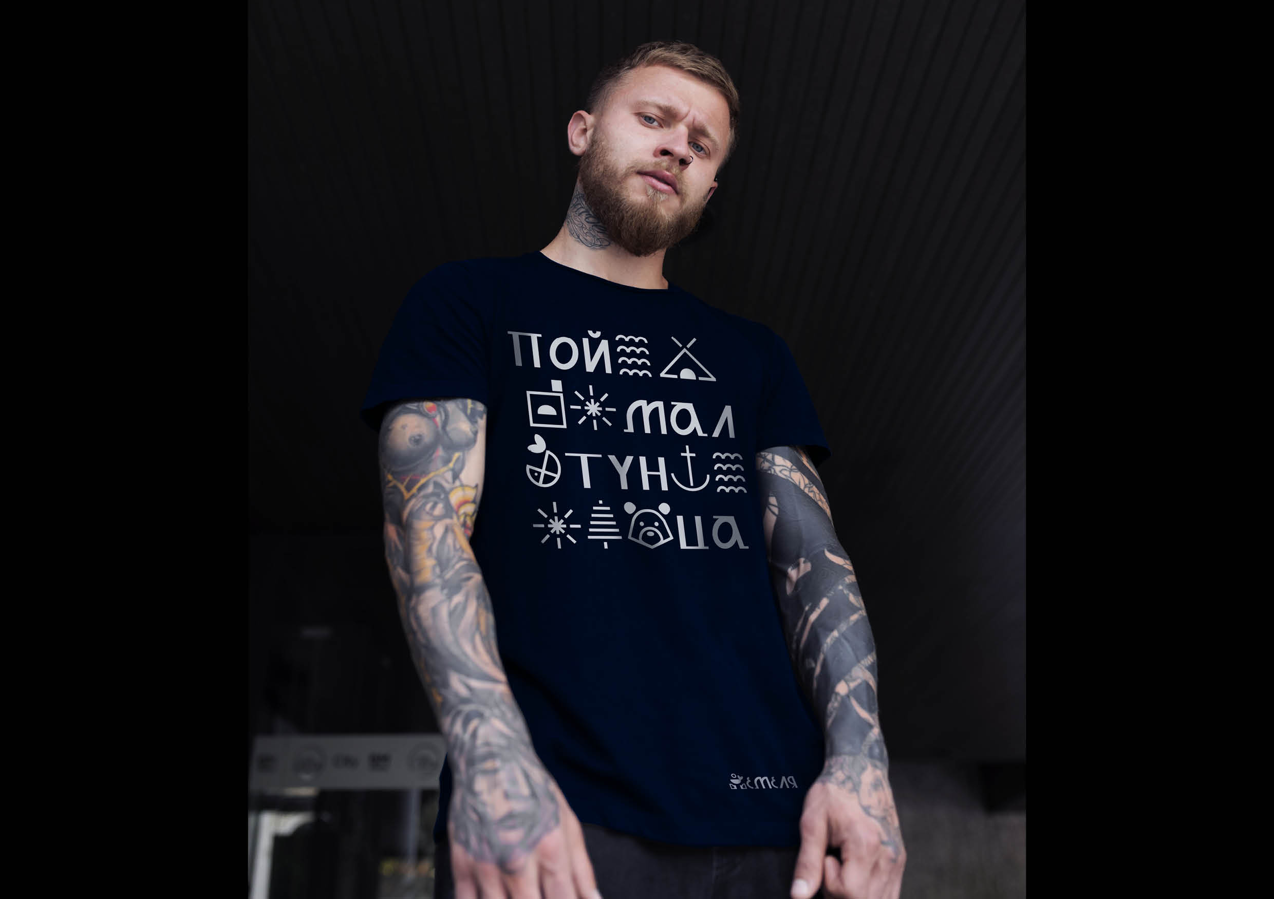
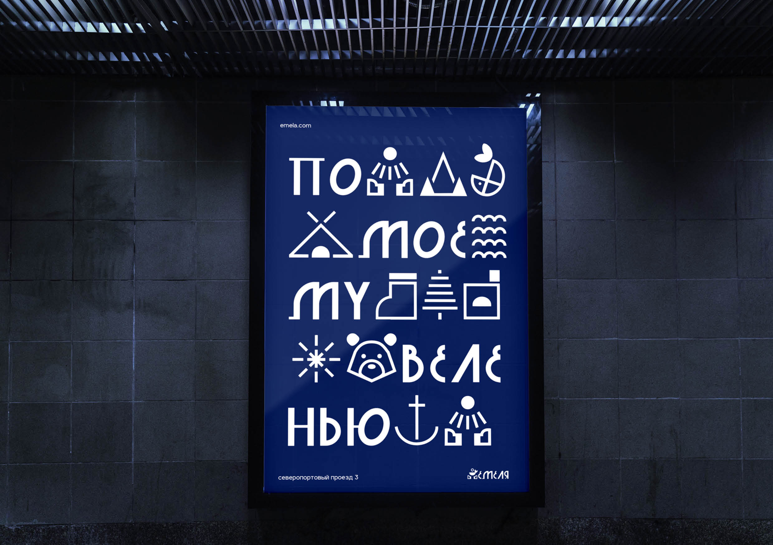
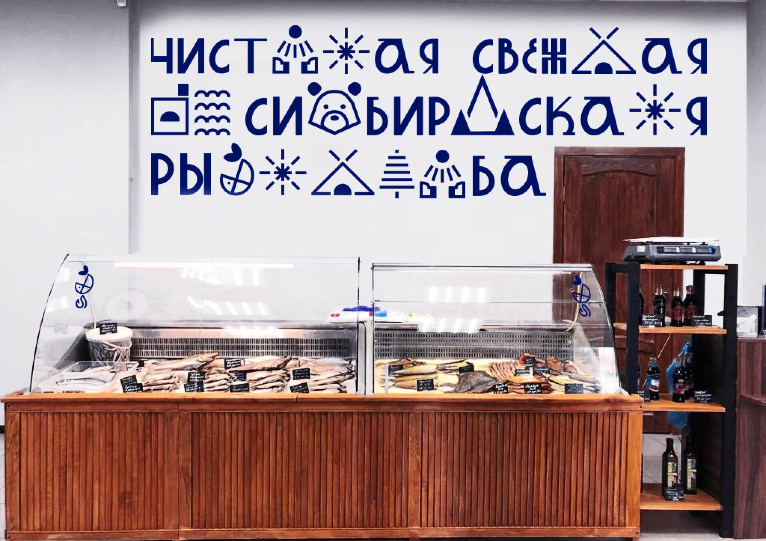
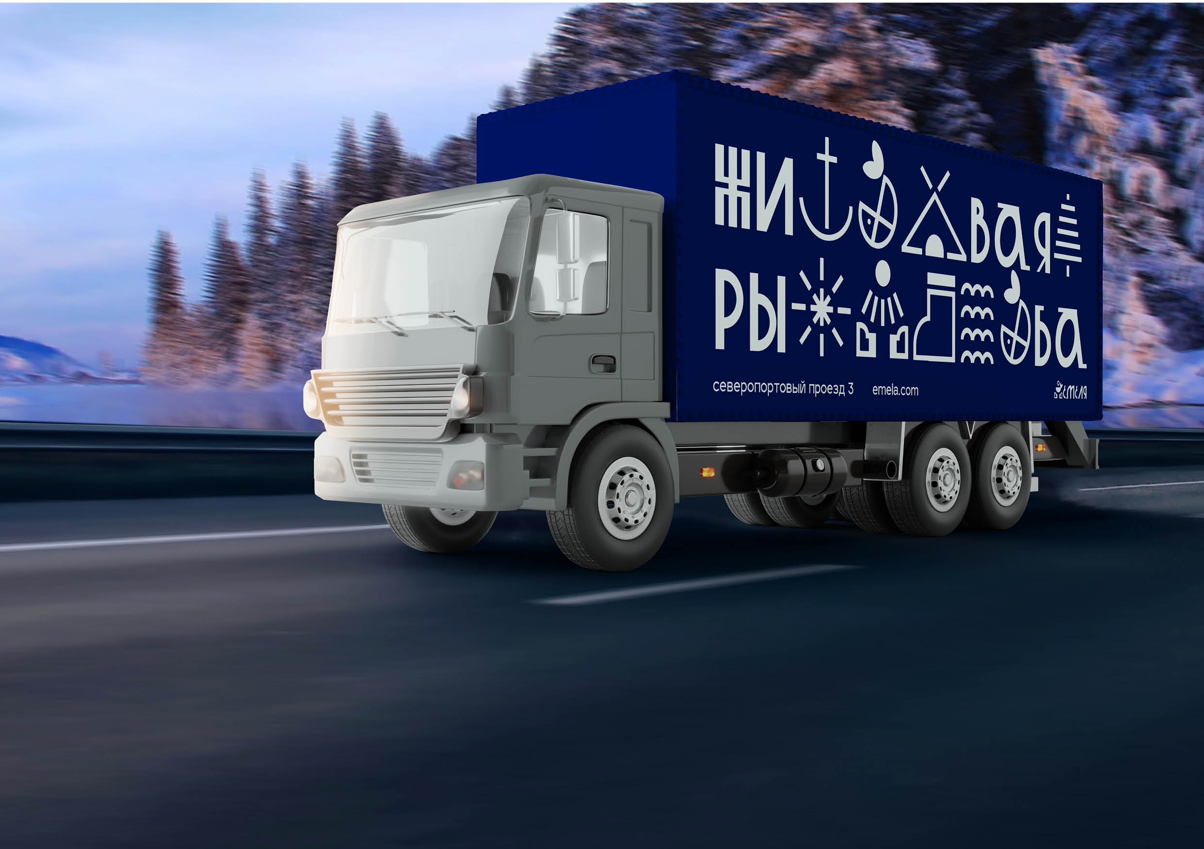
The style was based on the specially developed jobbing font for the project “emelafont”, which serves as a reworking review of old Russian fonts. Further additions to the style were icons with elements of Siberia.
The main idea of the corporate identity is that through the font and stylized icons we tell a fairy tale about Emela and fishing.
Now you can buy fresh Siberian fish without worrying about the health of yourself and your family.
“Emela” grows fish and sells “health” and “taste”


CREDIT
- Agency/Creative: Shipilova Polina
- Article Title: Student Brand Identity Concept For The Eco-Farm “Emelya”
- Organisation/Entity: Student
- Project Type: Identity
- Project Status: Non Published
- Agency/Creative Country: Russia
- Agency/Creative City: Moscow HSE
- Market Region: Global
- Project Deliverables: Brand Identity, Branding, Graphic Design
- Industry: Food/Beverage
- Keywords: eco-farm, fish, brand identity, font, graphic design
-
Credits:
Сurator (HSE University Art And Design): Burenkova Natalia


