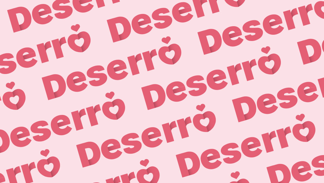
Delicious, appetizing packaging of the new brand of premium biscuits Deserro was created based on a market audit, competition analysis and brand positioning strategy. We designed the name, brand and visual identification.
The art of designing visual identity, which covers much more than just the packaging design, can be considered one of the most sensitive branches of commercial graphics. The visual identification of the brands that surround us has penetrated into the everyday life of people. That is why Deserro was a challenge that we took up with pleasure.
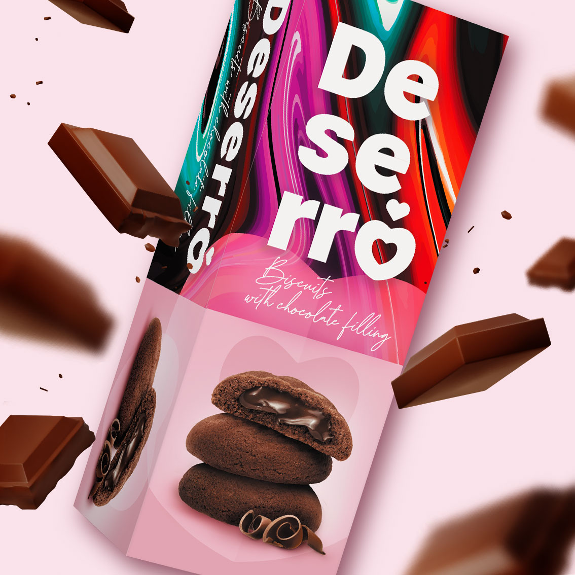
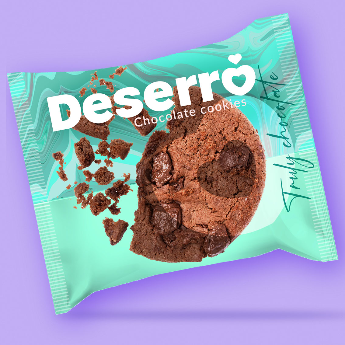
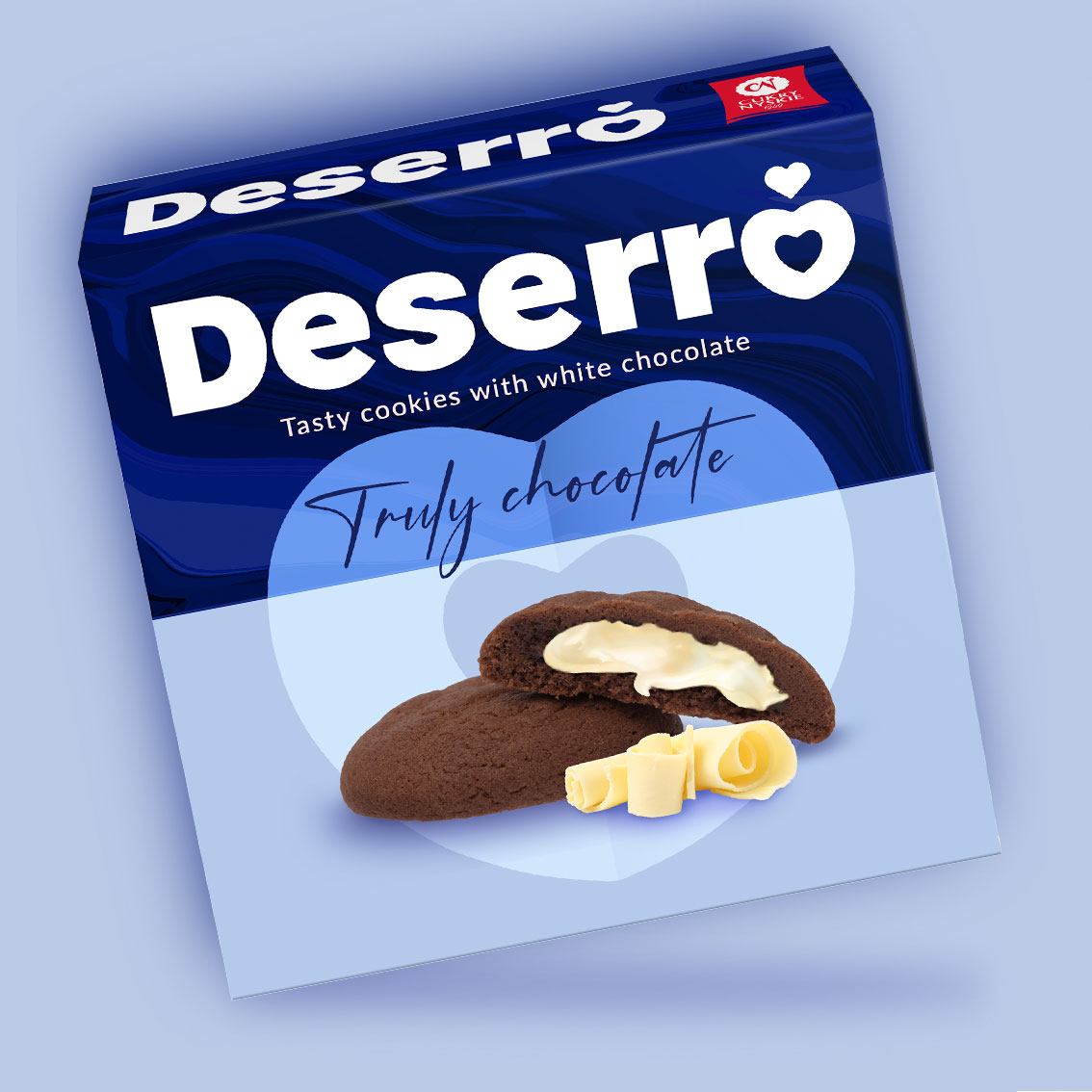
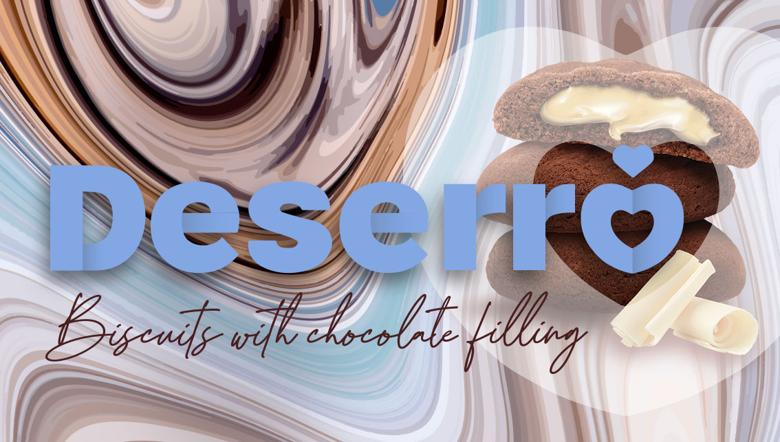
While working on the logo and visual identity, the goal was not only a unique design, but rather targeted at the target group, emphasizing the premium nature of the brand and its ingredients. Deserro is not only a top-notch brand, it is above all delicious, melt-in-your-mouth and delicious. The image at the heart of the project is a series of product photos made with great attention to detail. Modern background elements draw the eye to a strong, unique brand, and you just drool at the sight of chocolate.
The upper part of the packaging is filled with magnetizing, interesting backgrounds that refer to the fluidity of chocolate, but in a colorful, modern graphic form.
Deserro is a completely new brand in the client’s portfolio and on the market. Designing is a logical process where inspiration and creativity are only one of the many steps on the way to the goal. Of course, wonderful, delightful patterns and packaging are the result of inspiration and the imagination of the designer, but when designing a new brand, it is important to have a strategy and act according to its assumptions. The result is brand success.


CREDIT
- Agency/Creative: Studio DN Desig Group
- Article Title: Appetizing Visual Identification of a Premium Cookies Brand
- Organisation/Entity: Agency
- Project Type: Packaging
- Project Status: Published
- Agency/Creative Country: Poland
- Agency/Creative City: Warsaw
- Market Region: Europe
- Project Deliverables: Brand Creation, Brand Design, Brand Identity, Packaging Design
- Format: Box
- Substrate: Plastic, Pulp Carton, Pulp Paper
- Industry: Food/Beverage
- Keywords: packaging design, cookies, logo design, brand design, premium, brand
-
Credits:
Creative Director: Joanna Roszkowska


