Cleaning Color is a new brand, so we first conducted research among existing players in the market of household cleaning products.
To analyze the competitors, we considered brands that are presented in a regular household cleaning products store and products in a specialized eco-store (mass-market and eco-products).
As expected, the market is saturated with chemical, but effective super-strong products. Against their background, eco and natural products look very weak, ineffective and more expensive in cost. Not a good situation for launching another eco product, is it? No, it’s great! We just had to figure out why this was the case.
We took a closer look at the logic of positioning eco-competitors: they use a natural composition, so the product is harmless.
But their main problem is that not all consumers reach the final understanding of USP that eco is safety first of all for themselves, not only for the environment.
And then we thought: what if we start at the end? Make an inversion in the spirit of Christopher Nolan: the product is harmless for me, because its composition is pure. That is, the primary emphasis should be on safety for ME, and naturalness serves as confirmation of this positioning.
As a result, we chose the direction for positioning “safe because natural,” which will move the existing eco-products to the background. There is more to come!
We aimed to attack the whole market of cleaning products, namely to switch people from chemicals to eco-products and bring back those who for some reason were disappointed in the effectiveness of eco-products. So the main competitor was not even eco-products, but rather mass-market, where consumers are very price-sensitive, have a wide range of choices and are not willing to overpay for household chemicals.
Yes, Cleaning Color products are safe and effective. But in order to get ahead of the competition, we decided to create an added value to the product, which on an equal price terms would look more favorable than buying from competitors.
Cleaning Color is a household cleaner with which you become a better person: at the moment of purchase, because you chose eco and took care of yourself and nature, and at the moment of cleaning, because you got up from the couch and started cleaning.
We focused communication not on the product, but on the end consumer. We don’t praise ourselves, as our competitors do, but say that it’s all thanks to you. After all, it wasn’t us who cleaned the stain, it was YOU who took the product and started cleaning.
You’re The One Who Got It Clean!
Thus, Cleaning Color is a home motivator for those who want to be better. Honest, effective and caring. It is an environmentally friendly and biodegradable product with strong results that gives you a sense of pride in yourself.
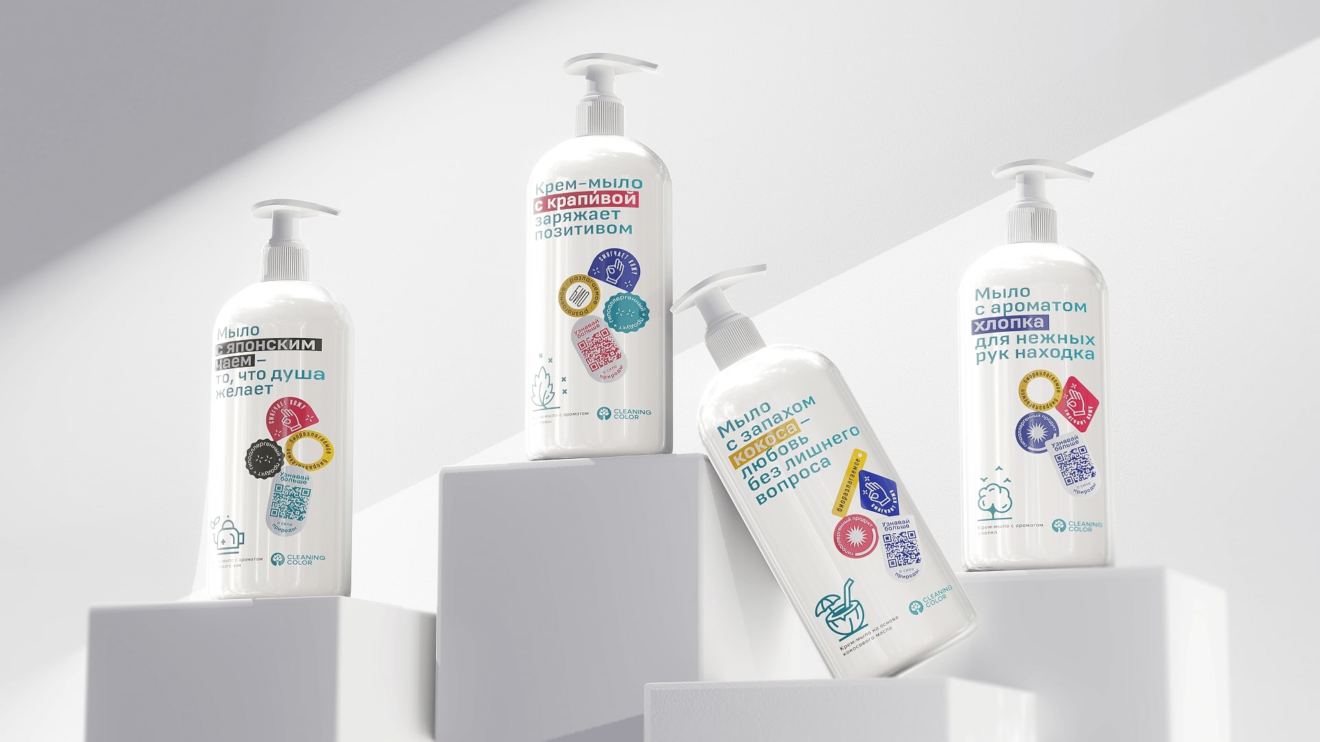
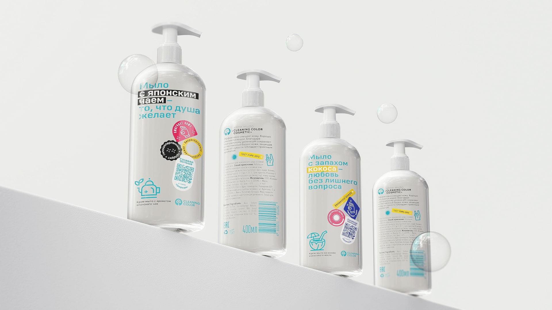
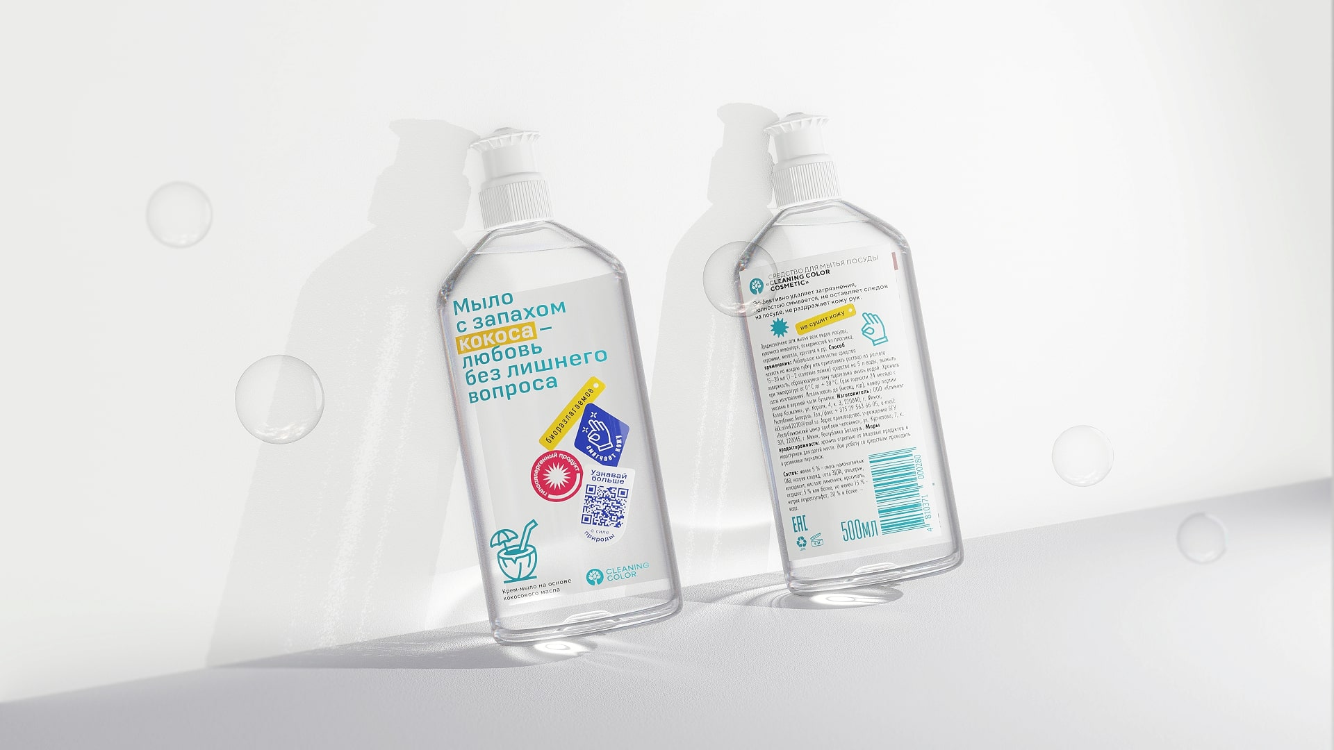
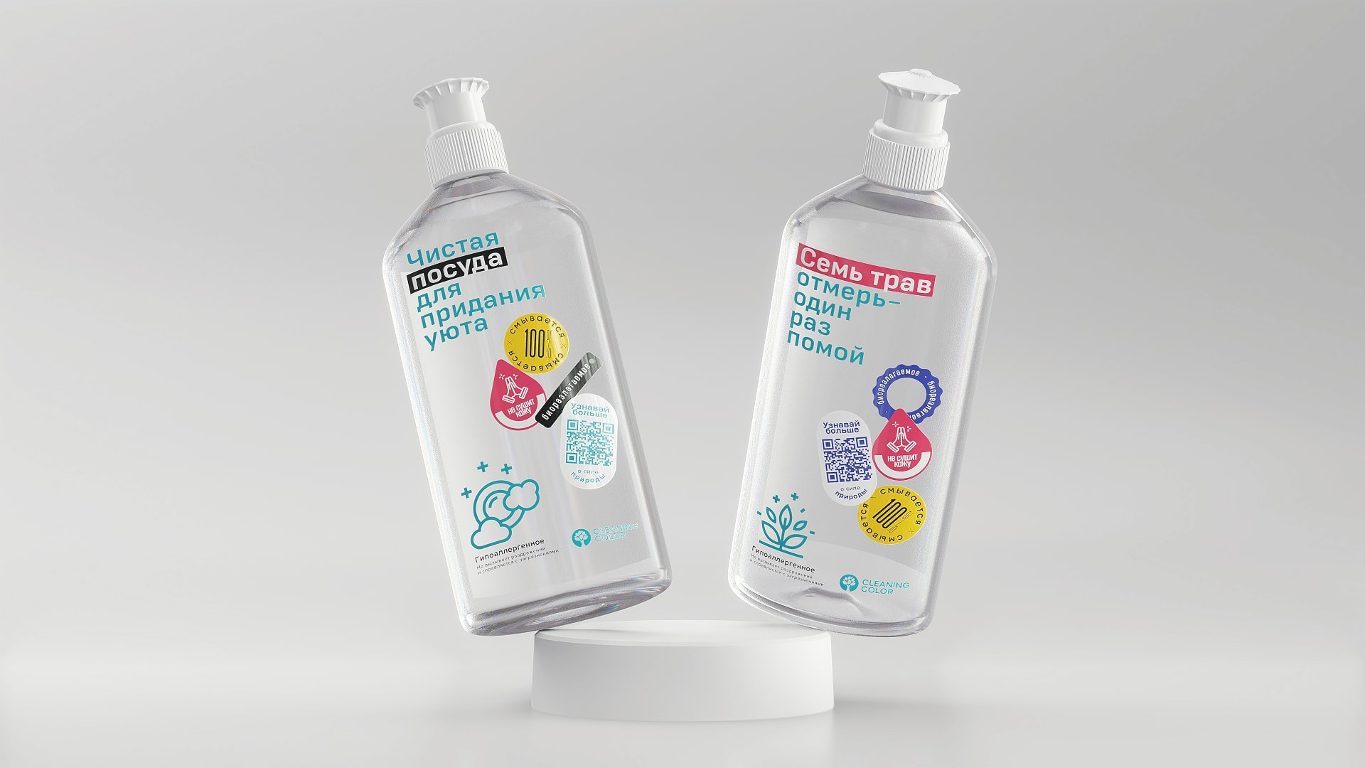
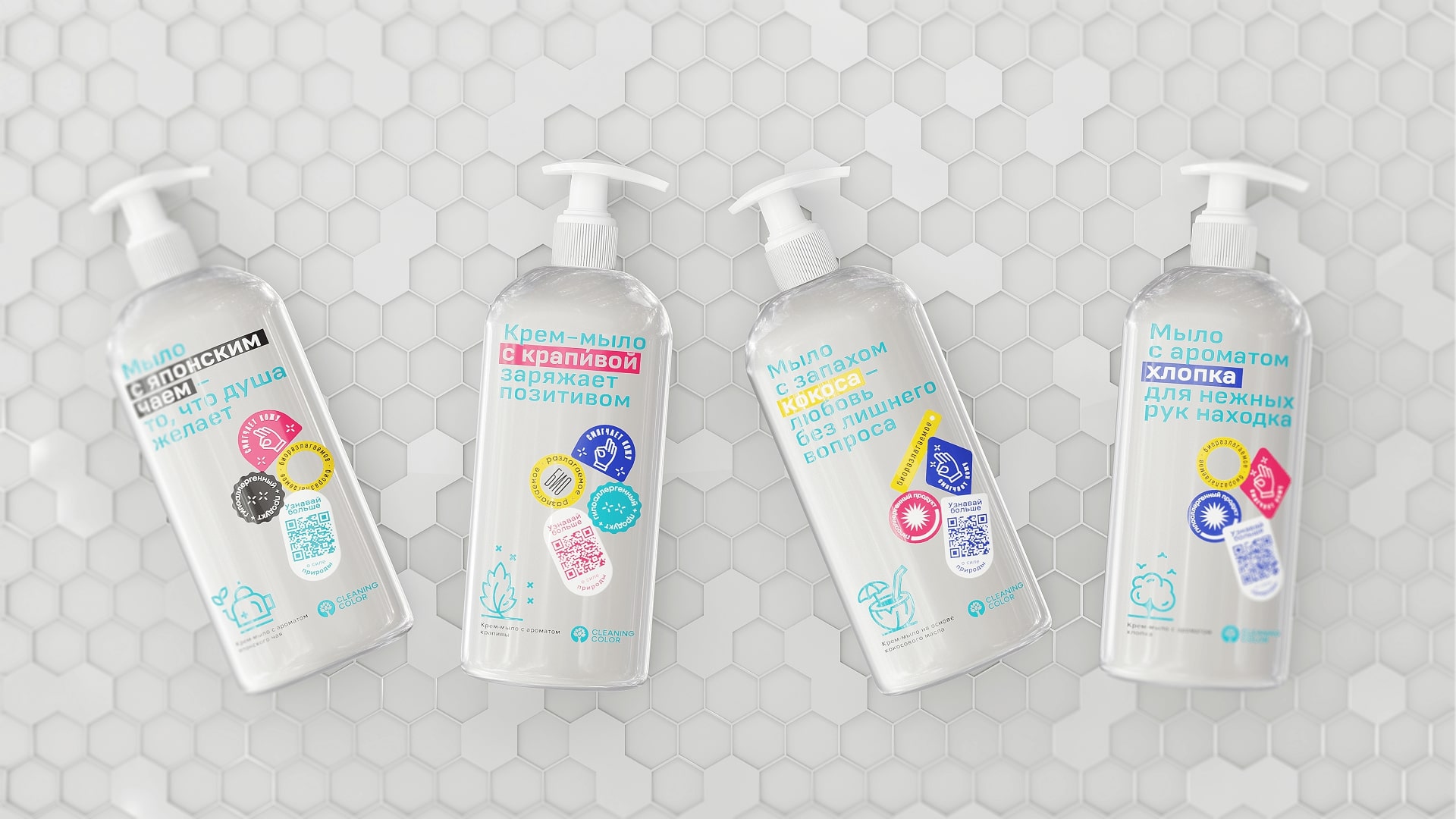
Packaging Design: We decided to use a convenient jar with a dispenser, clean and transparent, which in its natural appearance reflects the purity of the composition of the organic product.
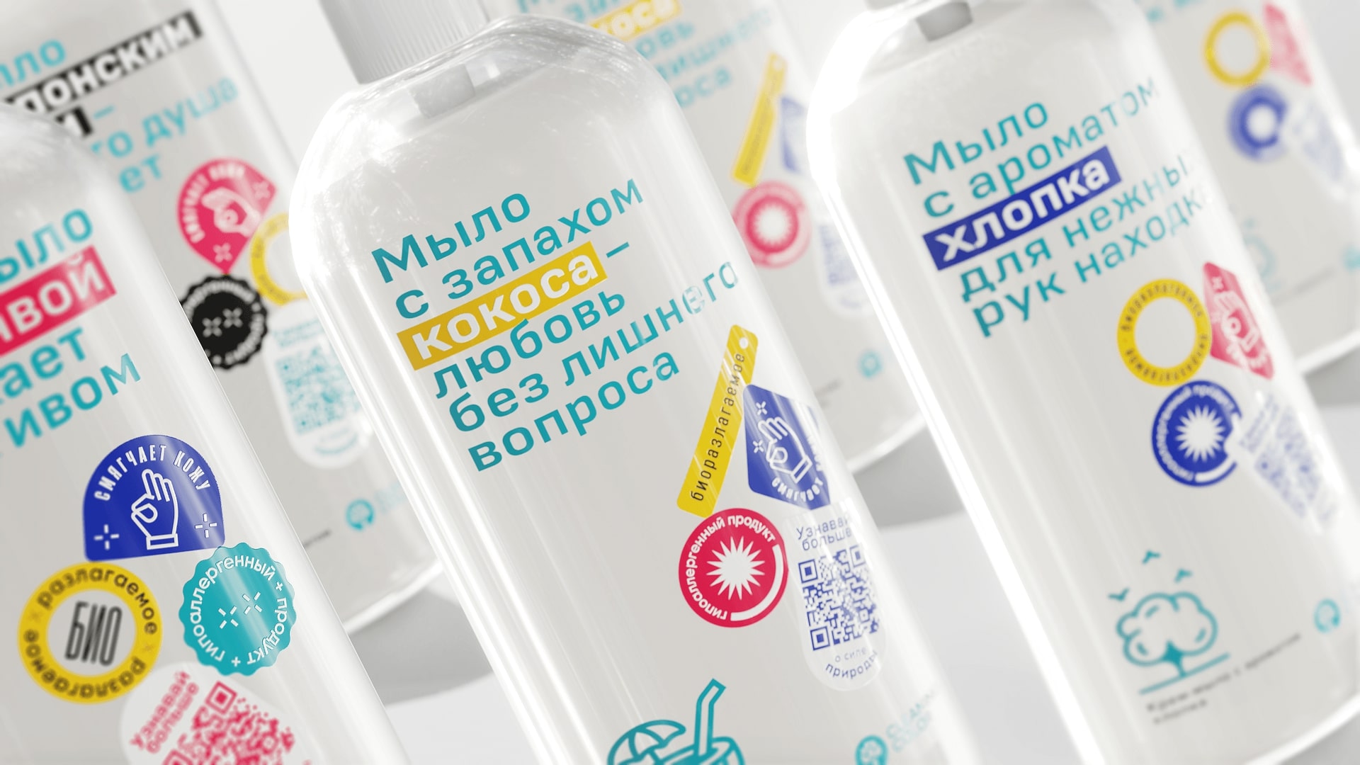
Have you already noticed that copyrights are an important part of the packaging? With such funny messages we communicate with our target audience, motivate them to clean, praise them, lift their spirits and tell them that they are good.
In addition, we also integrated the names of fragrances into the copywriting, which added their own character to the communication with the consumer.
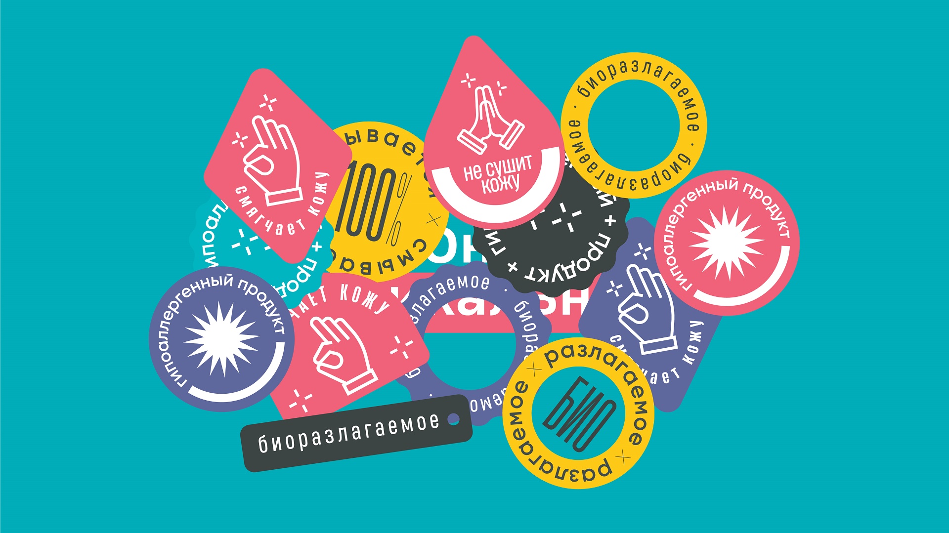
We presented all the useful information and benefits of the product with bright stickers and infographics, which are easy and much more positive to perceive than just a text about the benefits of the product.
As a result, the design of each product complements each other to meet the aesthetic needs of consumers and reflect the whole line for the absolute cleanliness of the home. And since the product is motivating, there’s no shame in putting it in a prominent place in the bathroom or kitchen =)
CREDIT
- Agency/Creative: Moloko Creative Agency
- Article Title: Cleaning Color Cosmetics by Moloko Creative Agency
- Organisation/Entity: Agency
- Project Type: Packaging
- Project Status: Published
- Agency/Creative Country: United States
- Agency/Creative City: Florida
- Market Region: North America, South America, Global
- Project Deliverables: 2D Design, Brand Design, Brand Strategy, Branding, Design
- Format: Bottle, Jar
- Substrate: Plastic
- Industry: Chemical
- Keywords: Brand, Packaging, Identity, Design, Graphic Design
-
Credits:
Creative Director: Denis Misyulya
Creator: Dina Vasilevich
Creator: Anastasia Eliseeva
Creator: Vitalina Dubitskaya
Head of Digital: Irina Kovaleva
Digital marketer: Ekaterina Bochkova
Art director: Kristina Mokhor
Art director: Olga Lobanok
Designer: Liana Ryzhova
Designer: Alexander Kazyukevich
Designer: Tatiana Shinkevich
Project leader: Anastasia Bondarchik
Project Manager: Veronika Khomyak


