Bread snacks is a conservative, boring and unexciting category. Our client, Strauss Group; the biggest food and snack manufacturer in Israel. For the first time ever Strauss decided to build an independent brand (not endorsed by Strauss on the
package). They presented the new product, with super-exciting flavors, aimed at a new target audience, and asked us to convey their needs and interests and position this new and fresh brand in uncharted waters.
In the strategic process we targeted the audience – foodies. An audience that is shaping its identity differently than before.
The Foodies of today are not Michelin-stared-chef-posh-only people. They are people who love to innovate, invent, taste and discover exciting new foods. They like to share with their community what they eat and what they do with it. It might be simple, but must be exciting in some way. It needs to pop and widen the eyes. The product, with 3 different crisps (crackers, grissini and pita chips) suitable for a wide variety of consumption situations, and extreme flavors is exactly what the target
audience is looking for.
The positioning line that was chosen is: Gourmet Crisps for Foodies. Putting the people in the front along side the product itself and its quality.
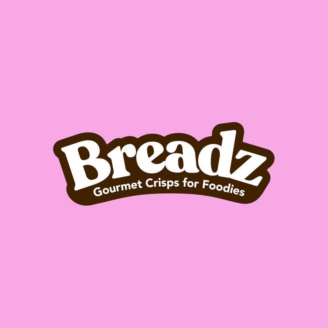
We then named the brand: Breadz, with a Z. It ׳s bread snacks, but with a twist.
The logo expresses warmth and flexibility of bread, and helps emphasise the colourful packaging and attitude of the product with its bold, serif font and thick brown frame.
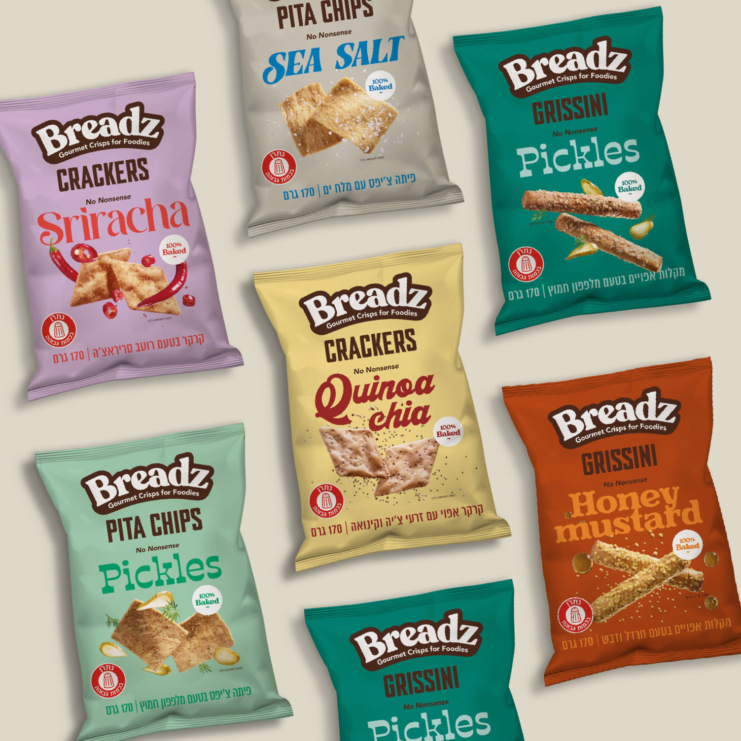
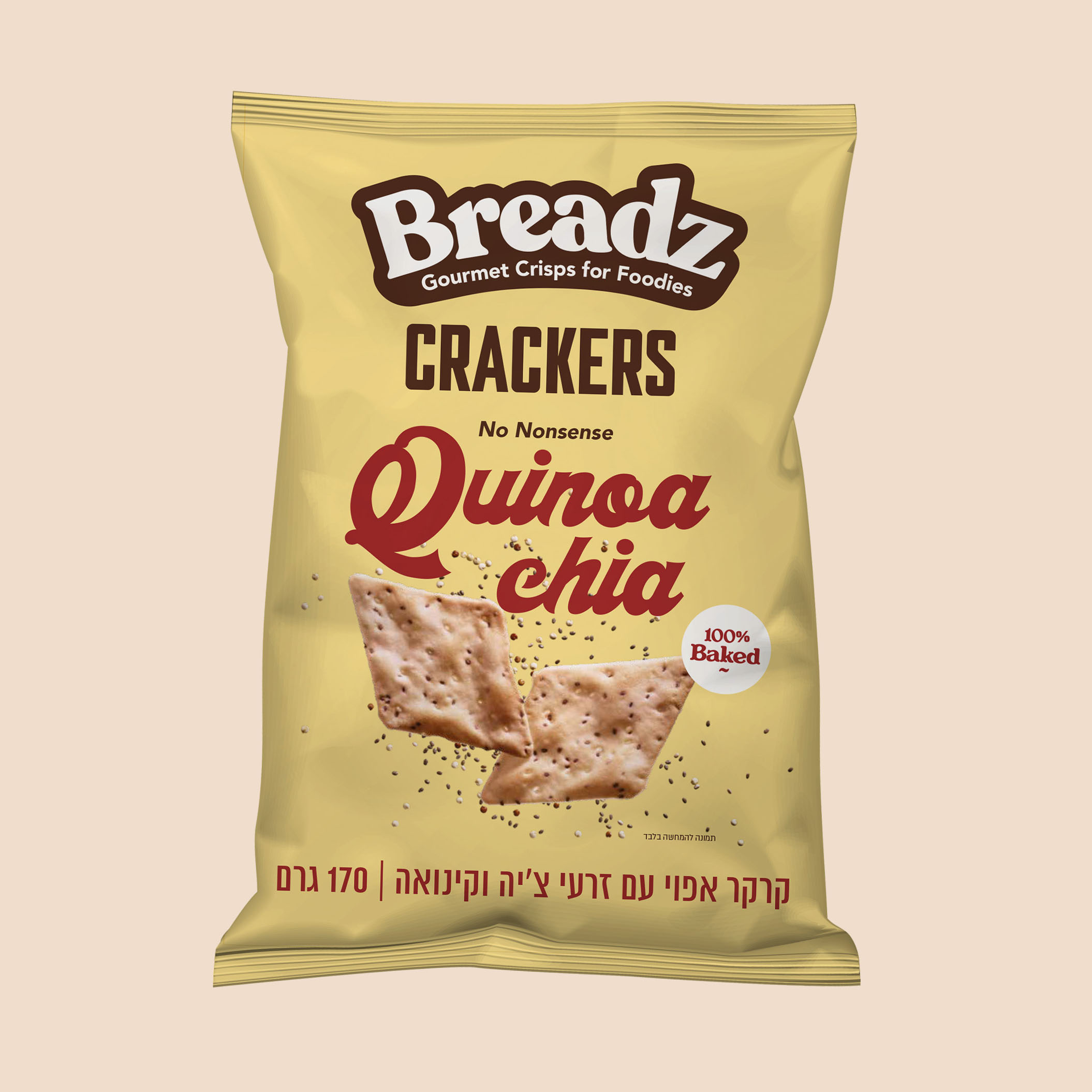
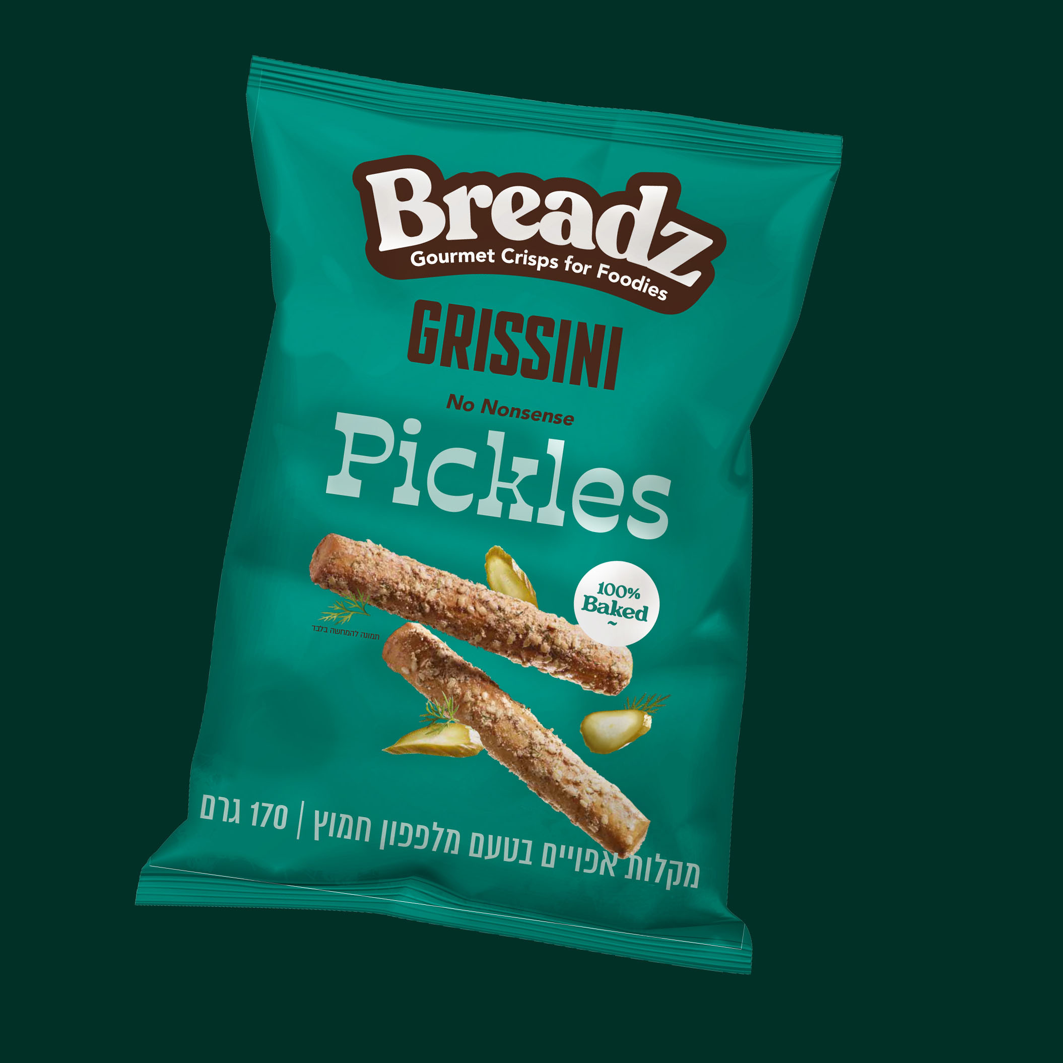
The brand identity itself is based on the audience too. Every flavor is distinct as the person who might choose it. We used different and trendy color combinations and a unique font to reflect each flavor, and together it gives each package an
2 of 4 identity of itself. Using a grid system helps unify the packages and gives strength on the shelf.
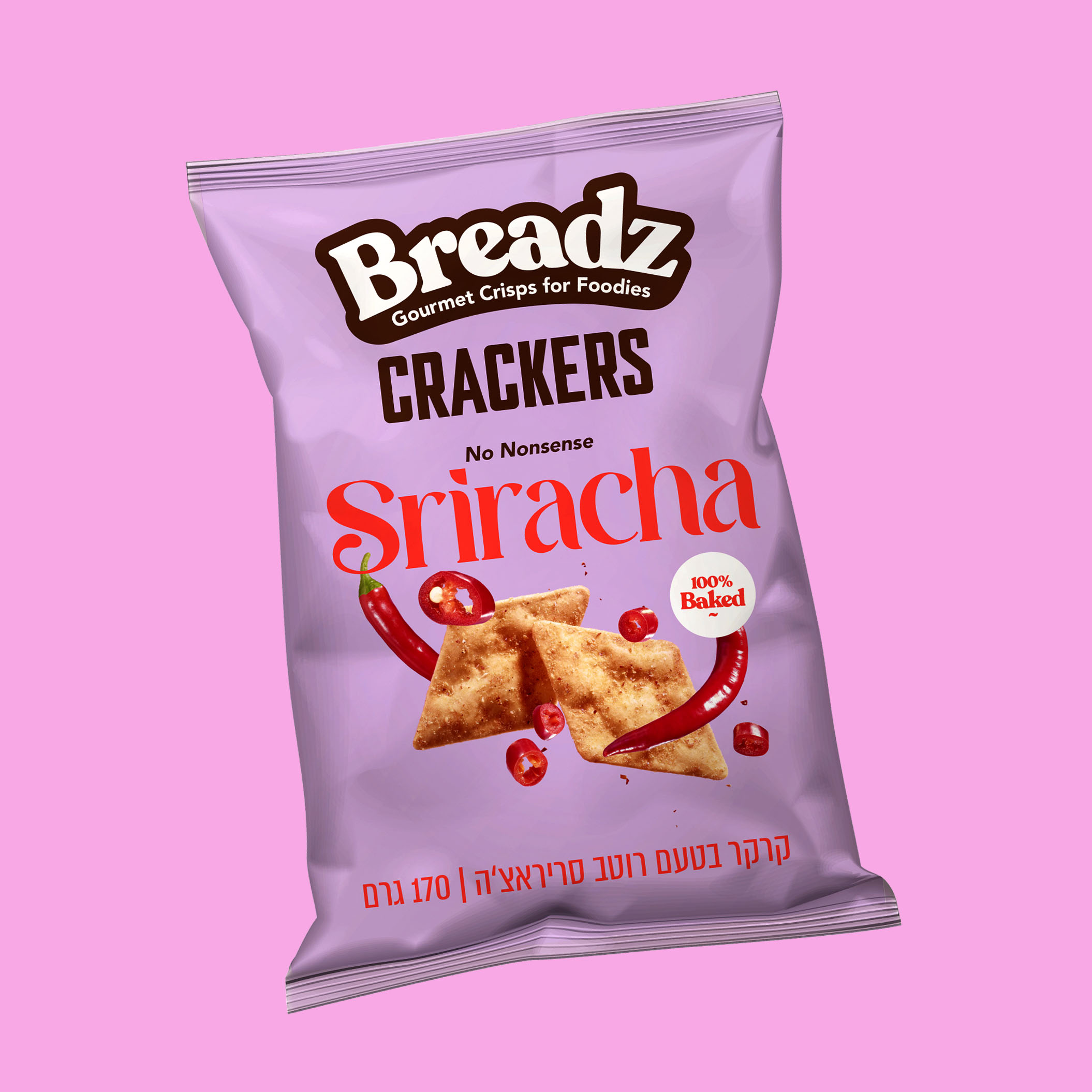
The photography of the product on the package is big, straight forward, sharp and crisp, with the flavors around it, without shadows, helping it pop out.
We chose to produce the package in matte finish that gives it an upscale and tactile feel. The total look of the packages is a packed-with-personality attention-getter in the bread-snacks or on the snack shelf.
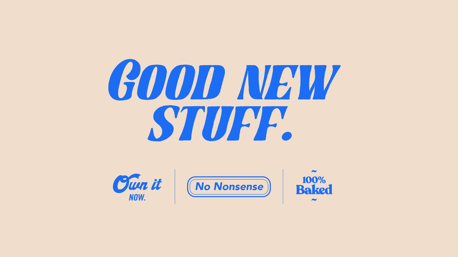
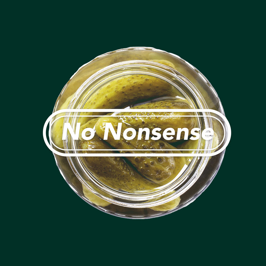
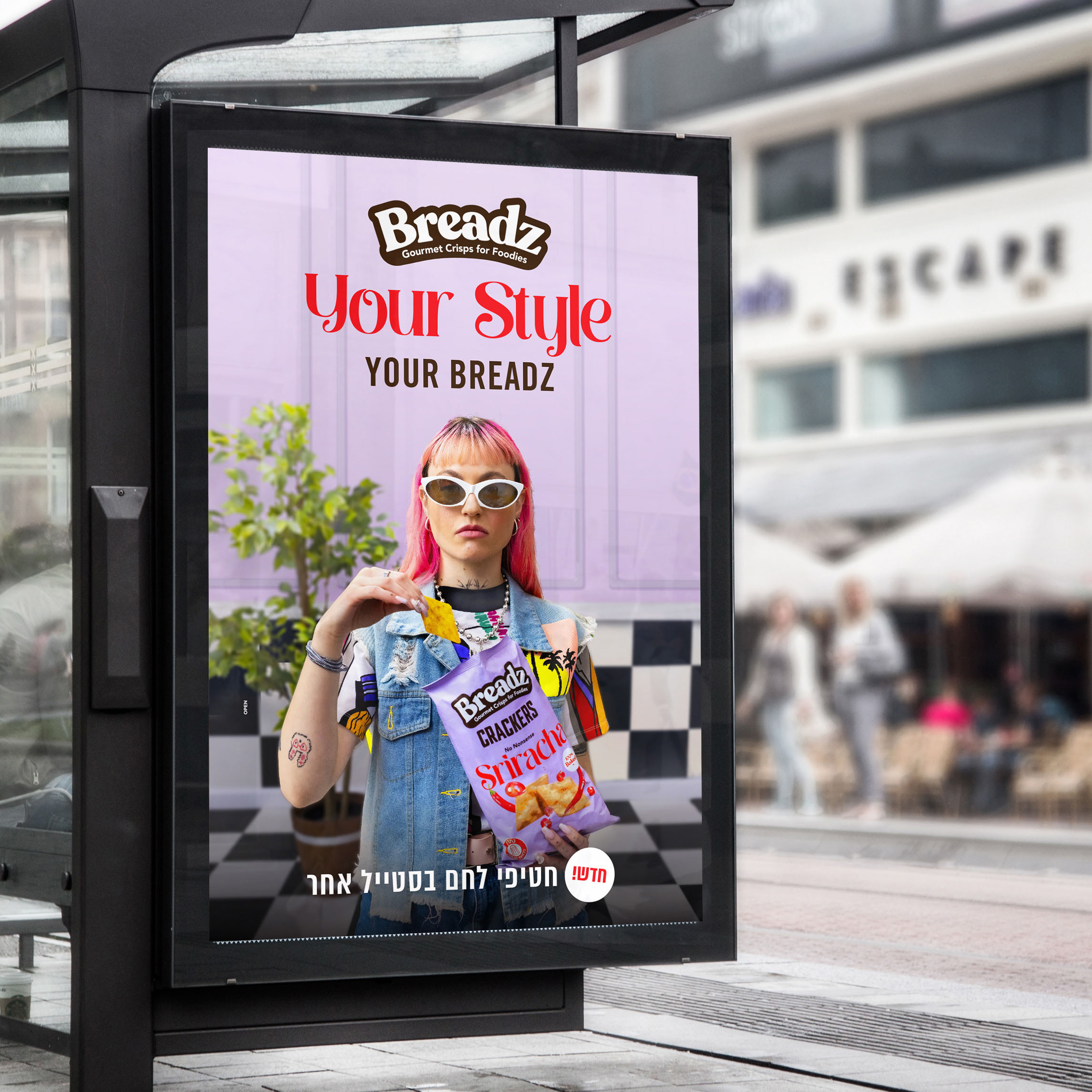
The brand identity, is young and very social-media oriented. The unique color palette and vintage-infused typography add up to a dynamic and flexible look-and-feel.
After the brand procces we then continued to create and produce the tv and digital campaign, showcasing the out-there personas and the wide range of consumption situations you have with the product.


CREDIT
- Agency/Creative: Open
- Article Title: Breadz Gourmet Crisps for Foodies
- Organisation/Entity: Agency
- Project Type: Identity
- Project Status: Published
- Agency/Creative Country: Israel
- Agency/Creative City: Tel Aviv
- Market Region: Europe, Middle East
- Project Deliverables: Advertising, Art Direction, Brand Experience, Brand Guidelines, Brand Identity, Brand Mark, Brand Naming, Brand Strategy, Brand Tone of Voice, Branding, Creative Direction, Design, Food Photography, Label Design, Logo Design, Packaging Design
- Industry: Food/Beverage
- Keywords: snack, snacks, breads, crisps, sriracha, honey mustard, pickles, strauss, open, foodies, package design, branding,
-
Credits:
Chief Creative Officer: Saar Friedman
Head of Design: Danna Eviatar
VP Clients: Nofar Halperin
Brand Strategiest: Hila Ozer
Brand Designer: Rachel Gedaliouviche
Client Manager: Moran Kastiel
Account Manager: Hadas Snir
Advertisement Creative Director: Moshe Saikevich
Art Director: Roman Gulman
Studio: David Shamos


