Approached to help Devoted re-position they’re brand and product and reach a younger market without alienating their existing consumers.
Over the years the brand had become stagnant and was lost in sea of other brands that all seemed to be working form the pet food design guidelines. It was time to give the Devoted a bold and confined brand and packaging that is deserved,
It was also crucial to elevate the brand status and be able to reflect that it was a British brand but without shouting or plastering union jacks over the packs. From this we devoted scenery scenarios from around the United Kingdom where people take their pets to get out and enjoy.
It was clear that a new fresh approach to the brand was needed and a lift to connect to current and new consumers to the brand and its understanding of the unconditional love a pet and owner share. This is where the brand name came from but had become lost.
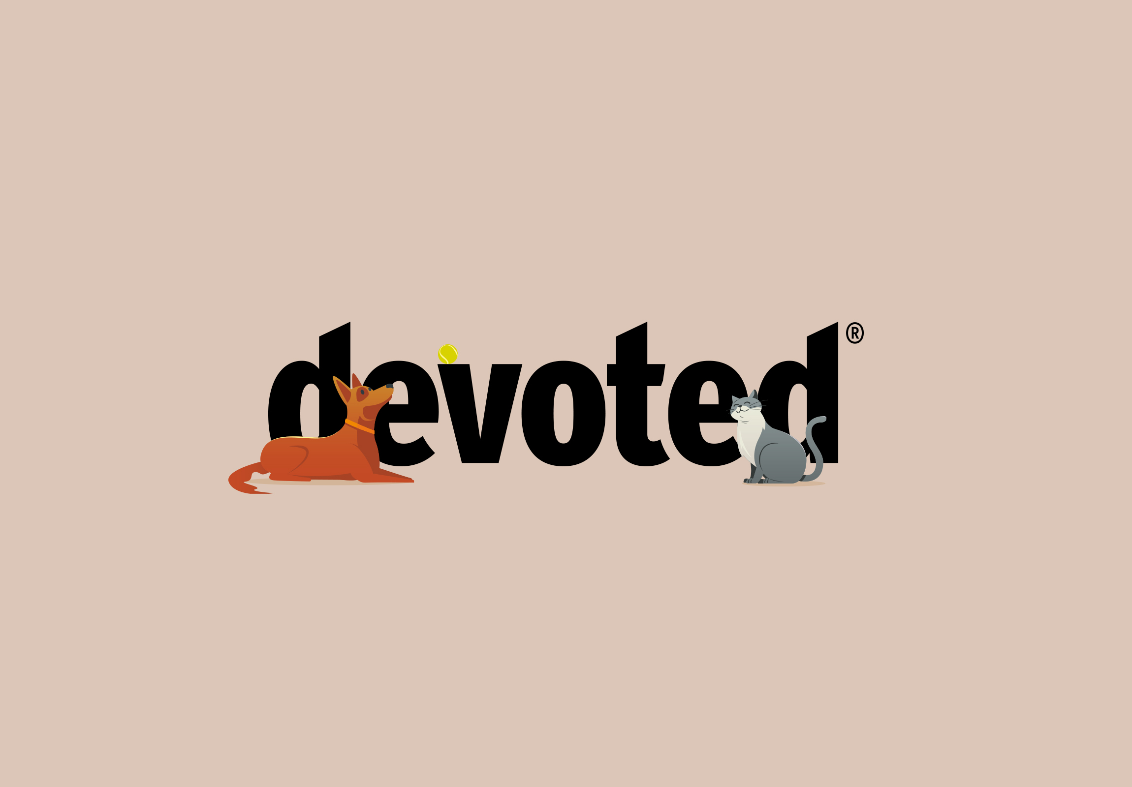
We started by cleaning up they brand word mark, a clean sharp cut result delivered a confidence to the brand.
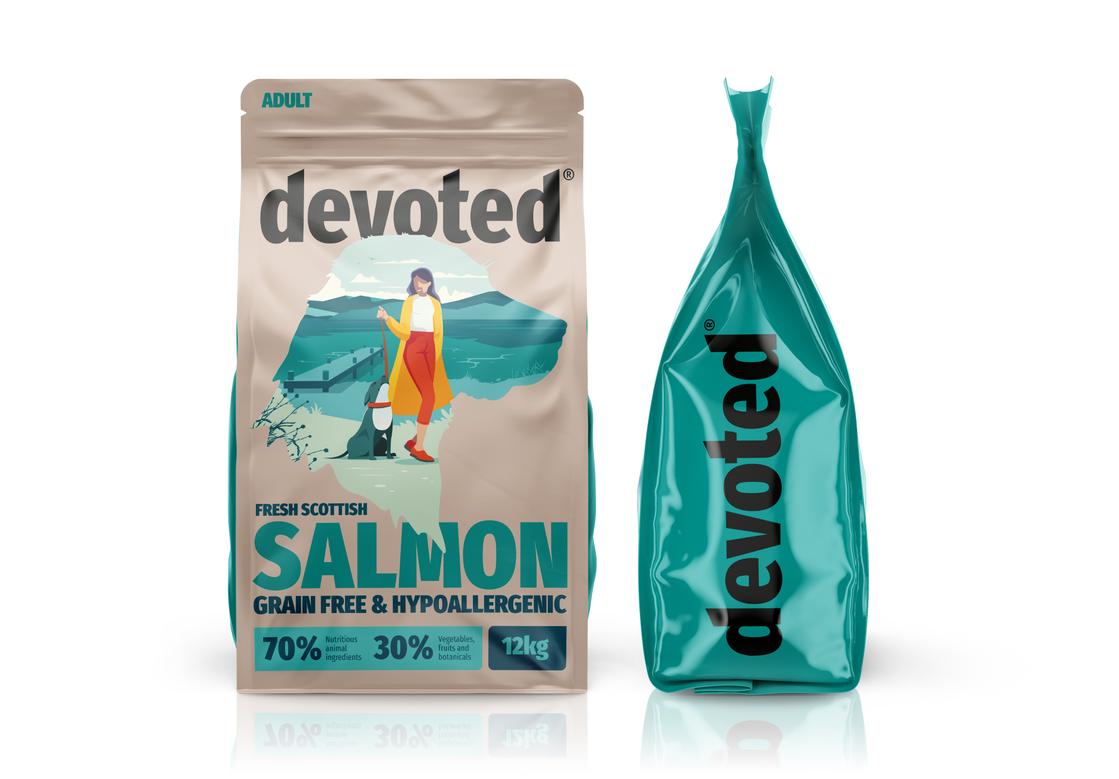
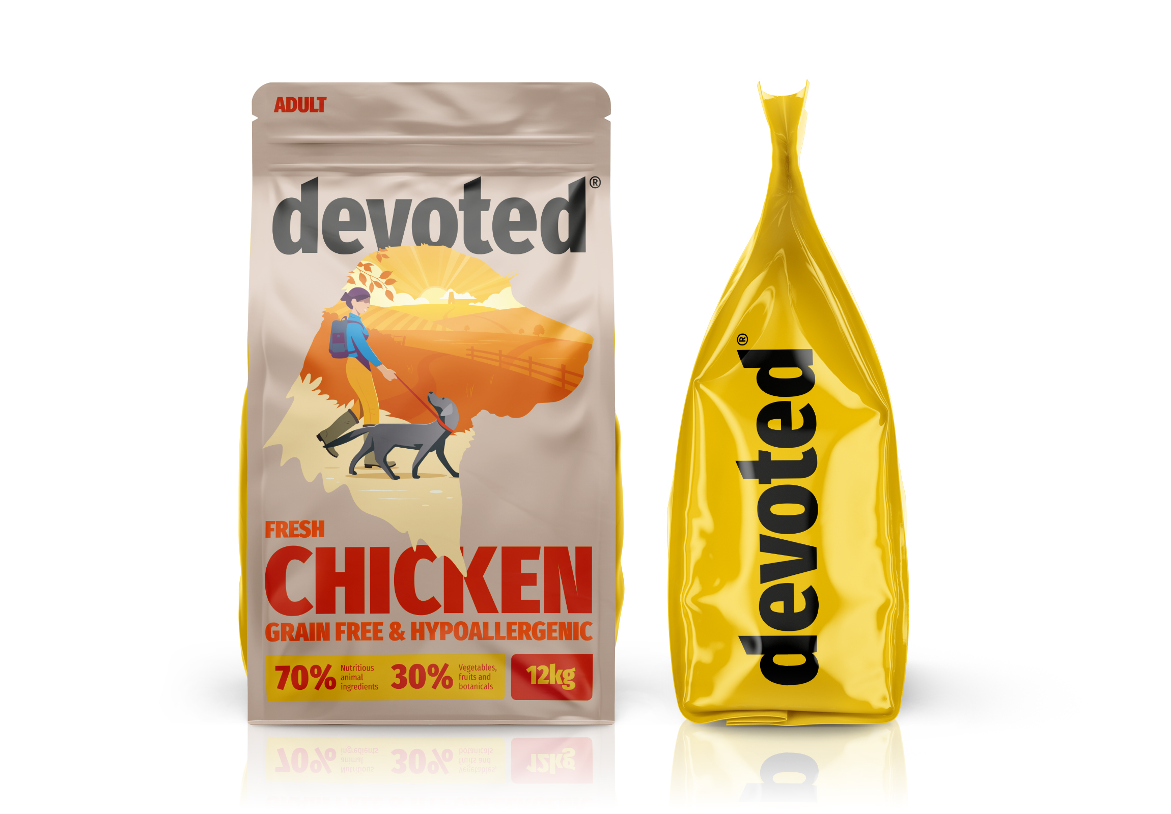
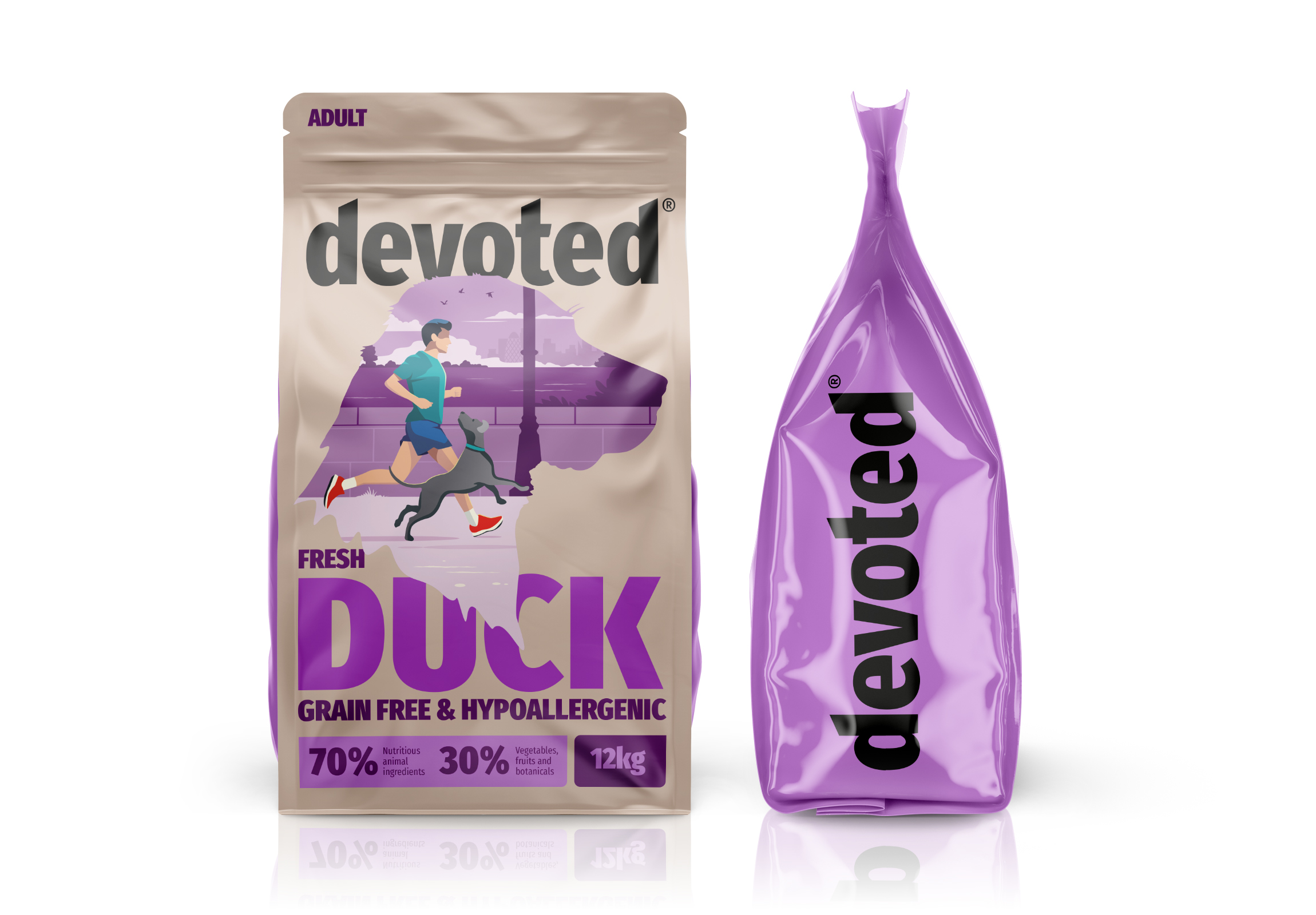
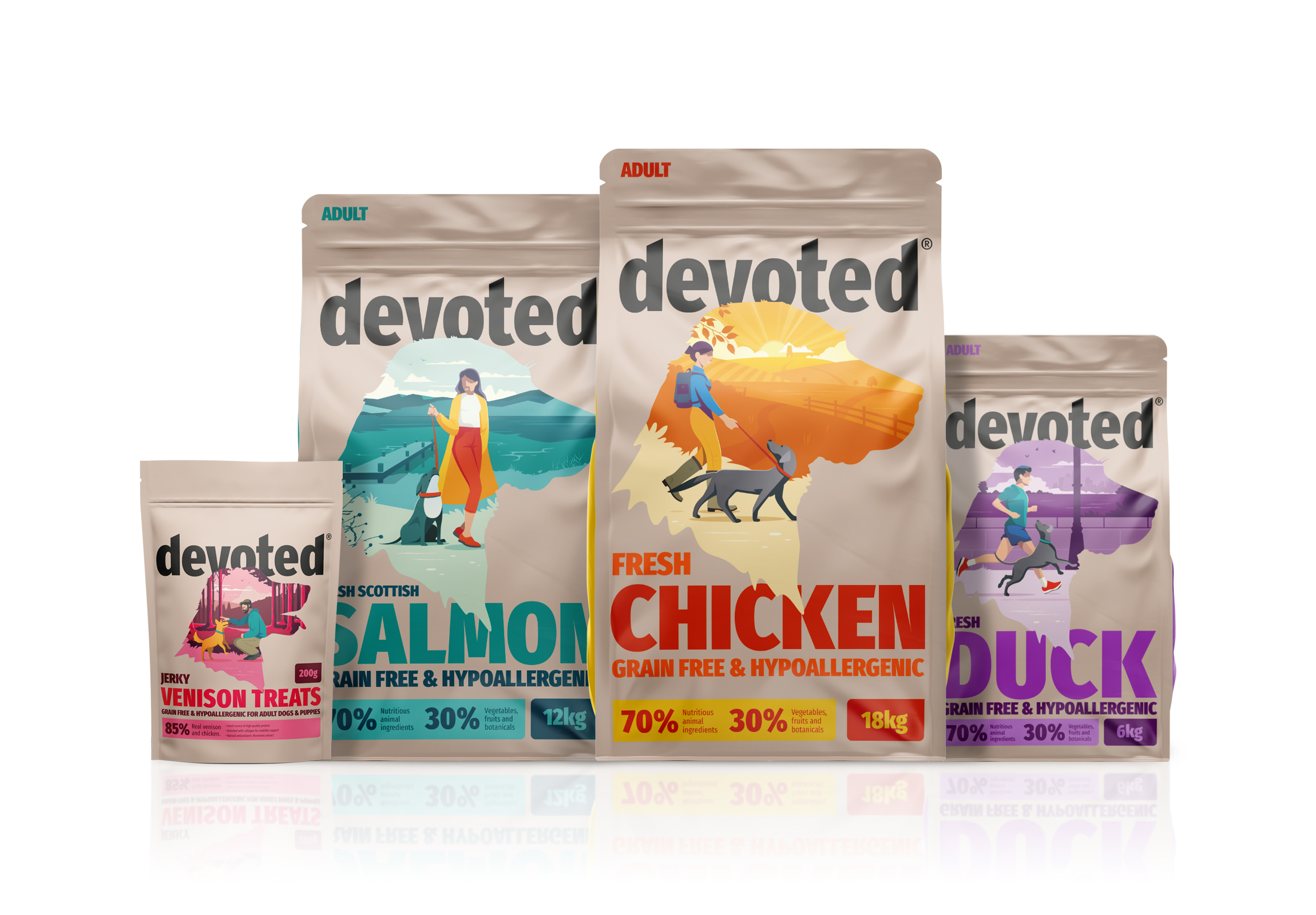
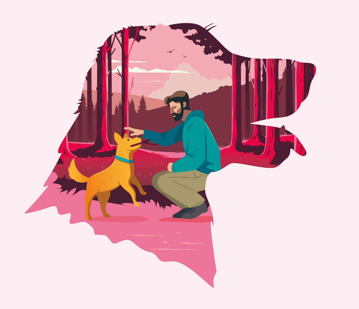
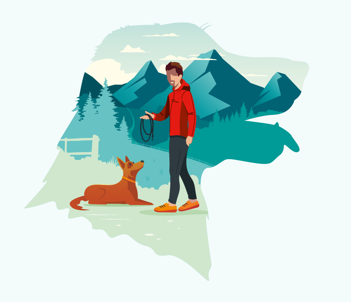
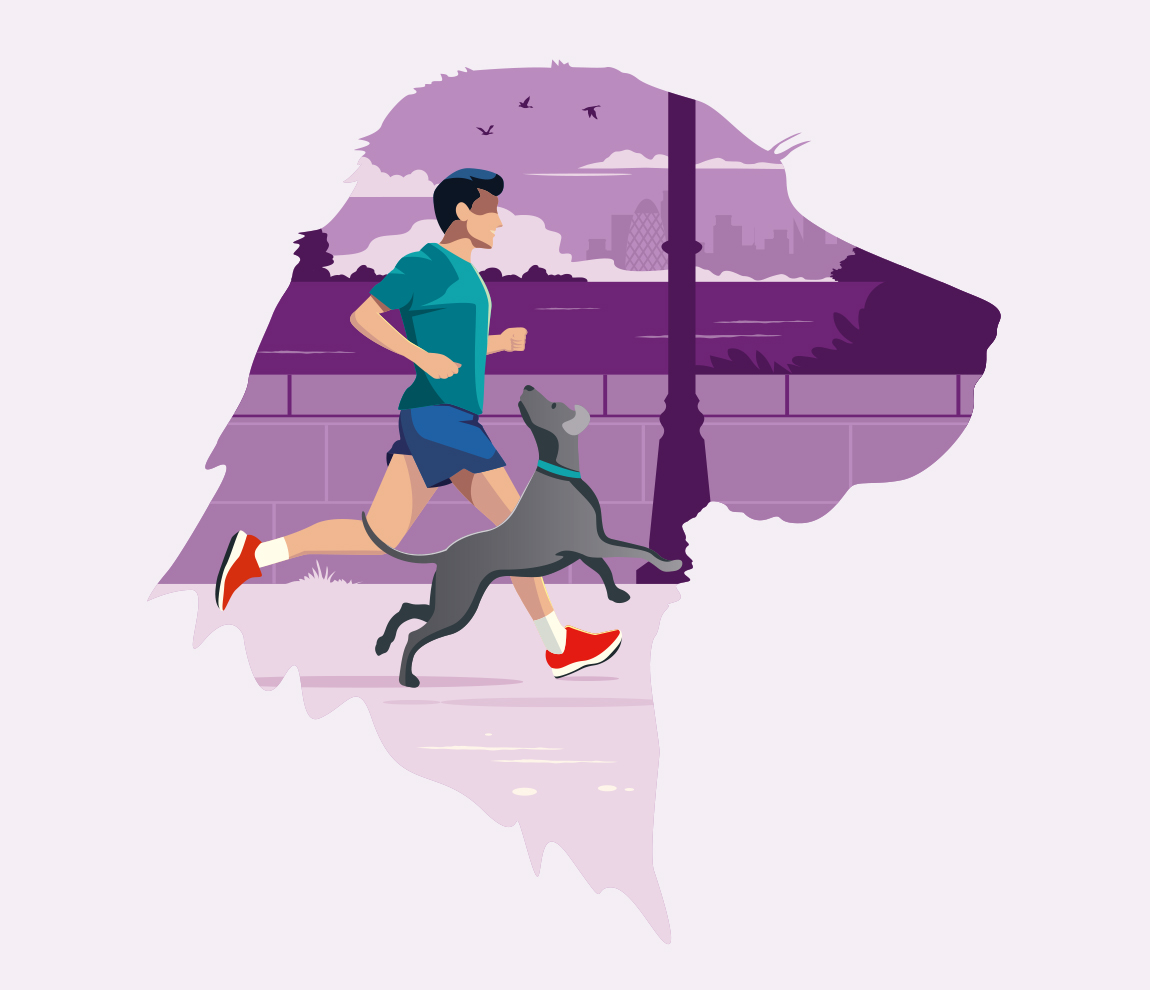
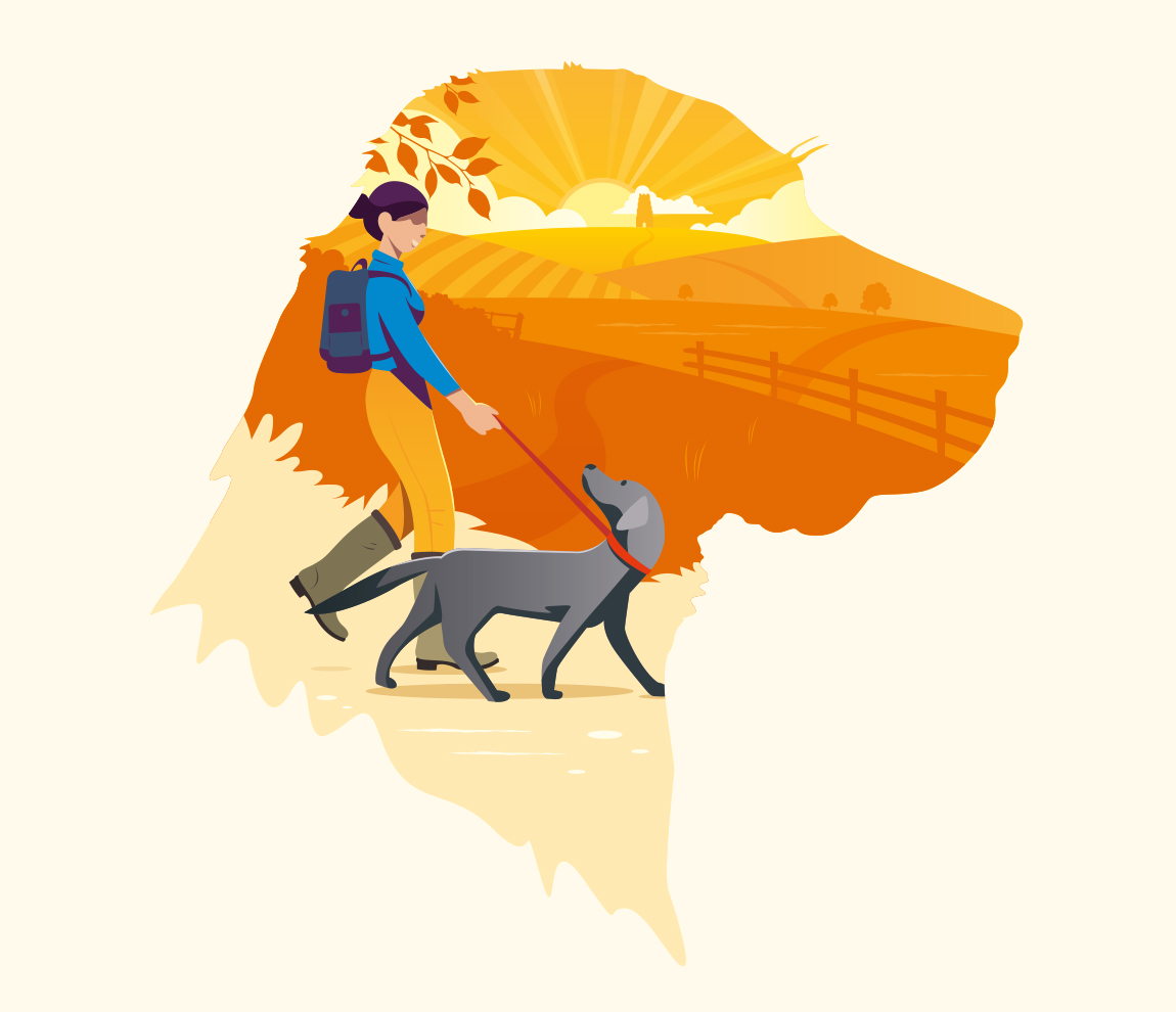
For the packaging we then developed a series of illustrations that were framed by dog head silhouettes which showcased a series of people with their pets in real-life relatable situations; from long walks through the woodlands to runs along the thames. Each one a clear pointer to the brands British heritage.
The dog heads were great identifiers for the sector the product sat in (as there are other pet variations to follow). The use of bold type and colours lifted the brands aesthetics to deliver a more youthful feel and allow consumers to easily see the product descriptors.
The pet illustrations from these core packaging formats could then be deconstructed to be used for brand activation, focussing on the playful and loving characteristics that pets have. These illustrations can then interact with type and work mark and create endless combinations to work with allowing the brand to stay fluid.
The end result is strong, bold and creates a real stand out look on shelf but more importantly anchors the brand back to its core beliefs.
CREDIT
- Agency/Creative: Pencil Studio
- Article Title: Branding and Packaging Design for Devoted Pet Food by Pencil Studio
- Organisation/Entity: Agency
- Project Type: Packaging
- Project Status: Published
- Agency/Creative Country: United Kingdom
- Agency/Creative City: Frome
- Market Region: Europe
- Project Deliverables: Brand Design, Packaging Design
- Format: Pouch
- Substrate: Plastic
- Industry: Retail
- Keywords: WBDS Agency Design Awards 2022/23
- Keywords: Pet Food, Dog Food, Pet Care
-
Credits:
Creative Director: Luke Manning
Senior Designer & Illustrator: Chris Osment


