Bitez is a burger place located in Saudi Arabia. Starting off as a food truck in 2017, their great taste and rare witty persona helped them evolve in a fierce fast-food market. In 2021, they were on track to open their 2nd restaurant branch. To go along with their quick evolution and prepare for possible franchising, they decided it was time to undergo a full proper rebrand to align their image with their friendly, sarcastic, welcoming persona.
Reflecting on their branding journey, a large disconnection was found between their family friendly, witty vibes seen in customer service and social media, and between their visual presence, which presented a more urban, street style, masculine aggressive impression. Our goal was to create a modern Arabic friendly new identity for Bitez, while keeping whatever brand recognition was possible.
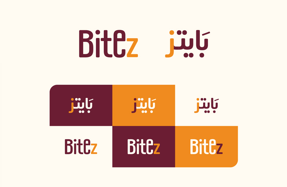
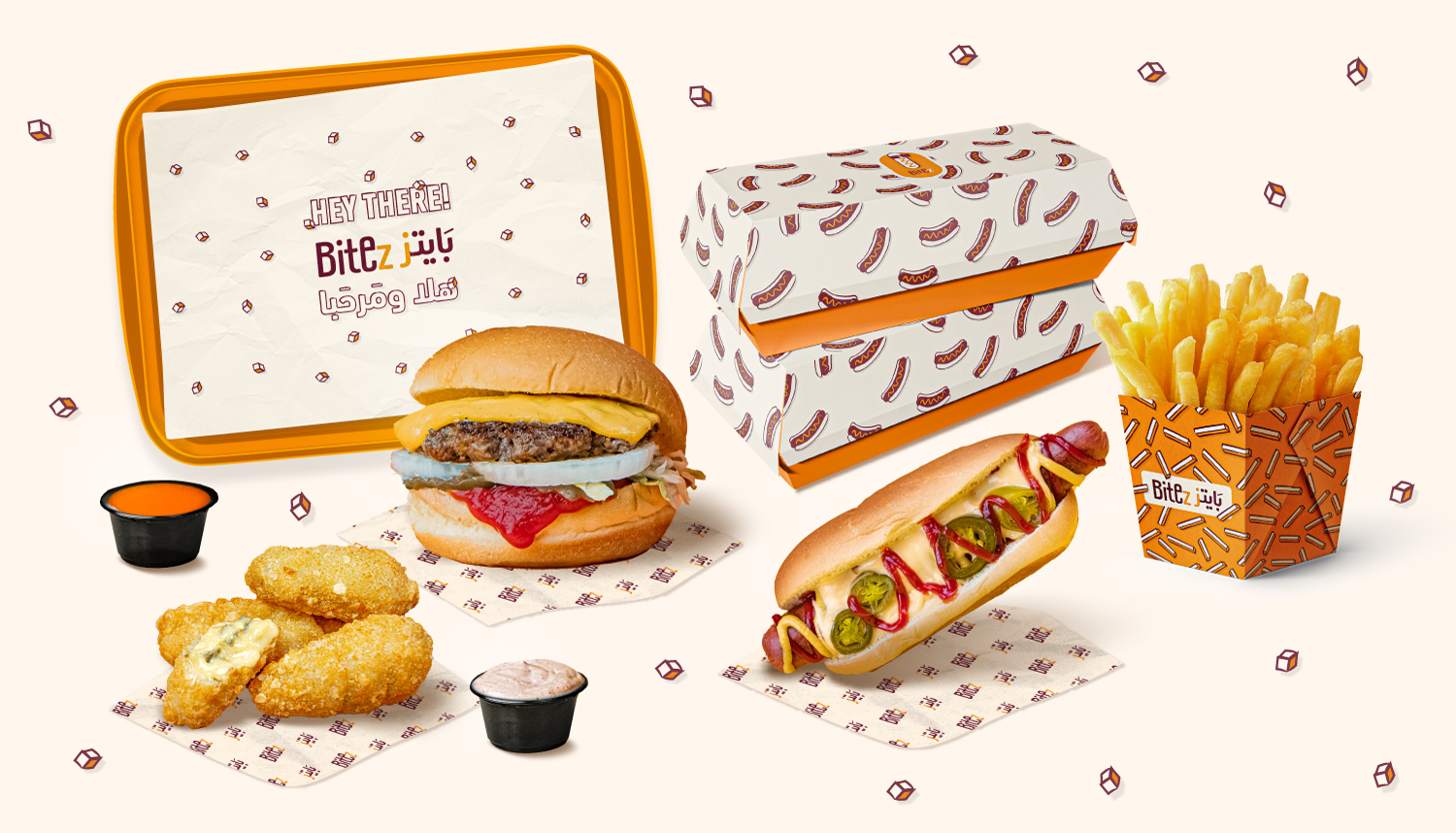
The new identity features a type based simple logo including minimal messages. The first depends on the naming story “one bite is never enough”. We highlighted the letter “z” and gave it a smaller size, to make it appear as a correction to the original word “Bite”, because one bite is never enough. The second reason was to emphasize the witty persona by highlighting the spelling twist “z” instead of a correct “s”.
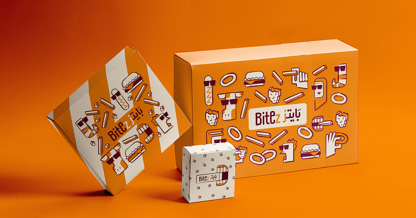
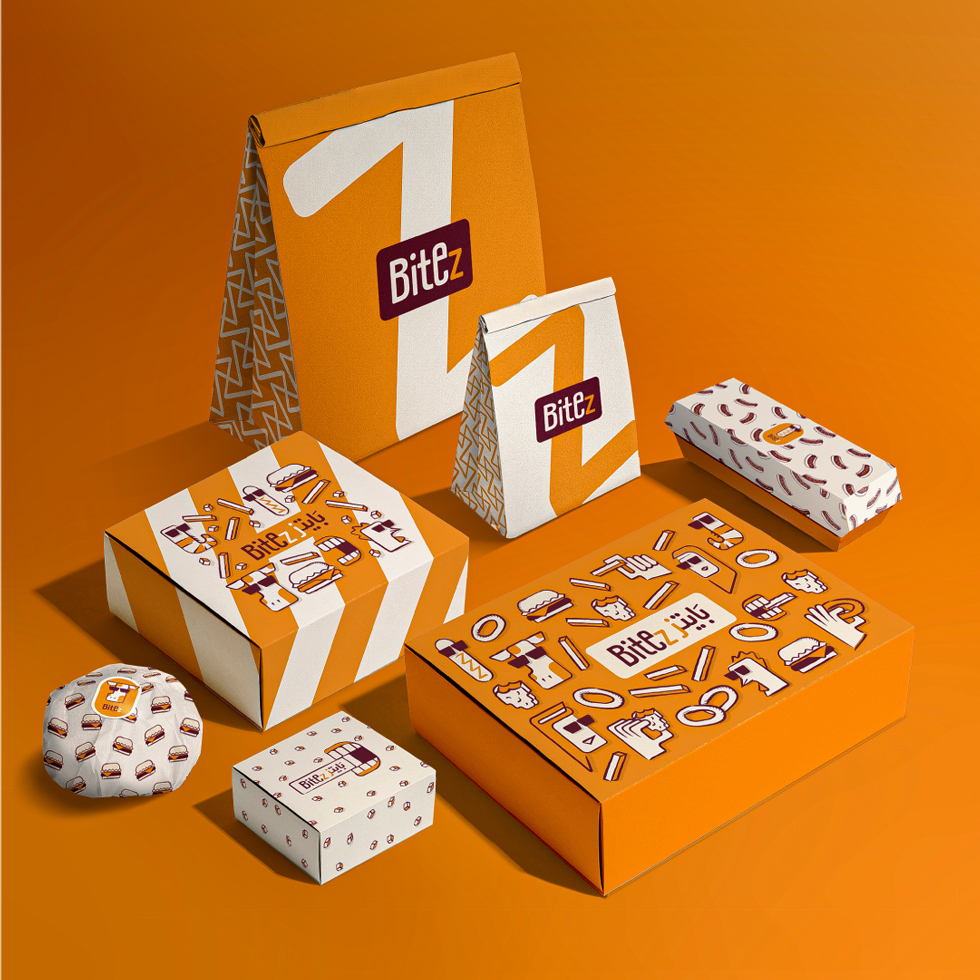
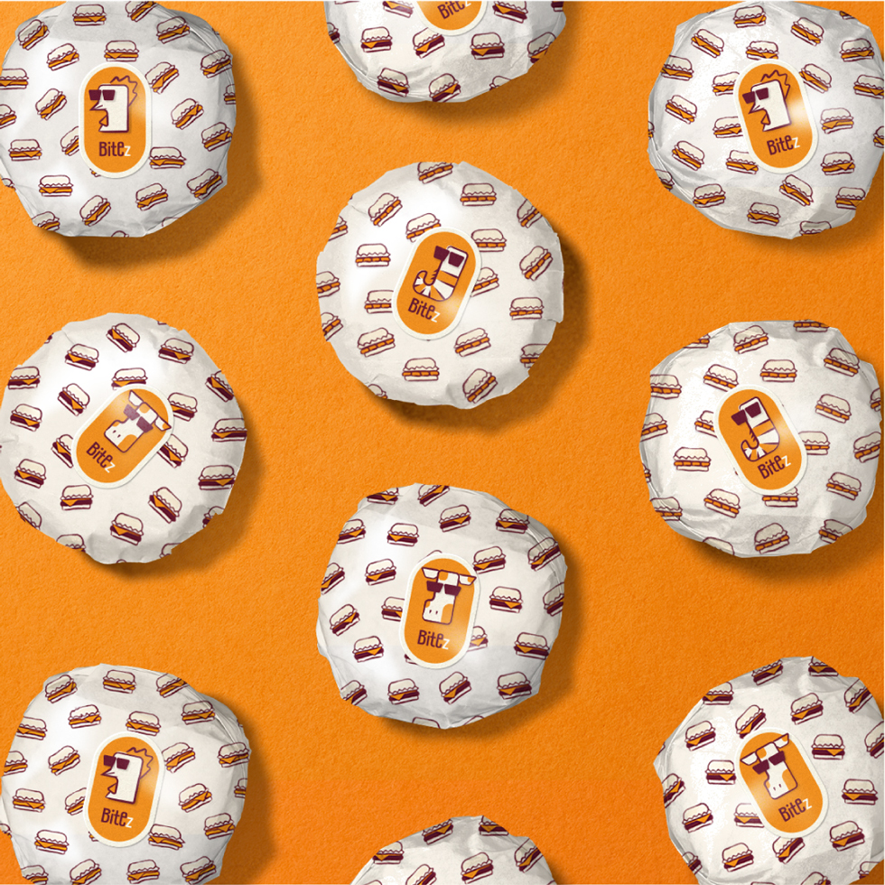
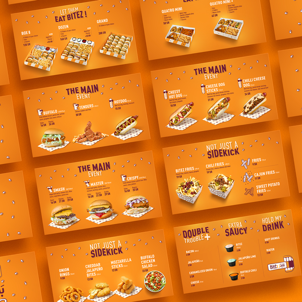
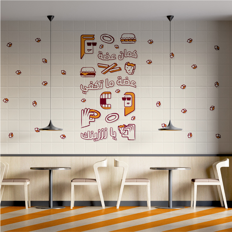
Having chosen a minimal type logo, the identity and packaging were designed with huge variety that included a full set of character illustrations and multiple patterns. This richness in visuals was desired to match the witty, engaging, and exciting persona of Bitez.


CREDIT
- Agency/Creative: Noor Alsawadi Design
- Article Title: Bitez Burger Rebranding
- Organisation/Entity: Freelance
- Project Type: Identity
- Project Status: Published
- Agency/Creative Country: Saudi Arabia
- Agency/Creative City: Jeddah
- Market Region: Middle East
- Project Deliverables: Brand Guidelines, Brand Redesign, Packaging Design, Rebranding
- Industry: Food/Beverage
- Keywords: Fast food burger restaurant
-
Credits:
Designer: Noor Alsawadi


