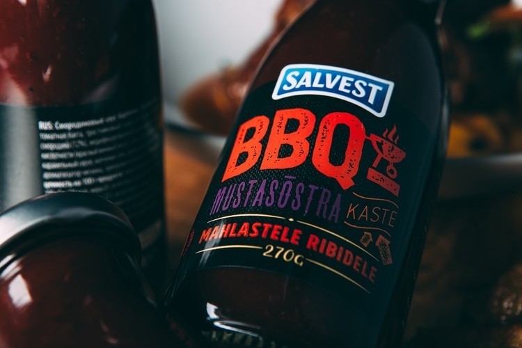
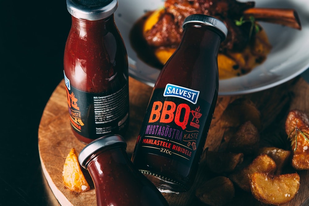
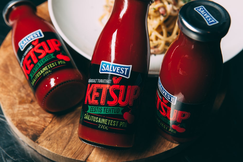
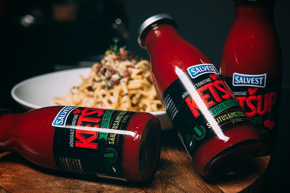
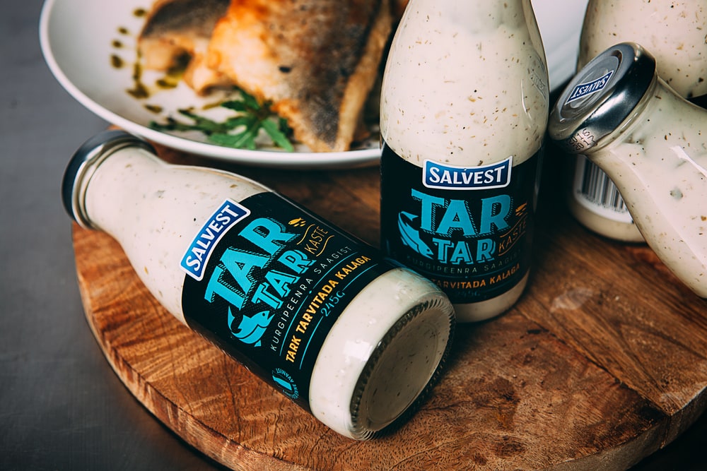
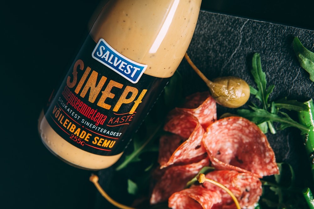
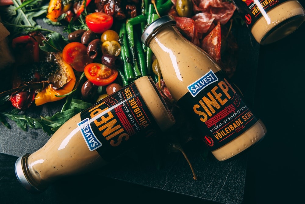
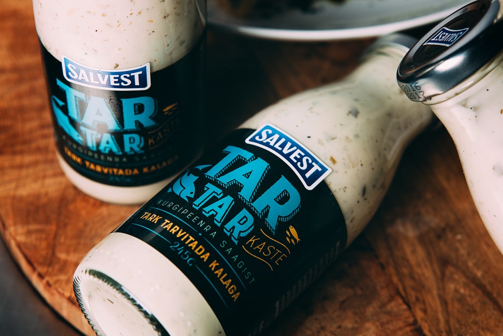
“Salvest brought 4 new sauces on our tables, every one of which has it’s own unique taste and characteristics. We’re displaying the name of the sauce and hints about the personality of the flavours using different techniques of typography. In addition to the texts, there are also pictograms indicating the characteristics of the sauce. To give our work a bit of elegance and to create a contrast we decided to use chic black background.”

CREDIT
FEEDBACK
Relevance: Solution/idea in relation to brand, product or service
Implementation: Attention, detailing and finishing of final solution
Presentation: Text, visualisation and quality of the presentation


