


“IT-Rhythm” is an annual conference on information technologies for enterprises of the fuel and energy complex, organized by the GIS Certification Center, St. Petersburg. The event brings together key industry experts, practitioners, as well as manufacturers and suppliers of domestic IT equipment and software. The conference participants receive information about the best methods of implementing programs for the transition to the use of domestic IT technologies, get acquainted with the products presented on the market and the plans of manufacturers for their development.
The format of the conference allows managers and key specialists of IT departments, as well as representatives of leading vendors and integrators to exchange their accumulated experience not only during a busy business part, but also in no tie session..
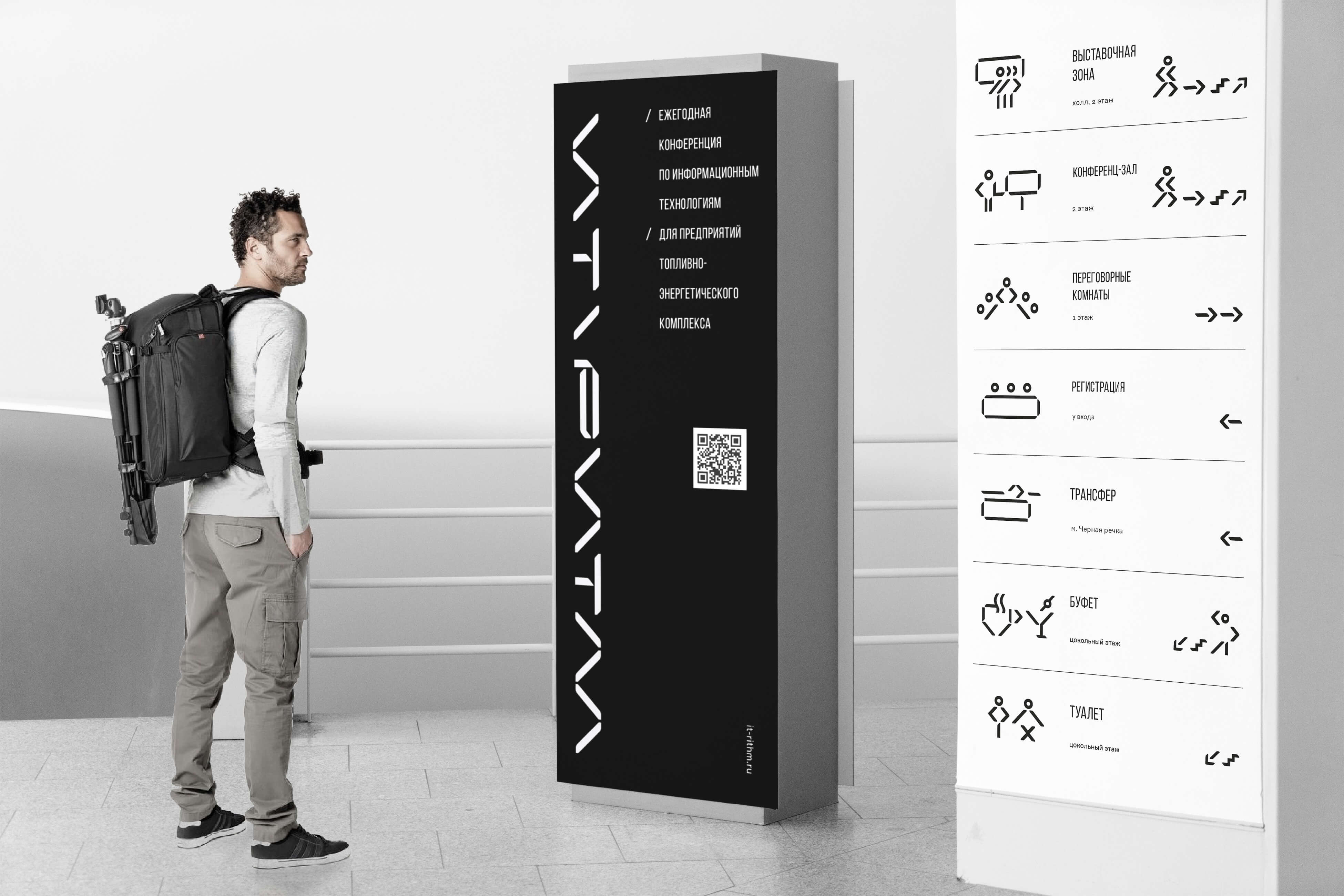
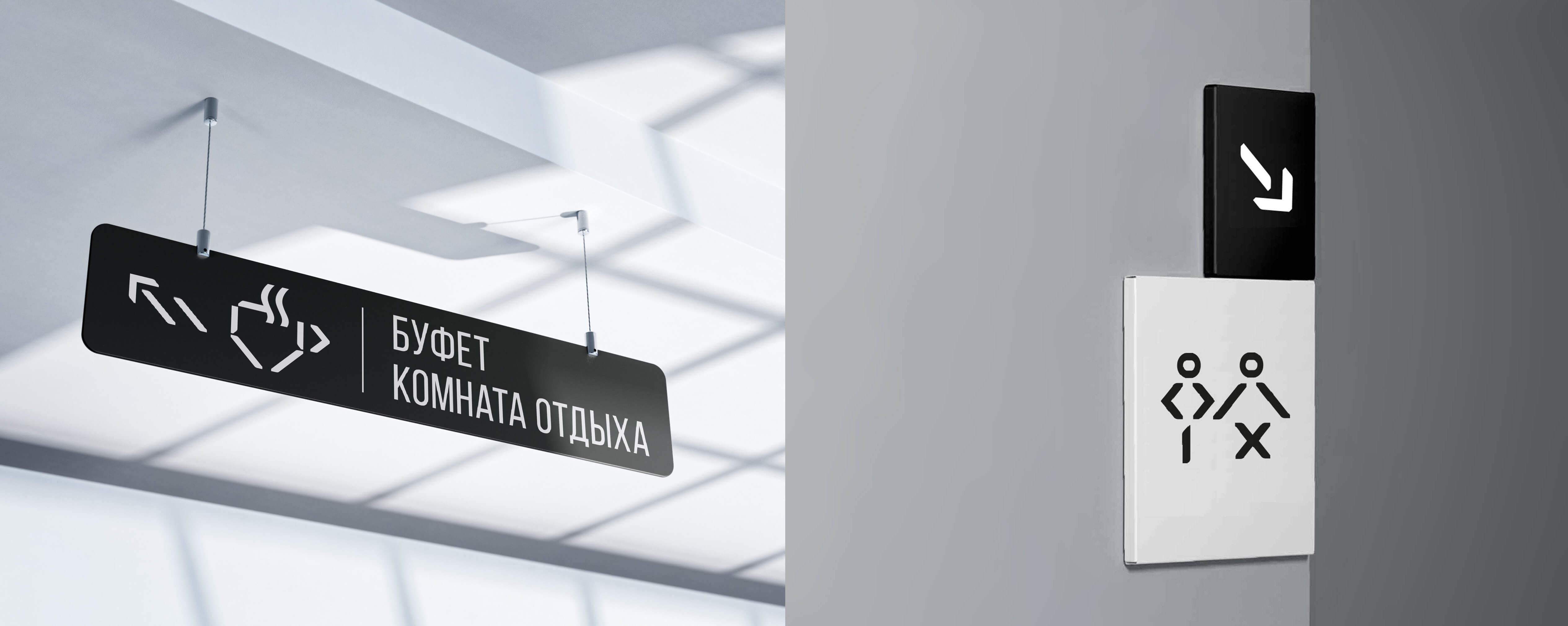
We got the task to develop a corporate identity of the conference and arrange navigation inside the exhibition. The exhibition is specialized and is held for an unusual audience, heads of IT departments, “computer scientists”, specific people who speak their own language, “incomprehensible to everyone”.
Considering these features, we decided to make an identity design “not for everyone”. That is, to hear from an average accountant girl the phrase “not readable” or from the head of the transport department “that’s not clear to me and therefore I don’t like it” is normal and even excellent.
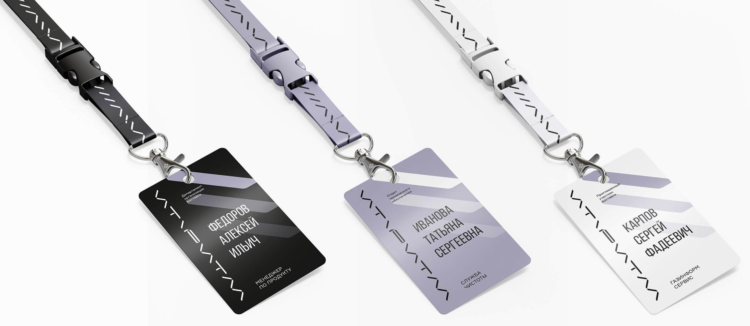
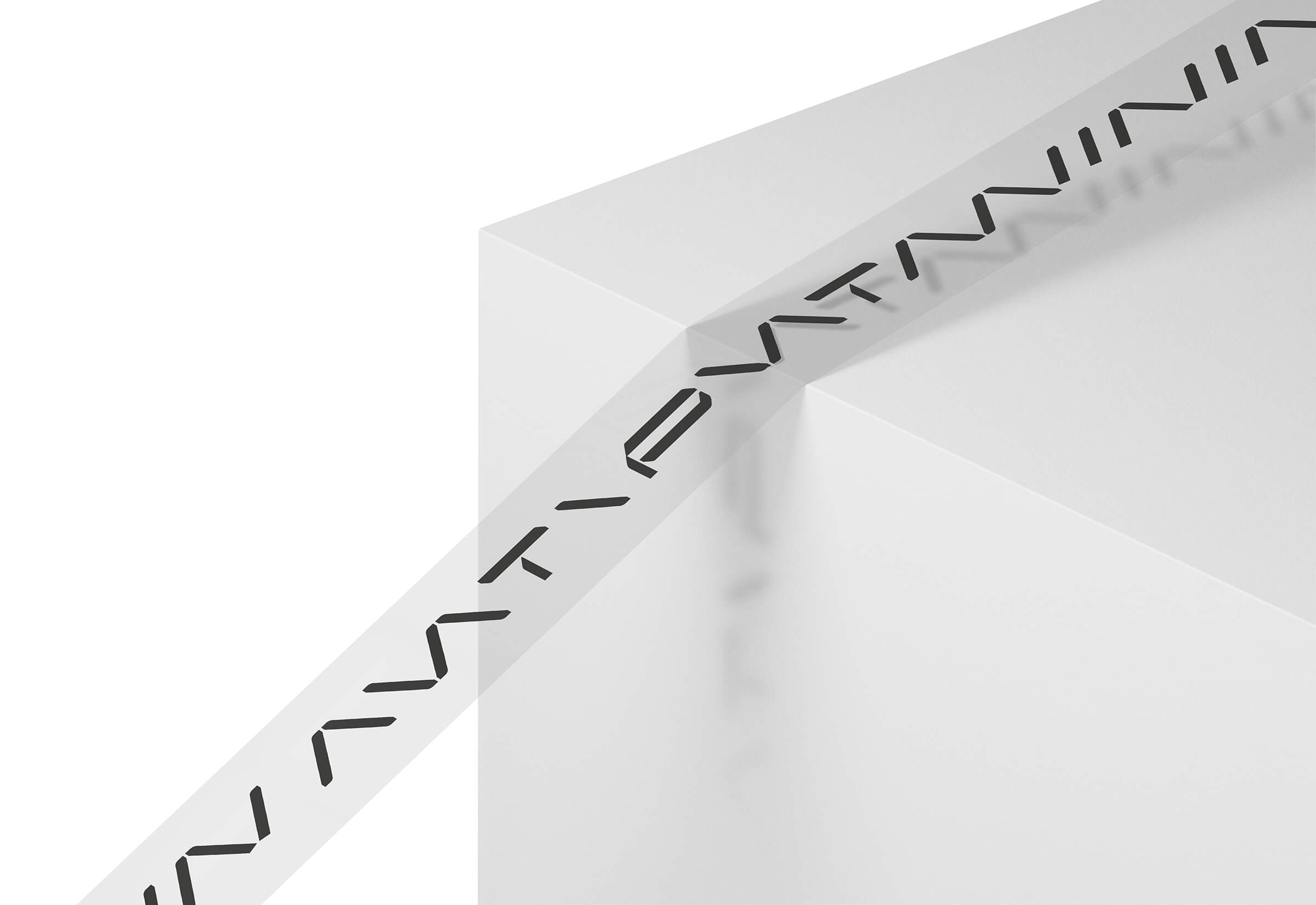
The design of the corporate identity of the conference was based on iconographic images stylized as ascii arts, a phenomenon that became widespread at the dawn of the Internet. In the 90s users drew basic illustrations with limited visual means and simple characters from the ascii code table. At the same time, emoticons appeared, that was an essential element of communication among “computer scientists”.
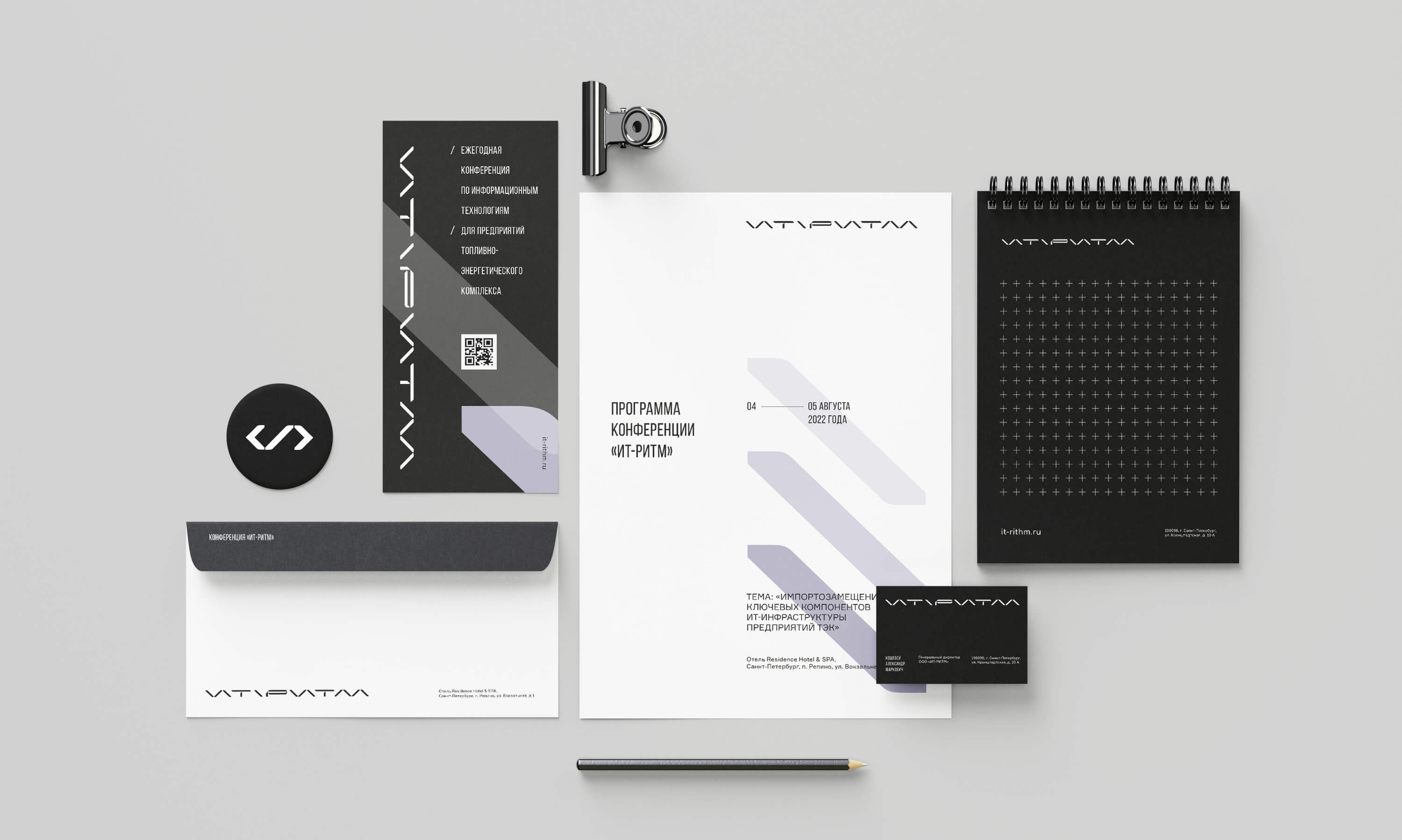
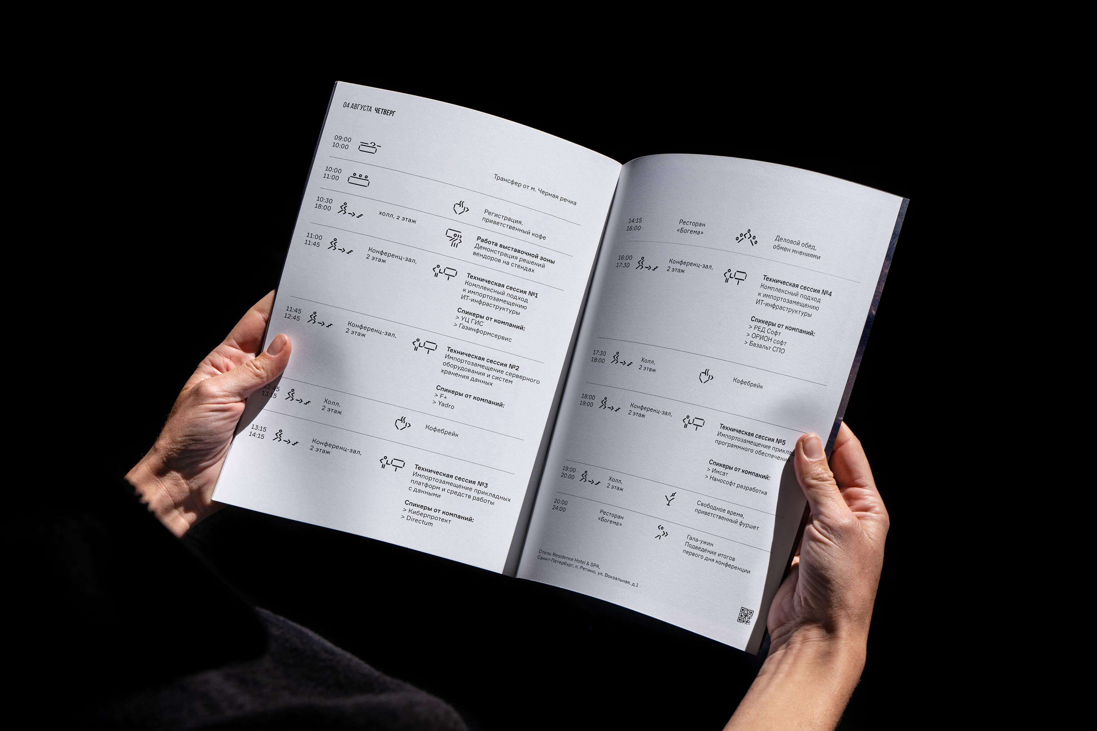
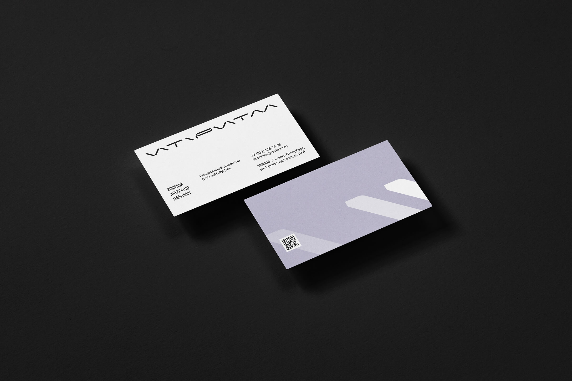
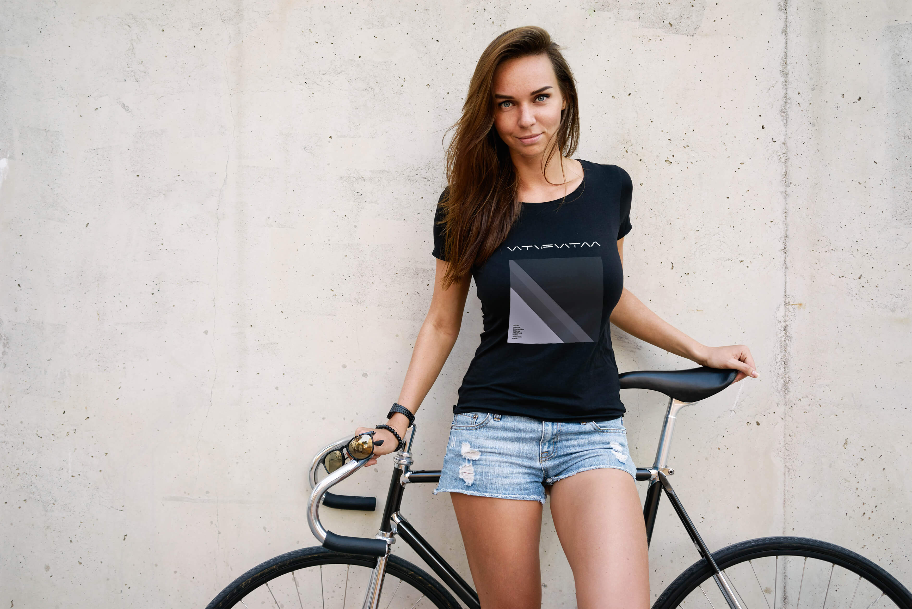
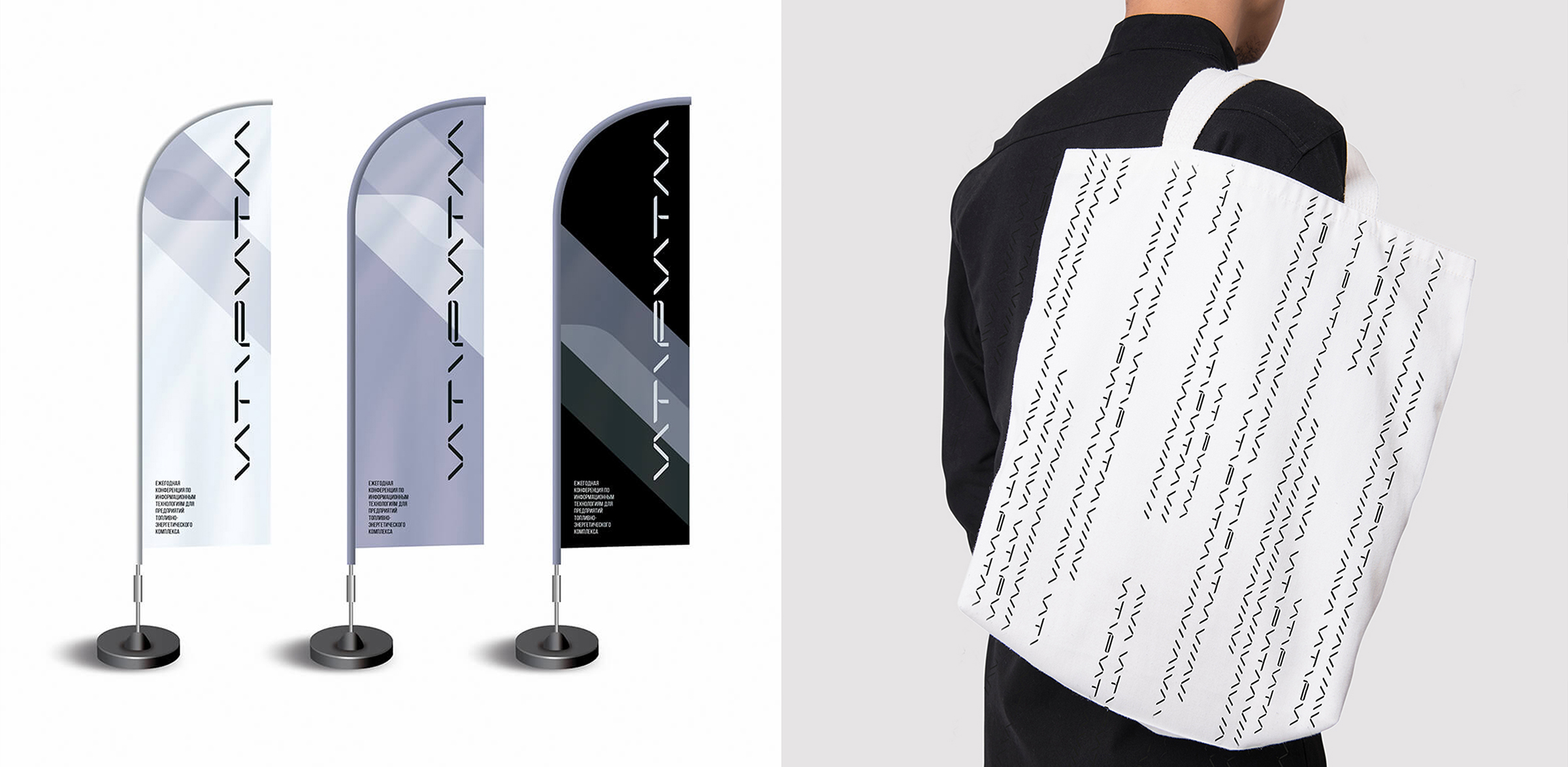
As part of the corporate identity, we developed a number of icons that are used on the website, in printed products and in the navigation of the exhibition.
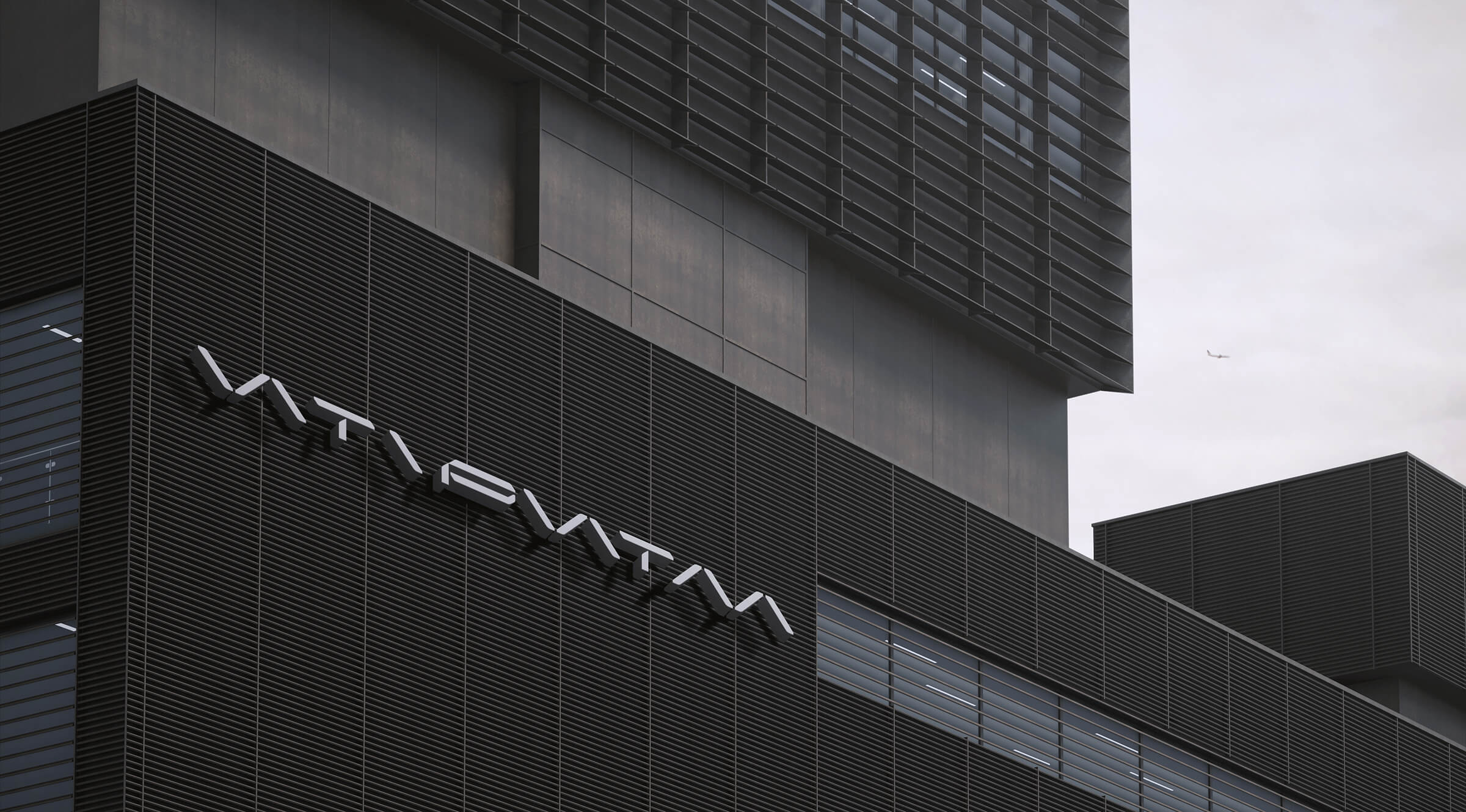
The IT Rhythm conference logo is a series of repeating elements: forward and backslash and other symbols. This results in additional style-forming graphics, reminiscent of the famous texture from the Matrix movie.
CREDIT
- Agency/Creative: uniqorn
- Article Title: IT-Rhythm Brand Design
- Organisation/Entity: Agency
- Project Type: Identity
- Project Status: Published
- Agency/Creative Country: Russia
- Agency/Creative City: uniqorn / Moscow
- Market Region: Europe
- Project Deliverables: Brand Guidelines, Brand Identity, Branding, Icon Design
- Industry: Technology
- Keywords: it, technology, conference, forum, expo, Cyrillic, navigation, infografic
-
Credits:
designer: Vlad Mikhailov


