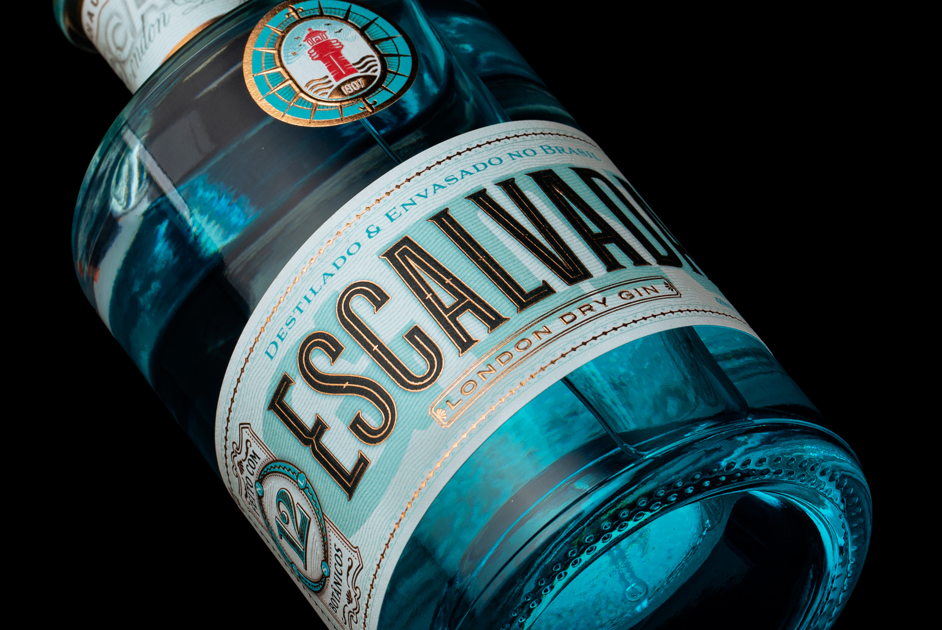
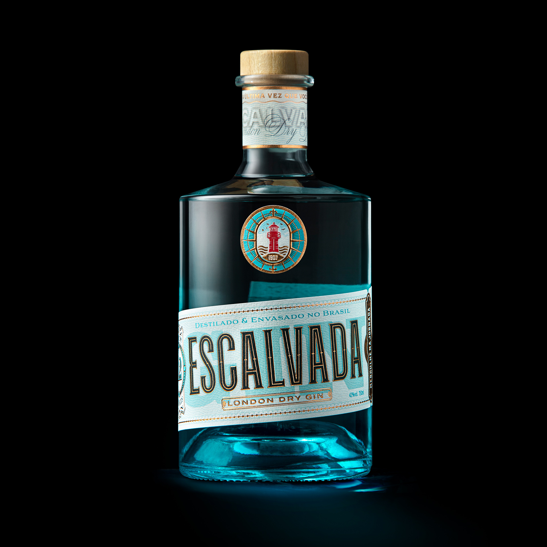
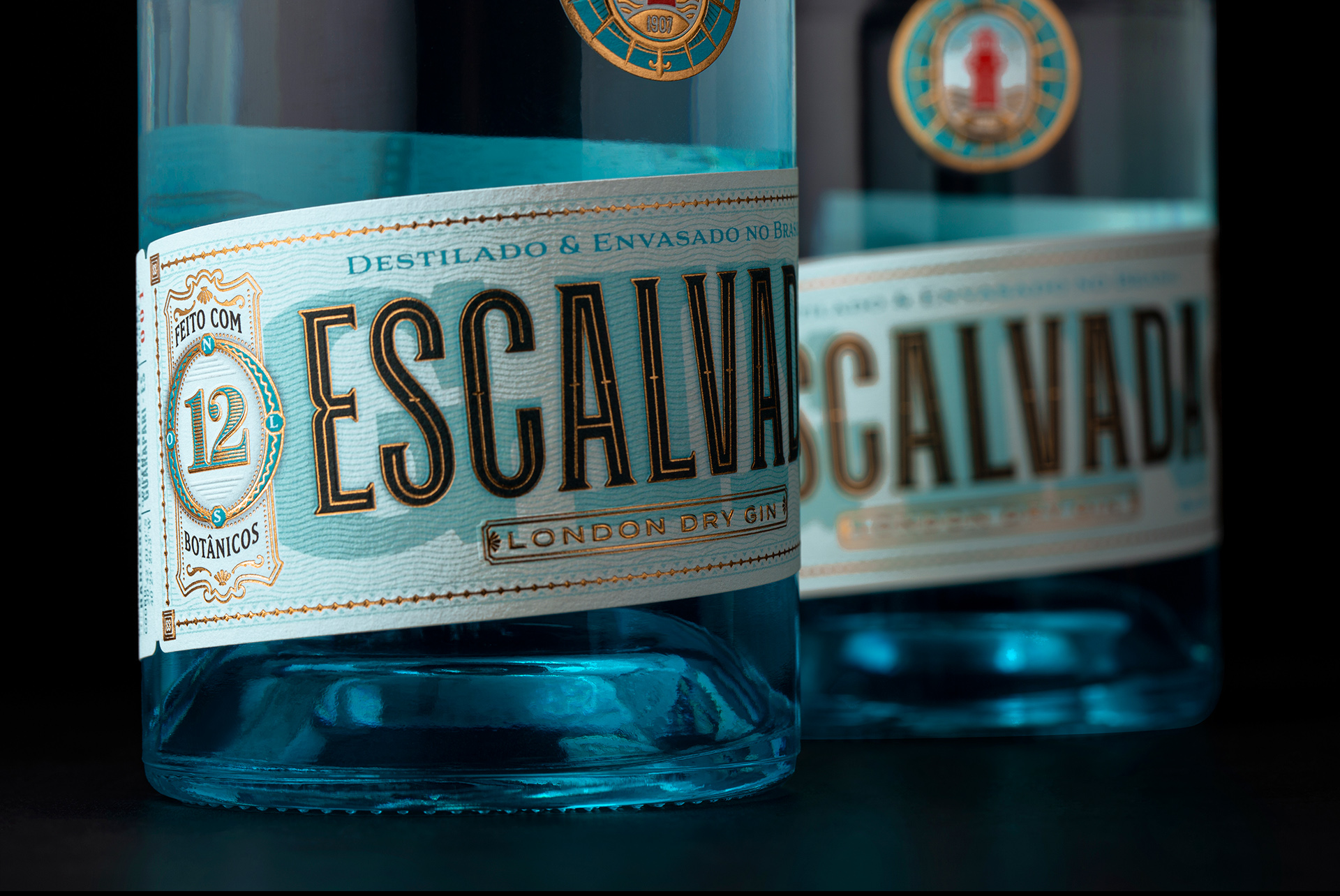
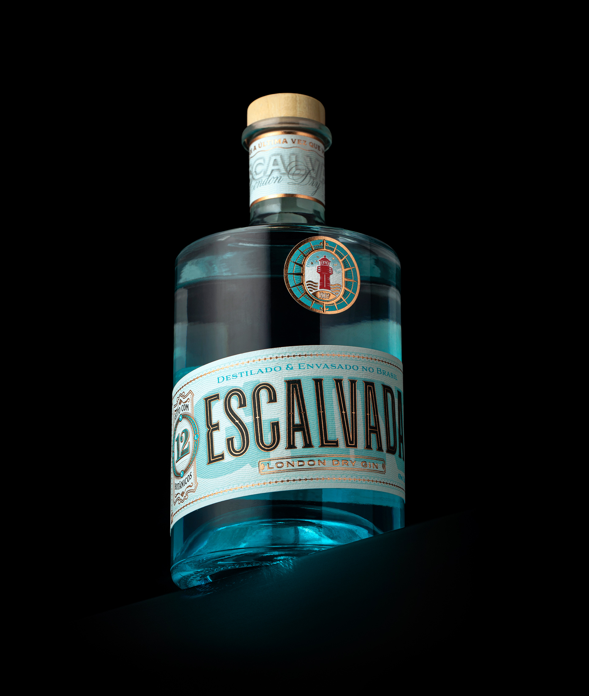
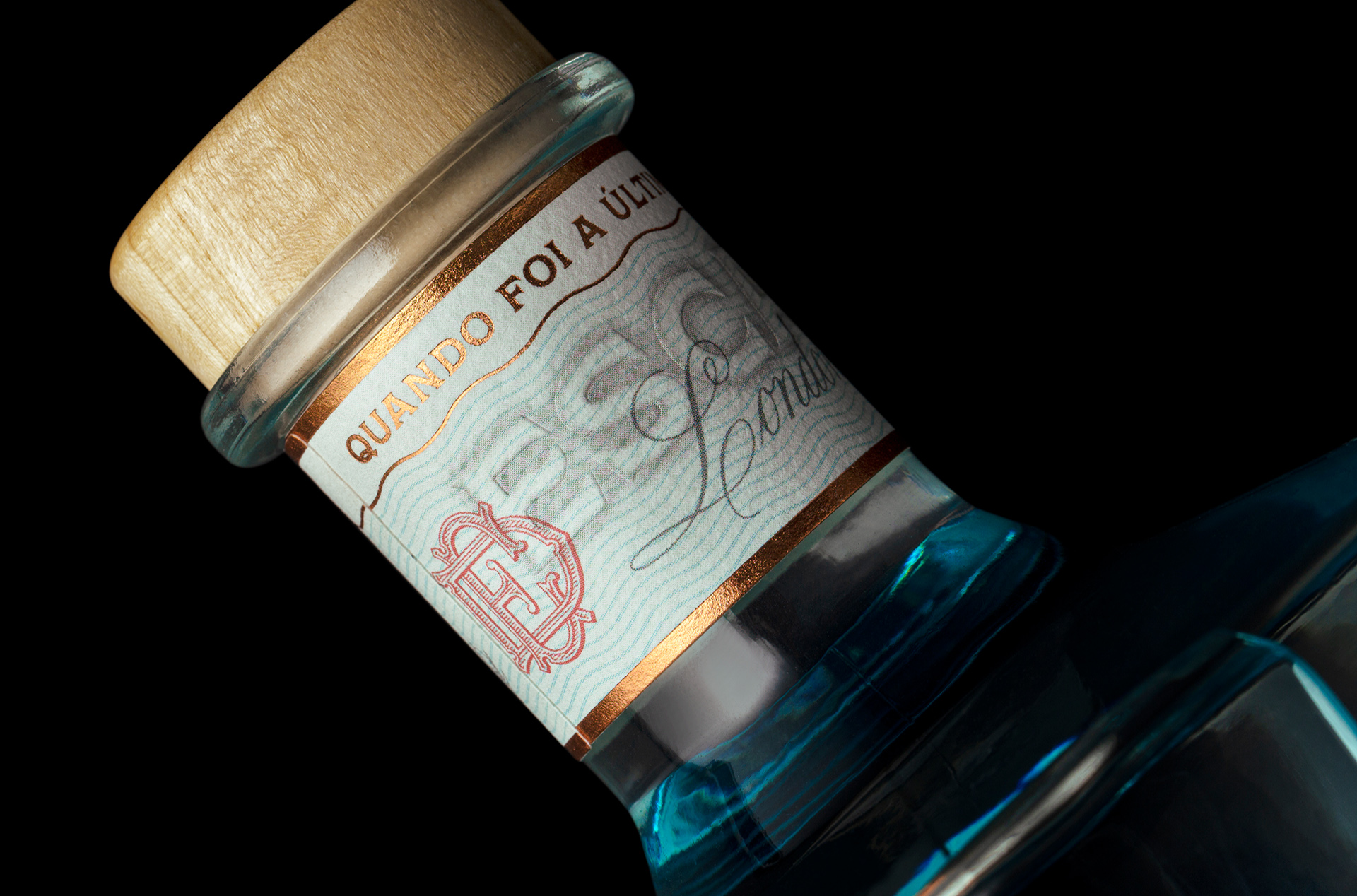
An invitation to dive into your Journey. Inspired by the name and beauty of a famous Island of Espírito Santo, Brazil, Gin Escalvada pays homage to a paradise location on a label inspired by old ferry and travel tickets. In a region rich in diversity and surrounded by exuberant nature Gin Escalvada personifies people looking for moments of relaxation and fun. An audience that wants to celebrate with elegance, enjoy with friends in a vibrant and relaxed atmosphere, whether day or night, on land or at sea. The inspiration for creating the label came from the tagline, created for the project “when was the last time you dive in?”. In essence it is an invitation to allow yourself.
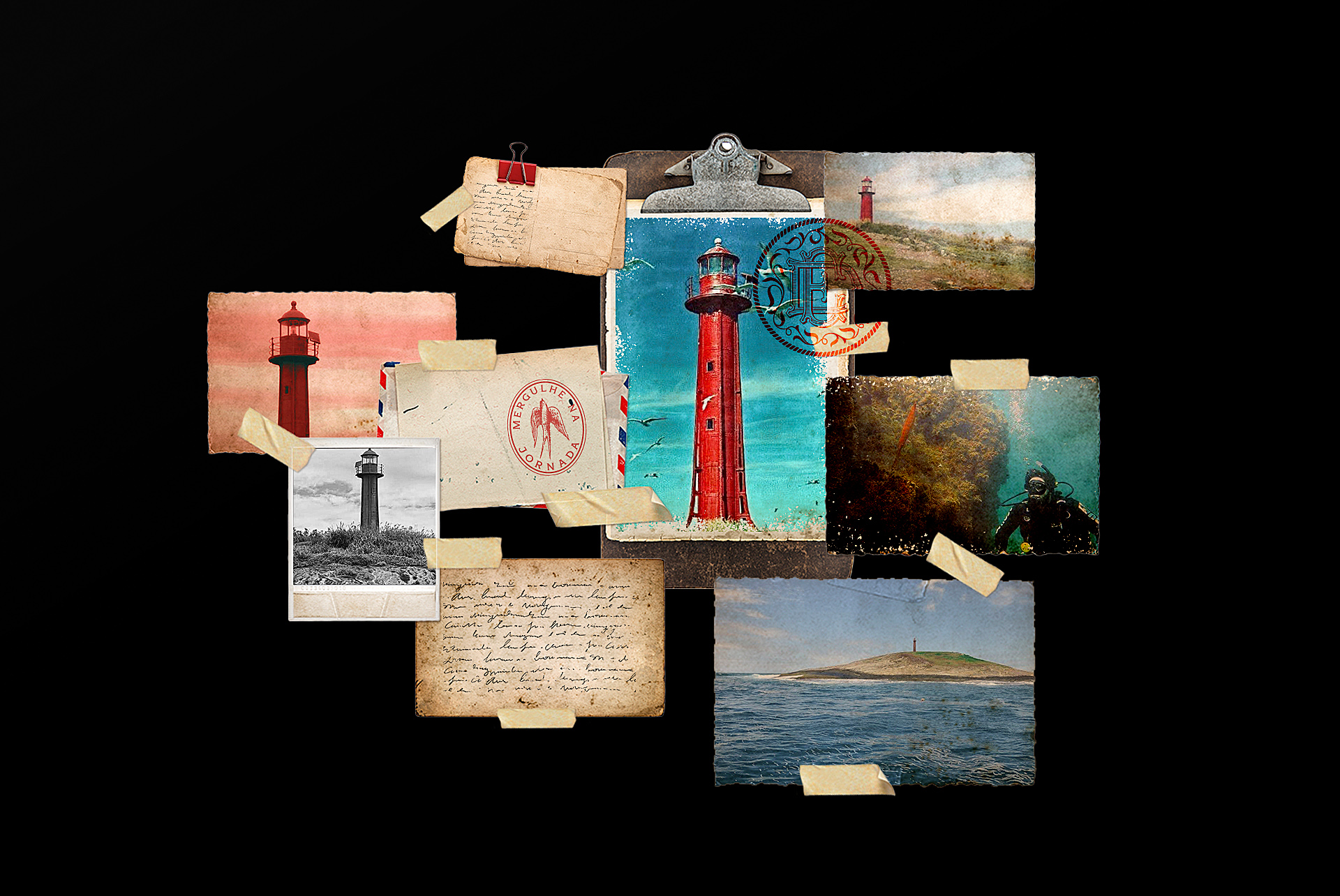
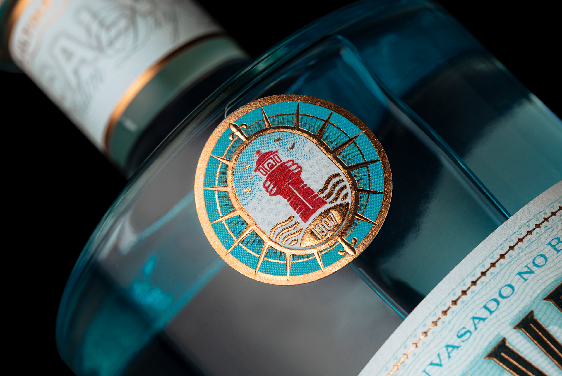
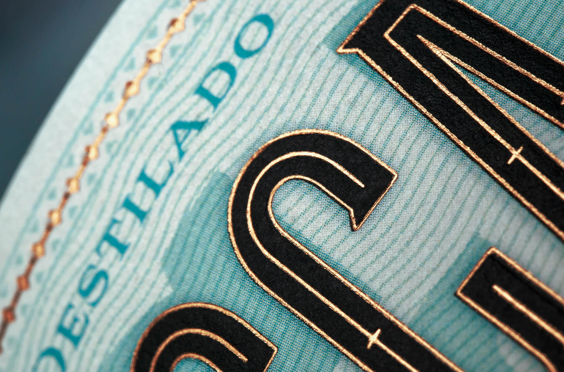
The details and aesthetics of the label refer to the origins of Gin production, recalling European drug label standards and the beginnings of the drink. The Turquoise Blue refers to the sea and the purity of the elements in red and recalling metals and rivets associated with the physical structure of the Escalvada Lighthouse, a monument with a reddish tone, existing in the center of the island and which gives rise to the symbol.
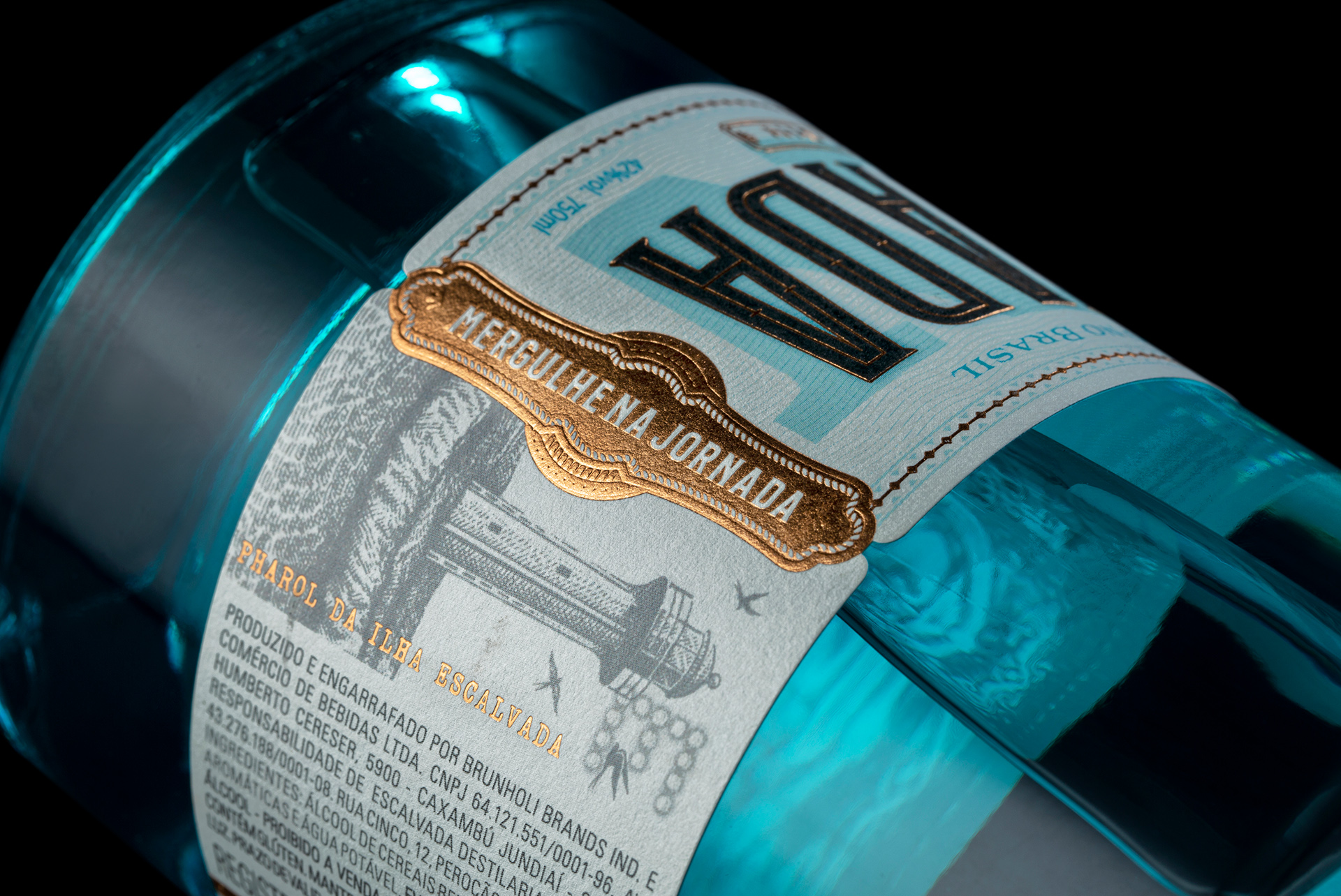
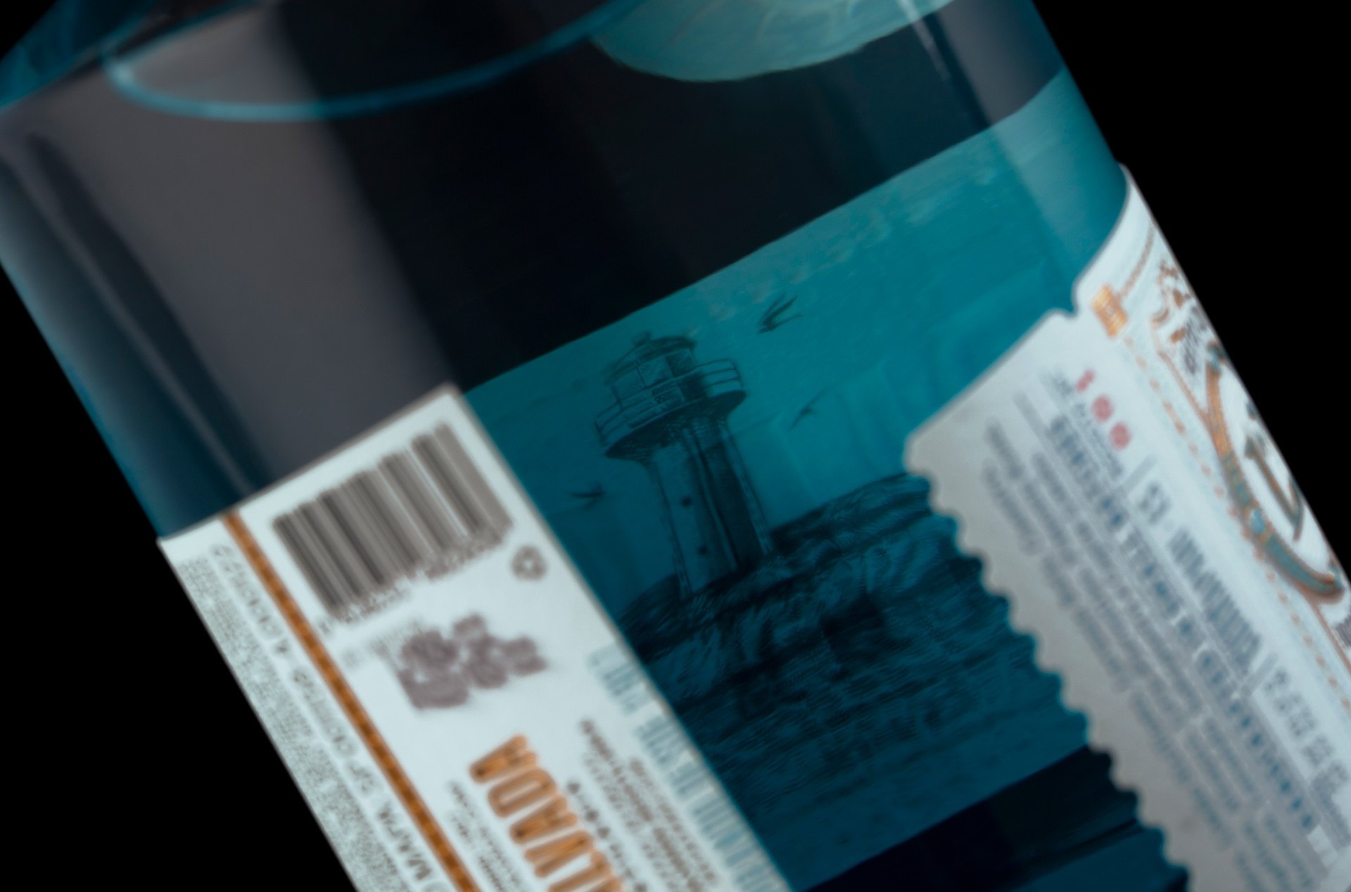
Rich in detail, the label also has an illustration printed on the inner side of the label, creating a provocative atmosphere when turning the bottle in order to convey the message of inviting you to visit the island. In this project, Holy Studio, going beyond the labels, developed the branding process following the pillars of label positioning and launching to the market a solid and cohesive brand platform with the elements of verbal visual identity and digital presence aligned with the purpose of the brand.
Escalvada. Dive into the Journey
CREDIT
- Agency/Creative: Holy Studio
- Article Title: Escalvada London Dry Gin by Holy Studio
- Organisation/Entity: Agency
- Project Type: Packaging
- Project Status: Published
- Agency/Creative Country: Brazil
- Agency/Creative City: Porto Alegre
- Market Region: North America, South America
- Project Deliverables: Brand Creation, Brand Identity, Brand Mark, Brand Strategy, Illustration, Label Design, Packaging Design, Packaging Guidelines
- Format: Bottle
- Substrate: Glass Bottle, Wood
- Industry: Food/Beverage
- Keywords: Gin, Gin label, Alcohol, Packaging Design, London Dry Gin, Gin Packaging
-
Credits:
Creative Director: Erik Marchetti
Creative Director: Luis F. Cavalcanti
Photography and Video: Moropolo Studio
Retouching: Patricia Thiesen
Printing: Brazicolor


