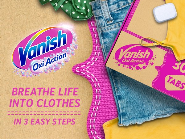
Reckitt power brand Vanish is launching Vanish Multipower Tabs with packaging and brand experience designed specifically for online shoppers, adding to its ecommerce portfolio alongside Vanish Miracle.
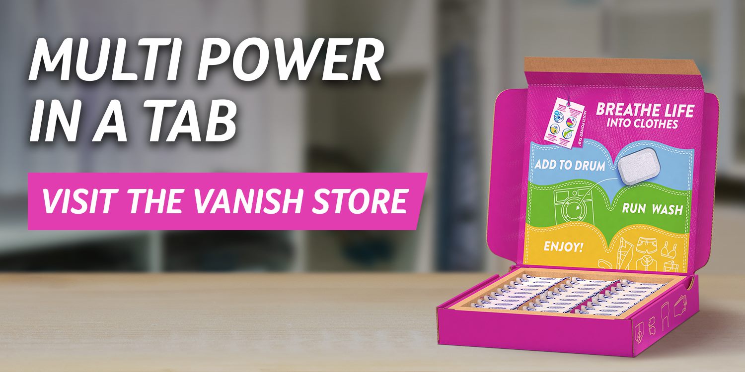
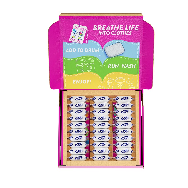
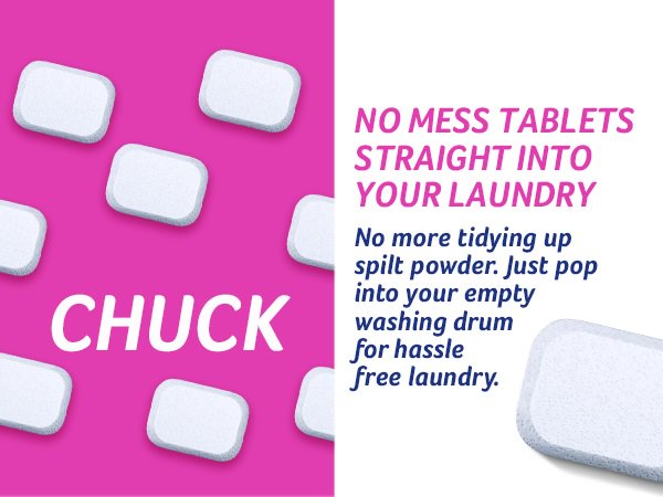
The Vanish Multipower Tabs have been developed as a compressed powder version of the brand’s main product to allow for minimal packaging. The SIOC (shipped in own container) format removes the need for an outer pack for online fulfilment, reducing packaging significantly.
A shift in approach
The new release signals a shift for Vanish, towards fully embracing ecommerce and making sure it develops the brand’s appeal among a younger, more time-strapped audience.
Nick Horan, Global Brand Experience Lead, Vanish, says: “Vanish is constantly adapting to the needs of people to give them solutions that keep clothes in circulation. With Vanish aiming to make clothes last longer, and fashion buying increasingly taking place in an online world, it makes sense for Vanish to show up more prominently in that space.”
Subtle exterior with detailed reveal
The packaging and visual assets of the new product, designed in collaboration with creative agency Marks, plays to this focus on ecommerce.
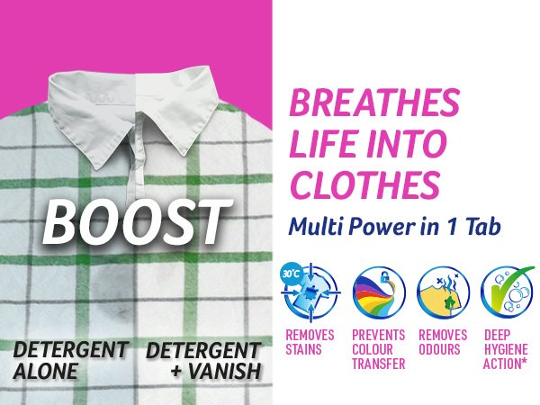
Nick Horan says: “By the time the packaging has landed on people’s doorstep, they have already engaged with the product online and made the first decision of purchasing it, so are already familiar with the brand. This allows for the exterior branding to be subtle, with the more intricate design elements revealed when the box is opened. Vanish is an ally in people’s desire to make their clothes last longer, we want to ‘empower them with the benefits of Vanish’ (removes stains, prevents colour transfer, removes odours and hygienically cleans). It was important for that to shine through in the design execution.”
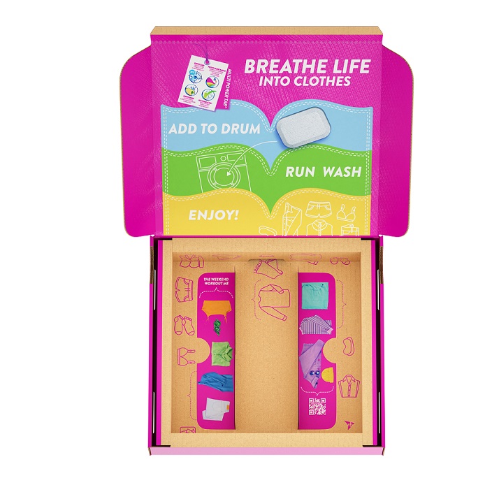
That empowering tone of voice comes through in all touchpoints and visual elements, such as illus-tration and typography. The exterior of the pack showcases the distinctive Vanish pink, while the interior reveals full colour and a purposeful selection of messaging and illustrations to engage the user and clearly convey how to use the tabs. Simple, yet cleverly configured design details include some ‘delightful discovery’ elements. For example, the use of single colours for a series of icons that demonstrate the types of clothes the Multipower Tabs can be used for. These are gradually re-vealed as the Multipower Tabs are used one-by-one.
Multiple stages of customer engagement
The packaging design also includes a QR code which enables and encourages people to engage further with the brand. It will offer access to enhanced advice, relevant content and dialogue with the brand.
Nick Horan says: “We want look at the full journey. We want people to share and receive further advice – and we aim to listen and respond to them, and then scale up relevant content. This is what makes ecommerce projects so interesting – the clever use of more touchpoints to tailor the right experience for every need along the journey.”
The Vanish Multipower Tabs release is a sign of things to come for the brand. Vanish has been pushing to move into the ecommerce space for some years. With the pandemic expediting the investment in those channels, the current launch is an important step towards ecommerce readiness – and an eventual ecommerce-first approach.
Vanish Multipower Tabs are being rolled out across UK pilot schemes.
CREDIT
- Agency/Creative: Vanish / Reckitt
- Article Title: Reckitt Unveils New Ecommerce Packaging for Vanish
- Organisation/Entity: In-House
- Project Type: Packaging
- Project Status: Published
- Agency/Creative Country: Netherlands
- Agency/Creative City: Amsterdam
- Market Region: Europe
- Project Deliverables: Brand Experience, Packaging Design
- Format: Box
- Substrate: Pulp Board
- Industry: Retail
- Keywords: Hygiene, laundry, FMCG, innovation, DTC,
-
Credits:
Agency partner: Marks


