


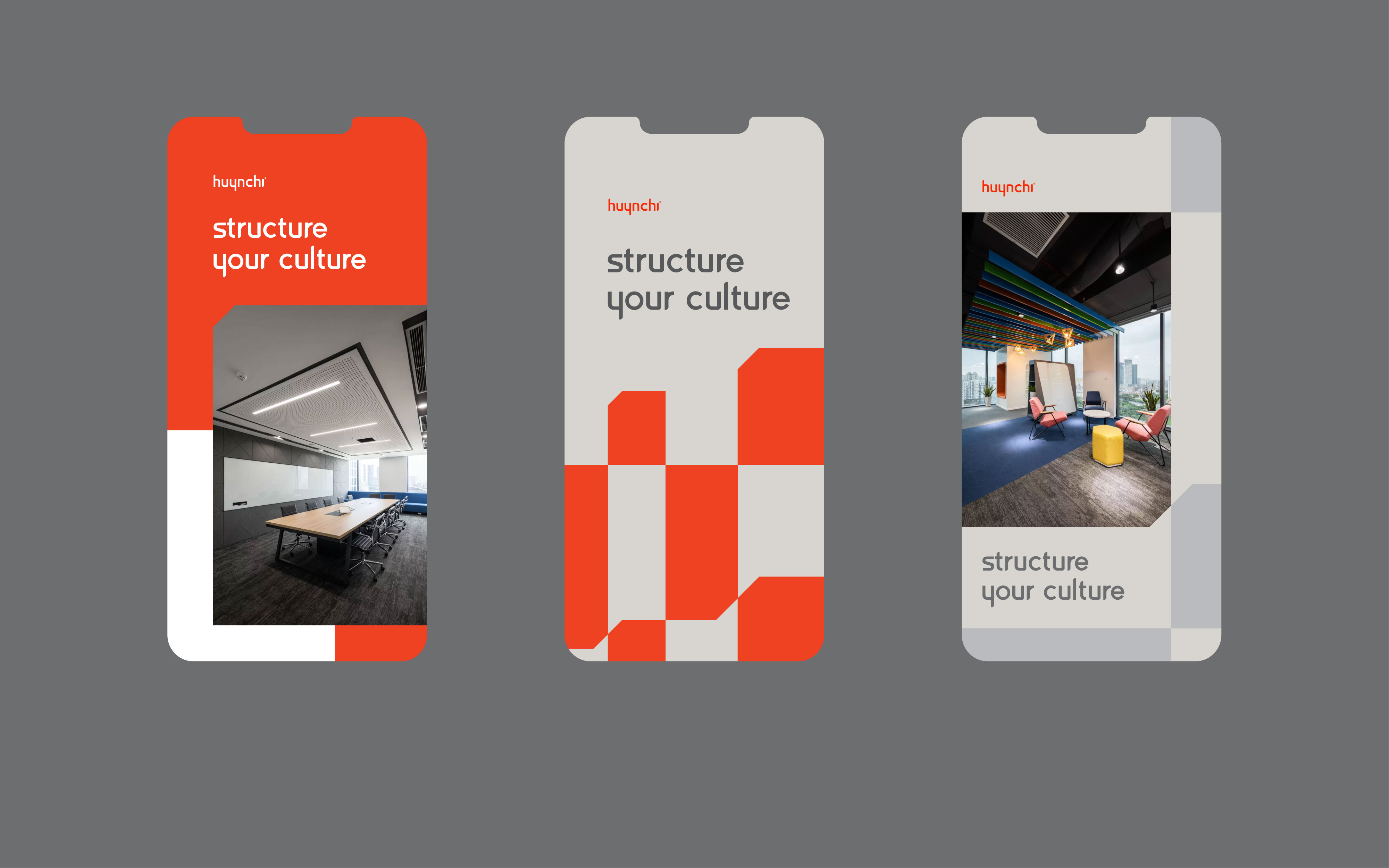
Workplace design brand Huynchi and the challenges of innovation
Huynchi is a Vietnamese workplace design brand with a strong market position. Not only for domestic clients, but they are also familiar with foreign enterprises.
Huynchi planned to redesign their identity, and after many considerations (even working with other agencies beforehand), the founders came to Vu Digital with the purpose of long collaboration.
Problem
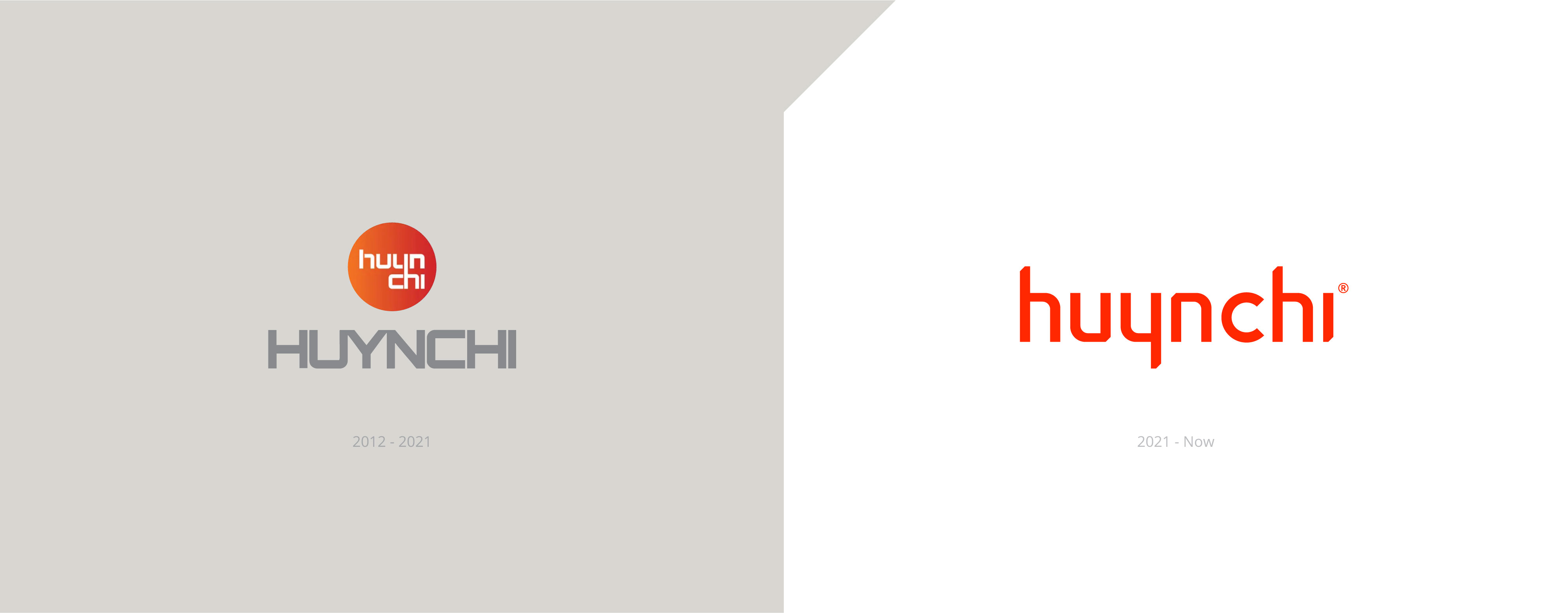
We identified one biggest problem of Huynchi identity was the logo. The old version of Huynchi’s logo was an unnecessary combination of an emblem and wordmark.
In detail, the founders decided to create a symbol of the words “Huyn” and “Chi, with an orange background, while they already had the wordmark. This option might help viewers distinguish the brand name, but as we mentioned, it created unnecessary redundancy in terms of content and design.
New Visual Concept
Many other office design brands follow the same path: getting ideas for visuals from office stuff such as tables, chairs, and doorways. We didn’t want to use that tedious approach!
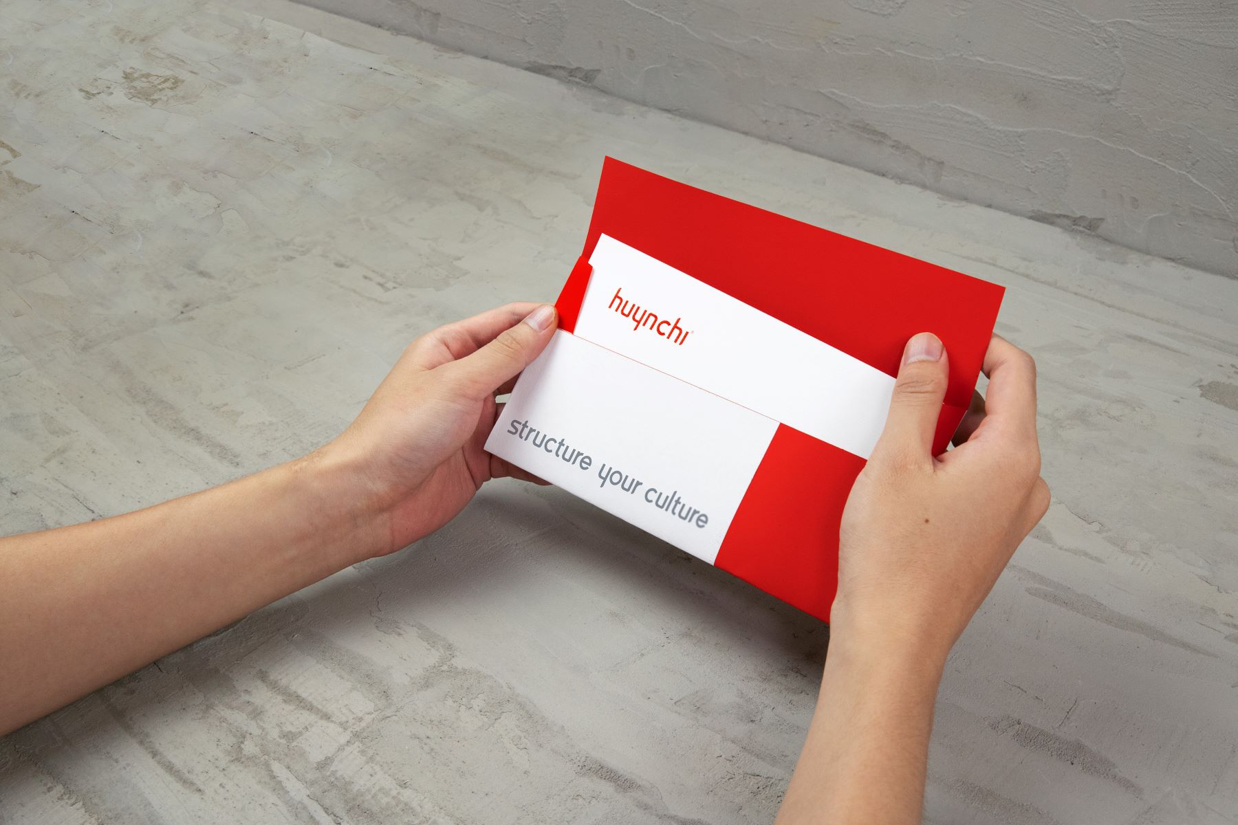
Instead, we considered the identity design as the key to opening new chapters in Huynchi’s history. From that point of view, we created a concept based on the act of someone “marking important pages” with a small fold while reading books. The new concept might reduce the smoothness, but whereas, they create a “highlight” in the whole visual system and go along well with other design materials.
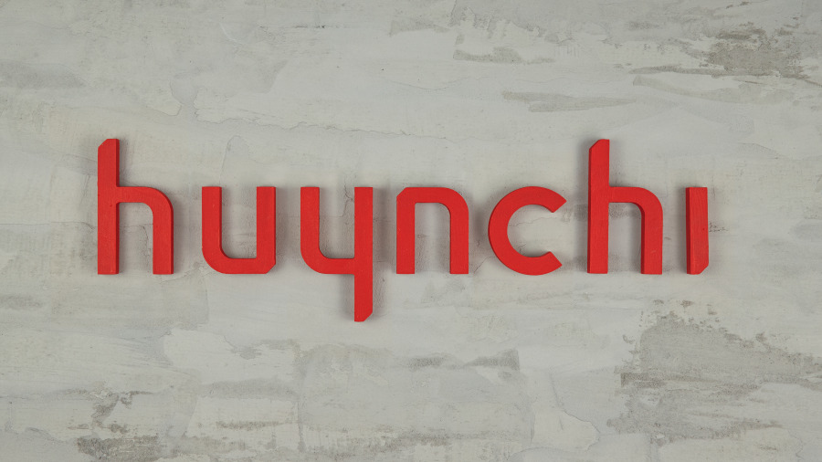
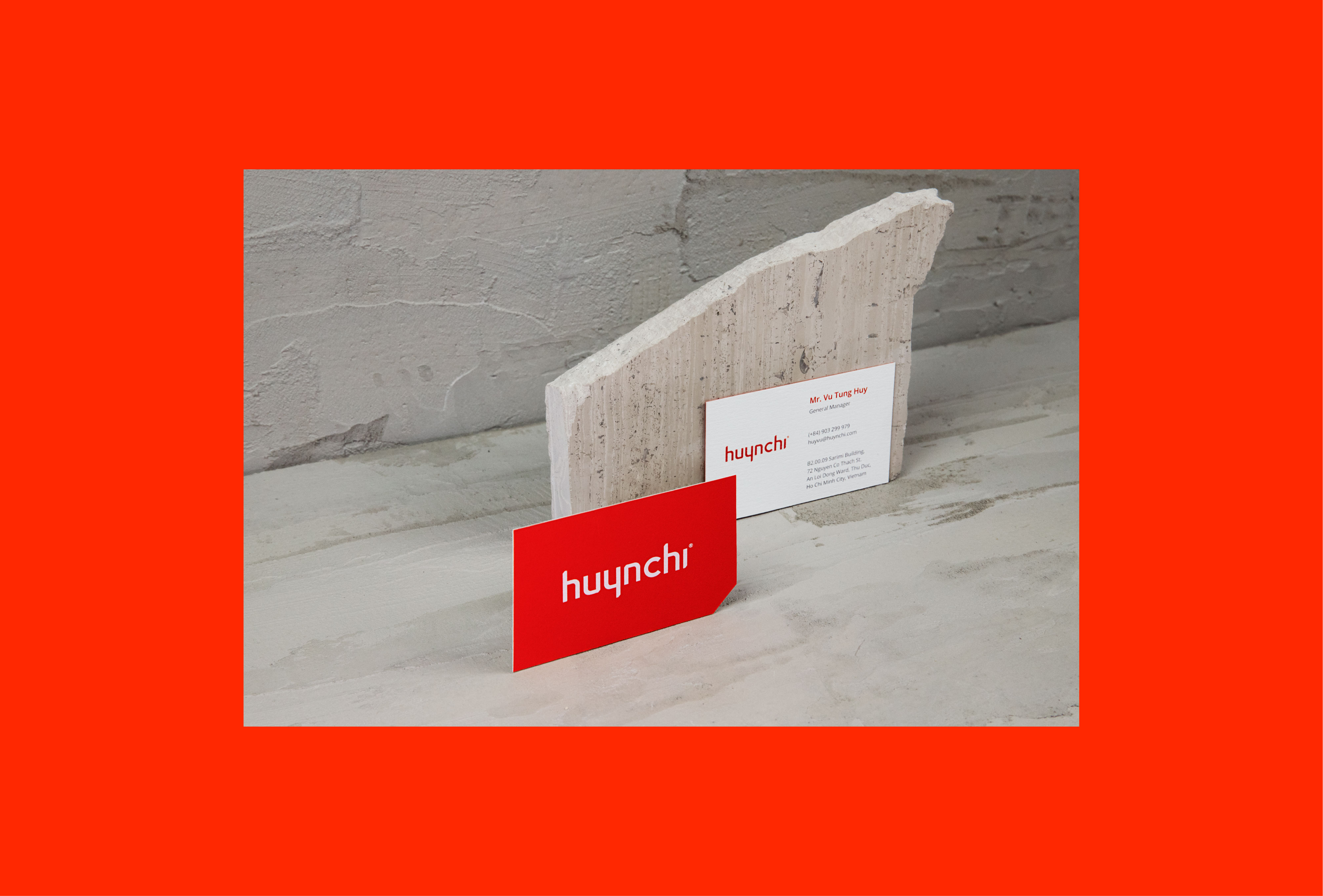
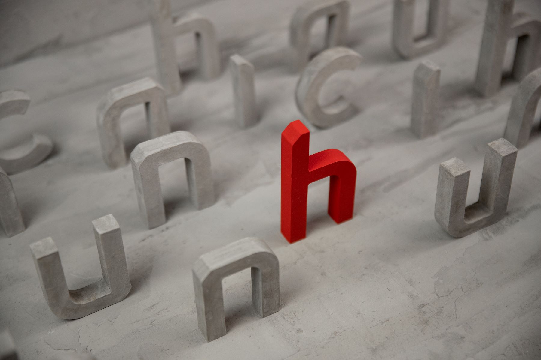
Logo
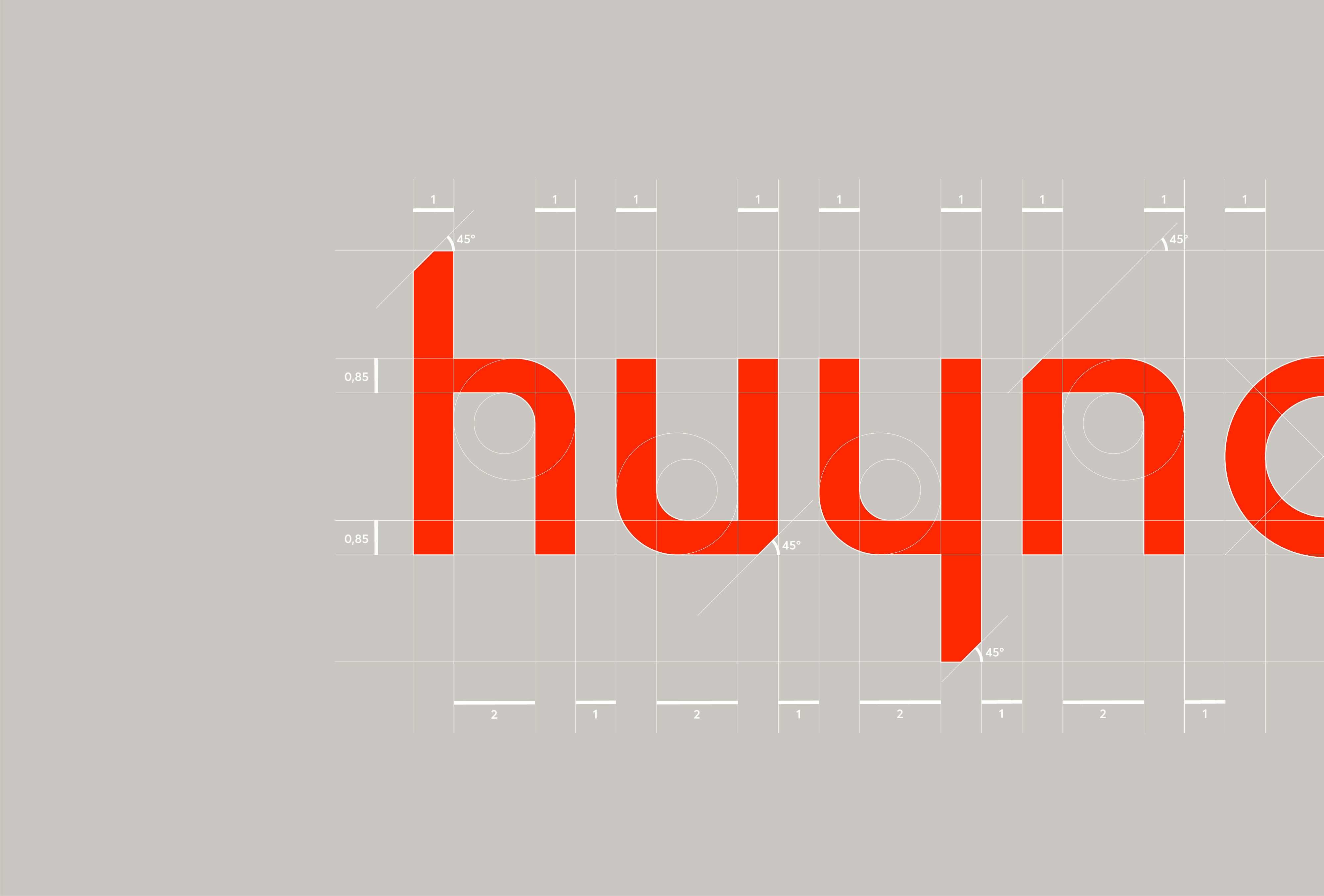
Vu decided to remove the old emblem and replace it with a more modern and minimal wordmark. To apply the “folded concept,” we arranged folds into each letter of Huynchi’s primary wordmark. The letters have also been adjusted to be neat to retain the folds’ detailed sophistication.
Another problem is that many clients mispronounce Huynchi’s name. Instead of /Huy-n-chi/, they call it /Huynh-chi/, which negatively impacted branding activities. Therefore, we designed the letter “C” with a little different structure. This adjustment helps viewers spell it right since they are now aware that there is punctuation.
Color Palette
Huynchi initially used a gradient (orange to dark red) as their primary color palette. However, these colors were so gentle that they became less attractive than other competitors.
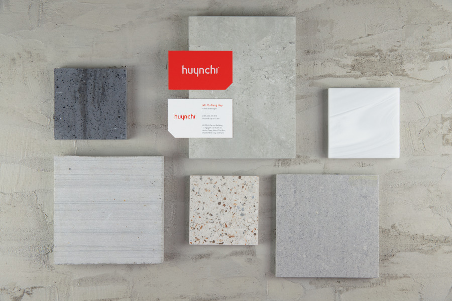
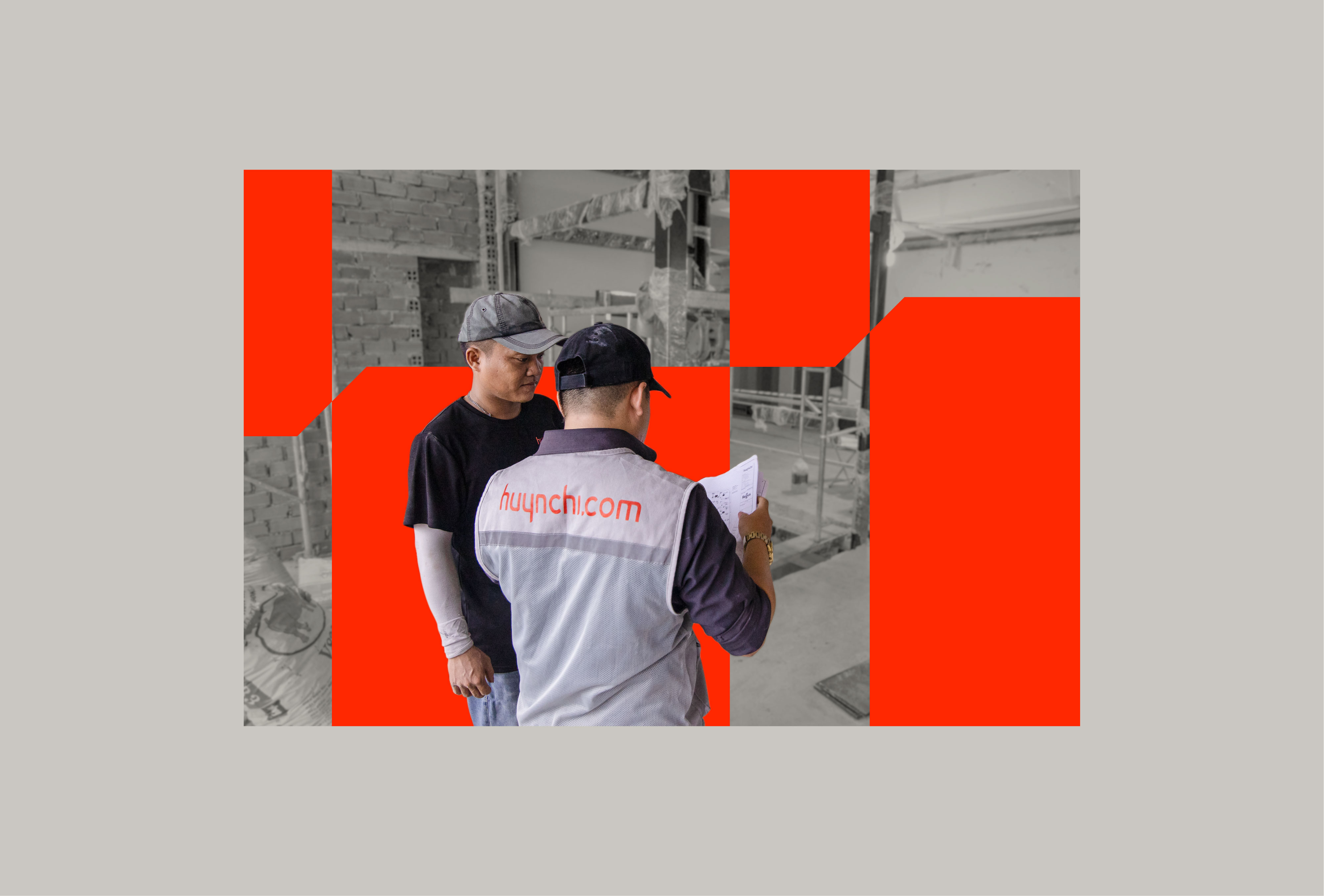
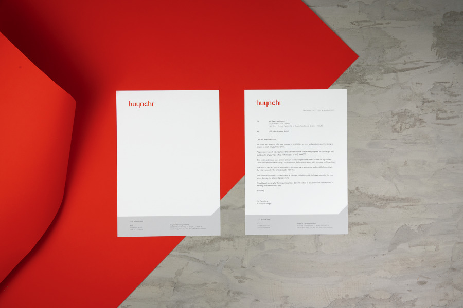
We decided to use only one solid color: Scarlet Red. It proved outstanding when displayed in digital environments (website, social media, etc.) and printed designs (billboards, uniforms, etc.)
We also use light gray as another choice in Huynchi’s primary color palette. The gray is applied in the design to create contrast with the Scarlet. Both colors fit well with the brand’s business model and industry.
The new visual identity of Huynchi ensures a better representation of values, uniqueness and culture. Huynchi is now different from many competing brands, and accurately conveys the brand message to everyone.
CREDIT
- Agency/Creative: Vũ Digital
- Article Title: Vũ Digital Redesigned Huynchi Brand Identity
- Organisation/Entity: Agency
- Project Type: Identity
- Project Status: Published
- Agency/Creative Country: Vietnam
- Agency/Creative City: Ho Chi Minh City
- Market Region: Asia
- Project Deliverables: Brand Design, Brand Guidelines, Brand Identity, Brand Naming, Identity System
- Industry: Construction
- Keywords: construction, brand identity, architecture, brand design
-
Credits:
Agency: Vũ Digital


