The once respected profession of hairdressing is now a craft profession and has not the best image. The Mr. Zopf Hairdressing Museum is a small museum in Bavaria that aims to convey the beauty of hairdressing to every visitor.
The hairdressing museum was founded by Heinz Zopf in Eckernförde in Schleswig-Holstein in 1980. Recently, however, the museum has moved into the building of the German Hairdressing Academy in Neu-Ulm to live up to its reputation of preserving the tradition and keeping up the enthusiasm for a bright future of the most beautiful profession in the world. Picking up on trends of the past is en vogue again and so is the idea of a hairdressing museum.
The goal is to demonstrate to the visitors how barbers have become hair dressers. But we also present a broad collection of valuable items from many centuries. The best stories, however, are taken from real life, so it is really worth listening to Mr. Zopf. He could go on for hours, explaining how to make a wig, telling you about scissors and razors from other countries and centuries. The most exciting story is the one about a German soldier being deployed to France and thus leading to the invention of the safety razor.
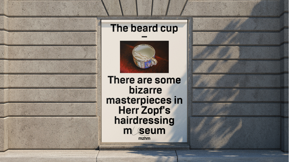
The main goal of the rebranding is to increase the recognition of the museum, to create such communication that will draw the attention of the younger generation to the museum and the profession. Now the positioning of the museum is a chamber museum, attentive to details.
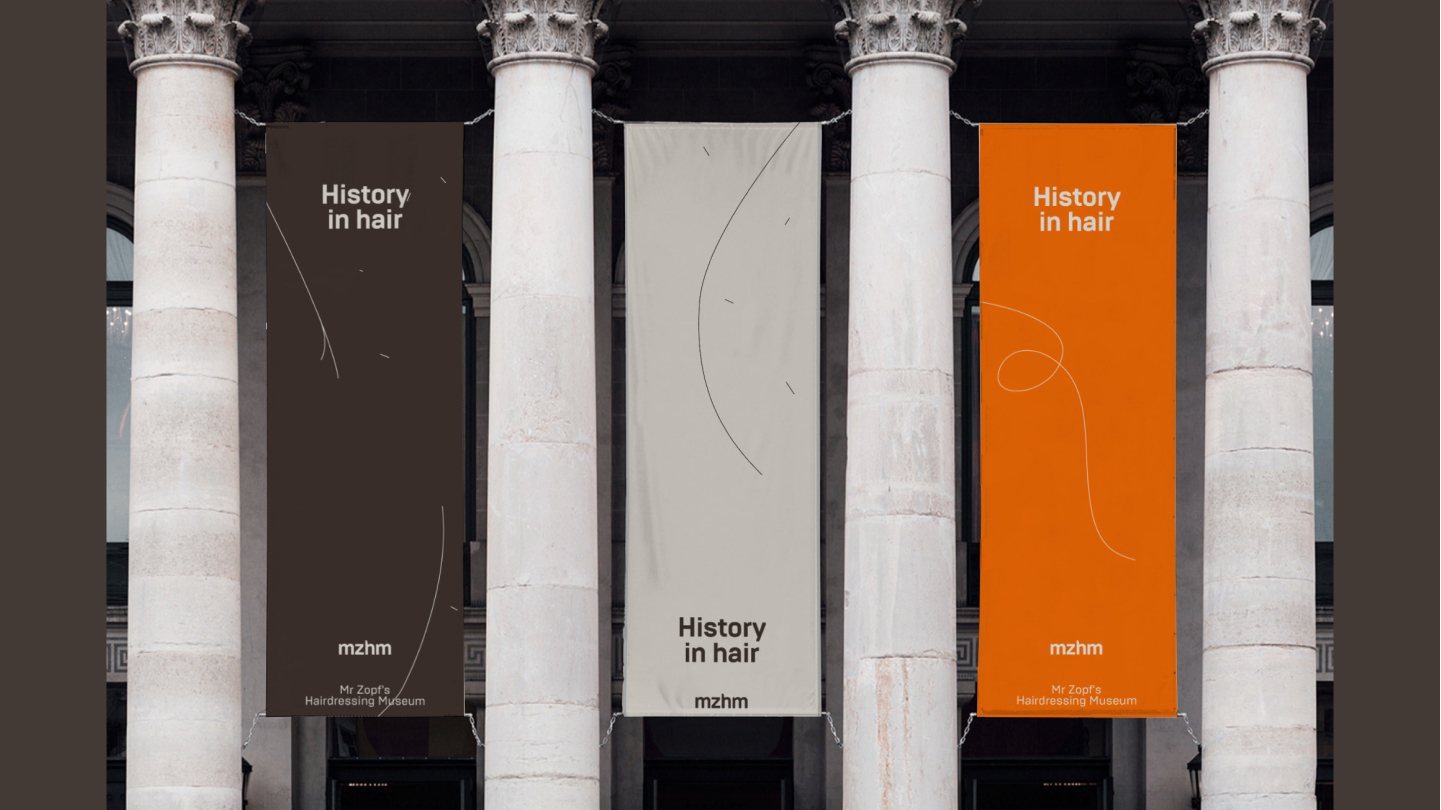
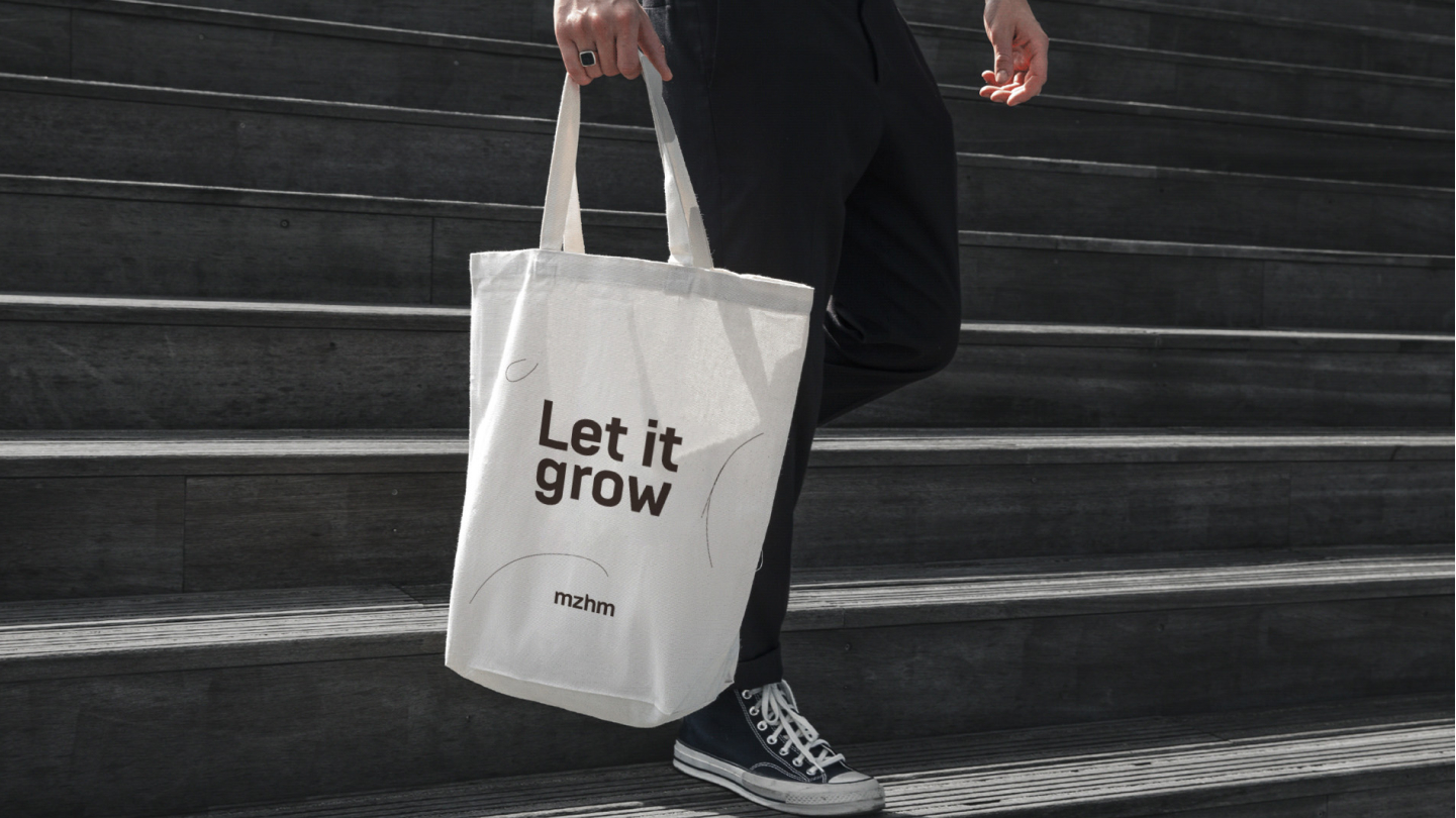
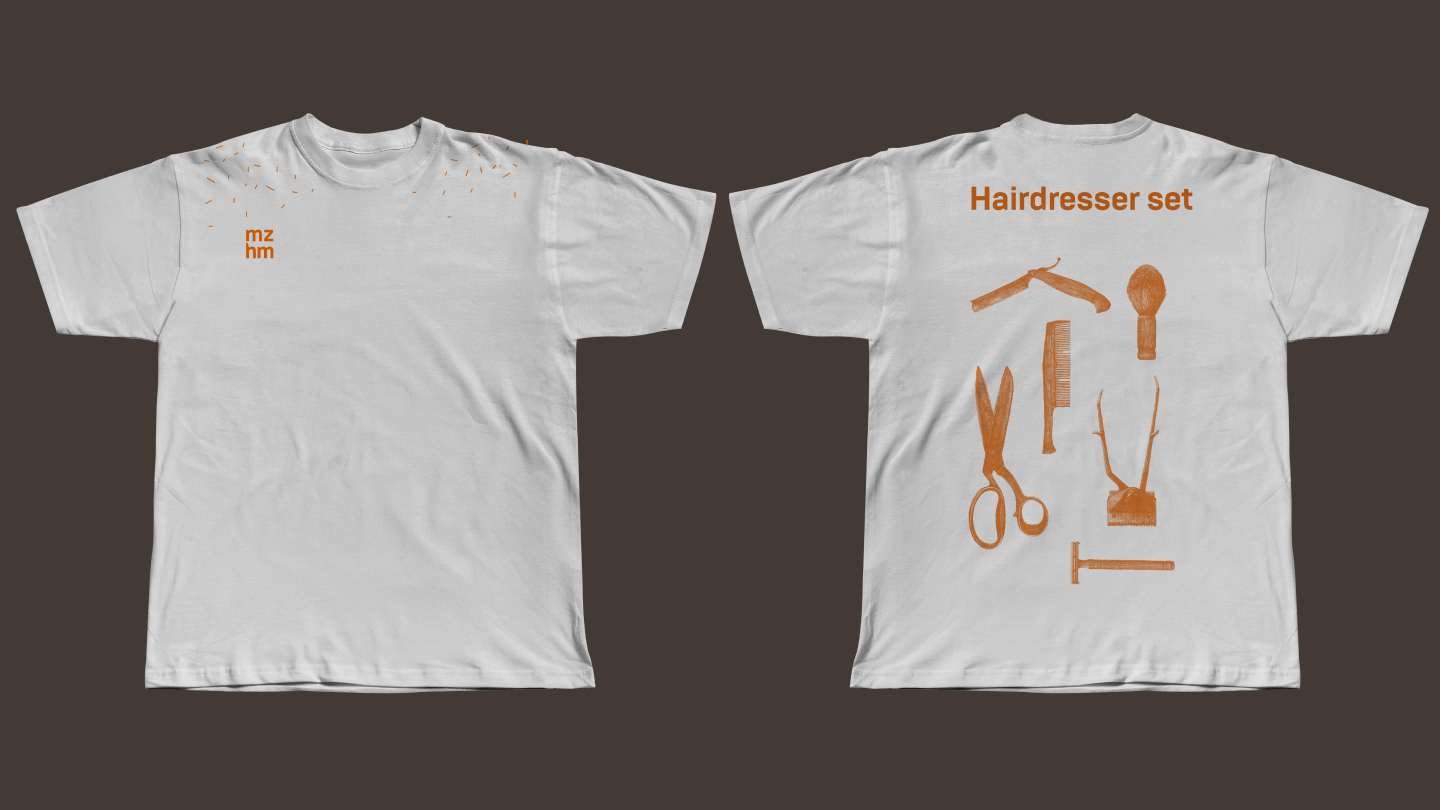
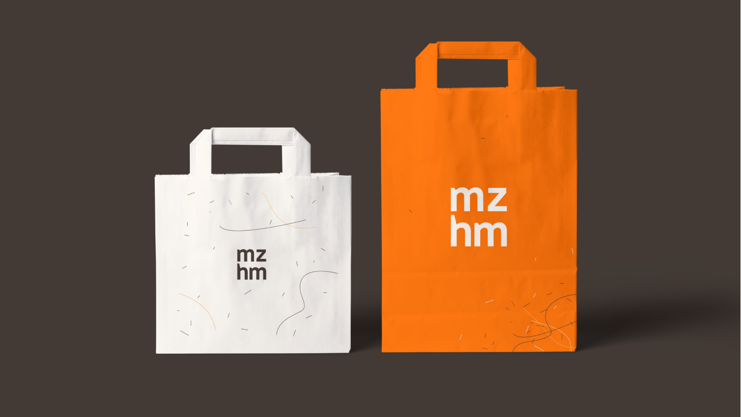
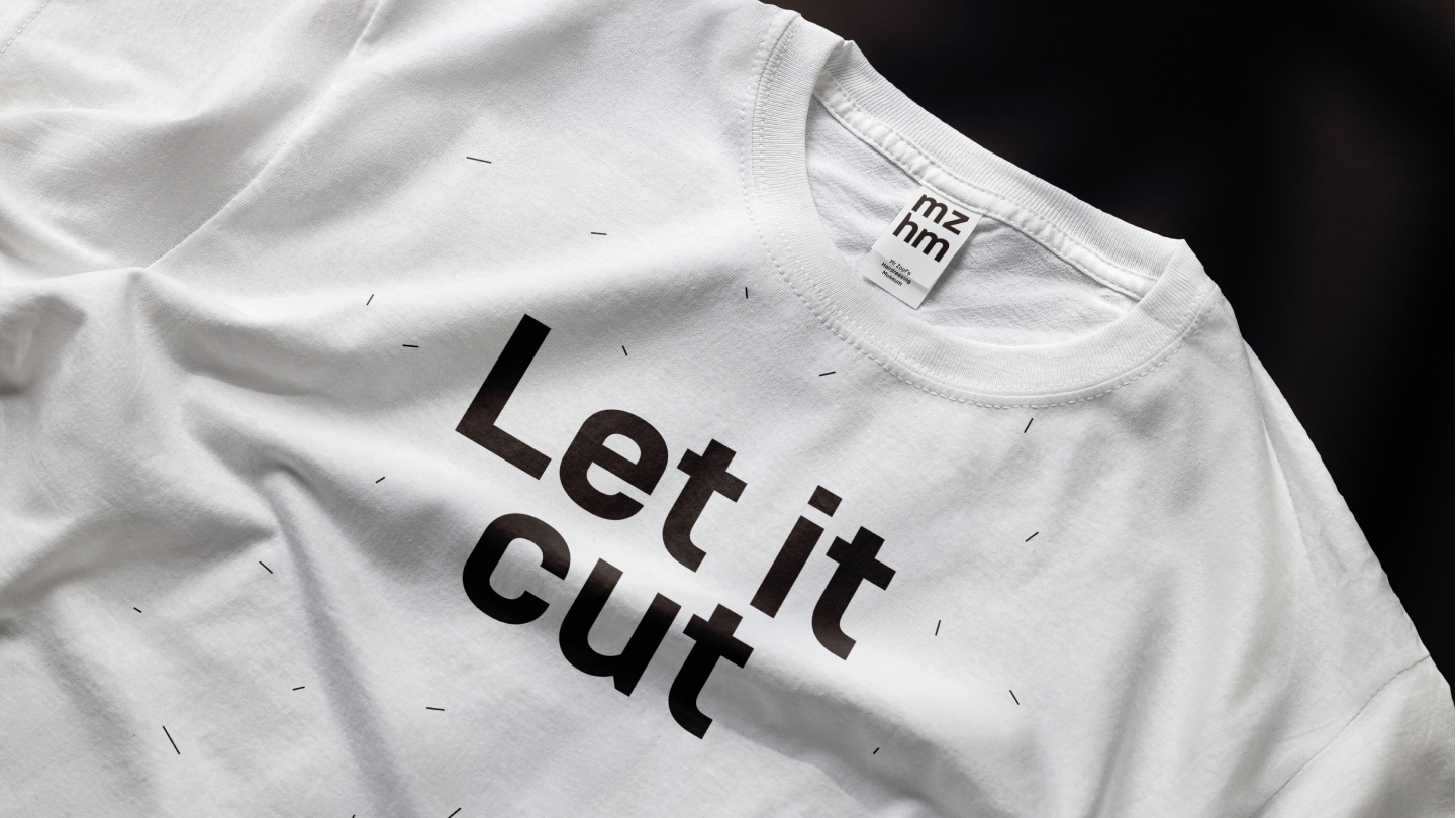
The style is based on hair, the most important detail for a hairdresser. I used it as letters in a font, as a pattern. To diversify the use of hair in the background, I turned to the ongoing actions when creating hairstyles. So, on some carriers, hair is added “as it is cut”, on others it is swept into a pile after creating a hairstyle.
The colors of the project – hair colors, redheads, blondes, brunettes – everyone is welcome in the museum!
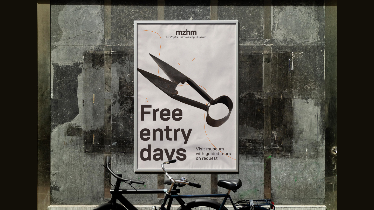
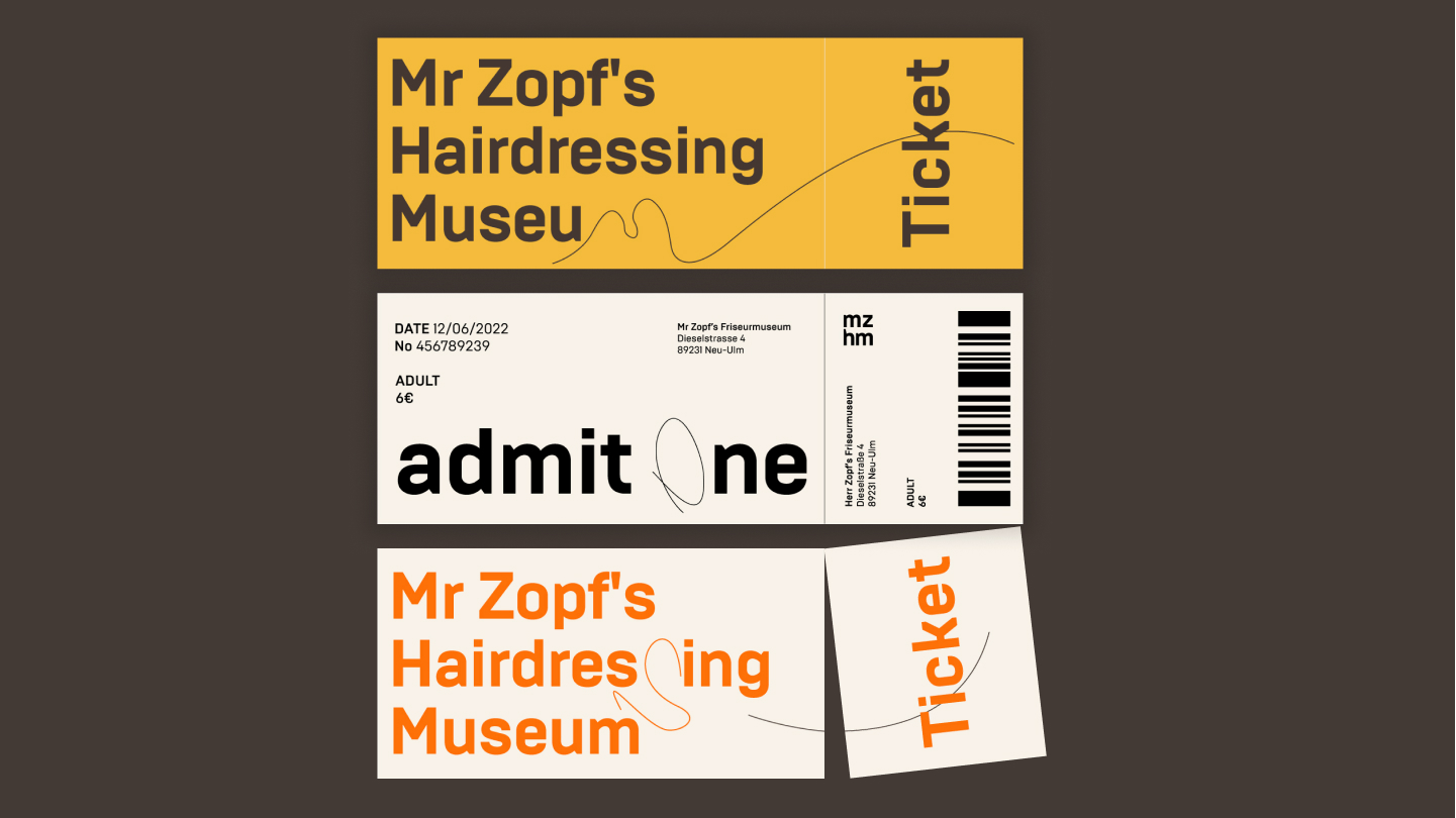
The technique of “cutting off the excess” is also used in the style. We cut off in the logo, cut off in the navigation and use a brutal font that also has “cut off” pieces in the letters.
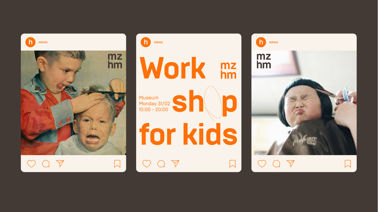
Photo style involves the use of retro hairdressing-themed photographs or cropped photographs to support the idea of attention to detail.

CREDIT
- Agency/Creative: HSE Art and Design School student
- Article Title: Student Rebranding Concept For Hairdressing Museum
- Organisation/Entity: Student
- Project Type: Graphic
- Project Status: Published
- Agency/Creative Country: Russia
- Agency/Creative City: Moscow
- Market Region: Europe, Global
- Project Deliverables: Brand Design, Brand Identity, Branding
- Industry: Fashion
- Keywords: museum, branding, hair, hairdressing
-
Credits:
Designer: Polin Chestnova
Curator: Evgeny Kashirin


