


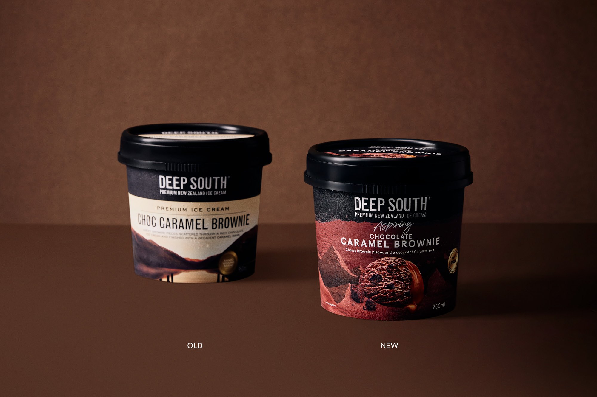
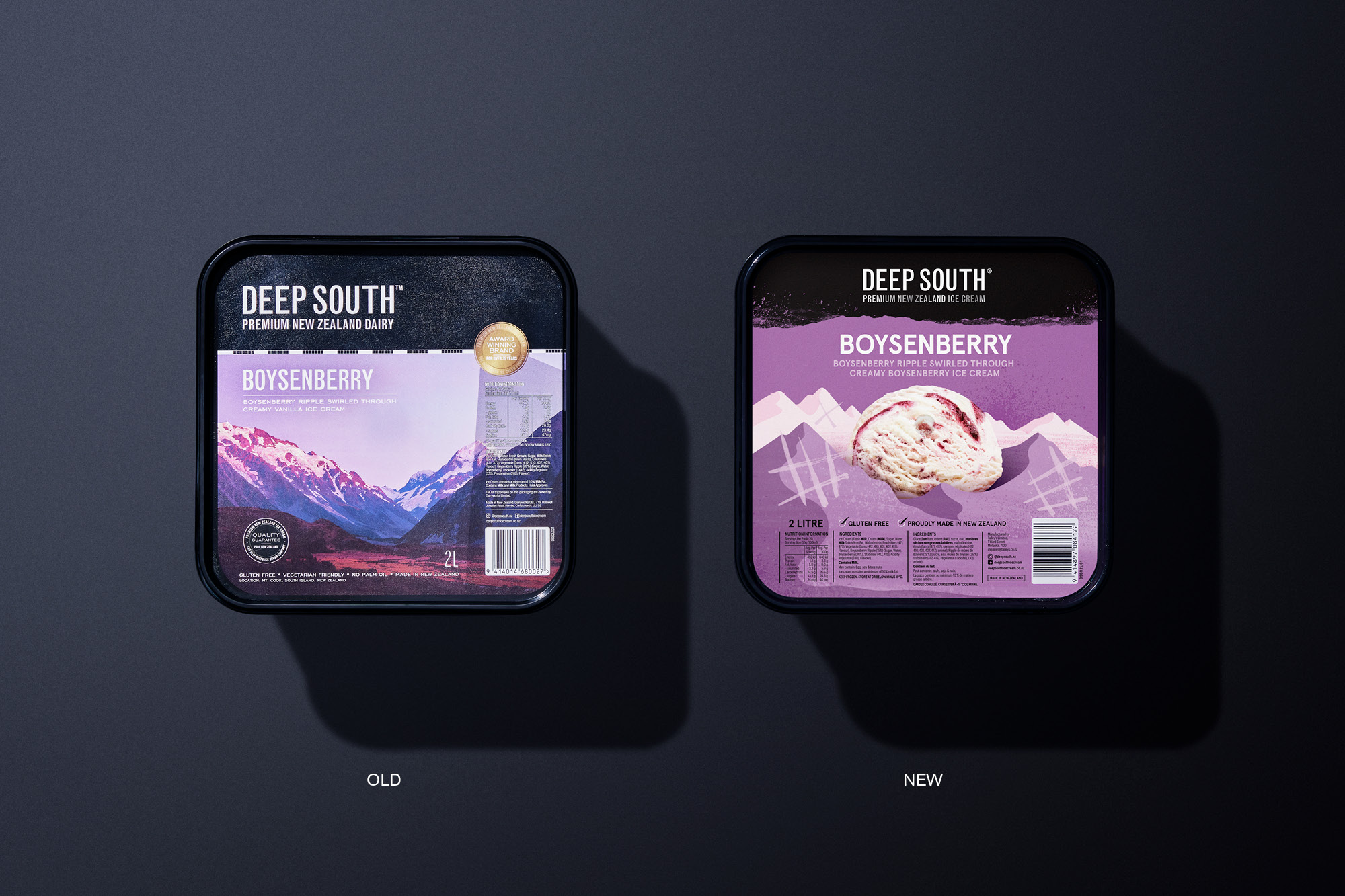
Established in New Zealand’s South Island in 1978, Deep South ice cream has become an iconic brand with a wide range of flavours and styles that cater to a wide range of consumers. Its current design livery has become an iconic, if somewhat cumbersome, livery with its picture-postcard South Island scenery. These illustrate the provenance and pride in the country but are often challenging to communicate pack messaging and muted colour coding.
With a refresh agreed upon to strengthen the brand positioning in the New Zealand market and its focus on export growth, we saw the opportunity to retain the emphasis on provenance while creating an ownable and flexible language that can be used seamlessly across all of its formats.
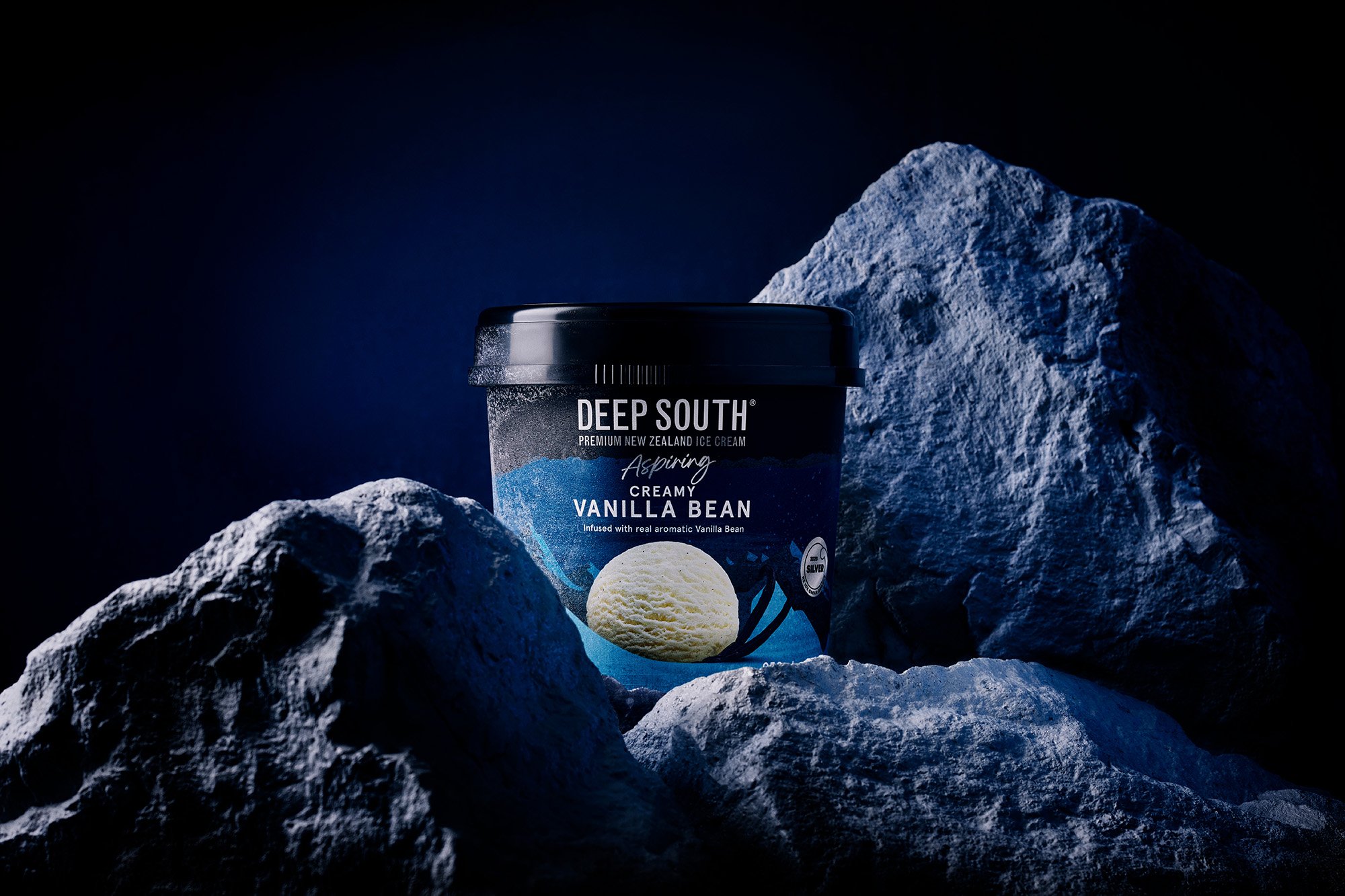
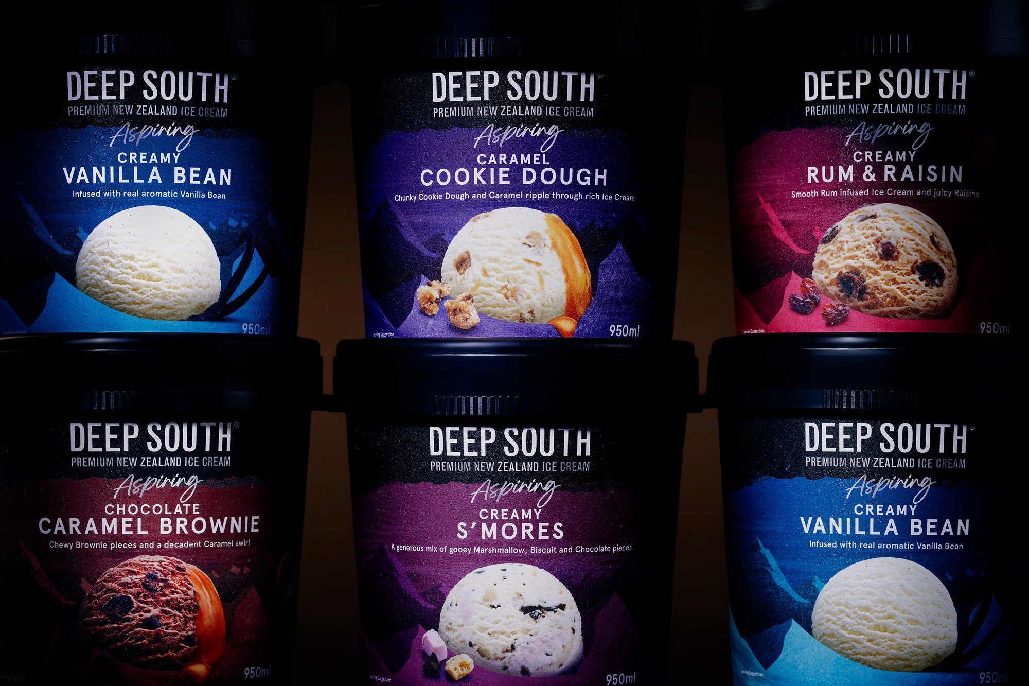
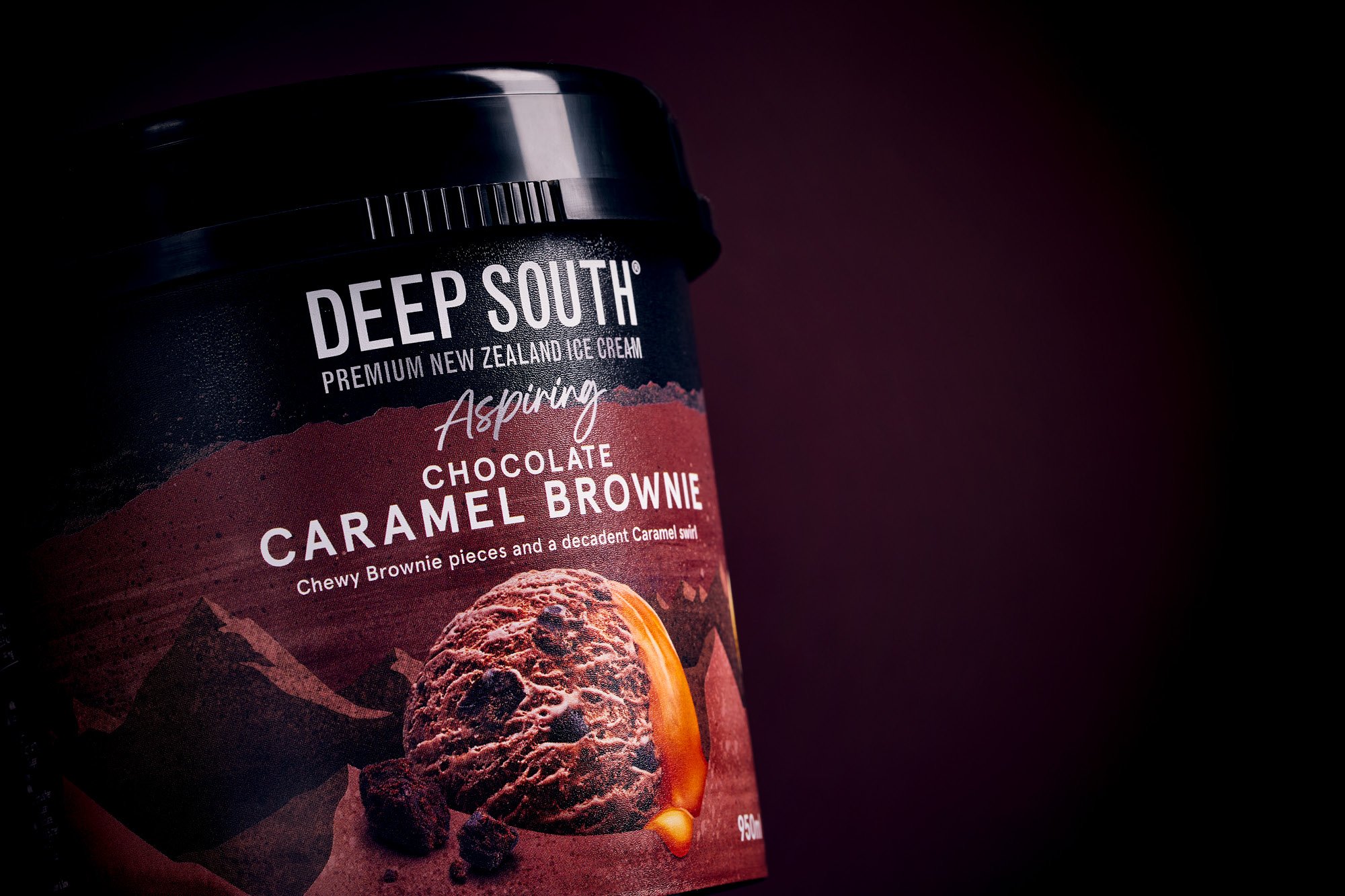
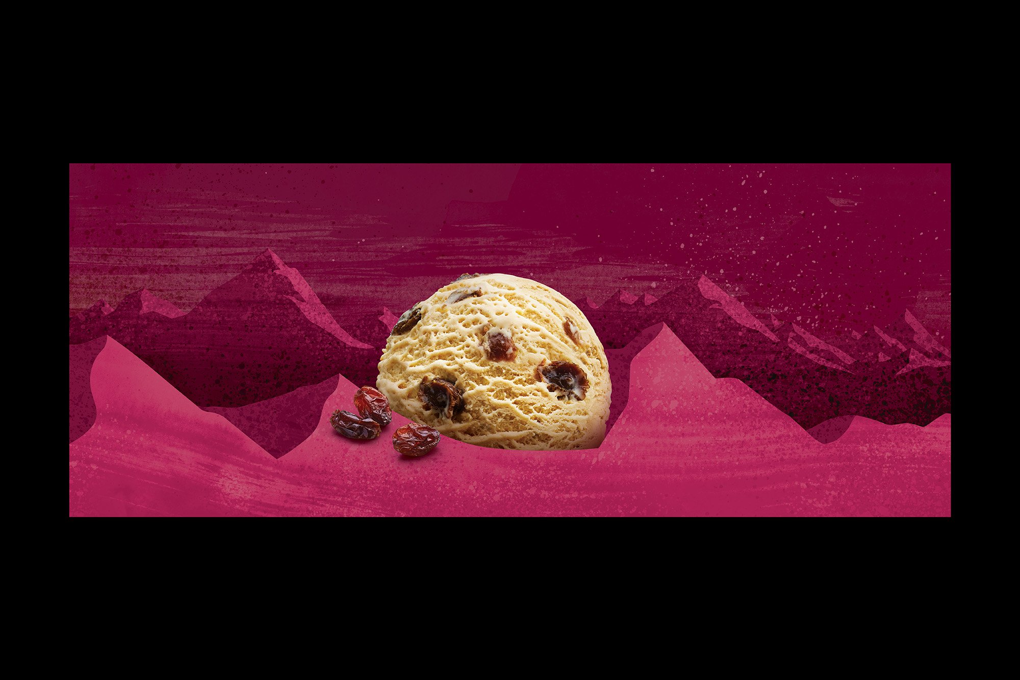
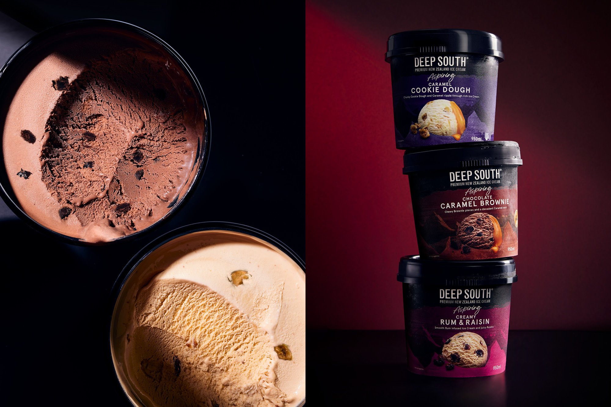
The range was split into premium and mainstream offerings to help broaden its appeal across different price points. We named the premium offering ‘Aspiring’ after the well-known mountain range and national park in the South Island. A unique, chilly, windswept mountain range was created, taking inspiration from the previous livery. This is applied consistently across all flavours with rich and dark colour tones for flavour navigation and textural depth. Proudly nestled within the mountains and centre-stage is close-up ice-cream photography, showcasing the product and ingredients while reinforcing its provenance.
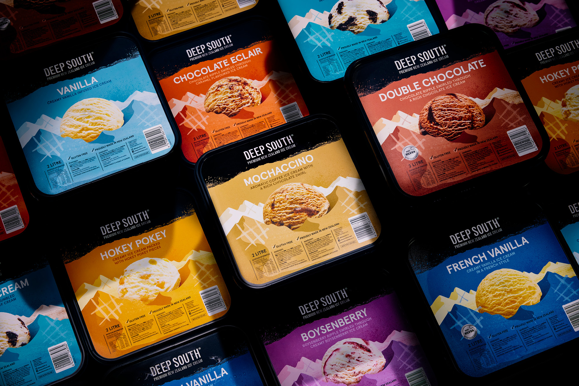
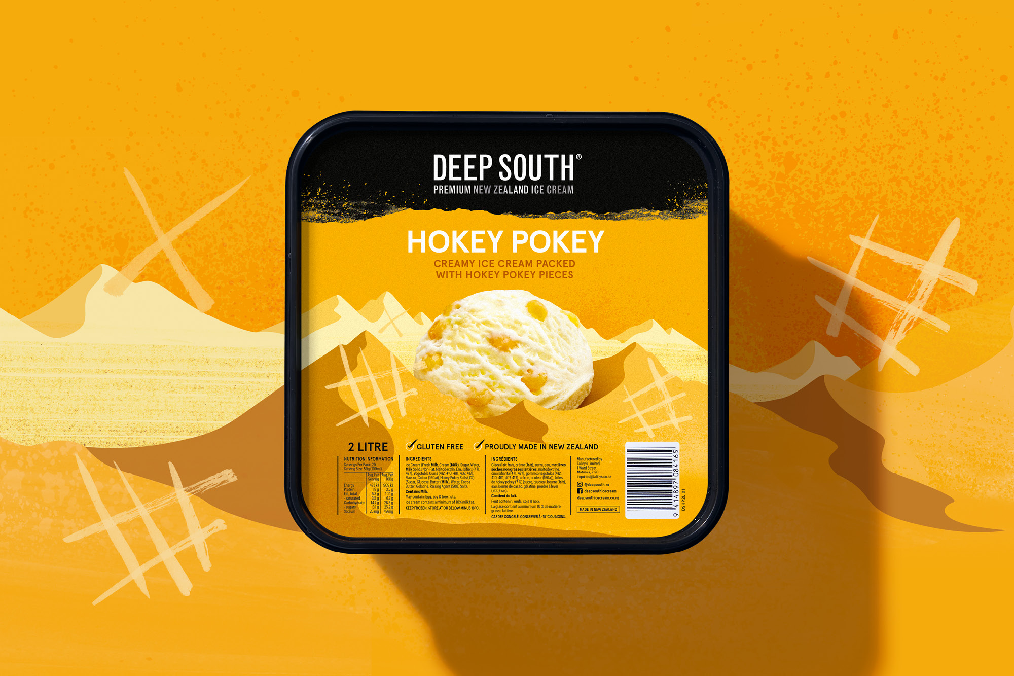
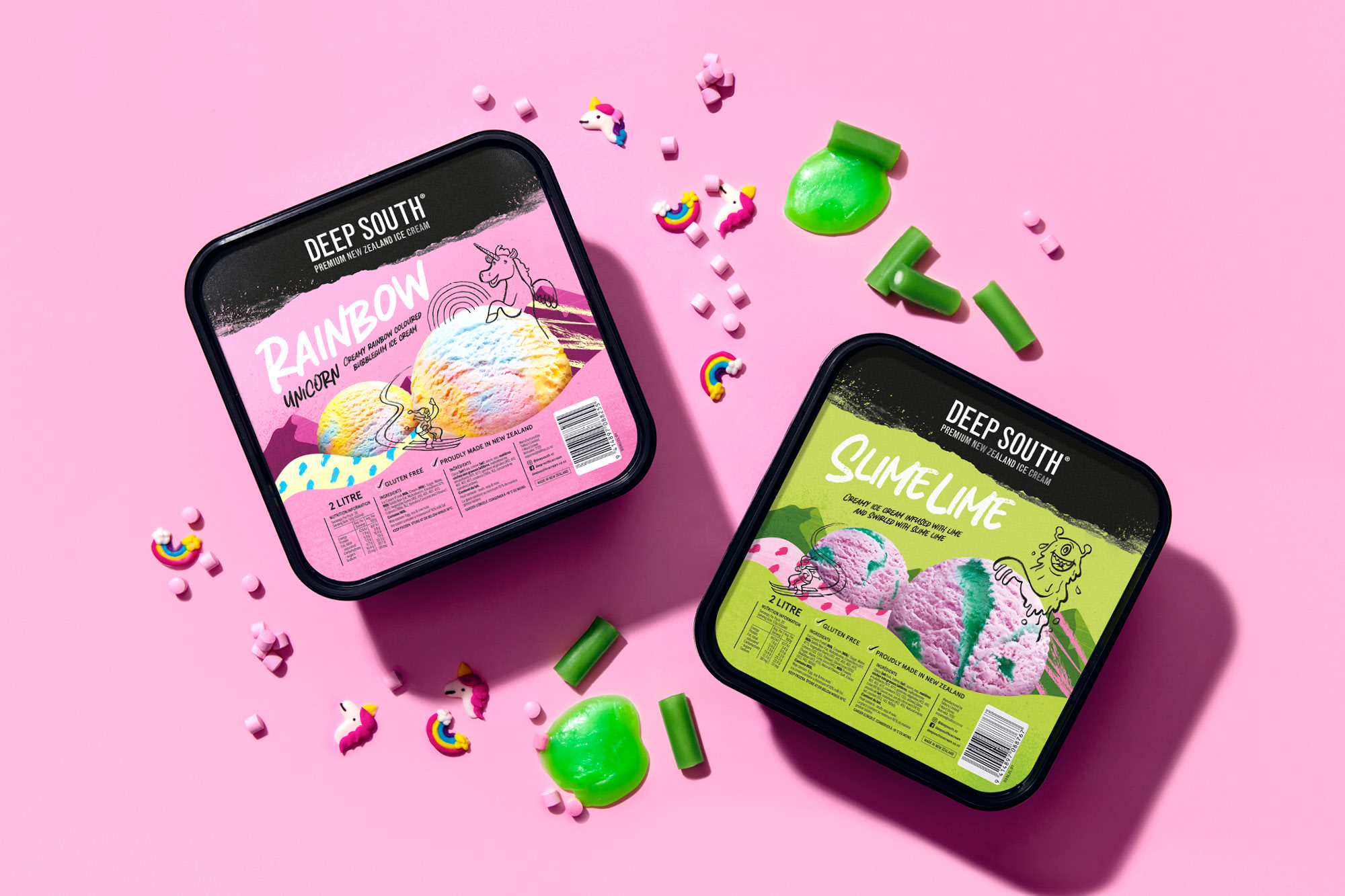
The two-litre tubs are focused on the everyday ice-cream loving consumer. For brand cohesion, the mountain range concept created for ‘Aspiring’ was applied to the tubs. A simplified landscape, brighter pop colours and reduced textures but with the ice cream still proudly sitting in the middle denote this range as the family pleasers. This range was further extended with new kids’ flavours. Taking the design language one step further, colourful foothills create more layers by introducing kid orientated typography and doodles that interact with the ice cream photography.
The result is a refreshed range that honours the brand’s past and is proud of its heritage with a livery that wears its love of the South Island on its sleeve.
CREDIT
- Agency/Creative: Onfire Design
- Article Title: Deep South Premium Ice Cream Brand Refresh
- Organisation/Entity: Agency
- Project Type: Packaging
- Project Status: Published
- Agency/Creative Country: New Zealand
- Agency/Creative City: Onfire Design / Auckland
- Market Region: Oceania
- Project Deliverables: Art Direction, Brand Rejuvenation, Creative Direction, Food Photography, Food Styling, Graphic Design, Illustration, Packaging Design
- Format: Pot
- Substrate: Plastic
- Industry: Food/Beverage
- Keywords: Ice cream, Food, Brand refresh, packaging refresh, Illustration, Photography, Colours
-
Credits:
Creative Direction: Matt Grantham
Art Direction: Sam Allan
Design: Matt Grantham
Design: Michael Nicholls
Illustrations: James Stewart


