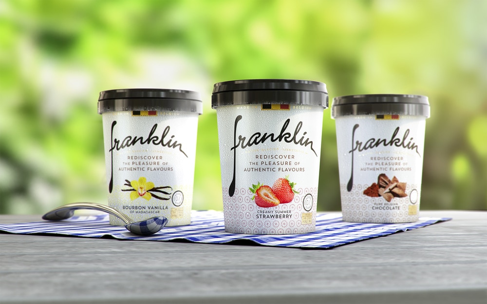
“JDO Brand & Design has redesigned premium Belgian ice cream brand Franklin. The brand was borne out of an idea to create something different – a game changer in the market. The ice cream has no added sugar but still delivers an indulgent flavour and uses the best quality ingredients and expertise drawn from the Master Glacier, Franklin himself, as well as from doctors and nutritionists. The team at Franklin believes that the low sugar and natural sweetness of the product are a way for consumers to rediscover the pleasure of real ice cream flavours. They consider the large quantity of sugar used in many recipes to damage flavours and make them taste less authentic.
The Franklin brand is a ‘meeting together’ of passion and innovation to create a ‘guilt free’ premium product. Using the natural sweetener Stevia, Franklin ice cream delivers 50% fewer calories than normal ice cream but maintains a density of 75% making it as rich, creamy and delicious as fuller fat premium alternatives.
The brand is currently available in upmarket retailers across Belgium. Leveraging the growing trend for healthier dessert options that don’t compromise on taste, the team at Franklin wanted to reposition the brand as a ‘mass-tige’ everyday premium product. JDO researched the more advanced UK market in order to ‘pre-empt’ possible trends and positioning in the ice cream category, to help lead concept direction and creative development.”

“JDO established a relevant positioning and personality for the brand that would resonate with consumers. The teams were also briefed to develop a new brand identity and branded packaging establishing Franklin as a delicious, indulgent premium ice cream whilst also communicating the ‘no added sugar’ benefit. In addition, the agency was tasked with considering how the new brand identity could translate across all touch points to help deliver a consistent look and feel.
The new design ‘a spoonful of happiness’ aims to deliver just that with a simple ‘homely’ feel evoking images of mixing bowls and gingham tablecloths. The design reflects back to a more simple time with tasty spoonfuls of uncomplicated, delicious quality ice cream.
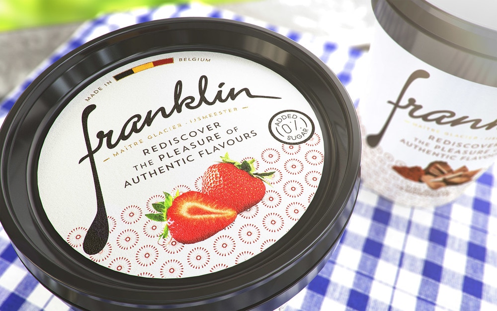
The ‘F’ spoon device creates a unique marque and acts as a short hand for the Franklin brand across all communication. This marque is repeated within the detail of the pack to consolidate the taste message in a charming and artisanal style that echoes the brand’s personality.”

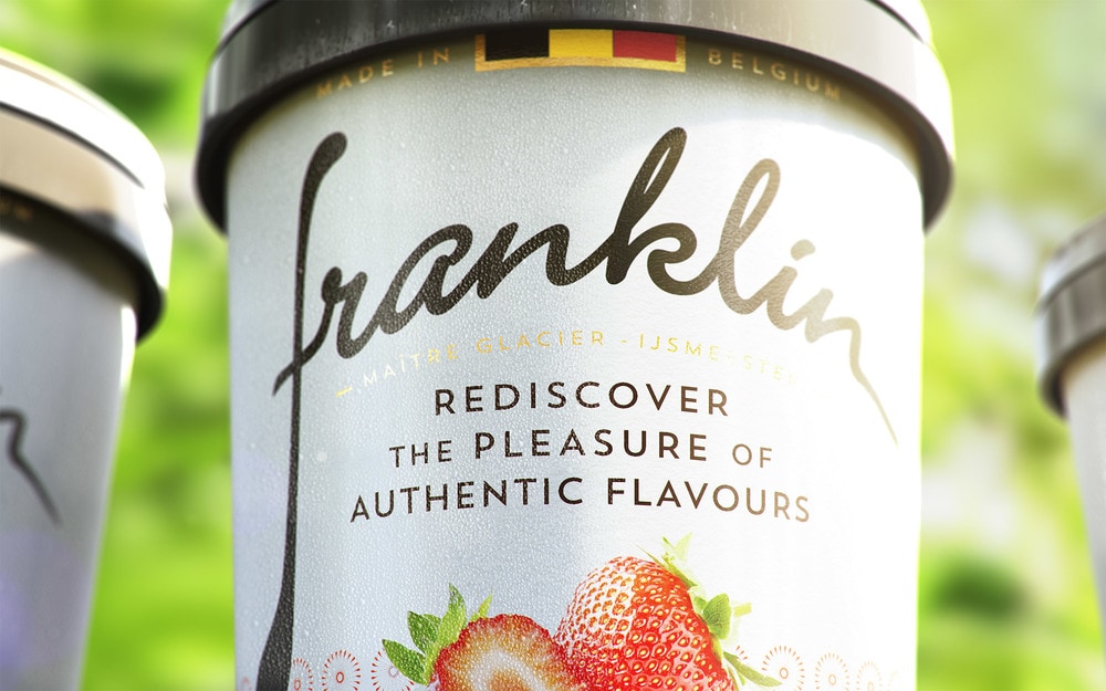
“The use of the Belgian flag at the top of the pack and lid, confirms the brand’s provenance and associated quality – a key USP for Franklin. The inclusion of the ‘Artisan Maitre Glacier’ copy in the logo lock up helps to establish the craftsmanship and premium nature behind the brand while ingredient imagery helps to reassure on the quality and taste of the product. The ‘0% added sugar’ icon delivers the health focused message in a direct and transparent way.
Ray Smith, JDO creative director said, “Rediscovering the pleasure of authentic flavours for everyone; is at the core of our new pack design. The product is delivered with Franklin’s signature and the new representation has his character at its heart. We feel that we’ve truly been able to tell the story of Franklin ice cream and to communicate the passion and knowledge behind the product.
The Franklin range launches in Belgium and is available in 500ml and 100ml tub with spoon across six different flavour variants.”


