


Background: In 1998, Eurochef Italia developed in Sommacampagna (VR) out of Stefano Stanghellini’s desire to, “Satisfy the growing need for fast, balanced food through a range of Fresh & Ready-made products inspired by high quality Italian gastronomy.” Over the years, commitment fed by passion has led to recognition of the company as a Leader for skill, service and quality in the reference market. In 2009, a new factory was inaugurated with all the certifications necessary for export, and with special attention being paid to organic products.
Throughout the years, development has been constant both in Italy and abroad. Today, Eurochef exports its fresh or frozen products worldwide.
The company pays special attention to the development of new needs. In recent years, a range of organic and vegan ready-to-eat dishes has been launched, and a production area for gluten-and lactose-free craftsman patisserie has been inaugurated.
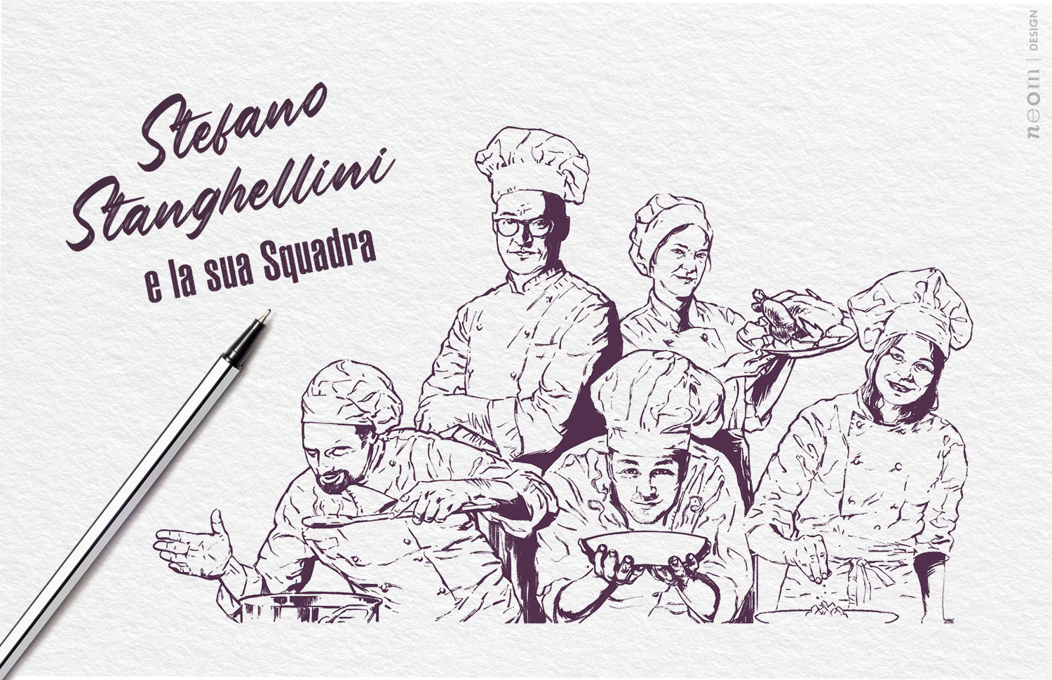
Chef a Casa brand ready-made dishes and desserts offer the chance to take advantage of the extraordinary range of recipes, prepared carefully and with passion to satisfy the daily needs of discerning customers in terms of flavour, practicality and quality. Stefano Stanghellini summarises the philosophy well, “We like simple recipes, the ones with a few, well-chosen ingredients, tasty dishes that anyone would always choose for their table because of the professional flavour and quality, noted at the first taste.”
Strategy: The strategy has aimed at giving a strong, clear signal of change to the market – Chef a Casa is here. And it’s here with the force of a company that clearly knows the value and quality of its offer, asserting it without mincing its words.
The purposely classical style with a modern touch establishes a language able to withstand current fashions.
In detail, at this delicate stage of the brand’s growth, five important goals have been highlighted: 1) the creation of precise, shared brand positioning, created together using the BrandVision® tool; 2) the creation of a coherent brand image focussed on the main concept; 3) the increase of brand visibility and the shelf offer; 4) clearly bringing out the high product quality and the properties of the various recipes; 5) to transmit freshness and appetite appeal using a tone of voice that conveys how the Chef’s team is behind each dish.
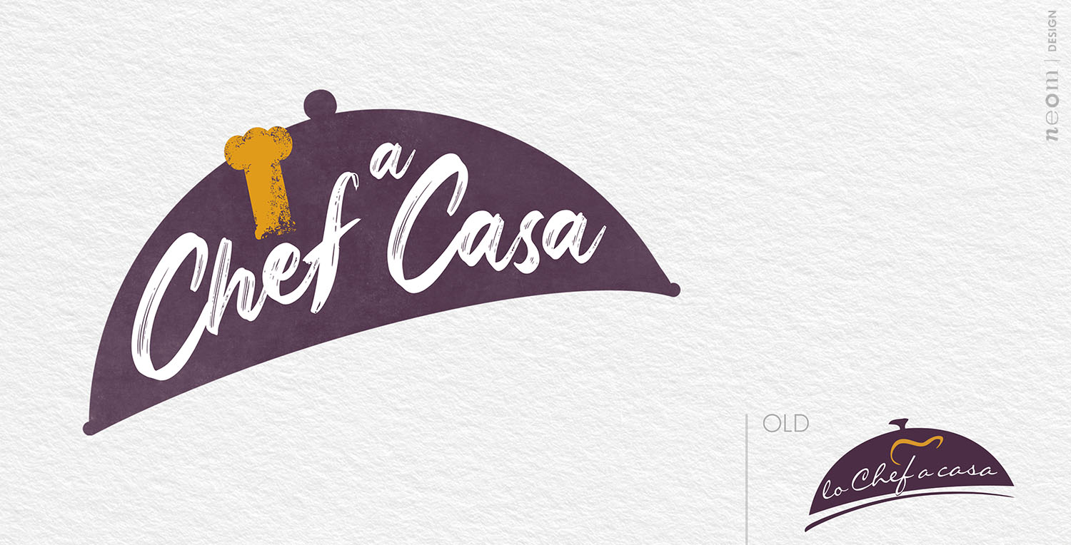
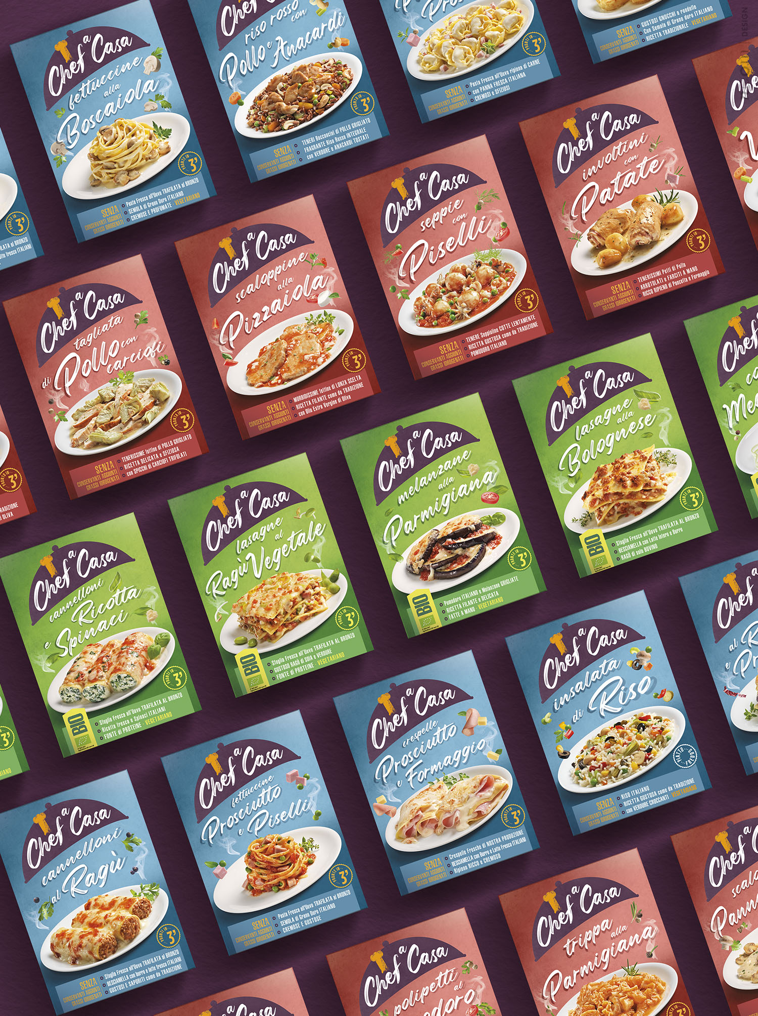
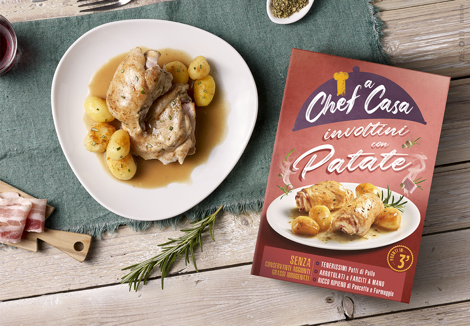
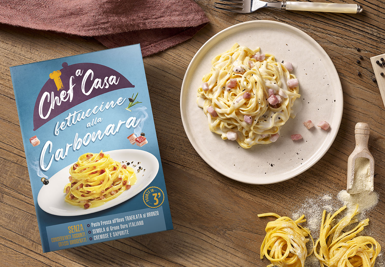
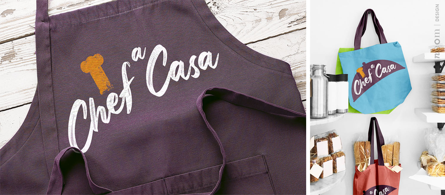
The project: Beginning with the logo, an evolution of the previous one with many substantial differences, starting with the shape of the cloche that becomes simpler but also more solid, showing reliability and practicality. The colour code has become less marked to offset the larger size expressing a determined, clear personality. Inside, the font is completely new and represents the Chef’s established presence as he signs with a stroke worthy of the food artist he is. Stefano Stanghellini has been moved to the rear where he lives with his close-knit team of cooks who create and check the quality of every recipe and dish. The chef’s hat in the logo has also been changed and now it stands imposingly above the letter ‘e’ until it spills out a little from the delimited space showing the ability to break the rules when necessary for creativity. At the second level of interpretation, there is immediately the great food appeal of the dish created purposely and skilfully shot. The dish is slightly inclined to give dynamism and the perception of ‘served’ in addition to harmonising with the shape of the cloche overhead. The name of the variant is between the logo and the dish, written with the font used initially for the logo, to highlight the same hand, surrounded by some side ingredients that transmit vitality. The background is clean and functional, like theatre backdrop, to give importance to what happens on stage. Everything is constructed to enter a relationship with the public easily, directly and immediately, working on the speed of understanding the basic concept – “professional quality noticed at the first taste”. The base is dedicated to the rational part of the mind – reasons to believe, promises and functionality. All summarised in a small, well-organised space. The range is divided into three colour codes to make decoding easier – blue for first course, ‘reddish’ for the main courses and green for the organic products.
CREDIT
- Agency/Creative: neom
- Article Title: Chef a Casa New Logo and Packaging Design System
- Organisation/Entity: Agency
- Project Type: Identity
- Project Status: Published
- Agency/Creative Country: Italy
- Agency/Creative City: Teolo
- Market Region: Europe
- Project Deliverables: Brand Identity, Identity System, Logo Design, Packaging Design
- Industry: Food/Beverage
- Keywords: readytoeat food dish logo packaging system
-
Credits:
Partner: Stefano Giuseppe Dell'Orto
Partner: Barbara Cesura
Partner: Giacomo Stefanelli


