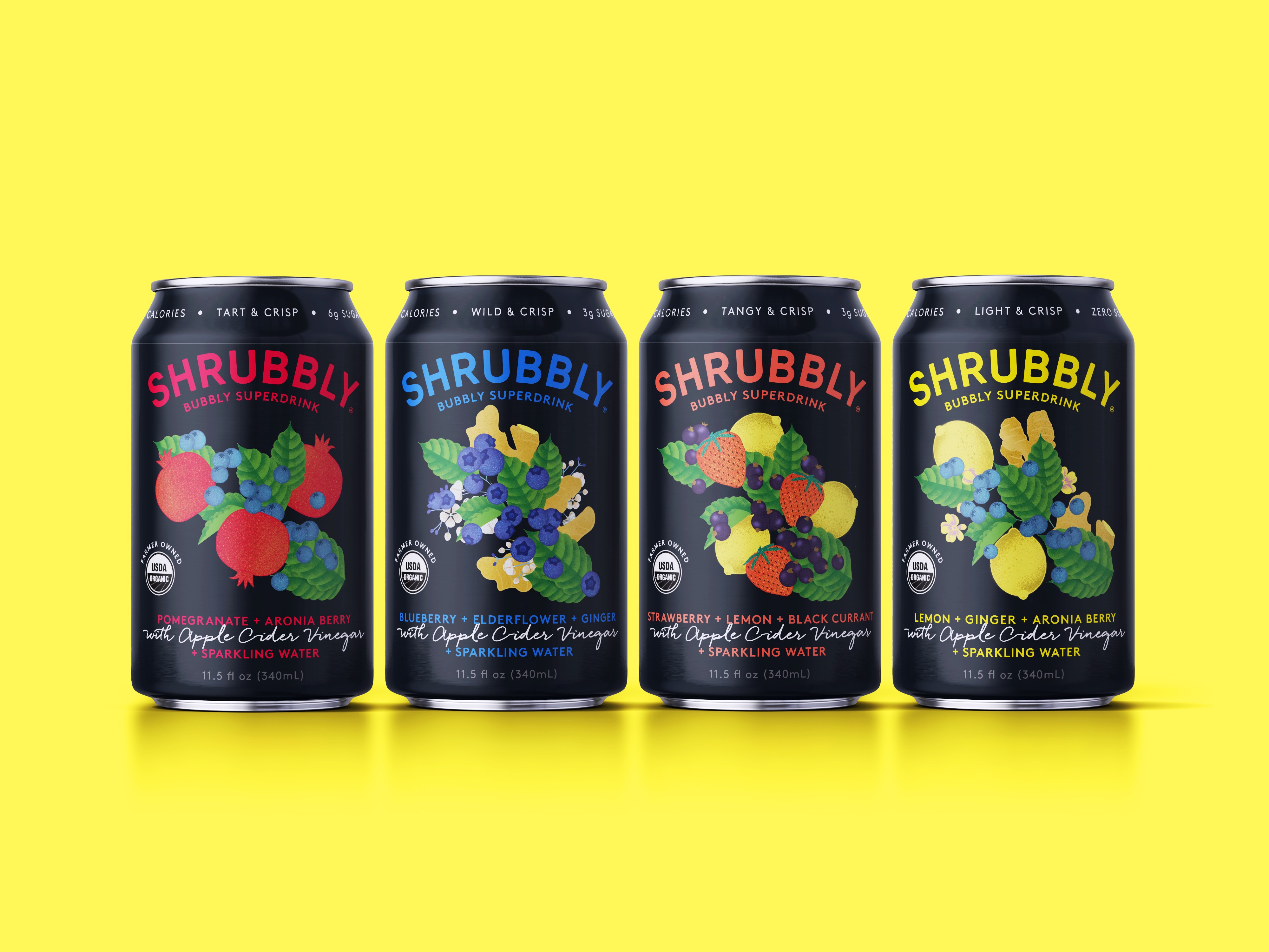
Shrubbly, founded by Matt Sayre in early 2020, was established on the basis of turning old-fashioned Shrubs into a modern functional beverage. The process of creating ‘Shrubs’ preserves often overlooked fruits and berries with herbs, spices, and vinegar. Shrubbly combines the crisp, refreshing flavor of Shrubs with a lightly carbonated water, and in turn, creates a natural, benefit-driven beverage option. This had been a dream of Sayre’s since he first purchased his Burlington, Vermont family farm in 2010.
Having launched Shrubbly and hit shelves merely weeks before the pandemic began, the initially positive consumer reaction was quickly diminished by the larger safety matters at hand. Come late summer 2021, with more regular consumer habits on the return, Sayre approached Rook/NYC hoping to elevate Shrubbly beyond the level of his earlier established functional beverage category competitors. Rook/NYC, a New York-based independent creative agency known for creating disruptive brands and packaging designs, was able to do exactly that by maximizing education without losing premium appeal.
The current category of functional beverages leans towards mass marketed, often youthful, approaches; bright colours, traditional typefaces, and abstracted illustrations. Rook/NYC saw Shrubbly’s competitive differentiations as major assets that required more visibility than the existing packaging was providing. Shrubbly, still carefully crafted from Sayre’s Vermont farm ingredients, celebrates the unique health benefits of shrub fermentation from the fruit chosen to the organic honey added to the natural health benefits of Apple Cider Vinegar. With so many positive layers of the brand, Rook/NYC was challenged to create a packaging system that translated each aspect to the consumer.
Founder and Creative Partner, Mark Christou, emphasizes that “The brand identity and design were developed to tell a story around the world of shrubs and the spirit of wildness that comes from this farm-based brand.”
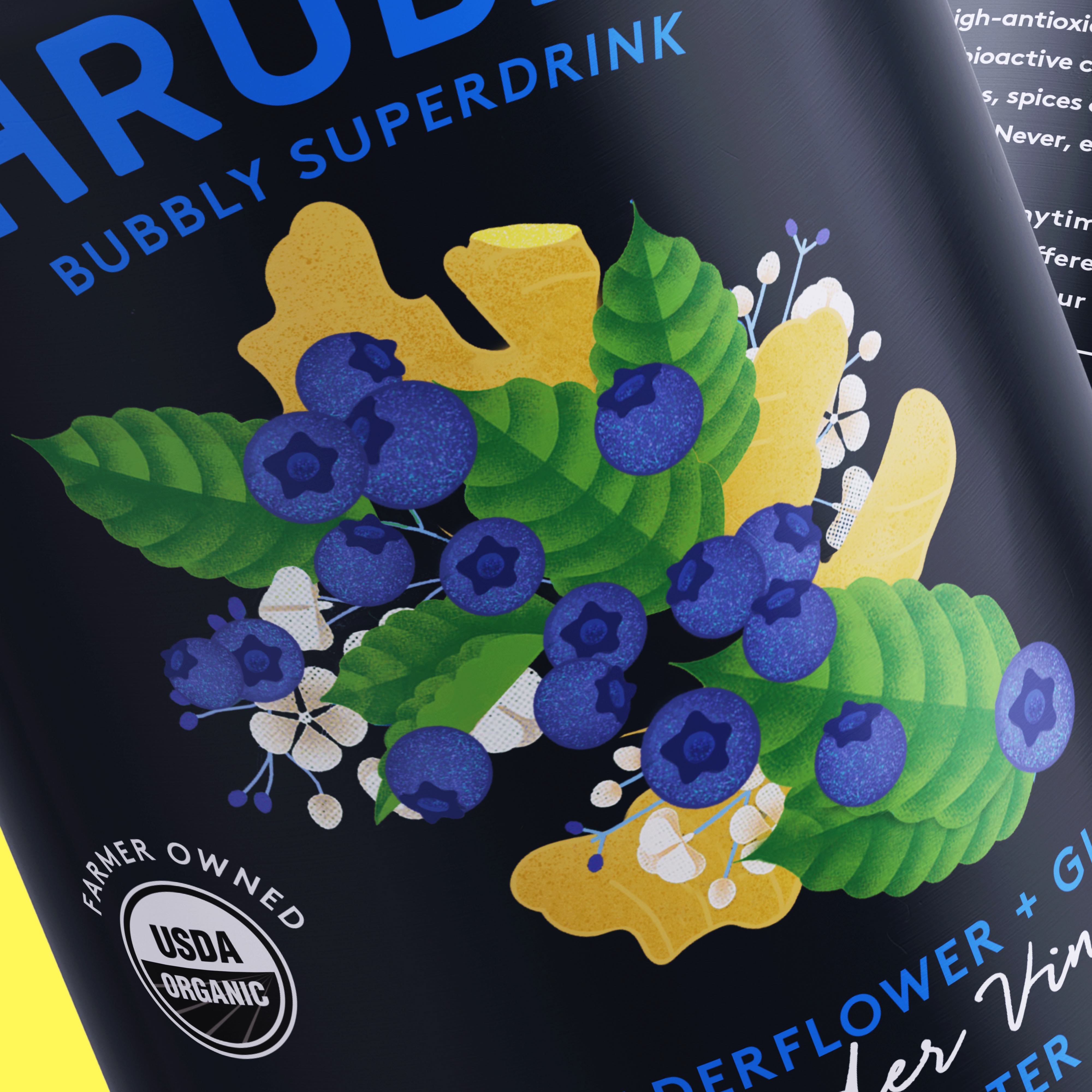
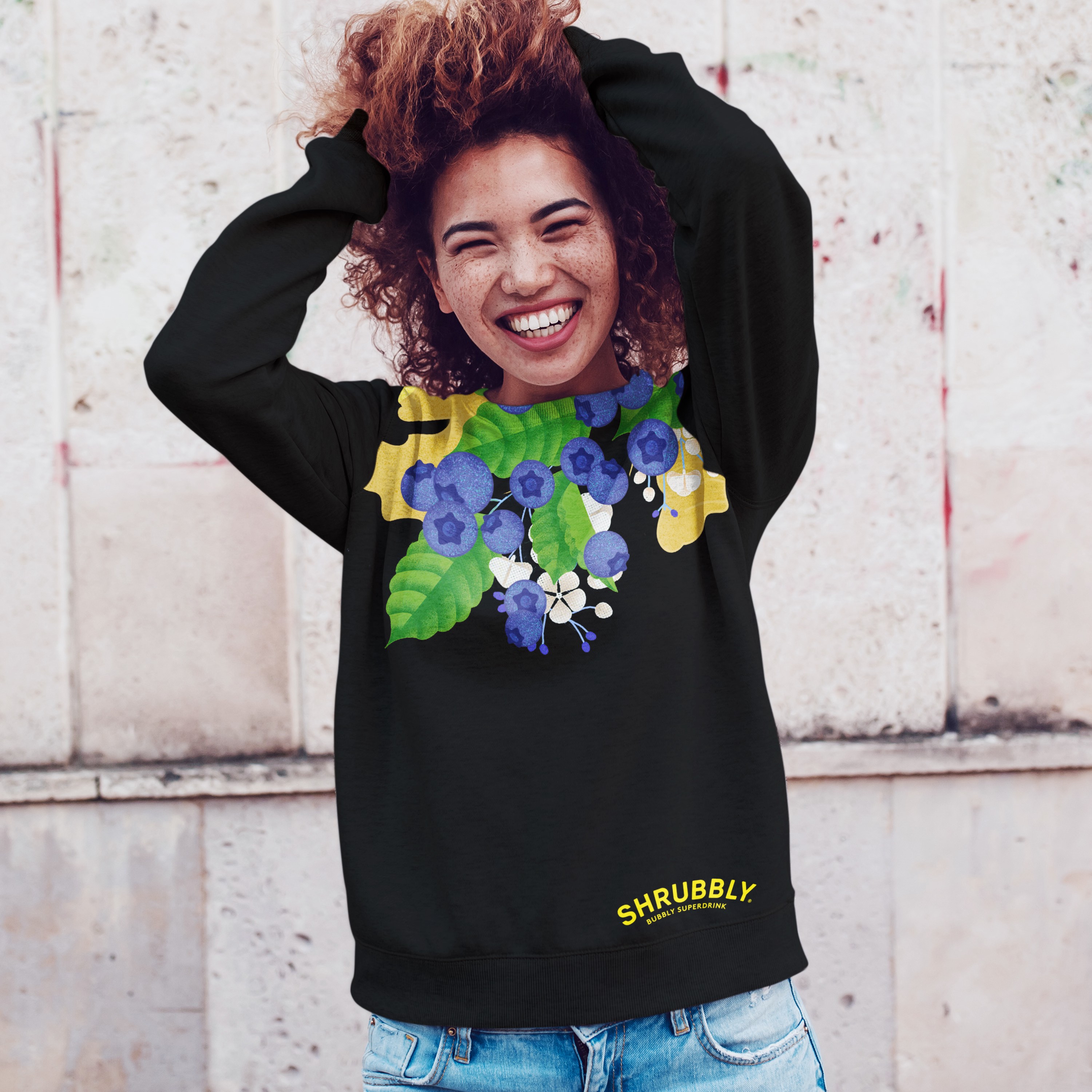
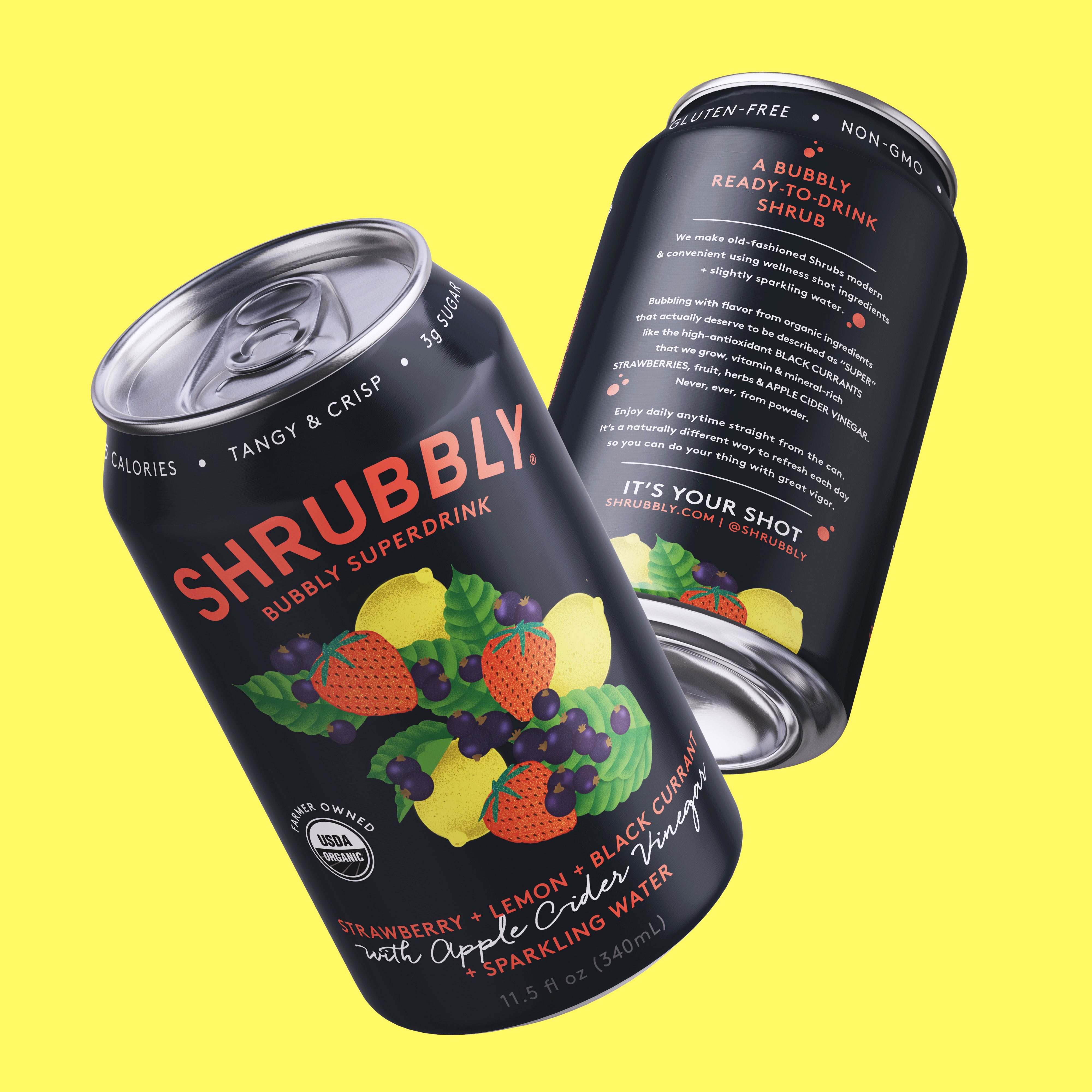
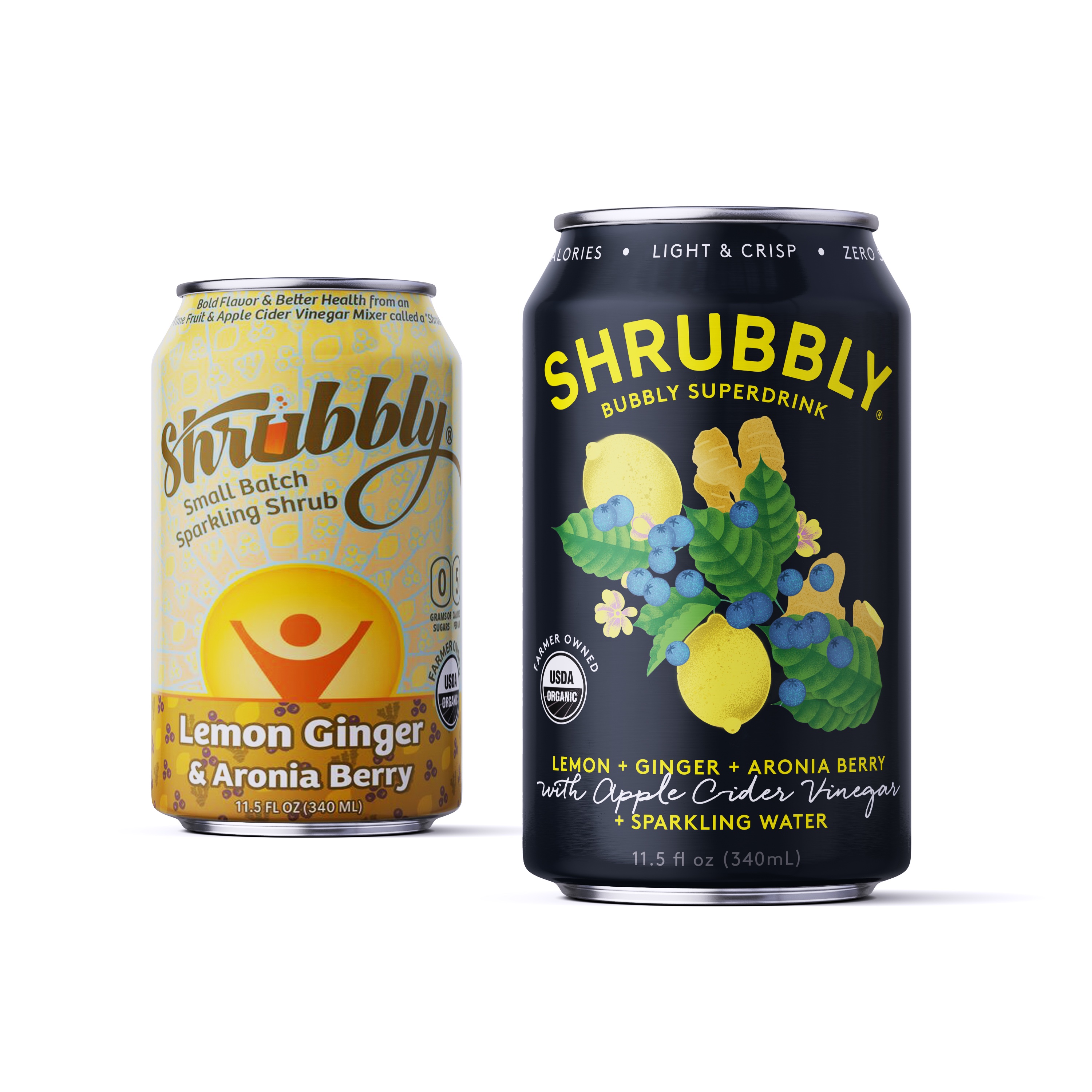
The intensity and wildness of the unique flavours and Shrub processes are what inspired Rook/NYC to create the matte black can. The black can expresses a strong presence on shelf, with bright ingredient illustrations and typography in contrast. Flavor expectations and health benefits are set at the top of the can, with various subheadings calling out additional positive attributes of the drink. Rook/NYC designed the can with visual intrigue at the front of mind, aiming to continue Sayre’s celebration of Shrubs’ unique qualities, and the carefully curated ingredients that go into each can. The centered illustrations and eyebrow shaped redesigned logo set the focal point on said ingredients, allowing consumers to recognize the shapes of lemons, ginger, and pomegranate, while embracing the potentially new shapes and descriptors of aronia berries and Apple Cider Vinegar.
“ROOK developed the term ‘Bubbly Superdrink’ to distinguish the drink from the direct and secondary competitive set. We wanted consumers to be able to pick up the drink and understand what it specifically entailed, while preserving a delicious and premium look.” Co-founder & Creative Partner, Mark Christou, Rook/NYC
Beyond the 4 full-wrap cans, Rook/NYC partnered with Shrubbly on each flavor’s 4-pack case designs, shipping trays, and website assets. Shrubbly’s new can designs, specifically of the two core SKUs, are rolling out as of Q2 2022, with 2 additional SKUs planned to launch in the 2nd half of this year.
While it is still early stages of the new designs’ release, Matt Sayre describes the result of this project as, “The new Shrubbly can designs are just starting to hit shelves but we have been sharing them with buyers during sales visits for the past month. Buyers have expressed more confidence in their ability to sell the new cans. They expect customers to be very attracted to the new cans. Current customers who we have spoken to have all responded very positively to the new designs.”
CREDIT
- Agency/Creative: Rook/NYC
- Article Title: Rook/NYC Combines Tradition and Modernity with Shrubbly Redesign
- Organisation/Entity: Agency
- Project Type: Identity
- Project Status: Published
- Agency/Creative Country: United States
- Agency/Creative City: New York
- Market Region: North America
- Project Deliverables: Art Direction, Brand Identity, Creative Direction, Illustration, Packaging Design, Tone of Voice
- Industry: Food/Beverage
- Keywords: Beverage, Shrub, Sparkling Shrub, Bubbly Superdrink, Apple Cider Vinegar, ACV, Functional Beverage, Drinks, Design, Visual Identity, Brand Identity, Packaging Design, Tone Of Voice, Pomegranate, Aronia Berry, Lemon, Ginger, Flavor, Bubbly, Typography, Logo, Illustration
-
Credits:
Illustrator: Anat Pritala


