Gorun Winery is my latest wine adventure – an exciting wine project that kept me in suspense until the end. The name Gorun comes from the oak forests around the winery, characterized by a special type of oak called Quercus petraea. The name itself is unique in its sound and meaning, so we took the bold decision to use it as the name of the winery. The logo itself is significantly influenced by the oak theme. It depicts a horizontal cut of an oak trunk with very specific annual rings and solid bark. The people from the winery are very connected with the place, the traditions and the Bulgarian folklore. Together we decided to somehow implement these themes in the design of the label, but in an associative and more modern way. This is how this new wine label design was born – a playful tangle of square elements.
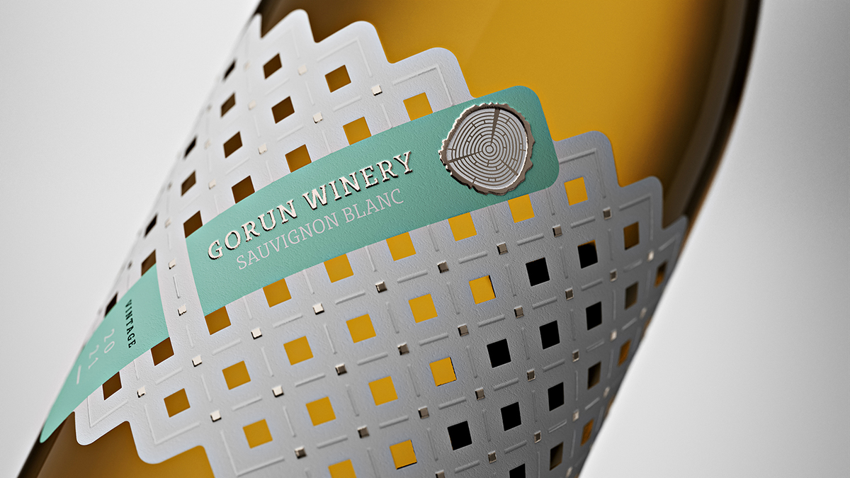
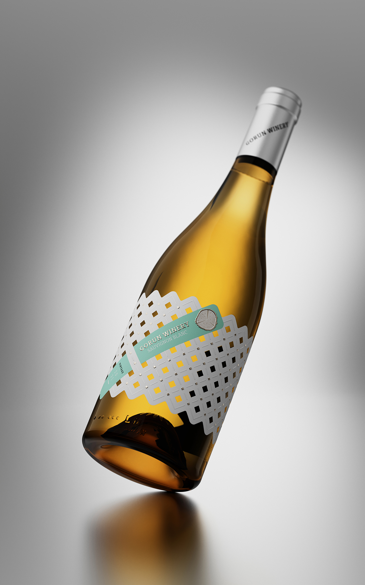
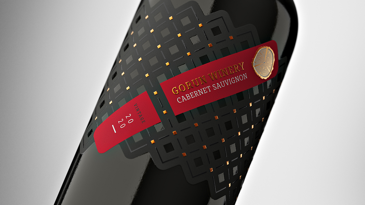
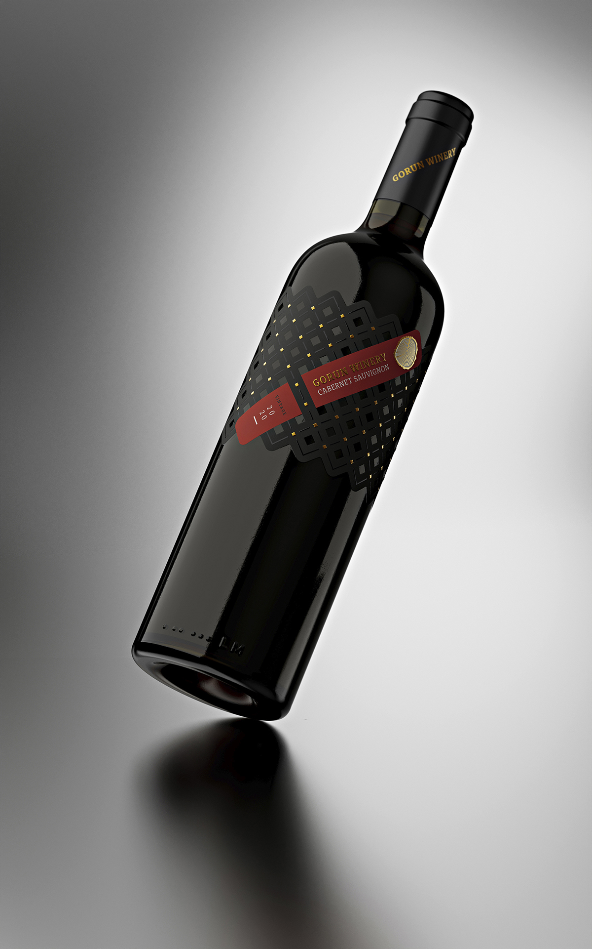
In the first versions, I used squares in different colors and the association with the Bulgarian folklore patterns was extremely close and direct. Later, however, I wanted to make the label more modern and with fewer colors, so I decided to simplify it as much as possible. The only color accent is a diagonal stripe, which is in different color for each wine. The name of the winery, the logo, the variety and the harvest are written on it. The logo itself is printed with domed metal foil with a very specific embossing effect. Each of the small squares is cut off in the paper and through it, you can see and touch the glass of the bottle, achieving a very interesting see-through effect. The result is awesome but I really left sleepless my friends from Dagaprint. The outer shape of the label follows the logic of the arrangement of the squares in the pattern. Another effect I used was a special pattern of smaller squares stamped with domed foil, combined with elegant diagonal lines printed with raised varnish.
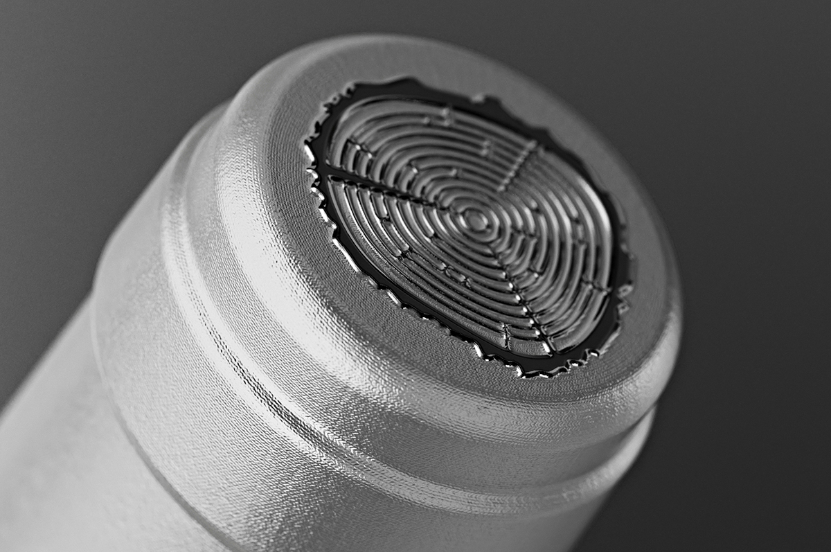
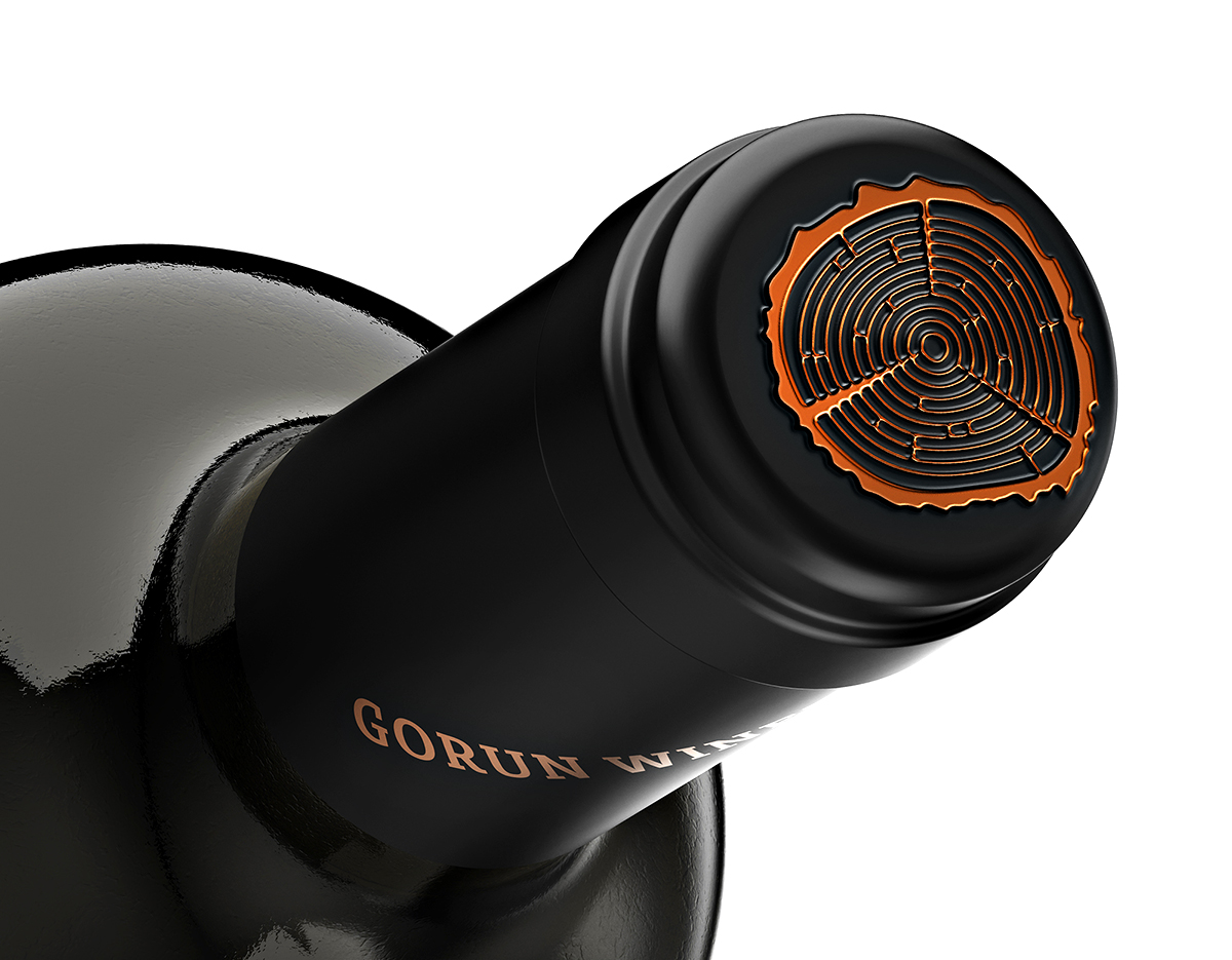
The white wines are in a burgundy bottle, while the red ones are in a bordeaux style bottle. The capsules are black and silver for red and white wines. On top of them is stamped the logo of the winery with a very strong embossing effect.
CREDIT
- Agency/Creative: the Labelmaker
- Article Title: Gorun Winery, Connecting the Bulgarian Folklore Patterns with Modern Design by the Labelmaker
- Organisation/Entity: Freelance
- Project Type: Packaging
- Project Status: Published
- Agency/Creative Country: Bulgaria
- Agency/Creative City: Sofia
- Market Region: Europe
- Project Deliverables: Brand Creation, Brand World, CGI, Label Design, Packaging Design
- Format: Bottle
- Substrate: Glass Bottle
- Industry: Food/Beverage
- Keywords: the labelmaker, wine label art, wine label designer, wine label design, wine design, wine branding, wine label print, hot foil stamping, microembossing, copper hot foil, wine brand creation, winery logo design, jordan jelev, gorun winery
-
Credits:
Client: Gorun Winery
Design: the Labelmaker


