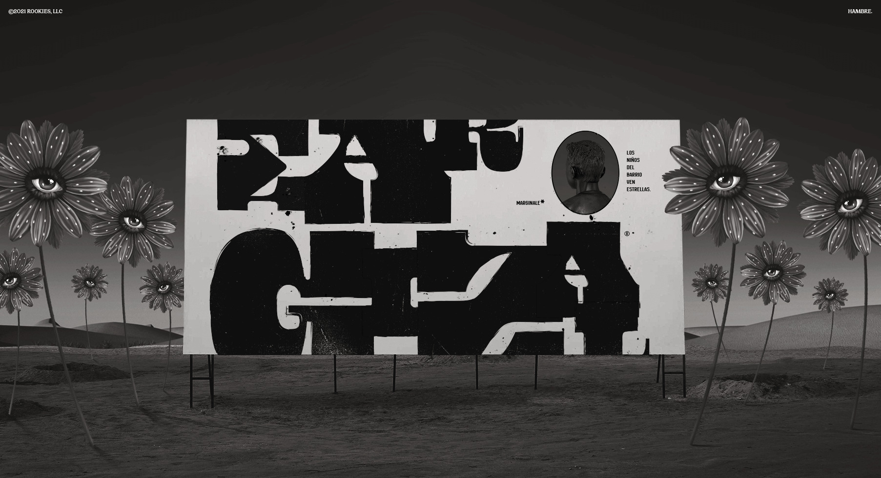
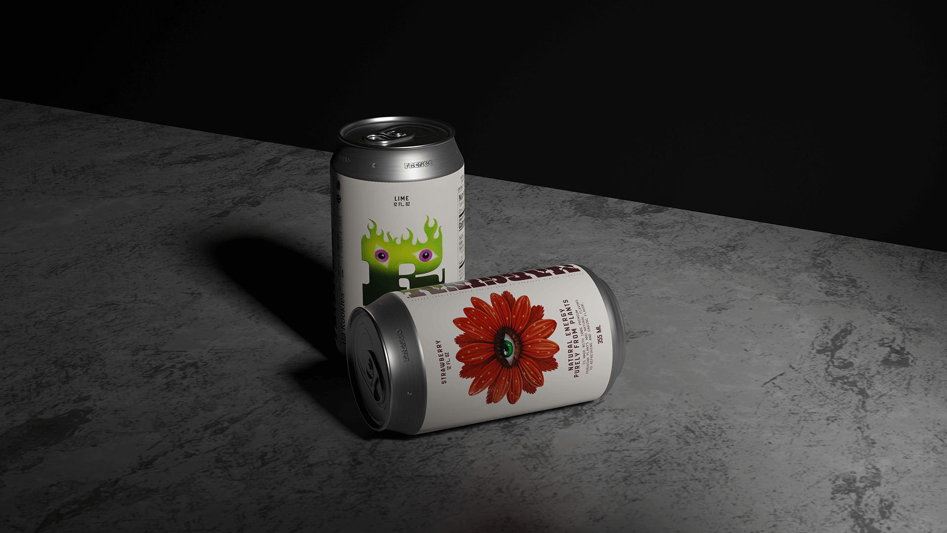
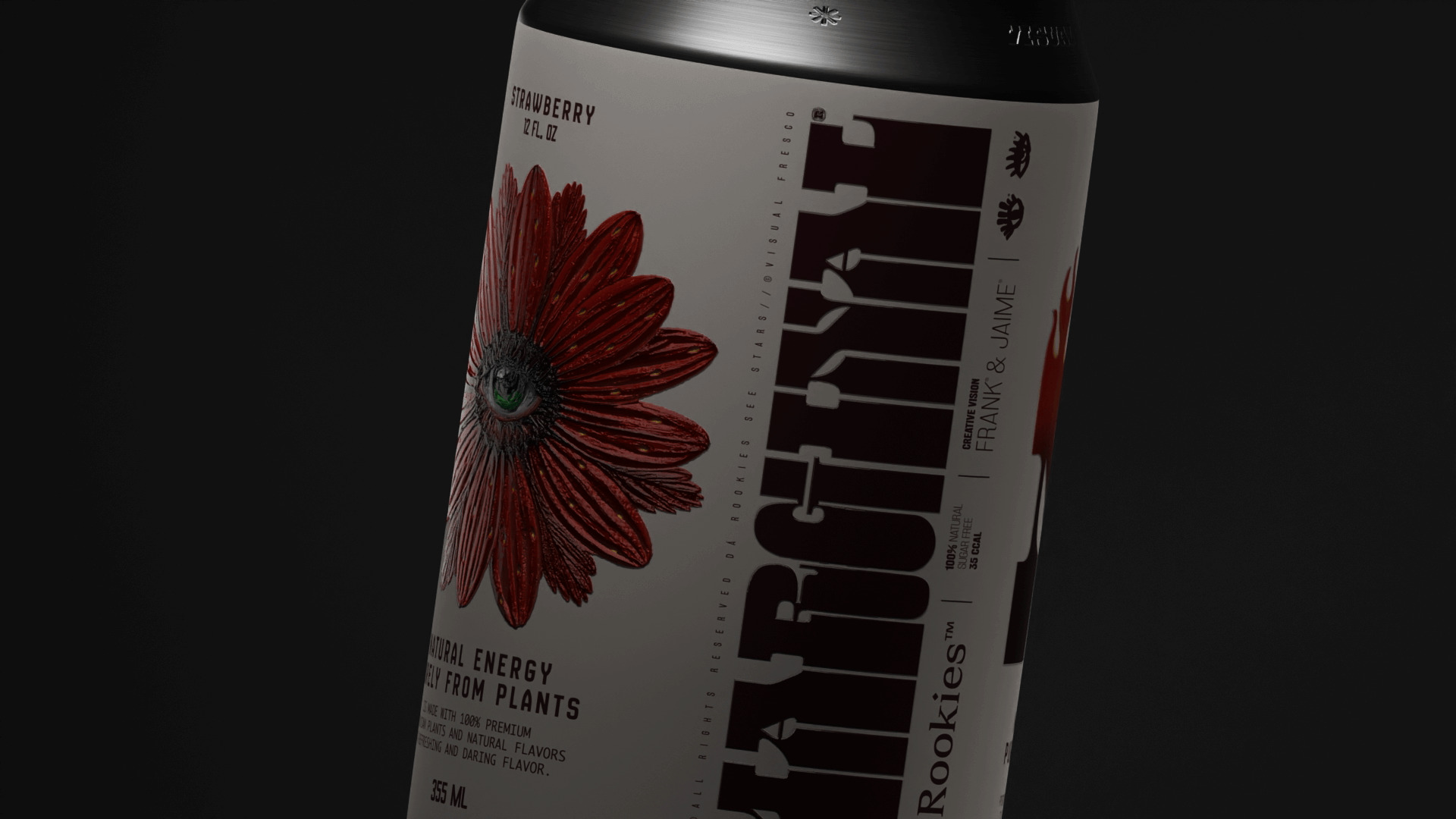
As the name suggests, the central idea and concept of the rookies revolves around the portal of vision, analysis and observation of the way we live, often synthesized and embodied as the awake and vigilant eye; in fact, the entire collection is based on powerful phrases that reinforce this concept.
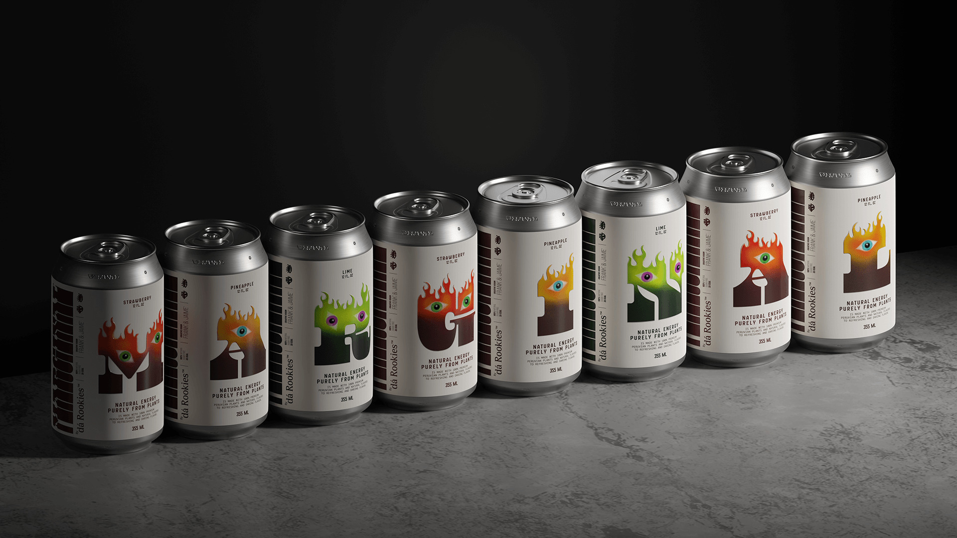
For this first publication, the concept fully adopts the ying yang system, having both sides as counterparts, on the one hand we associate leaves and color as the raw material, the positive and natural side; and on the other hand we explore the intense flavor as the uninhibited and confrontational side, turning each letter of the word marginal into a character with its duality.
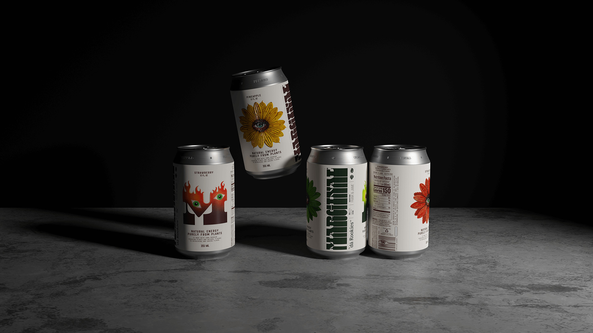
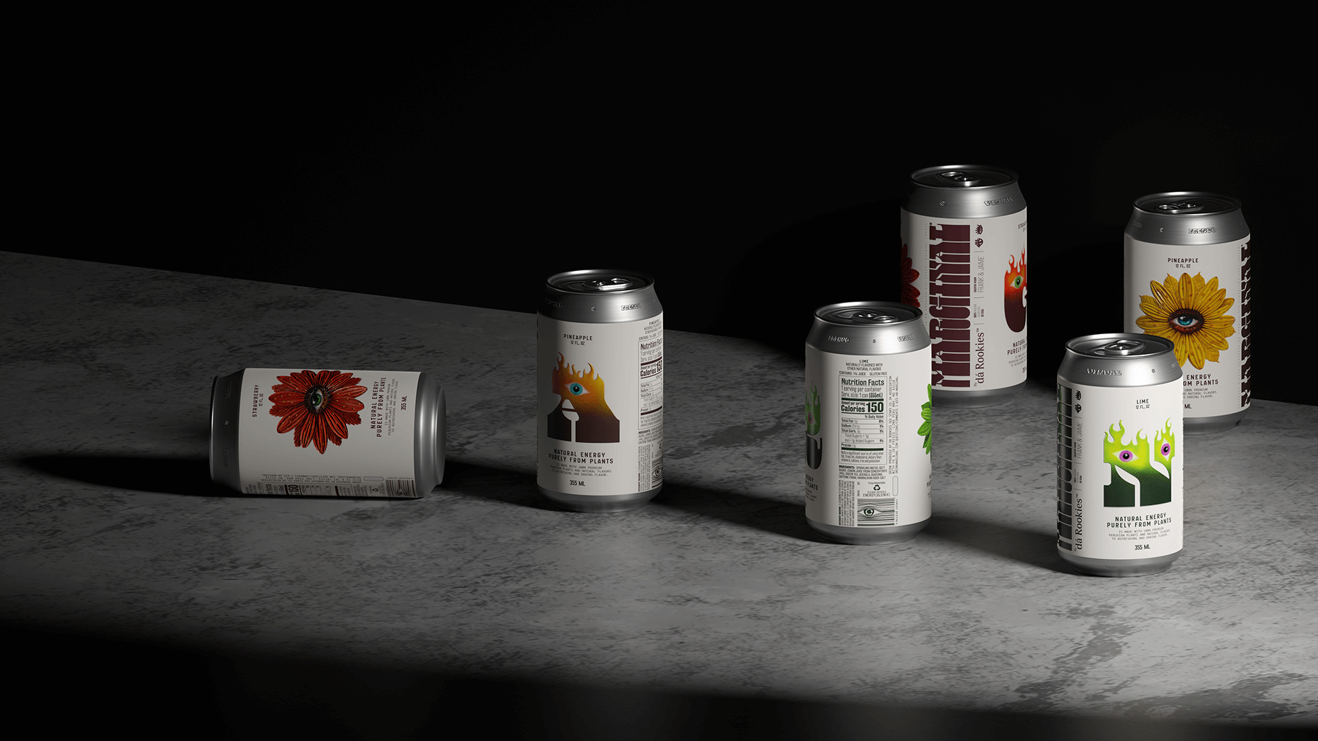
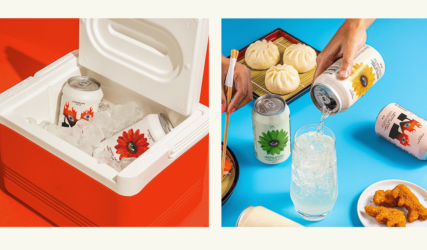
Color plays a key role in the brand’s packaging, with a color palette associated with the flavor composed of yellow, red and green, inspired by earth (yellow), fire (red) and nature (green).
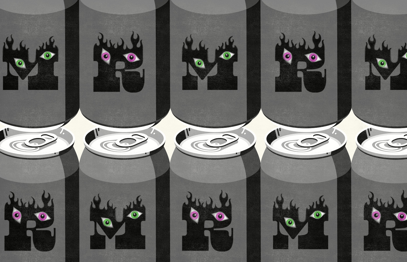
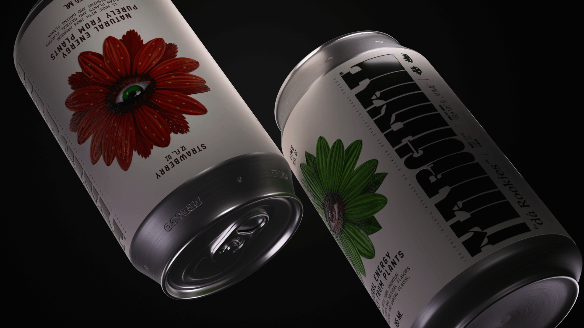
Each letter of the word marginal is thus represented alone, inspired by the name and the organic ingredients can appear in a variety of colors for different flavors. The type has been slightly deformed to have an almost brutal feel that repeats, manipulates and wraps the cans to great effect.
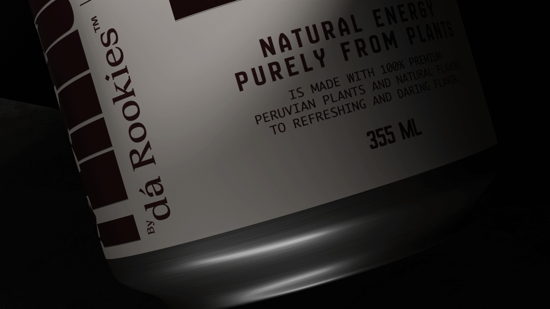
In addition, linear patterns were designed with watermarks created specifically for use as a backdrop on all packaging items.
CREDIT
- Agency/Creative: The Rookies
- Article Title: Marginals an Unpublished Concept Created by The Rookies
- Organisation/Entity: Freelance
- Project Type: Packaging
- Project Status: Non Published
- Agency/Creative Country: Peru
- Agency/Creative City: The Rookies / Lima
- Market Region: South America
- Project Deliverables: Animation, Art Direction, Brand Creation, Calligraphy, Packaging Design
- Format: Can
- Substrate: Metal
- Industry: Food/Beverage
- Keywords: Can, Art, Design, Brand, Design
-
Credits:
Produced by: The Rookiesu2122
Art Direction: Jaime Grover
Art Direction: Frank Solano


