Context
Carne is the world leader in handling the complex admin and regulatory requirements around investment funds. Their knowledge and tech platform provide digital centralisation, ease and efficiency in a siloed, fragmented and analogue industry. But by talking to a conglomeration of 40 products using a string of industry cliches, they communicated complexity and looked outdated. They didn’t stand out and no one could explain what they did – in fact many clients were simply unaware that Carne could help them. Their website generated zero leads.
Challenge
Two things can’t be stressed enough:
– The siloed, fragmented and analogue nature of this industry, tied to a conservative attitude towards change based on a fear of risk.
– The need to address complexity, and make change feel safe.
The brand had to address both of these to succeed.
More specifically, the challenge was to:
Simplify how the business offer was expressed: make the complex feel easy
Protect existing revenue streams
Win business in new areas – those running their own management companies weren’t aware Carne could help
Communicate the vision for wholesale change to ambitious CEOs
Position Carne as a digital leader
Educate and inspire the internal audience
An audit of the sector showed problems with communication to be universal – we argued to Carne that allowing us time to understand their offering and audience properly would lead to them creating a clearly differentiated position in the market on clarity of offer alone. This played out.
Process and foundations
– The complexity needed unravelling. We undertook a root and branch reappraisal of culture and messaging over several months: hundreds of hours with directors, employees, clients and investors, plus familiarisation with the technology.
– Carne’s willingness to do this enabled them to differentiate from competitors, who uniformly struggle with complex subject material
– This area of finance is dominated by common visual cliches (bridges, journeys, digital matrix, blue…) We mapped this and showed how to create stand-out but still win trust.
– We identified the changes that Carne brings about for clients: from slow to fast, stressed to reassured, inefficient to efficient and so on. This informed the core strategic creative idea.
– We took employees on the journey with us. We built values to preserve Carne’s strengths: thoughtfulness, togetherness and bounce, and values to guide the adjustments required by an ambitious vision: discipline and tenacity. Each value set out clear expectations of both employee and employer in terms of behaviour… and what this meant for the client experience. The order of the values told a clear story.
– We identified the ‘target emotions’ (in order) required for risk-averse potential customers to choose Carne: trust, relief, reassurance, confidence, excitement. All work was judged against these.
Strategy, creativity and innovation
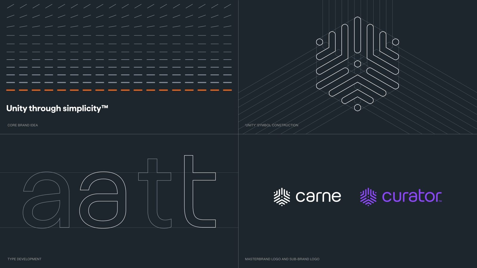
We built the brand around a vision for the industry, “Unity through simplicity” which addressed the need of all target audiences to address fragmentation. Several visual and verbal themes evolved out of this idea:
Visual elements
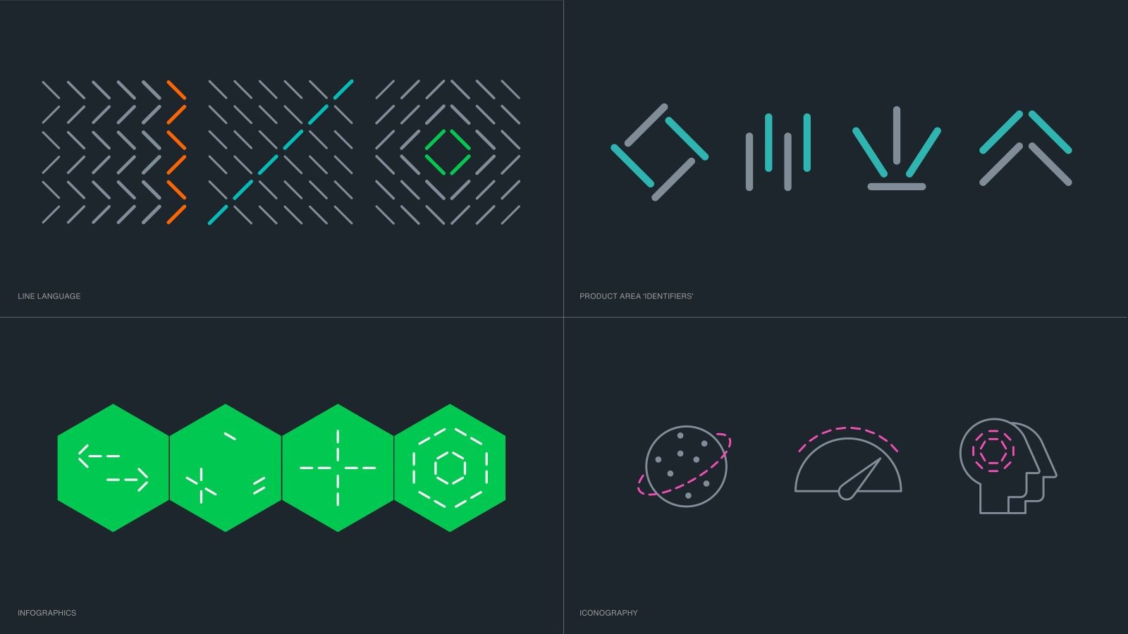
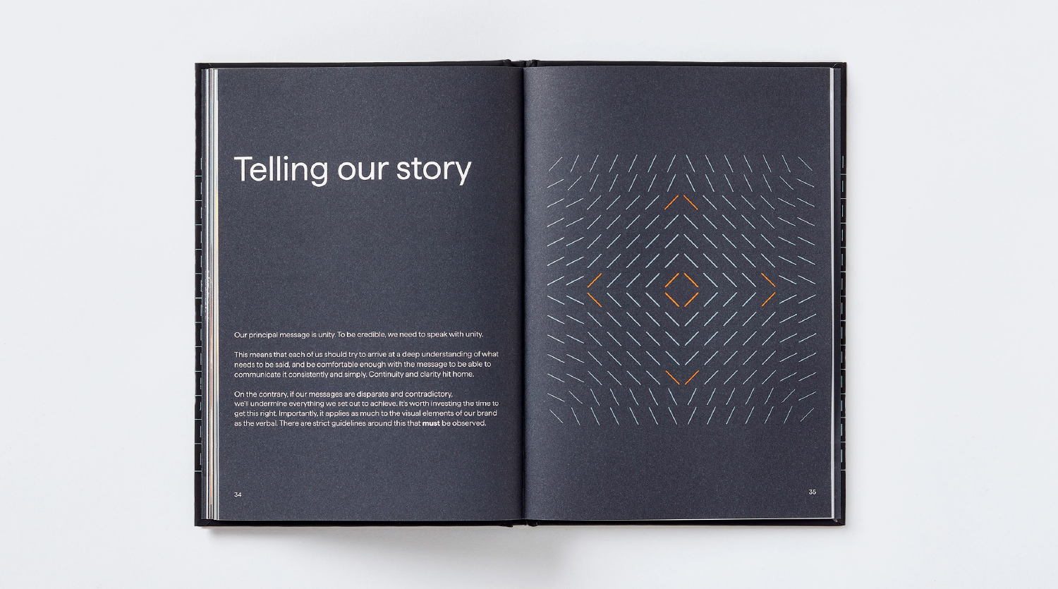
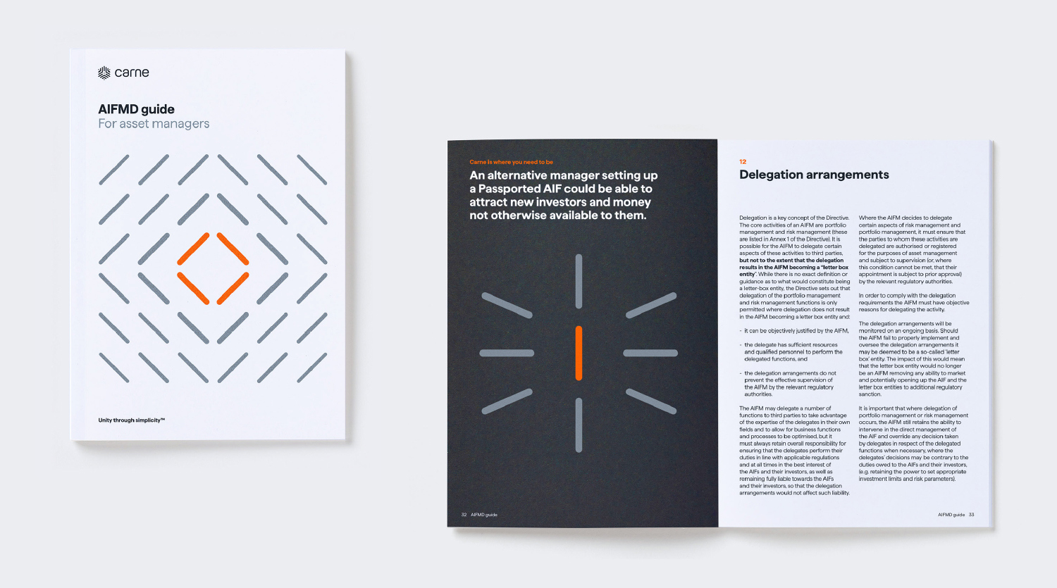
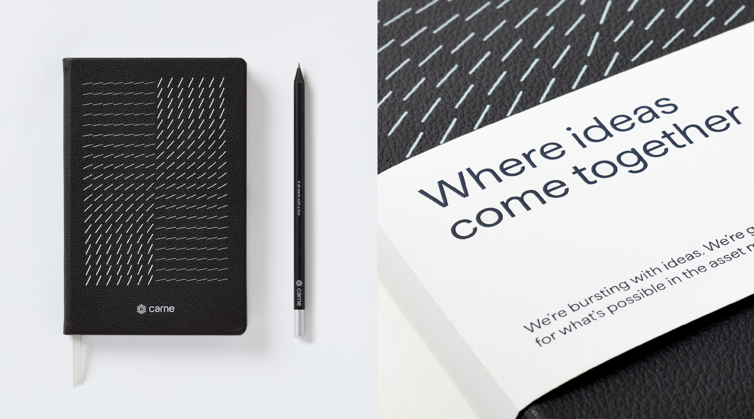
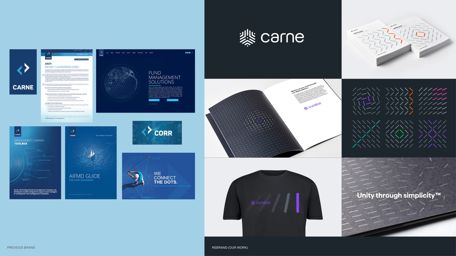
– Our visual building block is the simplest way to unite two points – a line.
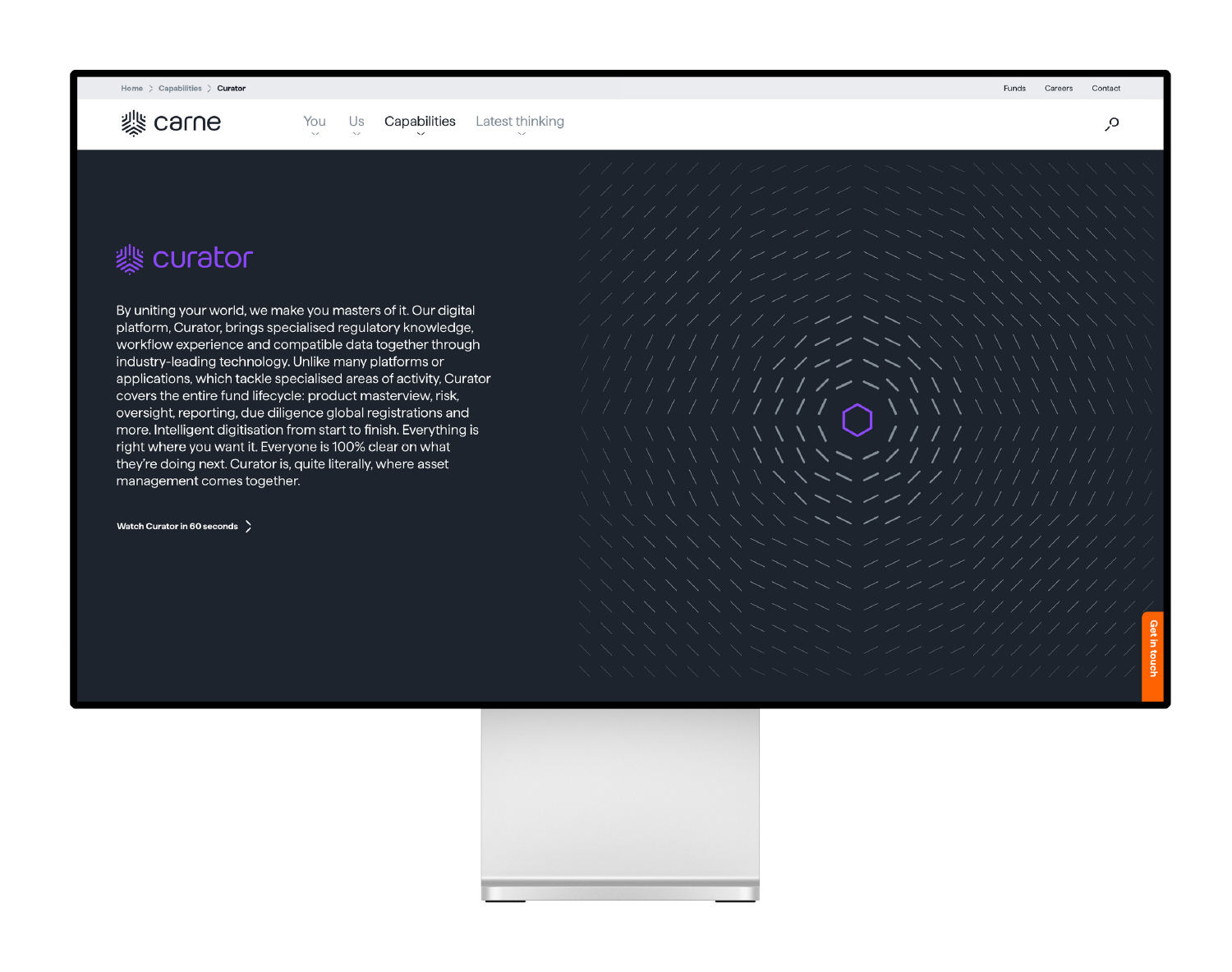
– This is a brand that moves, like data and information moves, but in a way that avoids the data cliches that abound – this positioned Carne as a digital business
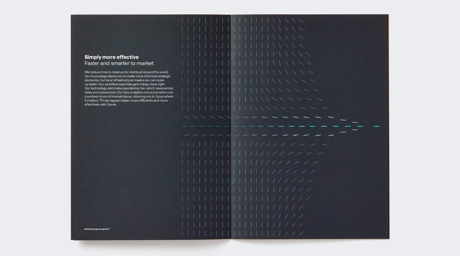
– In the Carne visual language things are always moving together, from disorder to order, to reflect unity.
– The line language evolved from this is flexible, extending from simple icons through to dynamic animation. By moving in and out with scale, Carne can control the intimacy and sophistication according to message and audience.
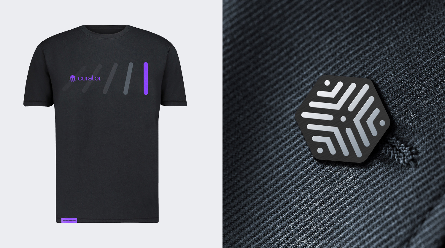
– The mark, or “unity symbol’, uses the lines to convey three key areas converging towards a single point.
– The typography in the logotype uses simple clean characters to complement the line use.
– The colour palette reflects the need to win trust before building excitement: reassuring, solid greys and whites are laced with brighter accent colours.
– The lines and colours help distinguish the service lines and products (see brand architecture below).
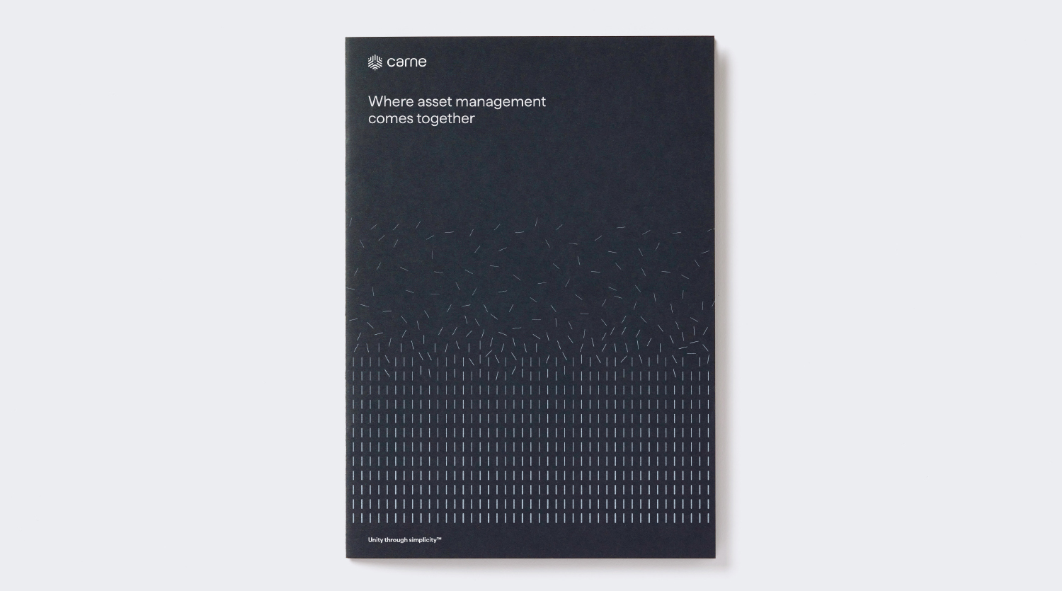
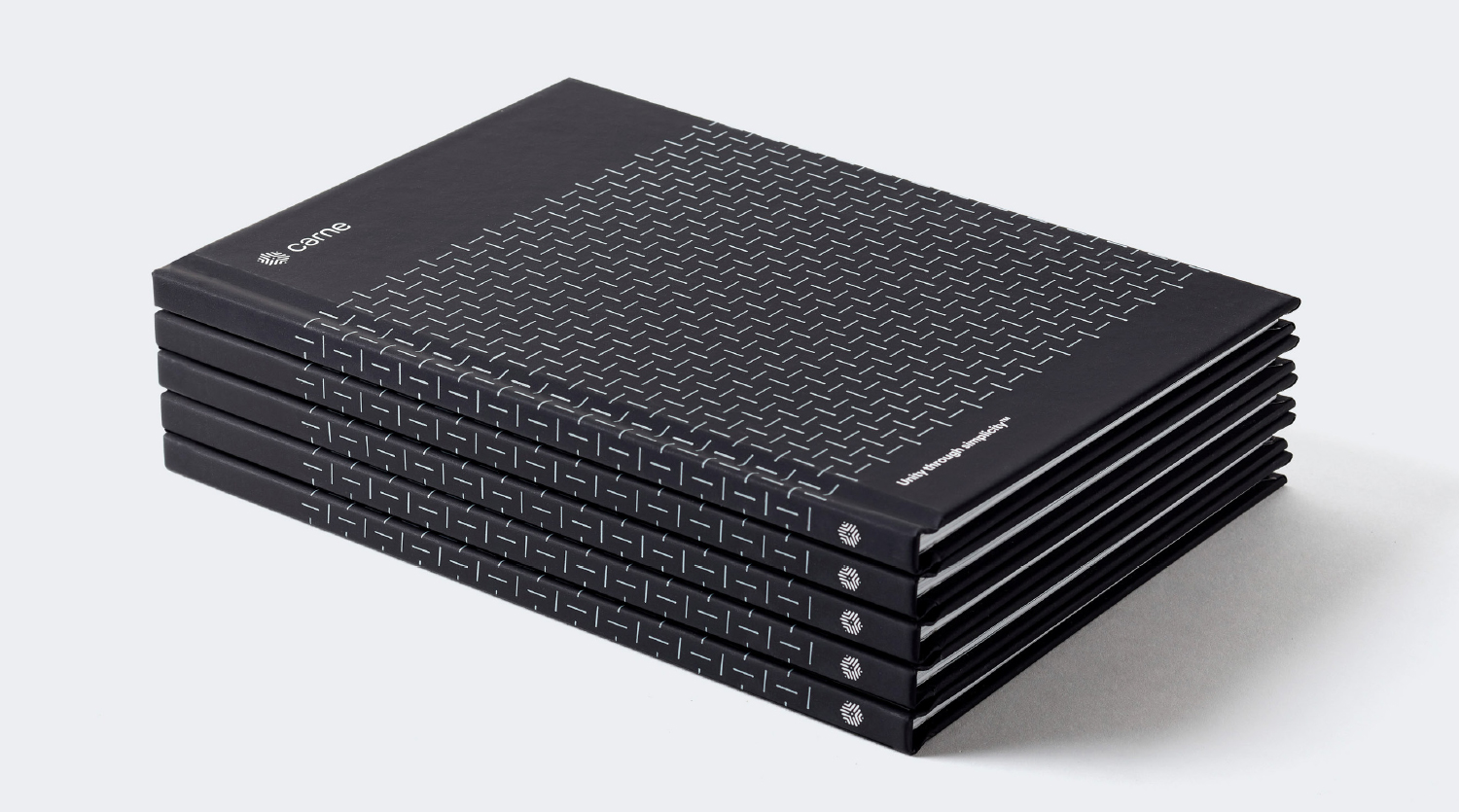
– The lines subtly reinforce the core brand idea in many discreetly crafted areas, for example the stitching of brochures.
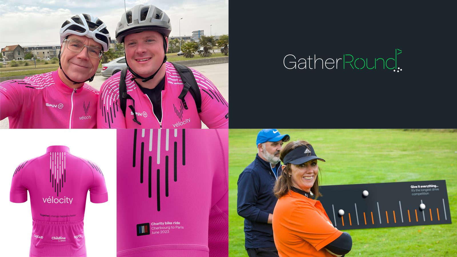
– The lines have successfully given meaningful and playful shape across a number of touchpoints, including two major corporate events – cycling and golf
Verbal elements
– We workshopped how Carne should sound, to create an assured, empathetic, calm, clear and energetic tone of voice.
– Much of this tone of voice is tied up in the careful unpacking of information, narrative building to buy time and interest.
– The technology platform CORR (a complicated acronym) was renamed Curator, instantly communicating how Carne’s clients are in total control from the big picture to granular detail.
– The brand headline of “Where asset management comes together” is an inspiring rallying call relevant to all audiences
– All this was measured against the “target emotions”.
– We simplified dense, incomprehensible presentation decks.
– We simplified messaging on the website and brochures, saving content for face-to-face presentations, where Carne perform well.
– In adverts and elsewhere we showed that with trust established, well targeted, emotive language could generate excitement: “Supercharge your ManCo”; “GatherRound” (an inclusive golf day), “Expertise where it counts”, “Force for good” (ESG and charity work), “Make your mark” (internal careers), “Together, change happens faster” (charity bike ride).
Brand architecture and naming
Since the technology here is the unifying force, we elevated it to a sub-brand and renamed it Curator to communicate clients’ control over information and knowledge.
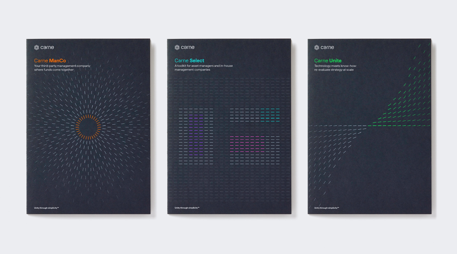
We simplified 40 products into 3 service lines. This:
– Allowed Carne to quickly direct the conversation to different audiences, making every word focused and relevant – no irrelevant noise
– Allowed employees and clients an immediate grasp of the history, business proposition and the vision
– Supported the business plan: protected ‘business as usual’, opened the next market, and set out the long term vision
– Created simplicity
– Built trust
– Bought time and headspace to unroll more involved propositions
The 3 service lines in detail:
– Carne ManCo
Funds launched in Europe are subject to a range of complex reporting, governance and regulatory obligations, which must be managed by a separate entity from the fund. It’s often cheaper, safer and faster to outsource, and Carne has become the global leader in this “third-party management”. “Carne ManCo” directs customers quickly to ‘business as usual’ whilst setting the foundation for a bigger story. ManCo is common industry vernacular for management company.
– Carne Select
90% of the industry still try to run management companies in-house – this does not mean they are efficient. Carne uses its expertise and technology to offer a toolkit to this untapped sector, which until “Select” was completely unaware Carne could help them. “Select” communicates quality, choice and control: helpful and non-threatening for tactical mid-ranking decision-makers.
– Carne Unite
The software also allows companies to think big, and move entire portfolios to a place where they have total visibility and control over data and workflow. We called this Carne Unite – the ultimate vision for the digitisation of the industry. It’s aimed at the ambitious C-suite, and includes broader targets such as institutional investors, distributors and consultants.
Other naming:
– The digital platform, CORR, a complicated acronym that was clearly off-brand, was renamed Curator, instantly communicating how Carne’s clients are in total control from the big picture to granular detail.
– Carne’s industry golf event was named ‘GatherRound’ – a play on a ‘round’ of golf, but clearly alluding to unity and coming together. Players gathered round the pro, their team’s ball, or industry ‘big hitters’ – the event was a huge success for its inclusivity, including lessons for beginners and a balance of 50% women at traditionally male-dominated event.
– Carne inaugurated a flagship charity bike ride. This was named ‘Vélocity’, with the tagline “Together, change happens faster”. 40 riders have raised €83,000 for children’s charities.
Interiors
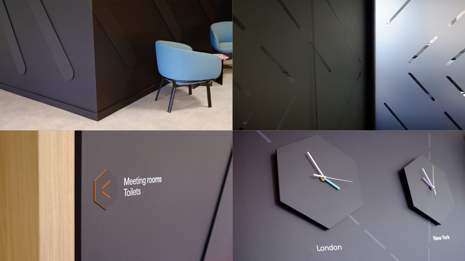
We worked alongside an interior architect firm to design and implement the brand across several global offices. The offices vary from large regional centres designed for client experience through to smaller satellite offices more focused on client servicing. With post-Covid hybrid working adding to the complexity of the brief, we designed a scalable system that would work for all interiors and uses – some examples of this are a cohesive signage and wayfinding system that uses 3D plaques that echo the logo shape, 3-dimensional graphic lines wrapping around walls to create an understated texture within client facing spaces and bespoke hexagon shaped clocks where the hands echo the lines from the language.
Internal engagement
Unity had to be lived out to be plausible. We took all 500 employees through a series of seminars, and gave each a brand ‘spirit book’ to ensure the thinking was clear for all, so they in turn could take the message out in a simple and unified way.
Events
The brand idea and visual language have brought thematic focus, visual clarity and playfulness to Carne’s flagship events. Carne used the rebrand to realign the events to the new brand, creating genuine difference through engaging occasions. Unity, in particular, has proved an effective theme for bringing people together, be that an inclusive take on a famously exclusive sport like golf, or the teamwork of a peloton in cycling. The visual line language brought the events to life through a series of thoughtful touches:
– Personalised golf cart number plates, course signage, merchandise and animations for GatherRound
– V-shaped peloton logo from line-language, riders jerseys, fundraising assets including animated social media gifs for Vélocity
The events won widespread acclaim. “The most enjoyable event I have been too. Loved the format and the theme of inclusiveness. Bravo!” wrote one participant. “You pretty much gave the industry a lesson in how to run a golf tournament (or any industry event for that matter)”, wrote another. “Inclusive, fun and excellently branded, really super job.”
Impact
Carne generated 40 new unsolicited website business leads in four months (up from 0).
Two pre-rebrand “Carne Select” lunches produced no business leads. A third, post rebrand, produced 10. This event will now be rolled out in other countries.
John Donohoe, CEO
“They acted like our psychologists. They have done what I think is very rare in our sector and in branding in general: capture our spirit as well as our business vision.”
Eoin Sheehan, Marketing Director
“We have received incredibly insightful business consultancy as well as brand strategy and design, and that has been seen as invaluable by our leadership. The way data moves is going to play a key role in shaping the industry, and the imagination with which Clout have bought this to life, and made it so easy to understand, both visually and verbally, has positioned us as the leaders in this critical field. This feels like alchemy compared to our old brand.”
Mike O’Brien, Non-executive Director
“I have been through global rebranding processes with both Barclays and JP Morgan, and I have to say that the processes followed, the thinking and the standard of work displayed here is far beyond anything I witnessed on those projects. How you have merged the business with the culture and the future aspirations and strategy is without precedent in my experience.”
Ciara Heslin, Chief People Officer
“You have done what we never could: explain what we do and capture our spirit”
CREDIT
- Agency/Creative: Clout
- Article Title: Clout Puts ‘Unity Through Simplicity’ at The Heart of Carne Group Rebrand
- Organisation/Entity: Agency
- Project Type: Graphic
- Project Status: Published
- Agency/Creative Country: United Kingdom
- Agency/Creative City: Cardiff
- Market Region: Global
- Project Deliverables: Animation, Brand Design, Brand Guidelines, Brand Identity, Brand Naming, Brand Strategy, Brand Tone of Voice, Identity System, Rebranding, Web Design
- Industry: Financial
- Keywords: WBDS Agency Design Awards 2023/24
- Keywords: Asset management
-
Credits:
Creative Director: Michael Smith
Brand strategy & writing: Scott Perry
Designer: Harry Meakin
Designer : Adam Cale
Designer: Leon Bahrani
Designer: Gareth Leyshon
Web build: Hambly Freeman
Animation: We are 17
Typography: Rob Clarke
Interior Design: HJ Lyons
Animation: Stephen Thomas
Print: Team Impression


