Lyon & Lyon – Evapo
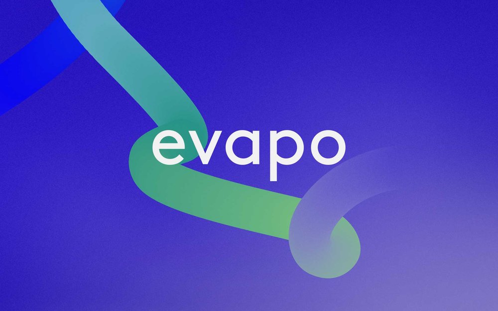
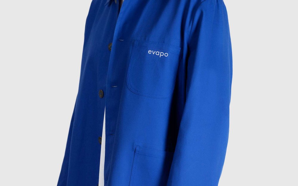
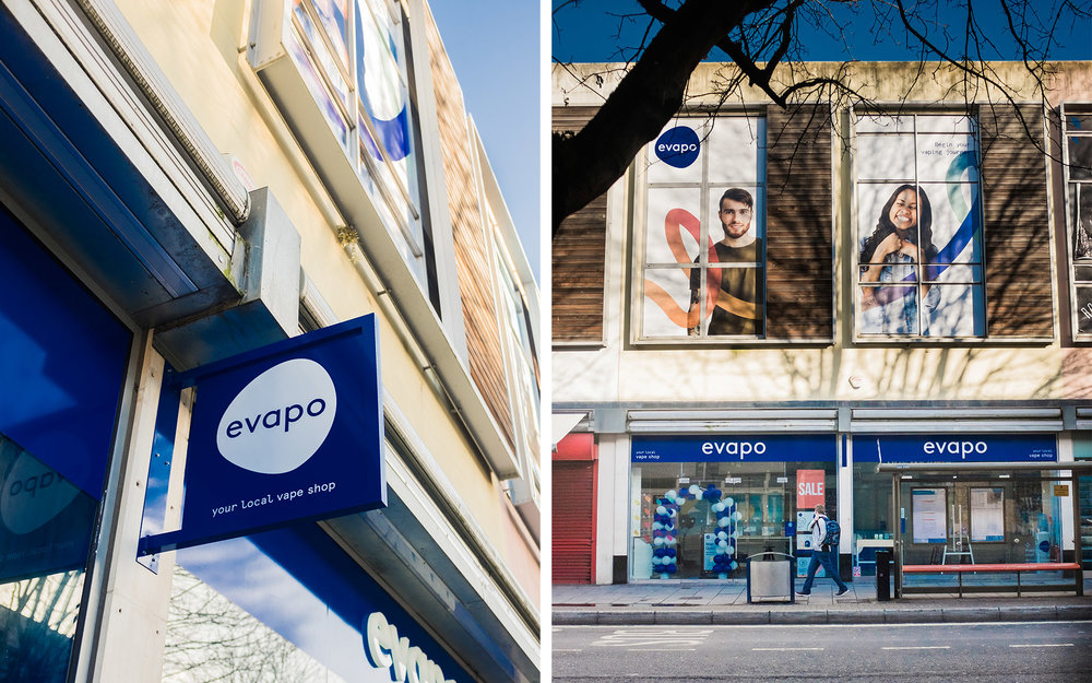
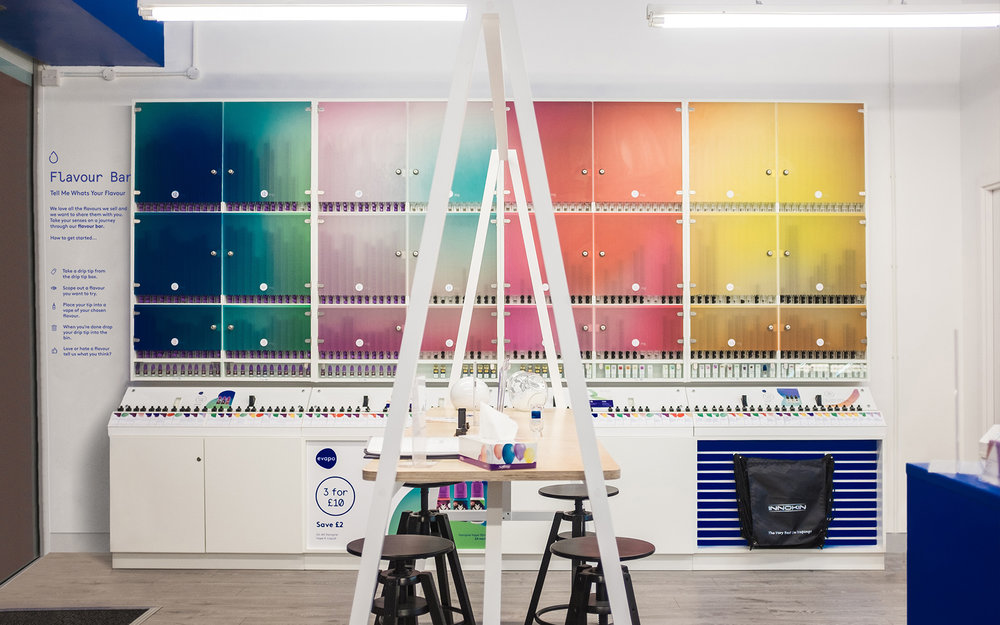
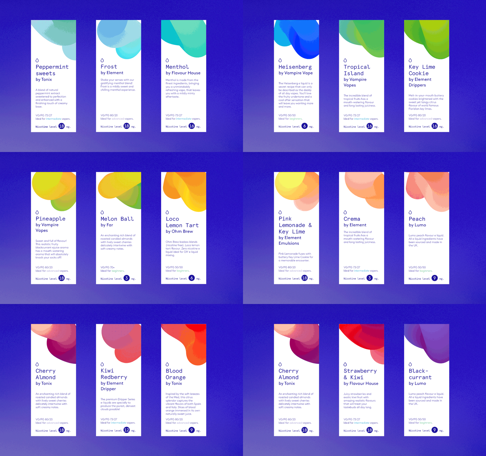
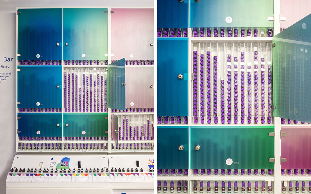
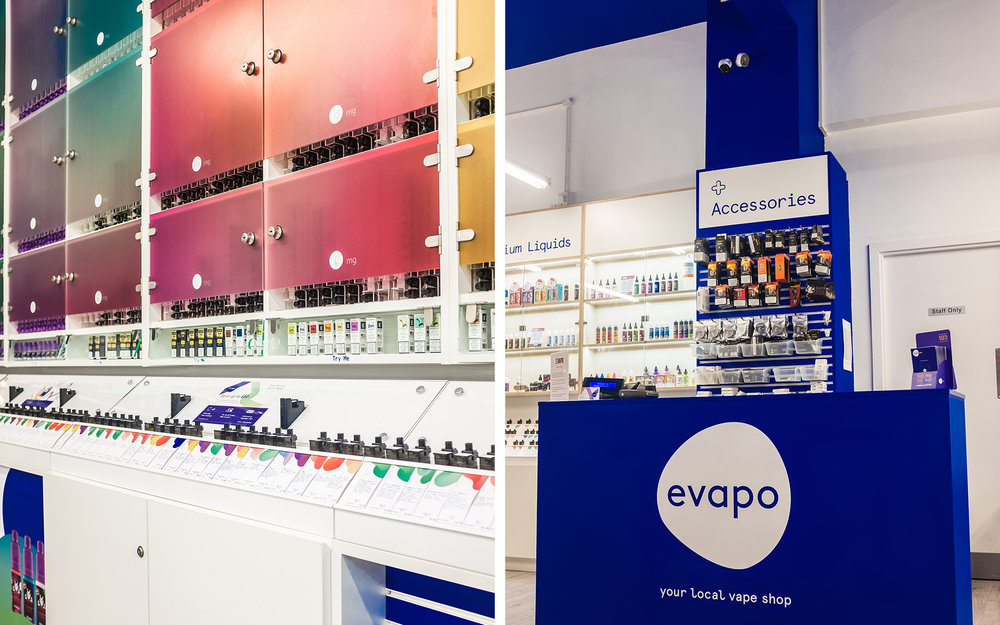
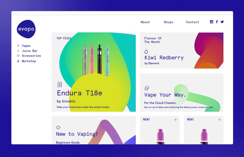
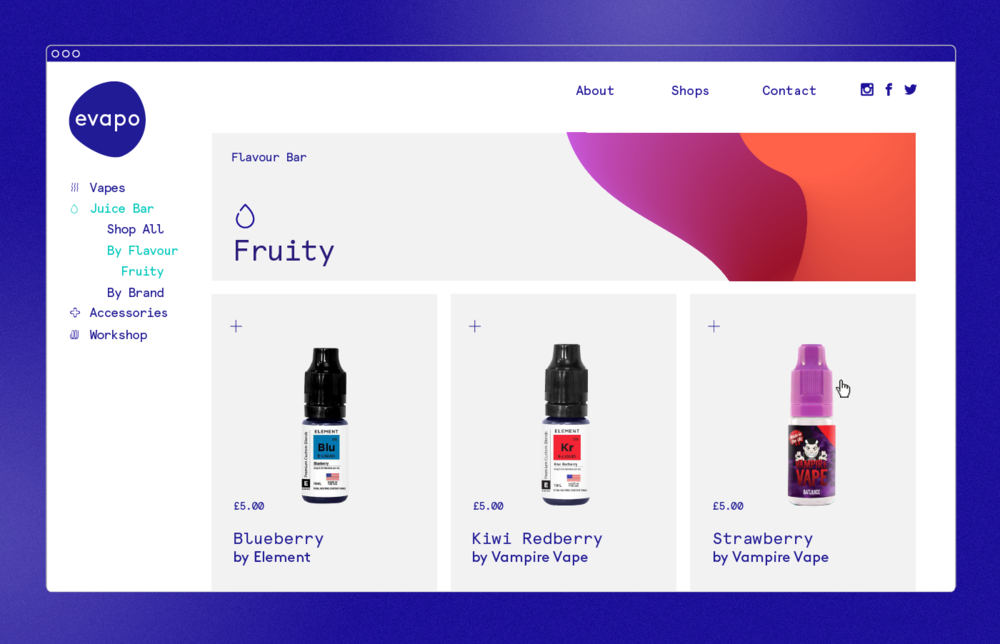
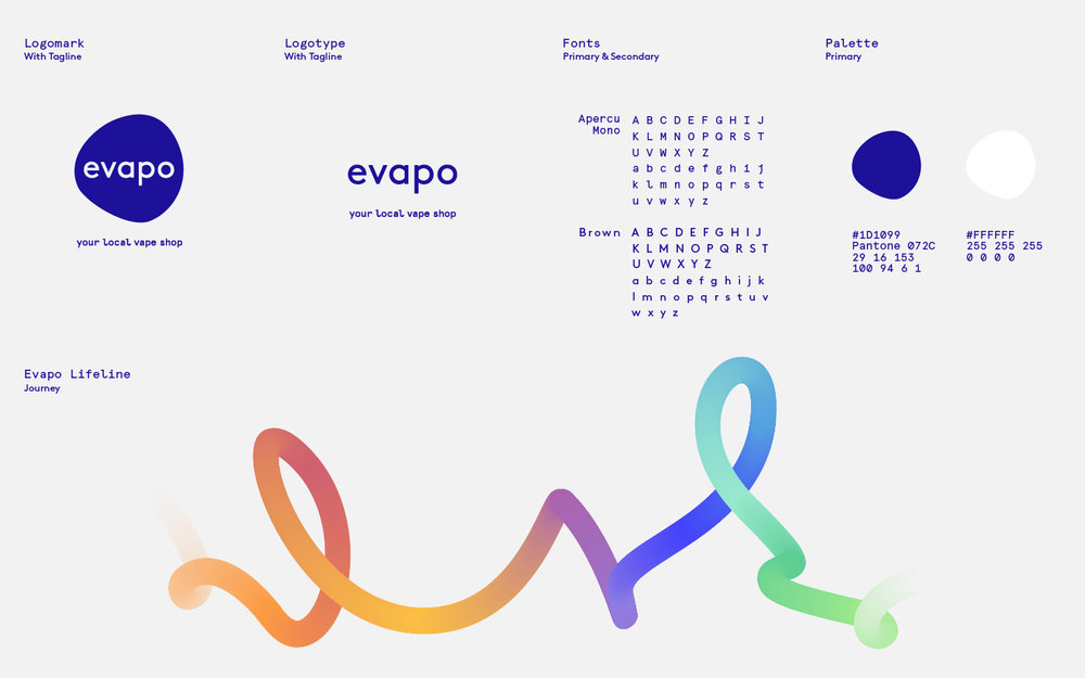
“We were invited to rebrand Evapo, a rapidly growing UK vape high street store chain. They felt their brand was unfriendly and disconnected. Evapo’s mission is to “turn every smoker into a vaper, and every vaper into a friend,” we took this idea of a smoke free transition and imagined it as the “Lifeline” that streams through the identity. The “Lifeline” is a journey of gradual colour with a fluid linear shape that ebbs and flows in-between products and promotions. Evapo have one of the biggest ranges of e-liquid’s in the UK. The e-liquid’s are sold by flavour rather than brand, our dynamic colour palette reflects the array of flavours available. The logo container is made from a cross section of the “Lifeline,” it’s irregular shape creates the idea of a loose gathering or community , something Evapo were keen to communicate. The font choices combine a friendly and approachable logo type, with a slightly more technical feeling mono-spaced secondary type, which represents the personality of Evapo and their staff.”
CREDIT
- Agency/Creative: Lyon & Lyon
- Article Title: Brand Redesign for Rapidly Growing UK High Street Chain Store
- Organisation/Entity: Agency Commercial / Published
- Project Type: Identity
- Agency/Creative Country: United Kingdom
- Market Region: Europe
- Industry: Entertainment


