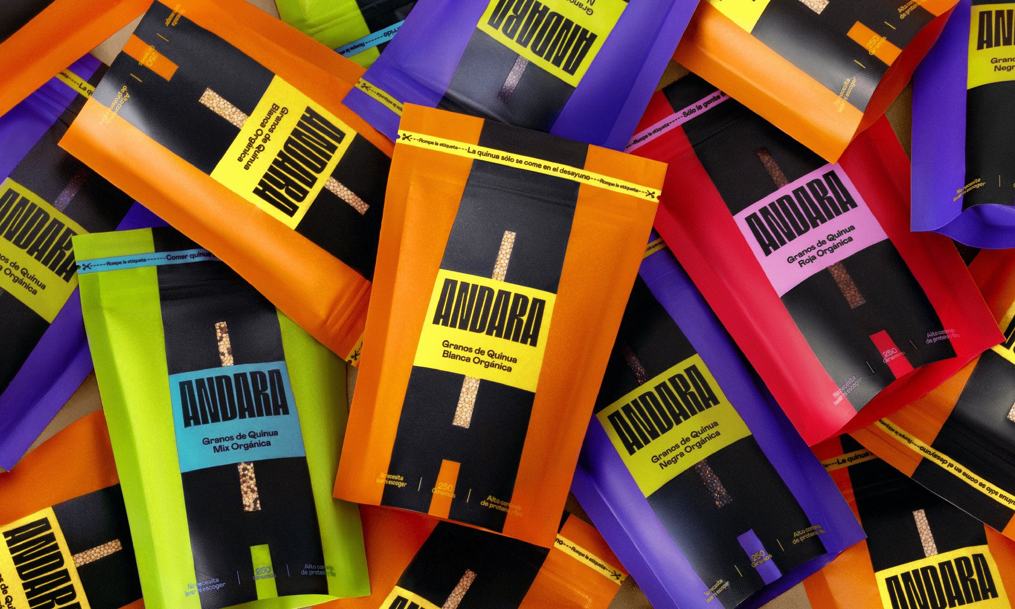
Society has always taught us how certain things are. They label actions, how we behave, how we should be and even what we eat and when to do it. Andara is aware of these labels and even more so for being a quinoa brand. Quinoa has always been labeled as a healthy, difficult to cook, unfun and even insipid food, only focused on the fit or gym audience.
Andara was born to break those labels, change our perception of quinoa and everything it represents. The Brand core aims to encourage people to look at quinoa in a new light. So, from now onwards, quinoa shall be fun, energetic, tasty and easy to use.
On the other hand, quinoa market is packed with Andean elements, earthy colors and overloaded illustrations that, in the end, only generate all of them to blend into both the national and international gondola. It was of the utmost importance to investigate the market context to know how to correctly break what was established and create an understanding of the brand, be consistent with the purpose and generate functionality at the point of sale.
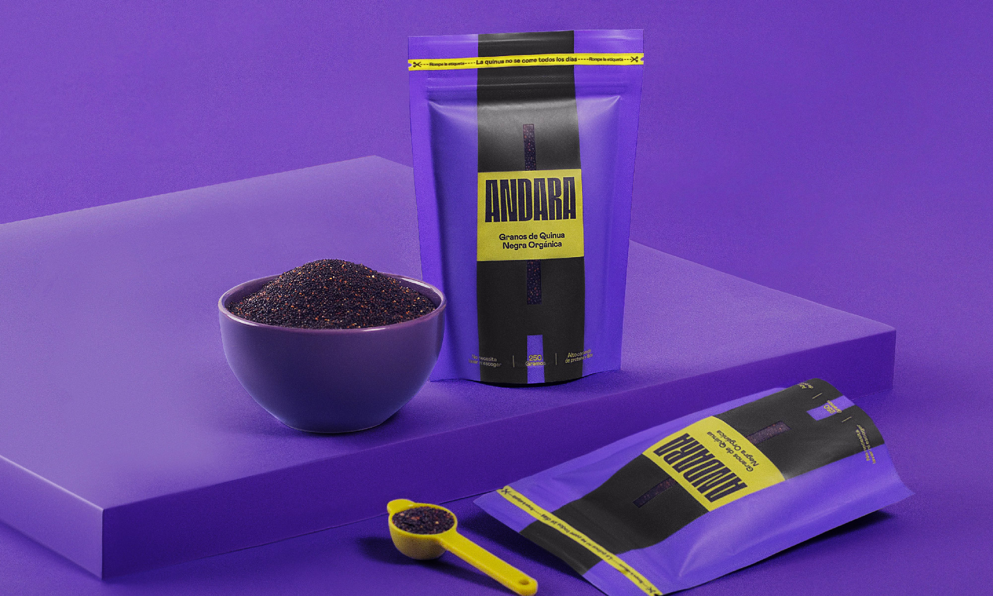
Based on the “break the labels” concept, we set out to create a packaging that challenges what is established within the category, by designing a simple and impactful structure. The goal is to break the labels by setting a disruptive visual and verbal identity, presenting a whole new meaning to its consumers.
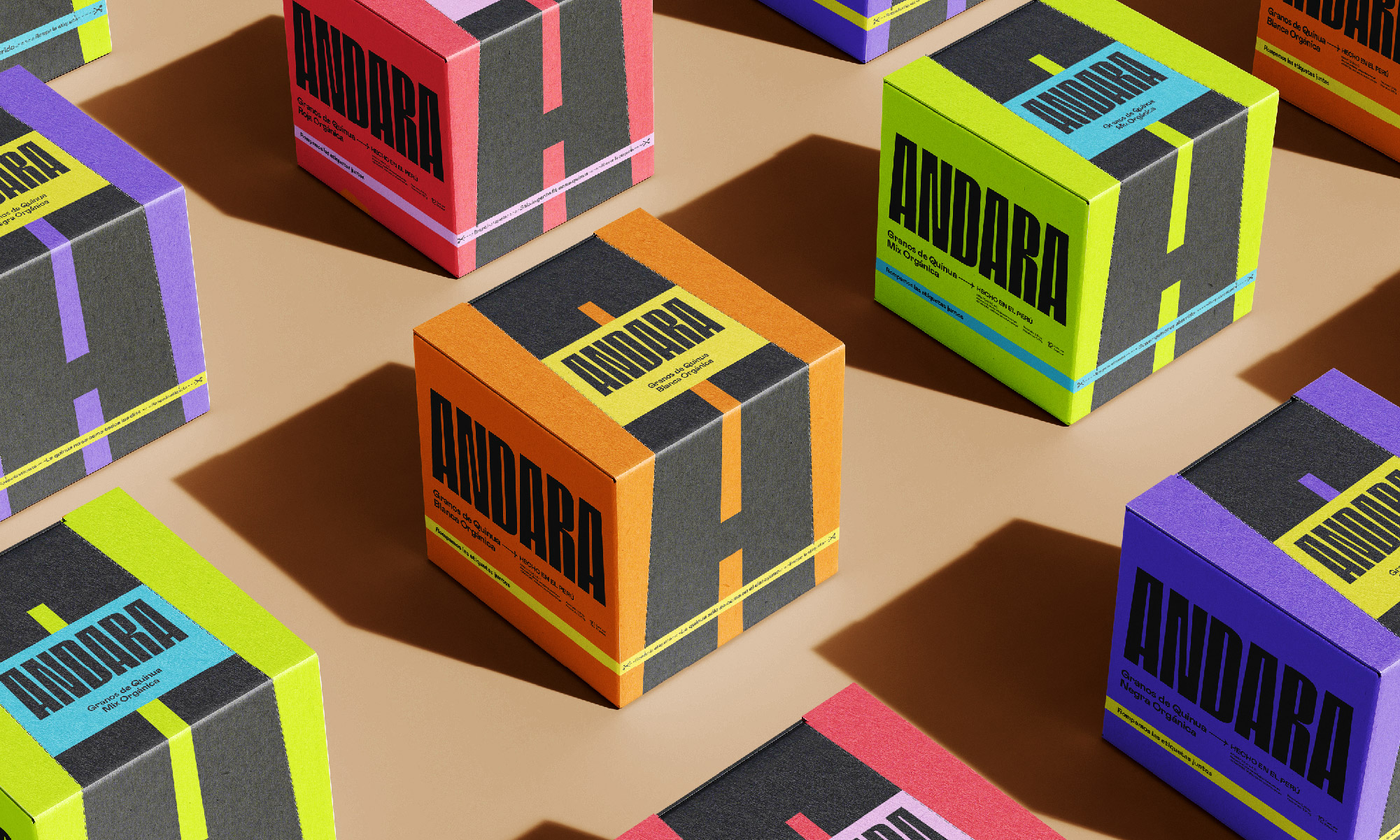
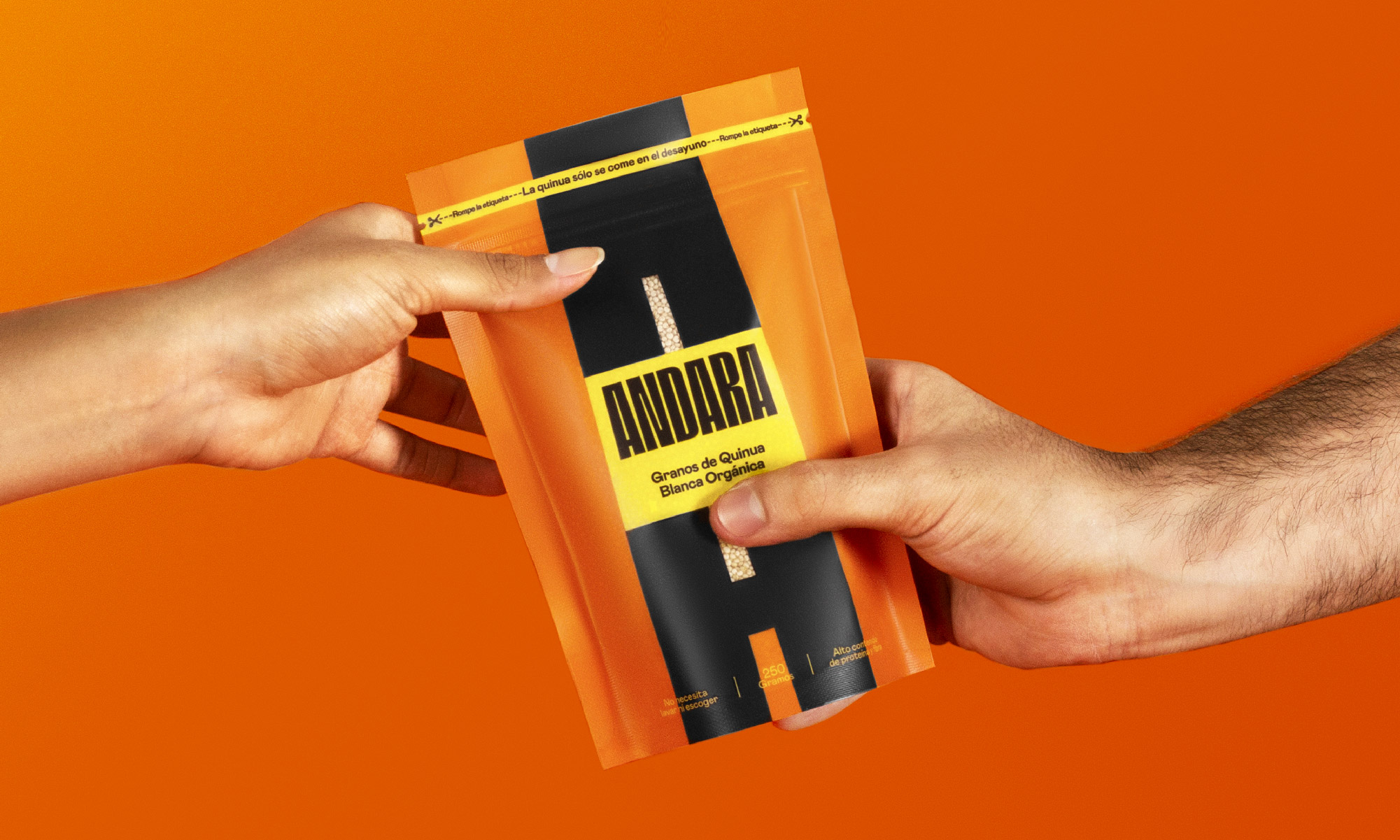
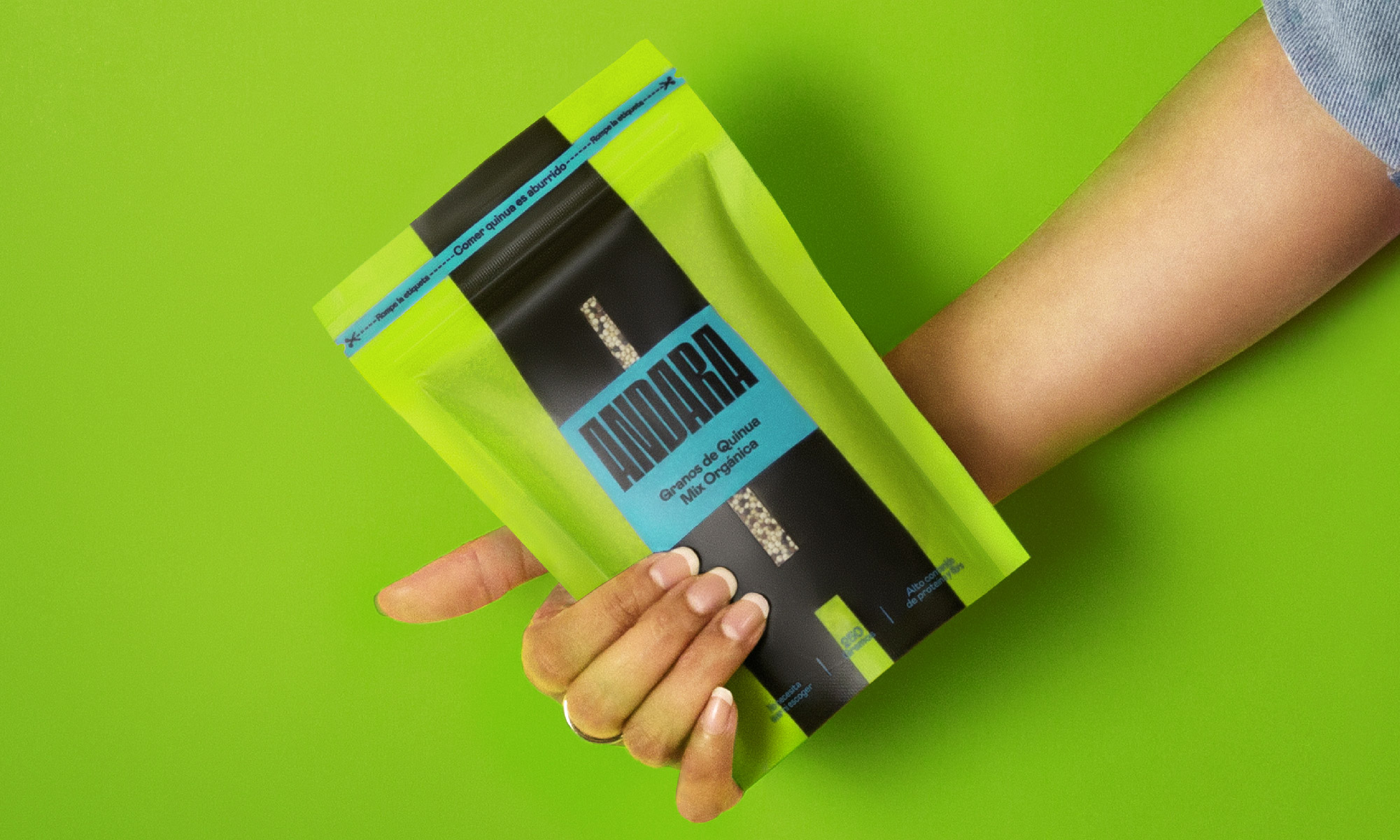
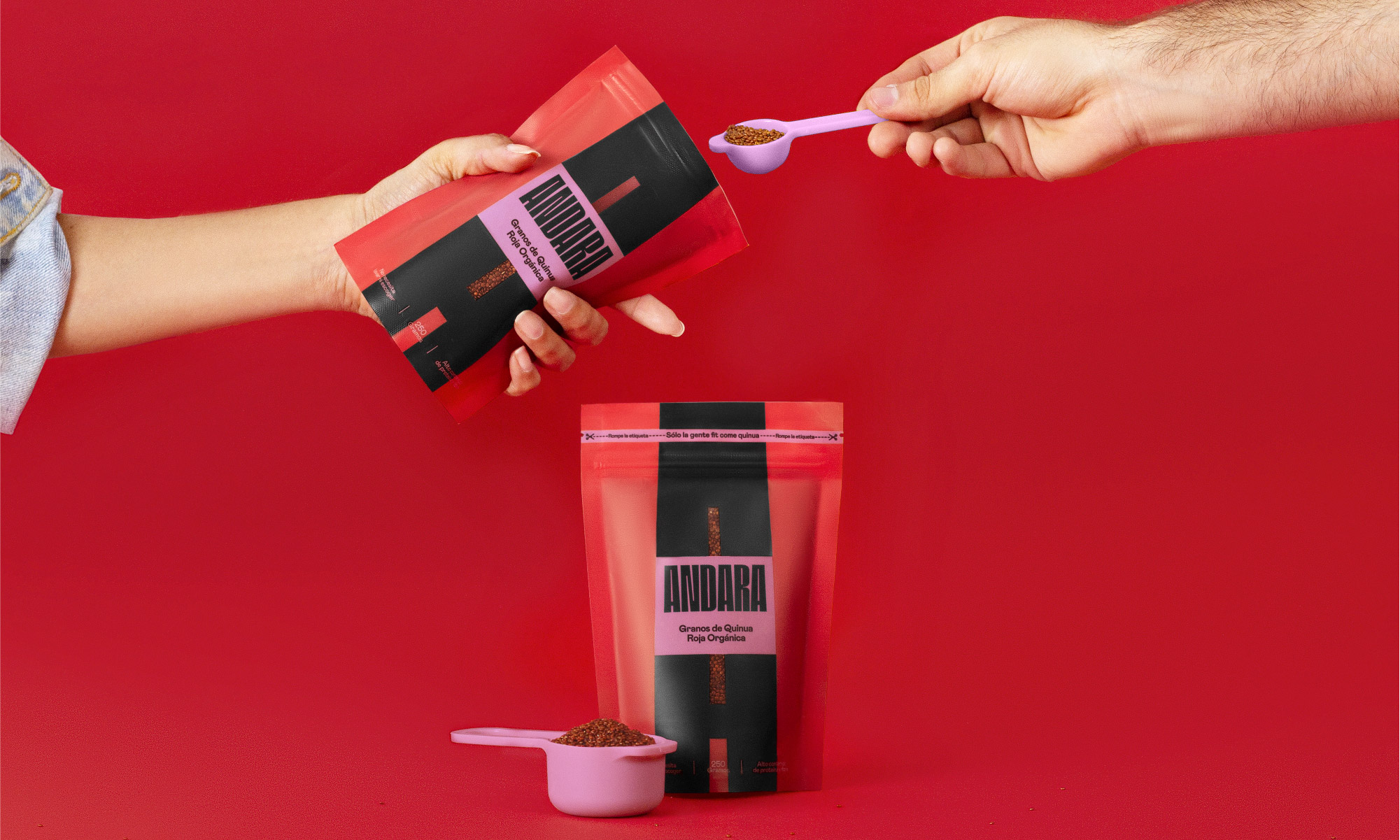
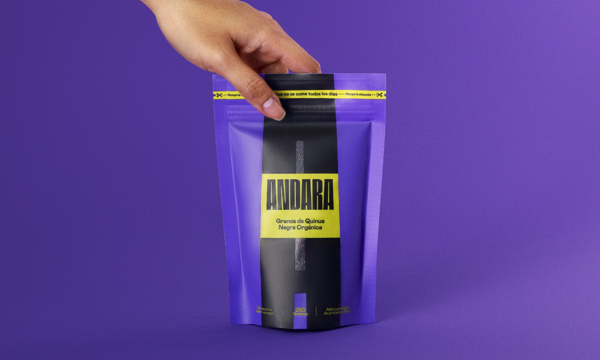
This is how Andara takes shape, by creating a new logo whose typeface inspires energy and impact. This is reflected in the monogram logo itself, which serves as a structure and window to visualize the packaging’s iconic product in a unique way. In addition, we bring strength and closeness with a wide color palette. This is how we use vibrant colors to pack a bigger punch on shelf, highlighting the notion of breaking labels throughout a world of conservative quinoa packaging.
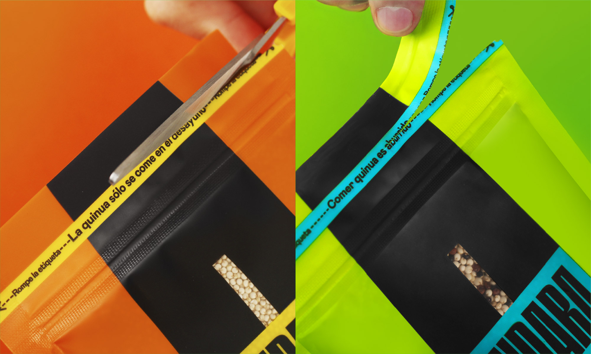
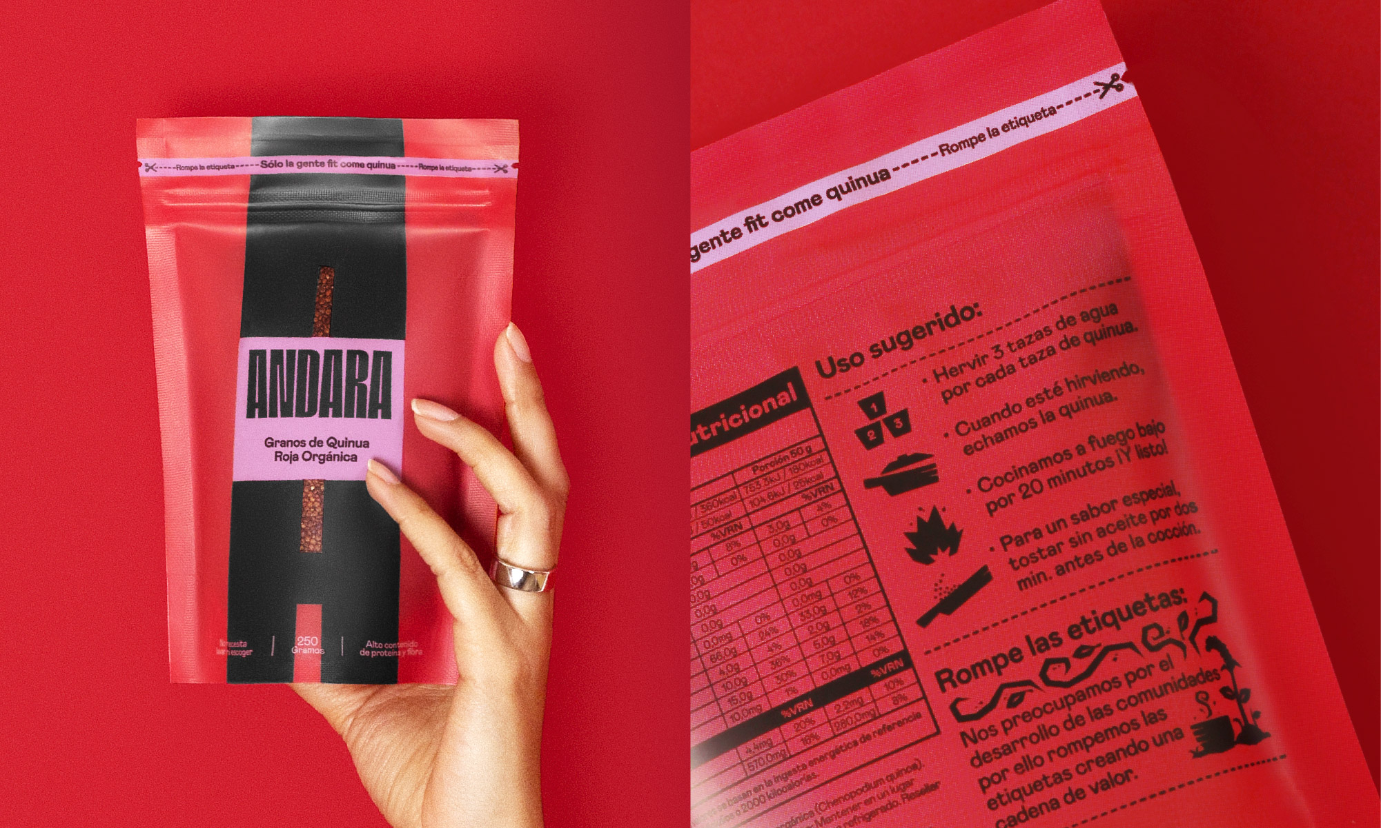
On the other hand, we set a tone of voice and suite of messaging that reflects our brand concept and what we stand for: living without labels. This is also a purpose that involves our consumers into the brand experience of our product. From the moment you open the package, by breaking it, you are breaking a paradigm printed on the wrapping band about the consumption of quinoa, phrases like “only fit people eat quinoa” or “quinoa is only eaten at breakfast” are integrated in this part. This is the powerful call to action we added, which makes our users rethink when consuming the product.
Finally, on the back, we created a simple yet expressive illustration style that allows the brand to show the preparation instructions in a didactic way, while also emphasizing the brand’s value chain with its workers.
CREDIT
- Agency/Creative: Boost Brand Accelerator
- Article Title: Andara Quinoa Packaging Design by Boost Brand Accelerator
- Organisation/Entity: Agency
- Project Type: Packaging
- Project Status: Published
- Agency/Creative Country: Peru
- Agency/Creative City: Lima
- Market Region: North America, South America
- Project Deliverables: Art Direction, Brand Design, Design, Packaging Design, Product Photography, Typography
- Format: Pouch
- Substrate: Plastic
- Industry: Food/Beverage
- Keywords: Quinoa, Labels, Food
-
Credits:
Art Direction: Ivan Coello
Creative Direction: Ivan Coello
Photography:: Miguel Estela
Post Production: Diana Vigo
Post Production: Jonathan Chafloque
Post Production: Jesus Chafloque
Project and New Business Coordinator: Eda Seguín
Accounts and New Projects General Director: Laura Vallenas
CEO: Luciana Olivares
Agency: Boost Brand Accelerator


