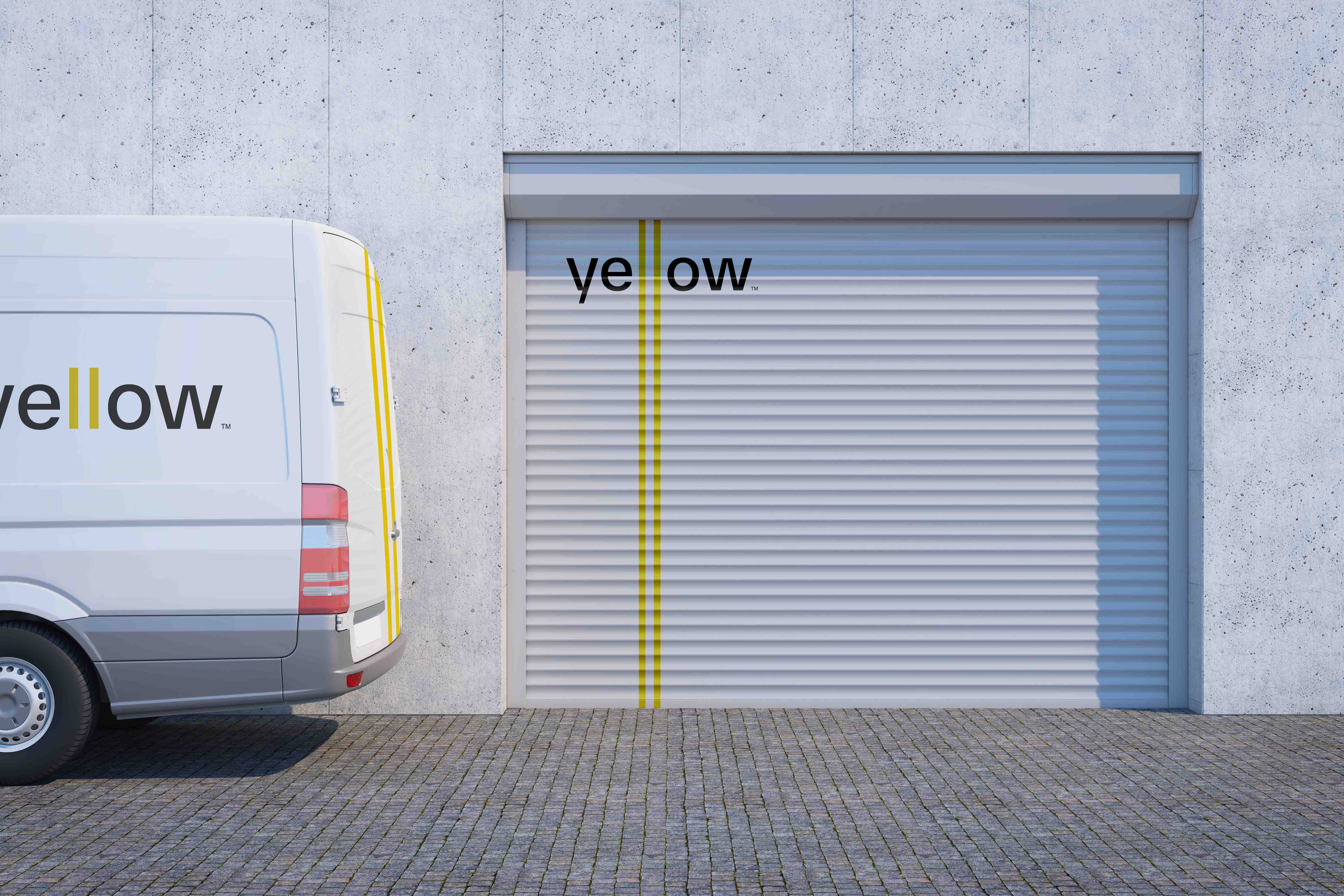
The project: Yellow is a delivery service company that transfers goods from USA to Uzbekistan and vice versa. They serve for Uzbeks in the USA. So, their primary audience is Uzbeks while the second audience is Americans. Apart from delivering from one country to another, Yellow does deliver the goods across the USA. They stand for equality and aim to serve both nations equal delivery service.
The task: To create a sophisticated visual identity for the company that targets two nations and the identity should be appropriate for both, without including any traditions and etc. Also, showing the company’s core value, equality, was the primary mission.
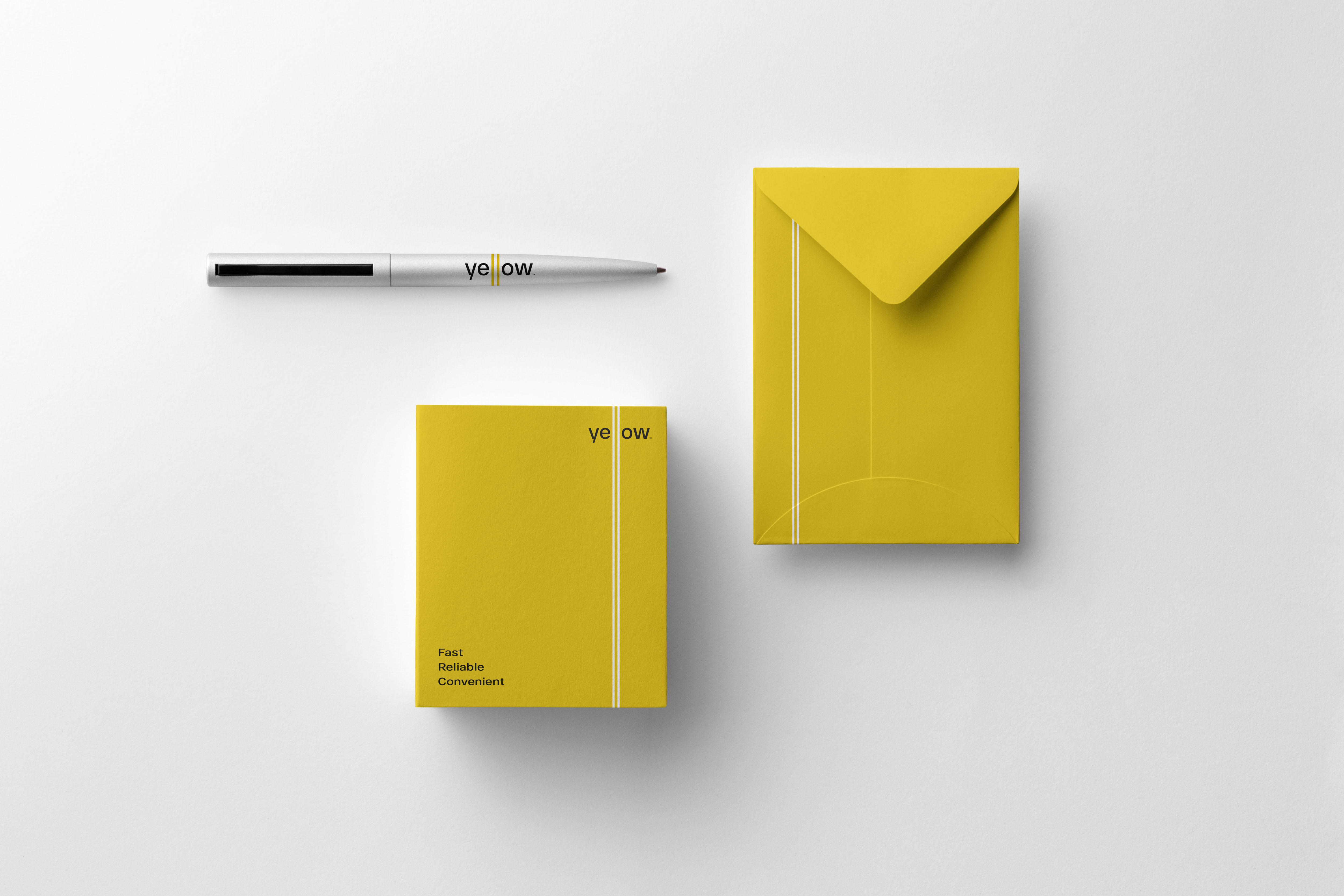
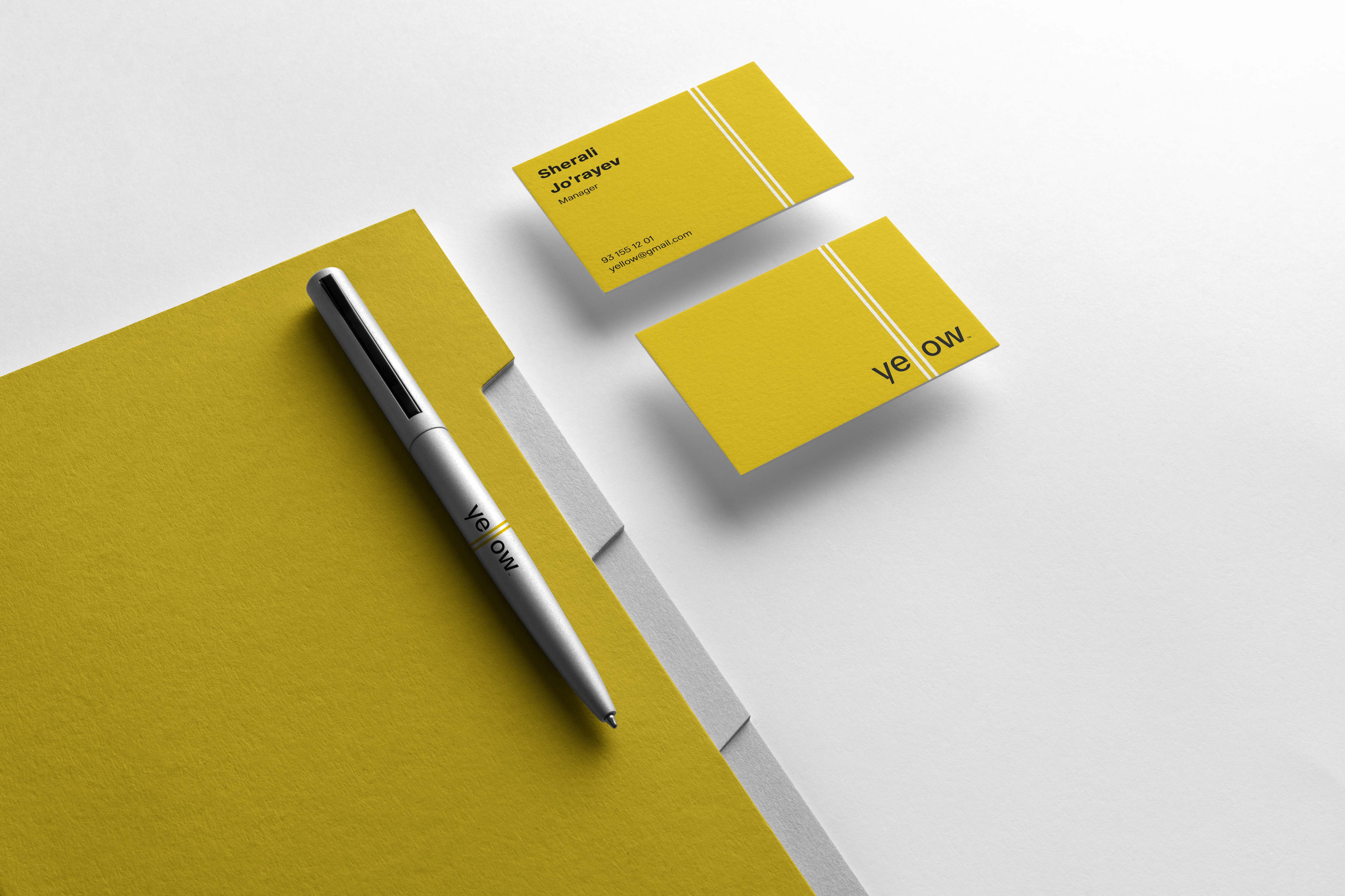
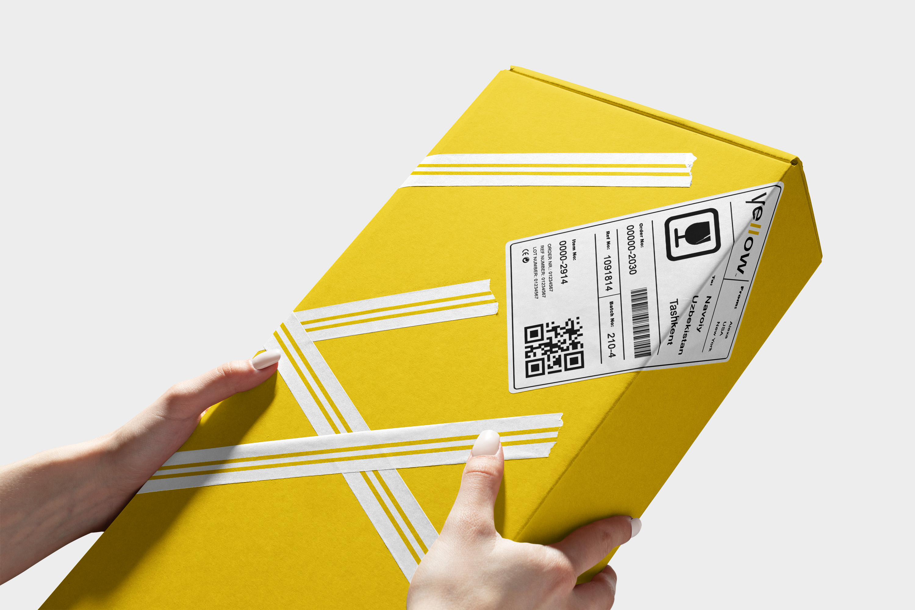
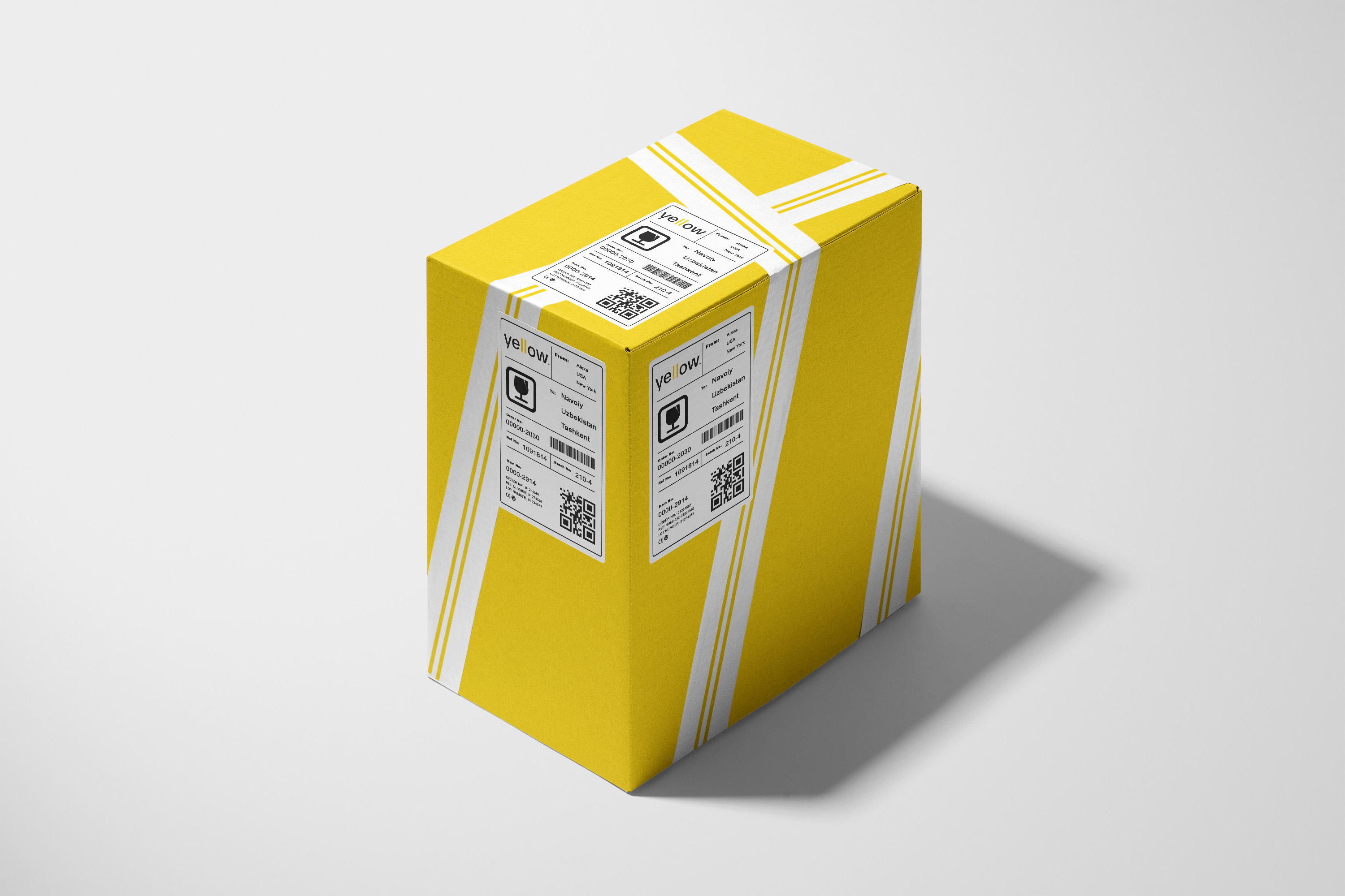
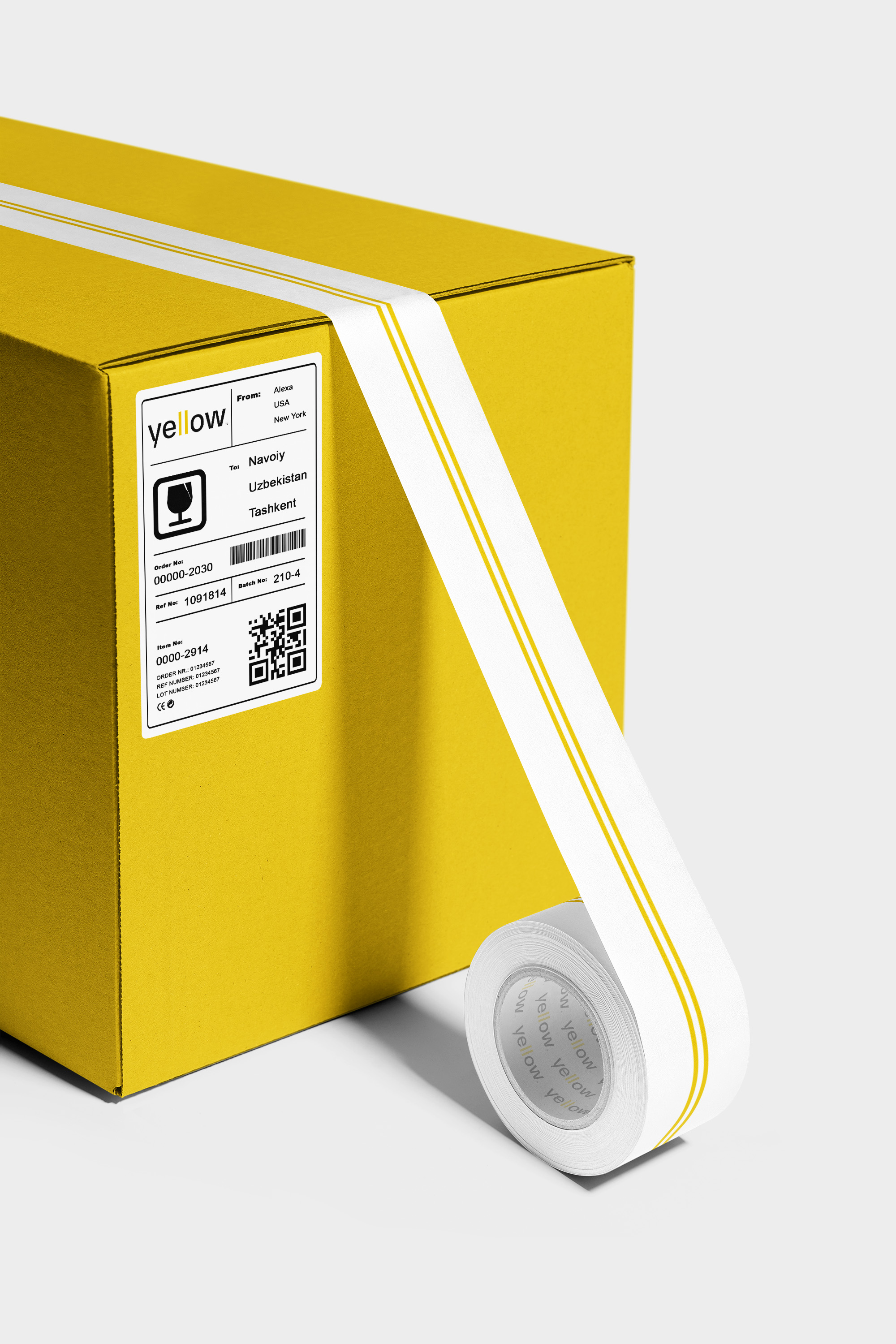
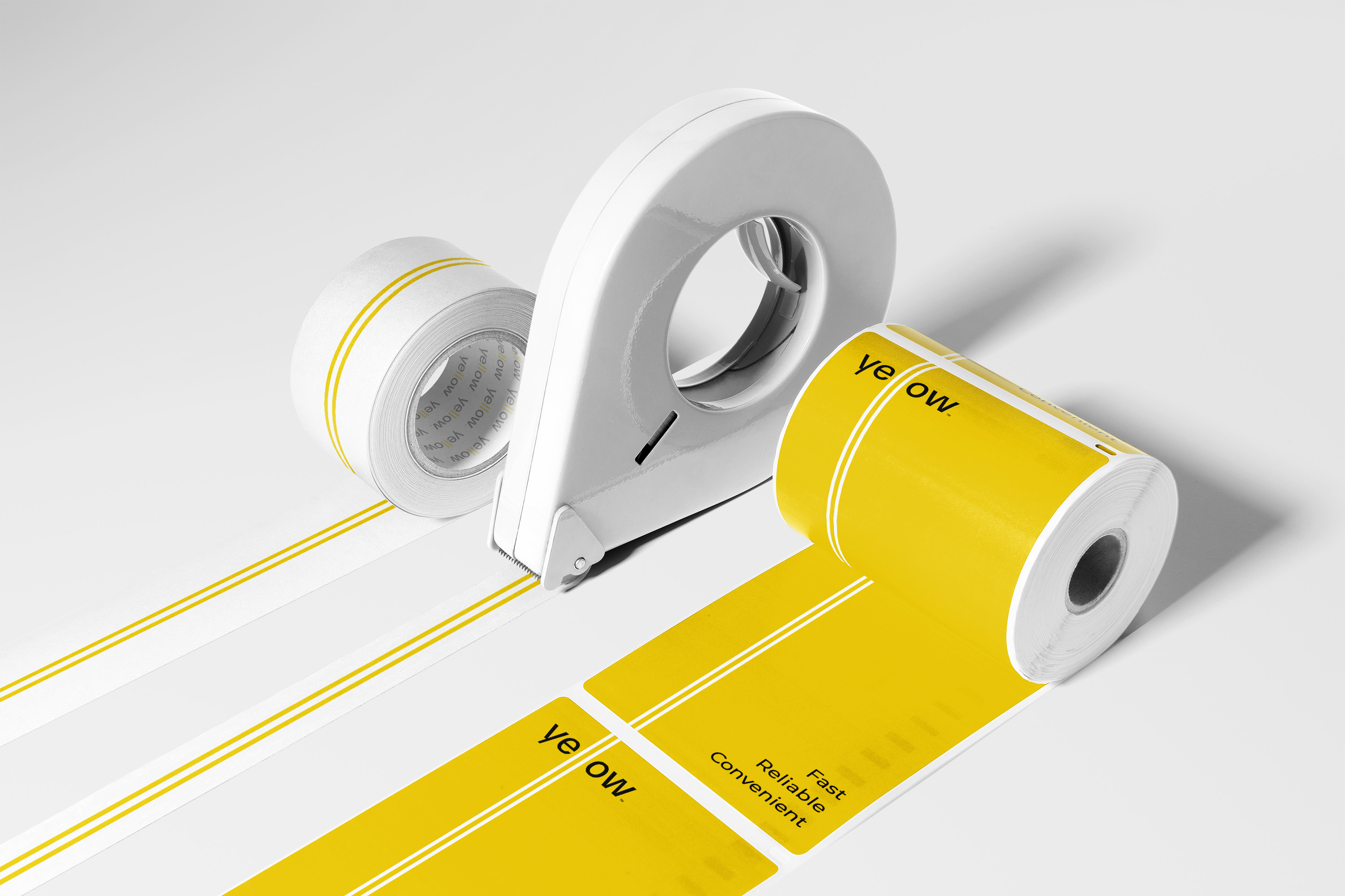
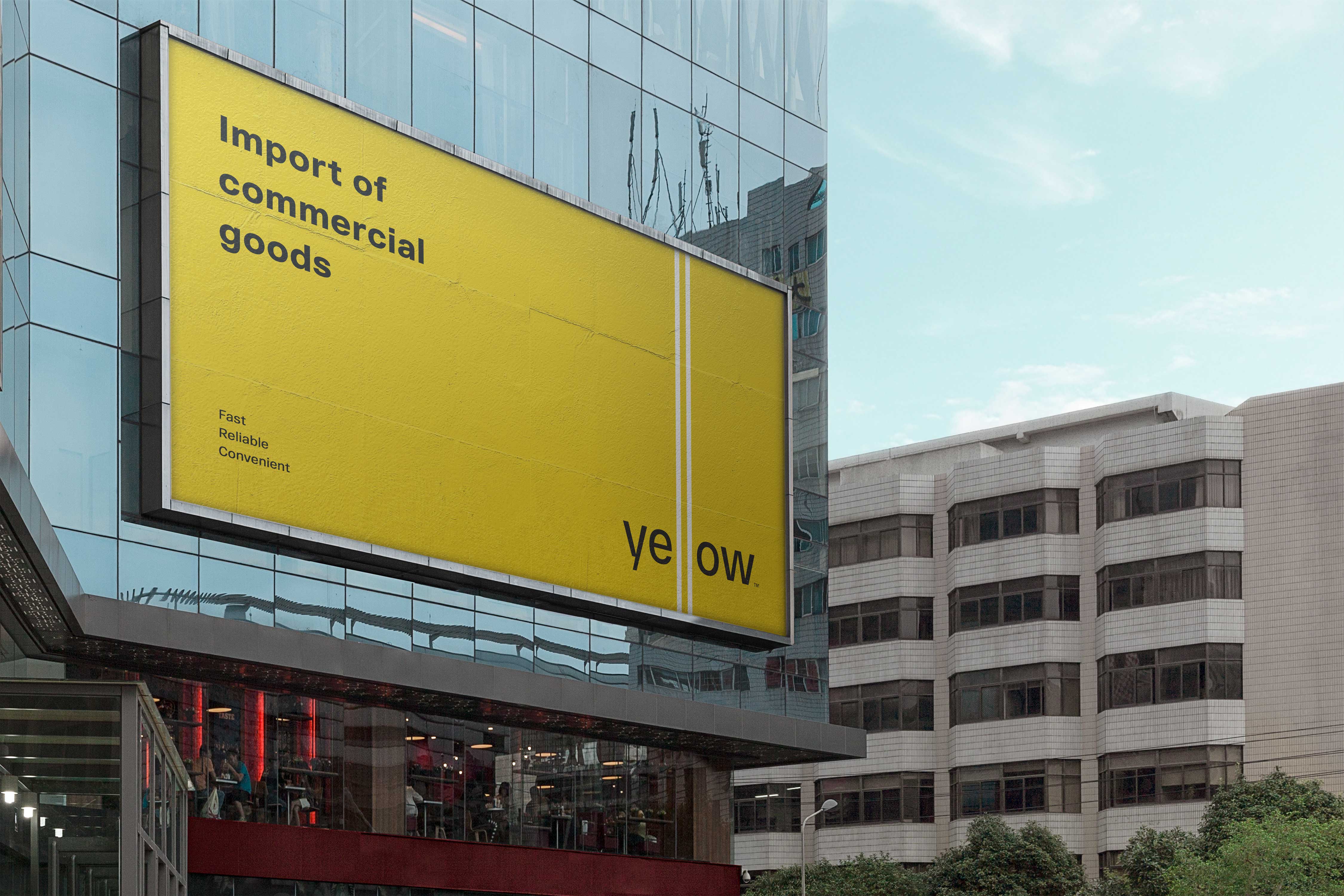
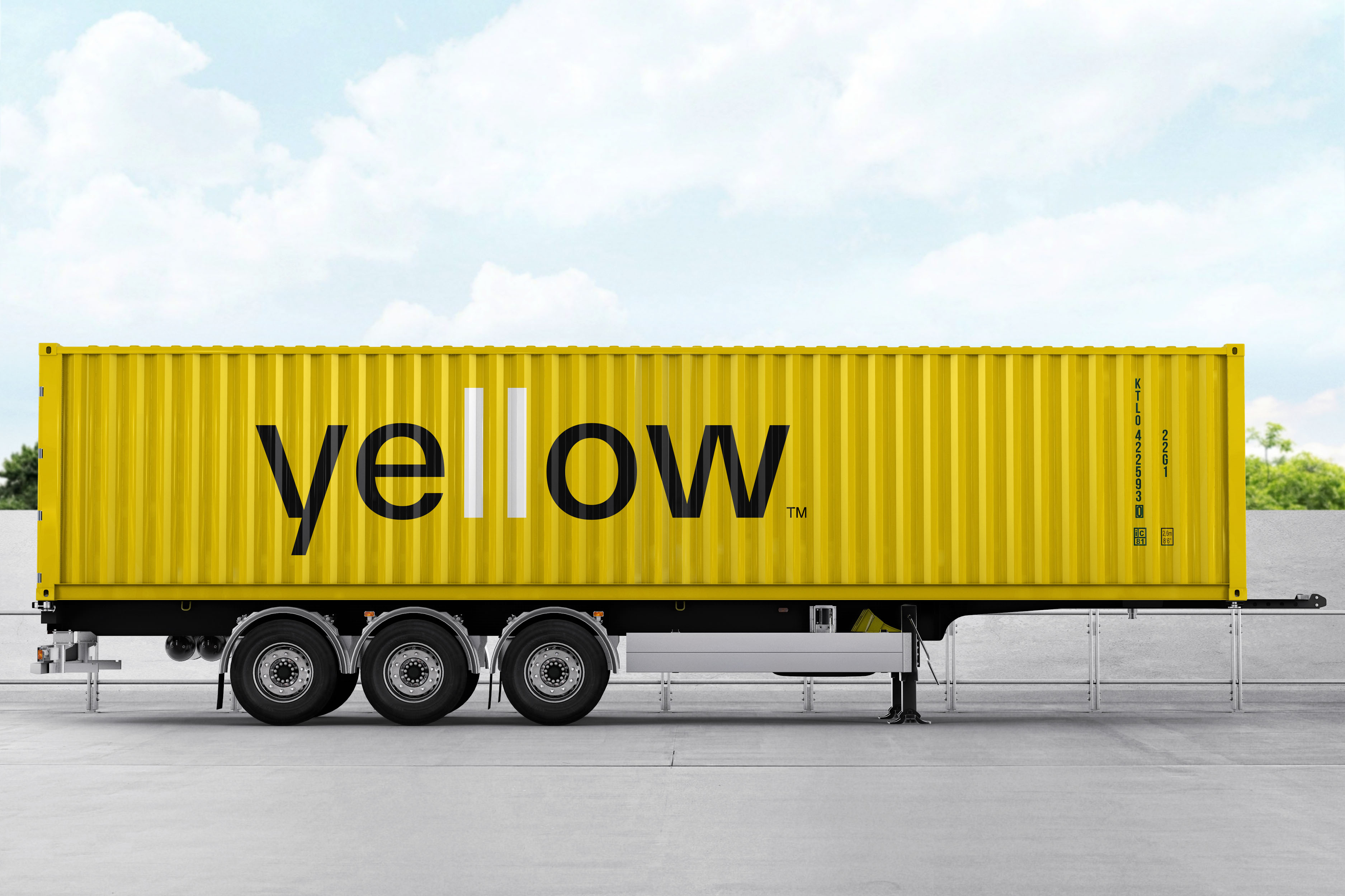
The solution: Since it is a delivery company, the idea for the logo was inspired by the yellow road lines. Delivery process is usually via on the road with usual cars, vans and etc. This represents company’s job and is very suitable for the naming too. And these lines literally represent speed and infinity. And most importantly, the core value which is equality was clearly shown and described with those lines. As a result, timeless, minimalistic and functional logo was made. The color palette is taken from the nature, road and lines themselves. It’s another color that grabs people’s attention. The identity is too inspired by the road lines and used these two lines only for the brand applications. Every brand application, depending on the case, includes the road-line-look-logo making the brand look one of a kind and stand out in the market.

CREDIT
- Agency/Creative: Zokhir Bozorov
- Article Title: Visual Identity for Yellow Delivery Company
- Organisation/Entity: Freelance
- Project Type: Identity
- Project Status: Published
- Agency/Creative Country: Uzbekistan
- Agency/Creative City: Tashkent
- Market Region: Asia
- Project Deliverables: Brand Design, Identity System, Typography
- Industry: Transport
- Keywords: Delivery, shipping, retail, identity, logo
-
Credits:
Designer: Zokhir Bozorov
Copywriter: Dilafruz Abdinabiyeva
Project manager: Javohirbek Abdullayev


