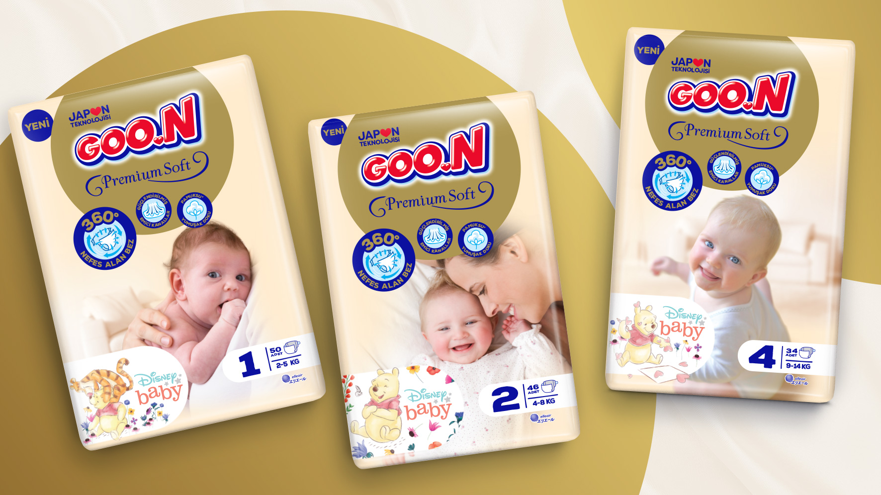
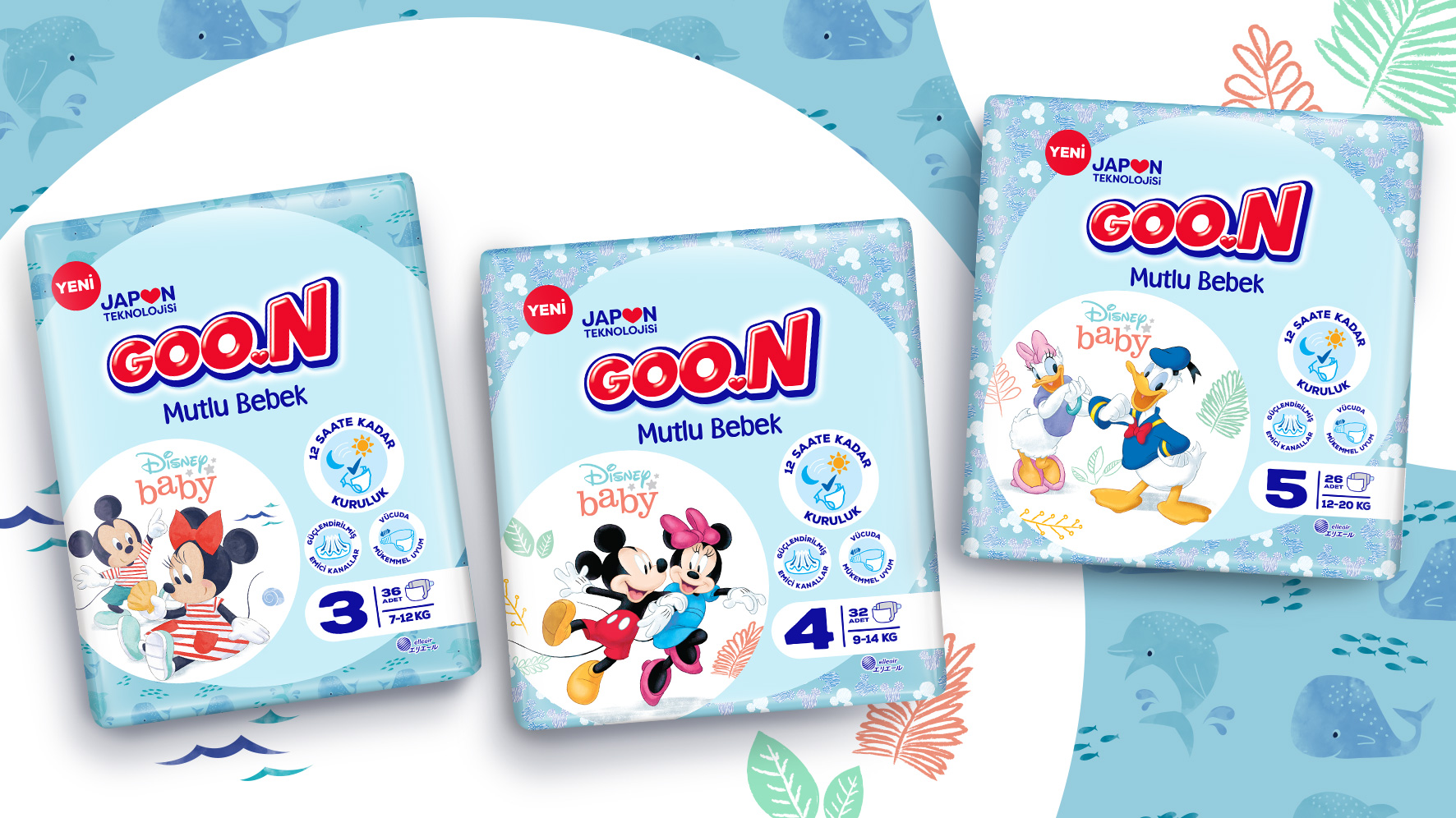
Istanbul based design agency Orhan Irmak Tasarım renewed the global packaging designs for Goon baby diapers. Goon is the brand of Daio Paper, one of Japan’s biggest paper and cardboard producers. New designs are launched in Turkish market first and will be launched in Russian market soon.
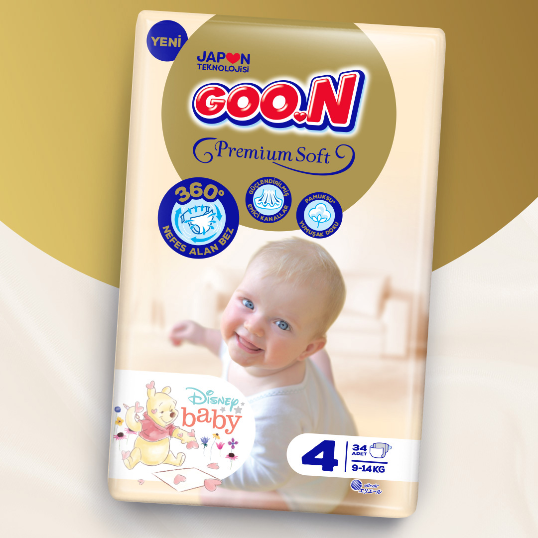
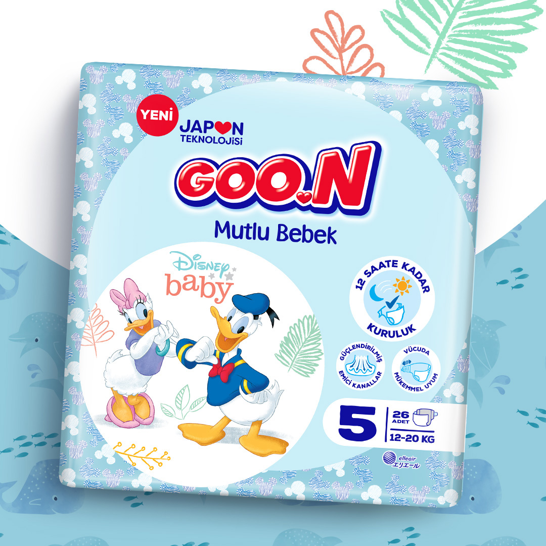
Goon baby diapers has two sub brands: Mutlu Bebek (Happy Baby) is used for the standard baby diapers, where Premium Soft is for the upper segment. In order to create a common visual language for Goon diapers, a brand architecture of circular forms was created. The inspiration was the circular forms of G-O-O letters in the logo. For Goon Premium Soft, a golden circle was located under the logo as the main visual element of the architecture. The gold color refers to the premium positioning of the brand. For the Mutlu Bebek (Happy Baby) on the other hand, Licensed Disney characters were used inside white circles and a babyish blue color was used to create a more sincere communication with the mothers. Although circular forms create a common language for Goon brand architecture, their different sizes and locations provide differentiation for the sub brands. The product features were turned into icons with illustrations that specially created for the Goon brand architecture.


CREDIT
- Agency/Creative: Orhan Irmak Tasarim
- Article Title: Goon Baby Diapers Packaging Designs by Orhan Irmak Tasarim
- Organisation/Entity: Agency
- Project Type: Packaging
- Project Status: Published
- Agency/Creative Country: Turkey
- Agency/Creative City: Istanbul
- Market Region: Asia, Middle East, Global
- Project Deliverables: 2D Design, Art Direction, Brand Architecture, Brand Identity, Brand Redesign, Graphic Design, Packaging Design
- Format: Bag, Flow-Pack
- Substrate: Plastic
- Industry: Health Care
- Keywords: Goon, Baby diapers, diapers, baby product, Packaging Design, Graphic Design, Premium Soft, Mutlu Bebek
-
Credits:
Design Director: Orhan Irmak
Art Director: Ömer Doğan


