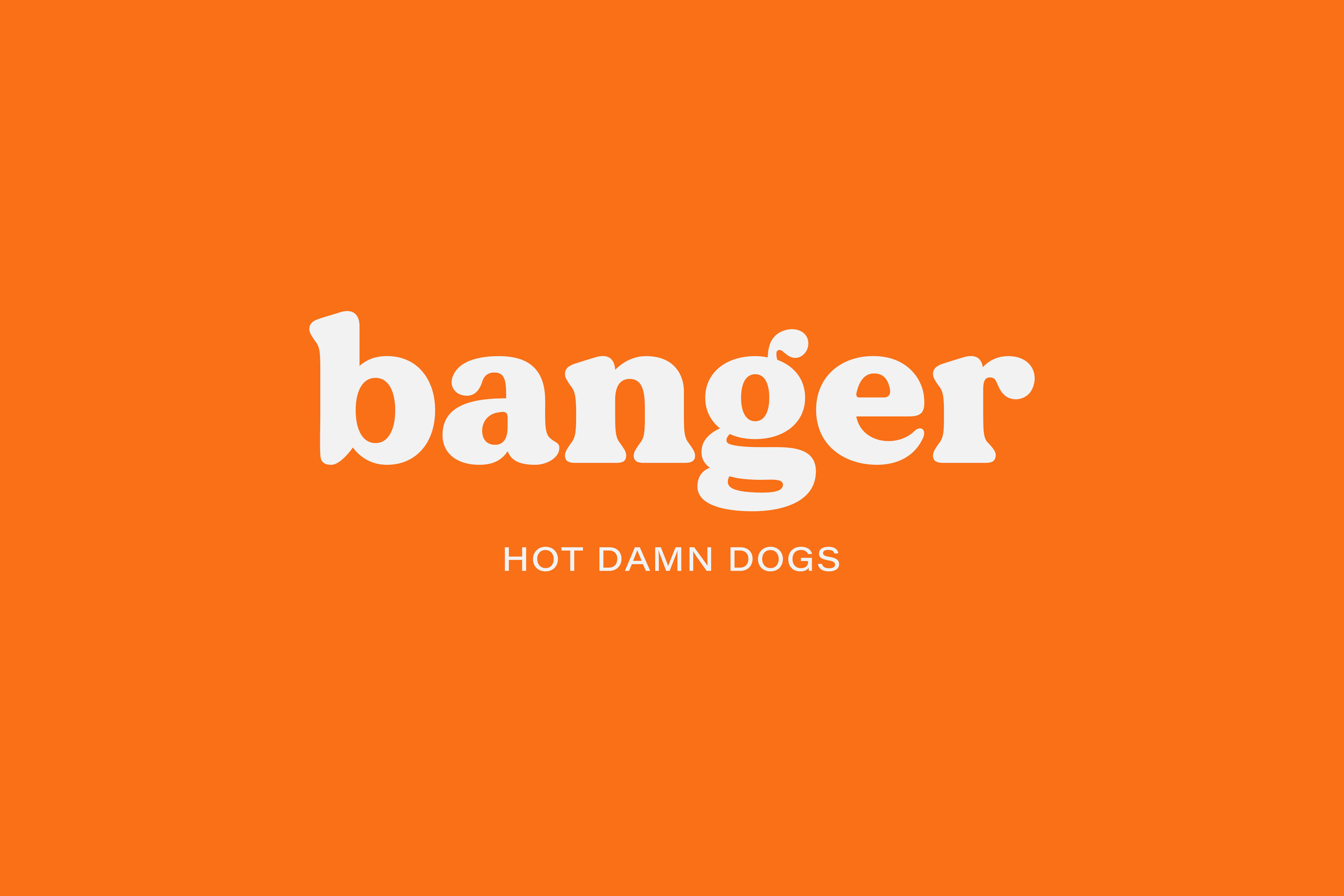
Banger, the hotdog destination of Belfast, Northern Ireland, is the work of design studio, Angel and Anchor. Jumping into a hot dog-shaped gap in the hospitality market, the founders wanted to create artisan fast food in a way that was built for 2021. This particular year brought in several challenges for the hospitality industry in a world that was adjusting to functional life during a pandemic. The industry faced restrictions for restaurants to limit indoor seating and seasons of take-away-only service. Banger set up a pop-up shop with the flexibility of service options and a selective menu. The founders had a passion for quality food and they wanted to bring classic British sausages and creative toppings into the world.
Bold flavors deserve bold character. A bold character deserves a bold brand. Banger was created as a British spin on American hot dogs, playing to its name and tying the brand to its UK roots. Several brash innuendo connotations with the name ‘Banger’ – and the shape of sausages – were a key spark for the brand concept and personality.
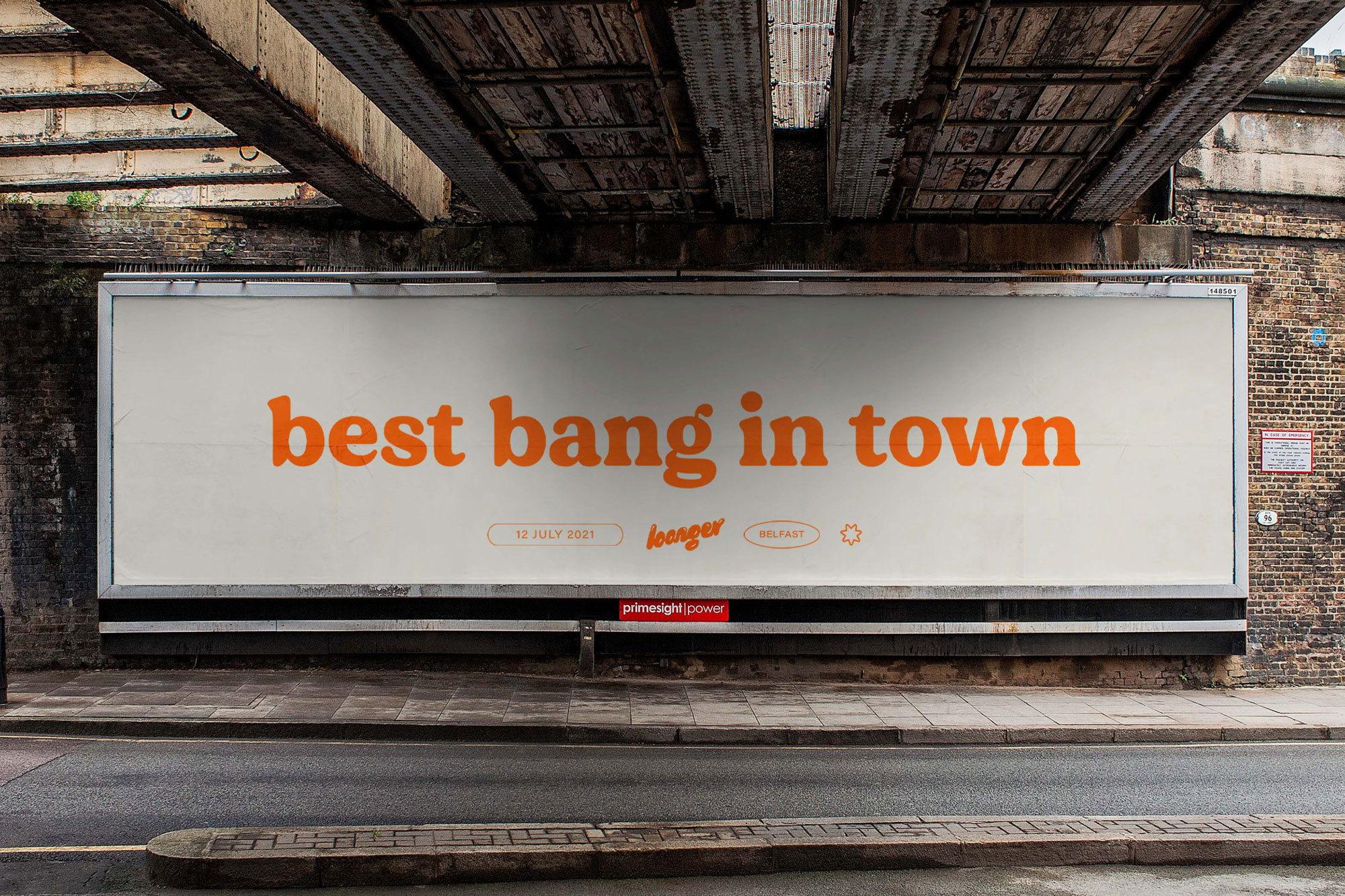
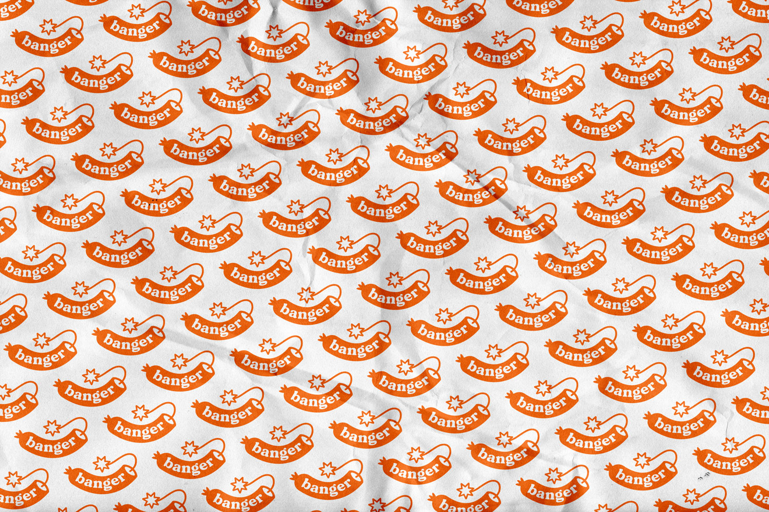
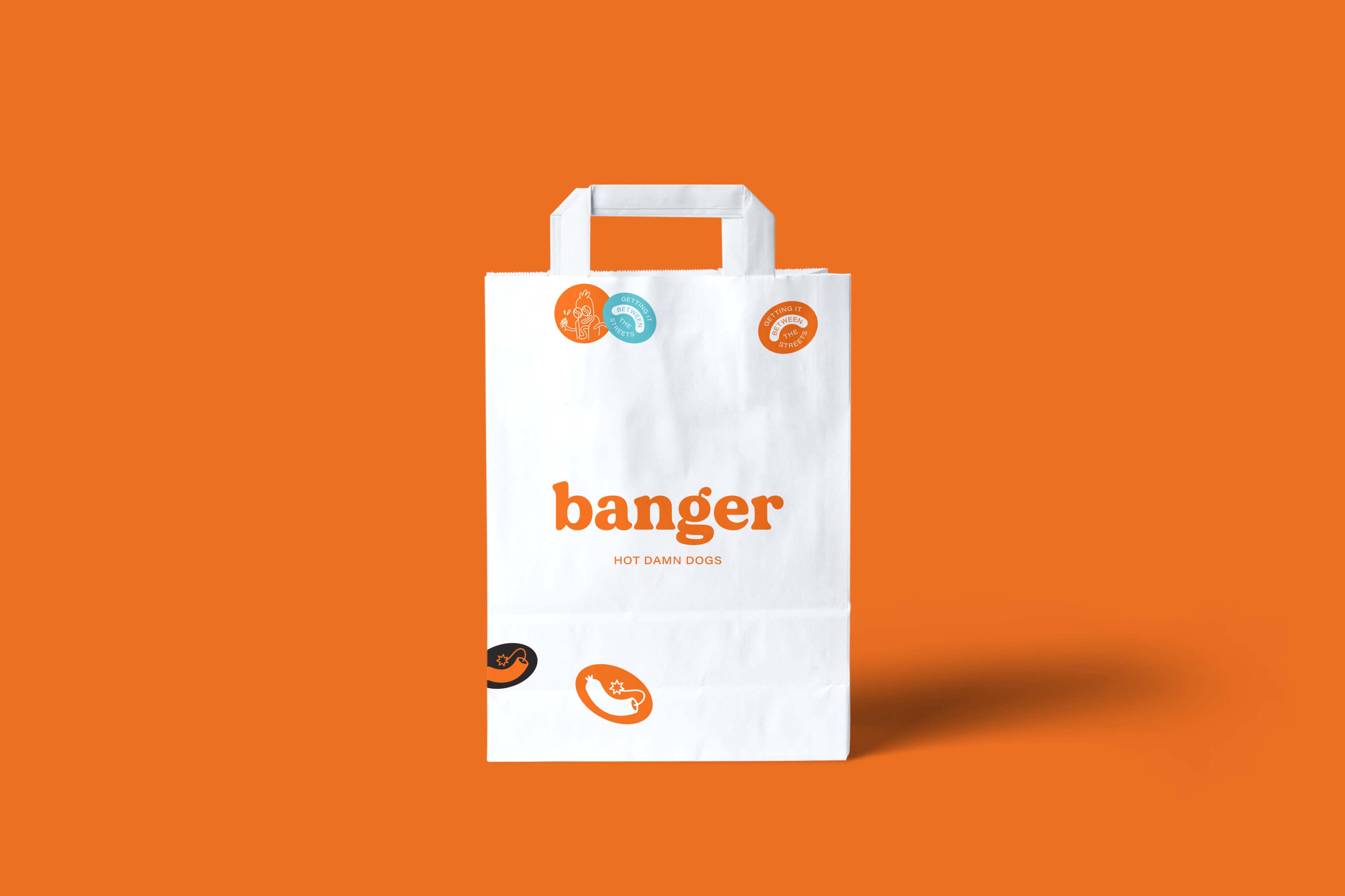
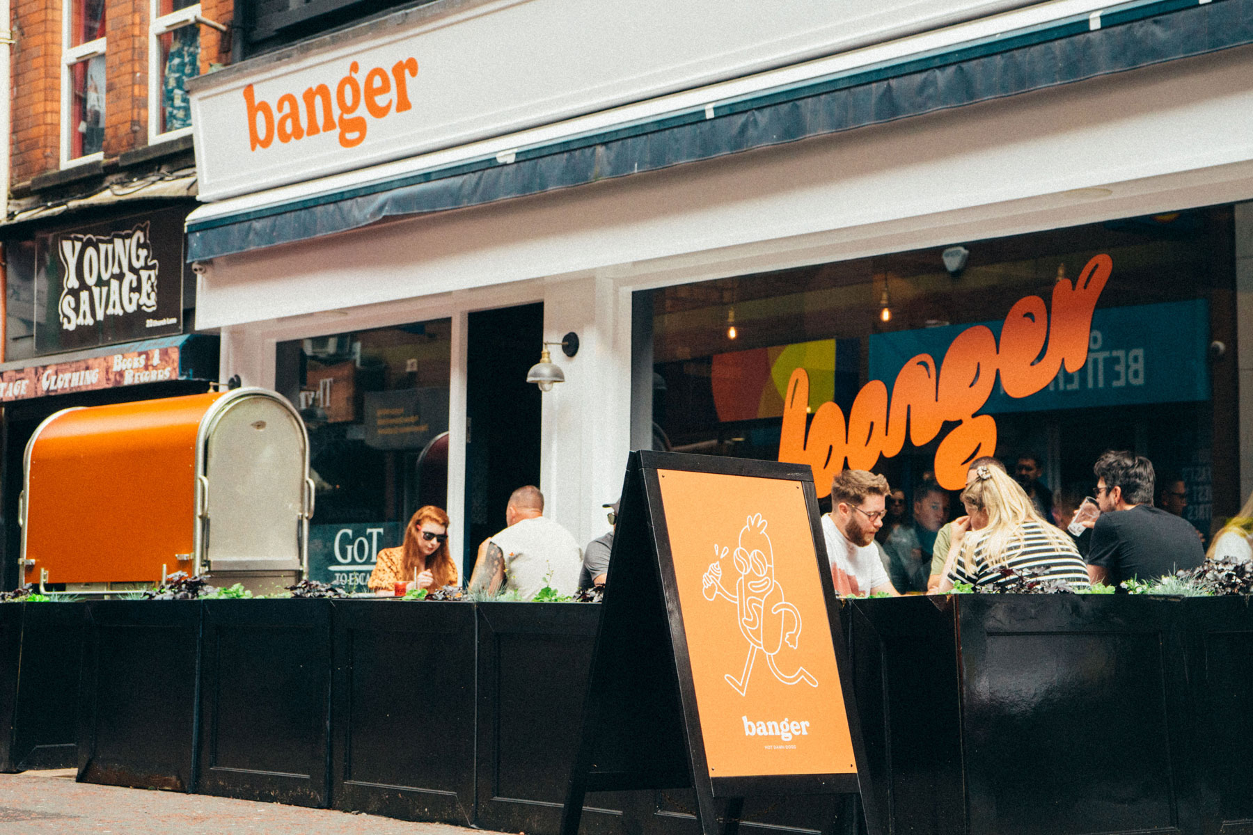
With this cheeky personality being a key part of the brand, we also wanted to bring elements that made the concept identifiable as fast food. Visuals from corner shops became an inspiration when we drew from the idea of convenience. Classic sign painting, mid-century advertising, fruit stickers, and carrier bags became the vehicles of inspiration for the Banger brand touchpoints. Retro references bring a playful and innocent balance to saucy phrases and brash undertones. This translated to a fun mascot, digital and print stickers, and custom type. The personality of the brand became a nod to the corner shop that is stuck in time, creating a fun and nostalgic experience.
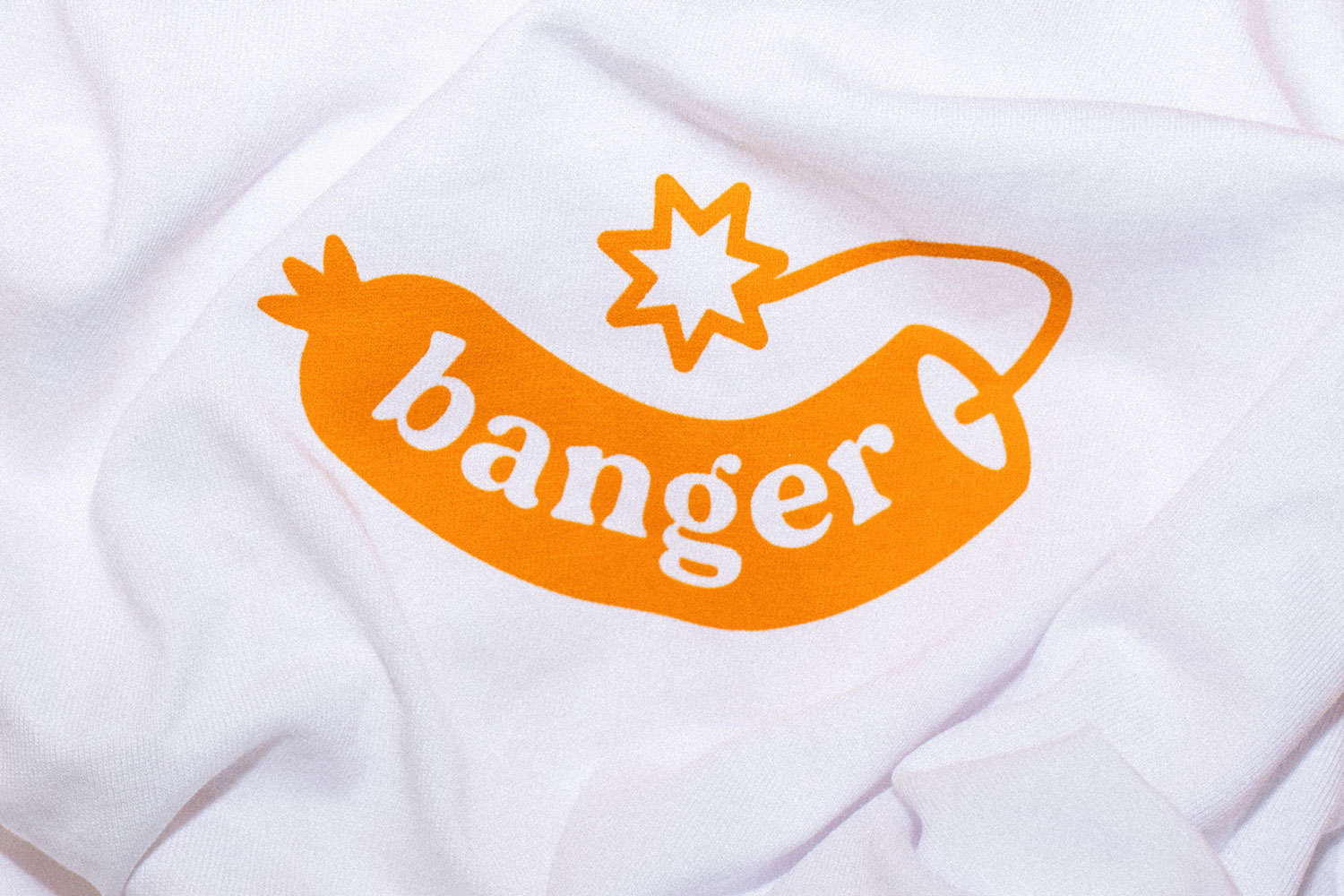
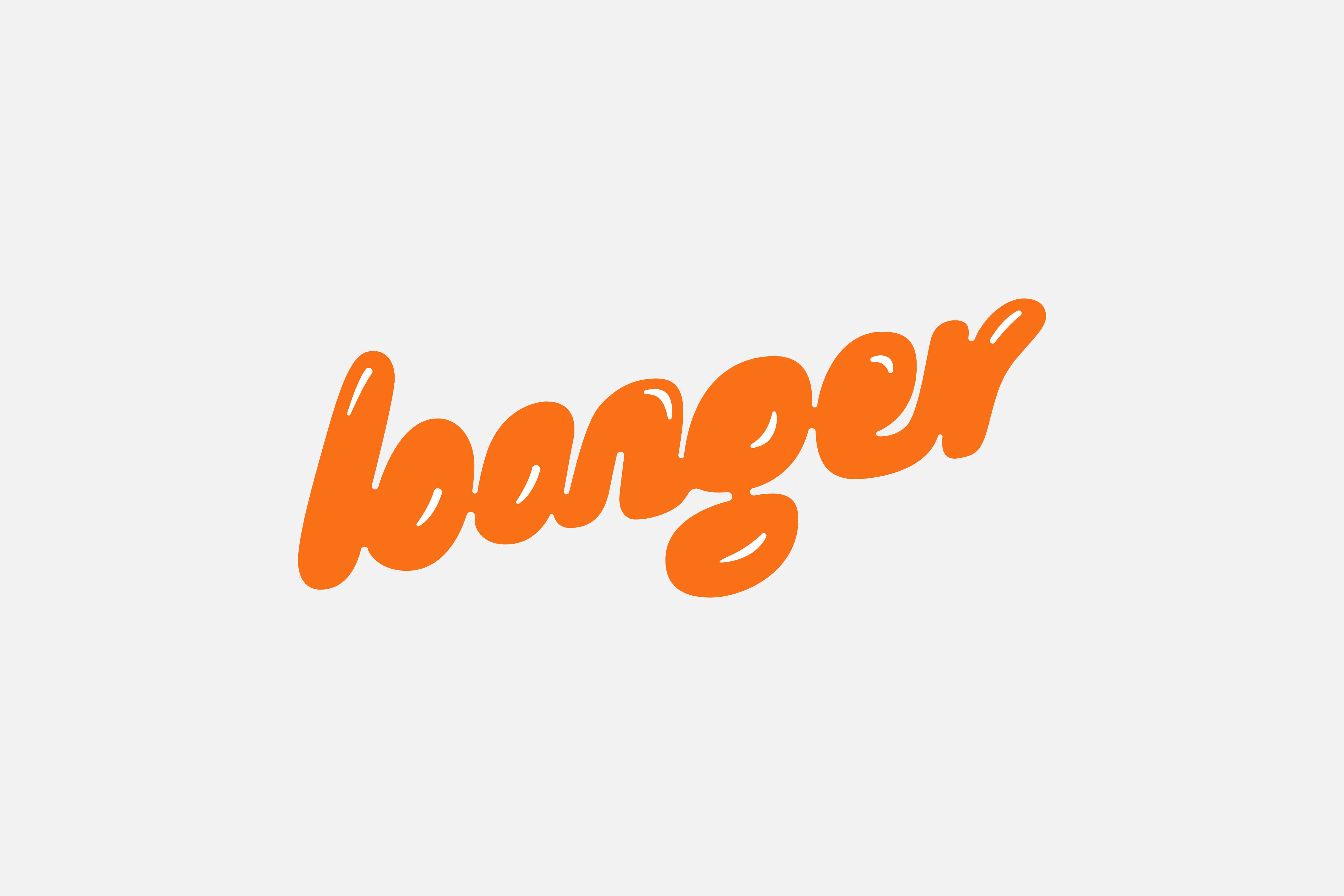
The logotype is a twist on a classic retro style, creating further nostalgia from the brand experience. A secondary custom lettering mark, bubbly and rounded, ties the brand’s playfulness, associations to retro branding, and the shape of hotdogs together in a script. The use of extended and normal Helvetica throughout Banger were chosen to best present the connection to corner shops, contributing a straightforward and bold edge to the brand.
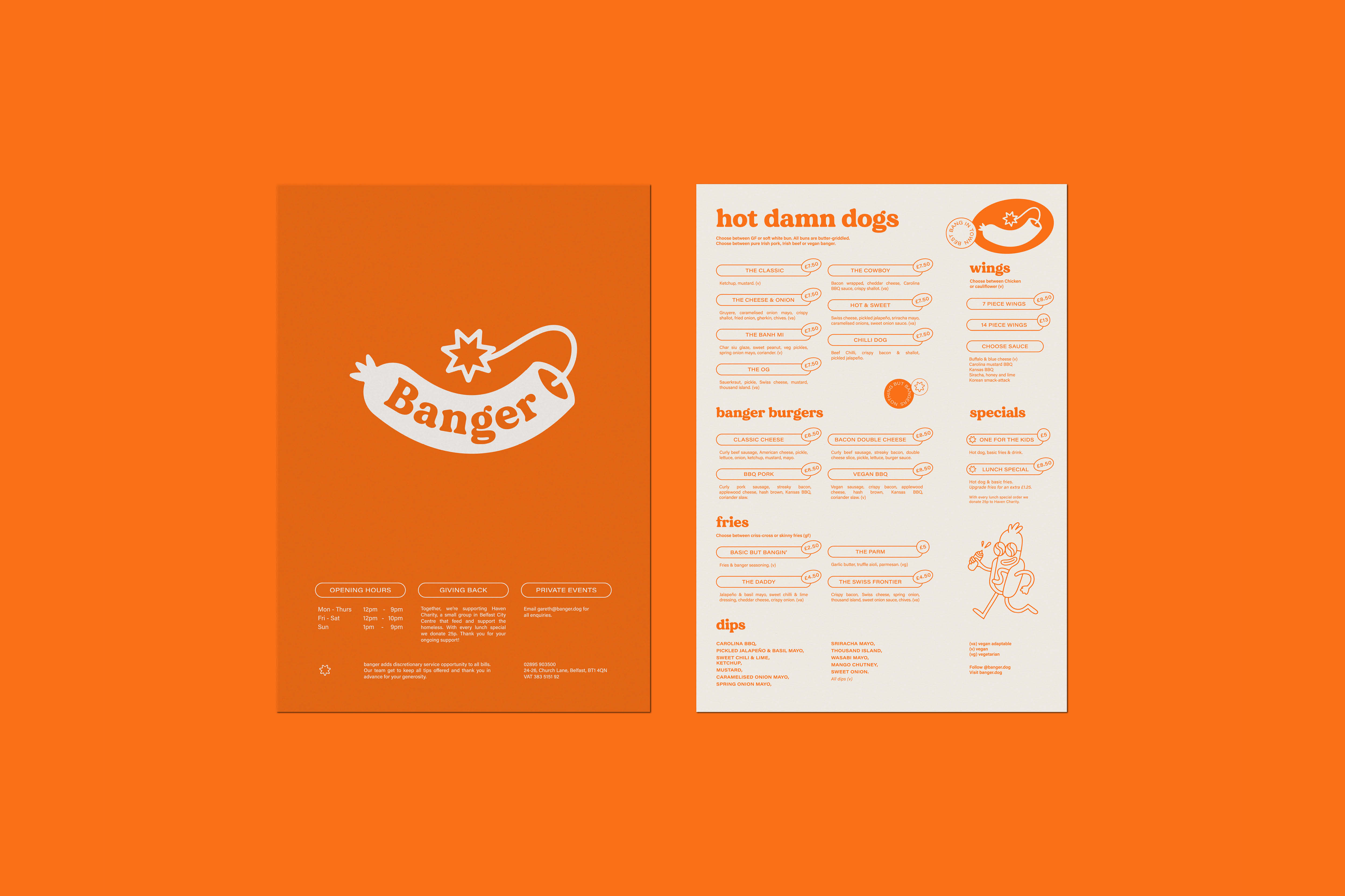
Angel and Anchor landed on frisky messaging to draw customers to conclusions of indulgence and fun. A cheeky way with words created key phrases that associate the brand to everything sausage. ‘Hot Damn Dogs’ became the main phrase to speak to Banger’s fun side. ‘Nothing But Bangers’ is a straightforward message to customers about Banger’s focus while maintaining innocence. ‘Getting it Between the Streets’ is exactly what you think it is – a joke at the shape of a sausage – and a hint to Banger’s iconic location of Church Lane which is woven between streets and alleyways.
The innuendos continue through illustrated marks and extend the x-rated personality.
A stick of dynamite disguised as a sausage and a sausage smoking in an ashtray as if it were a post-coital cigarette are clever devices to dancing on the line of adult suggestions. A cheerful hotdog character who mischievously holds a sauce bottle is a bouncy and endearing mascot encapsulating Banger. Illustrations are in a simple monoline and keep the brand upbeat, witty and fresh.
CREDIT
- Agency/Creative: Angel & Anchor
- Article Title: Branding Hot Damn Dogs by Angel and Anchor
- Organisation/Entity: Agency
- Project Type: Graphic
- Project Status: Published
- Agency/Creative Country: United Kingdom
- Agency/Creative City: Belfast
- Market Region: Europe
- Project Deliverables: Brand Identity, Copywriting, Illustration
- Industry: Hospitality
- Keywords: hospitality, belfast, Northern Ireland, logo design, identity design, hot dogs, mascot, copywriting
-
Credits:
Photographer: Luke McCallum


