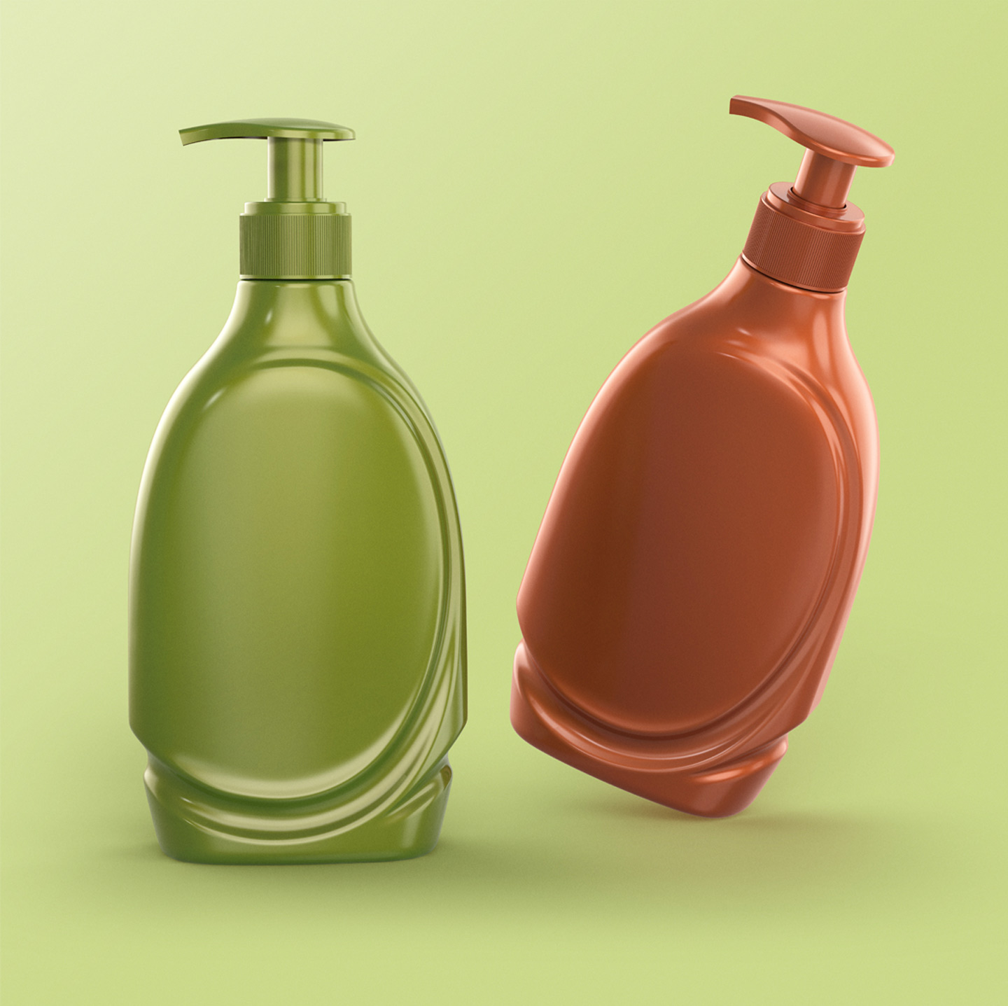
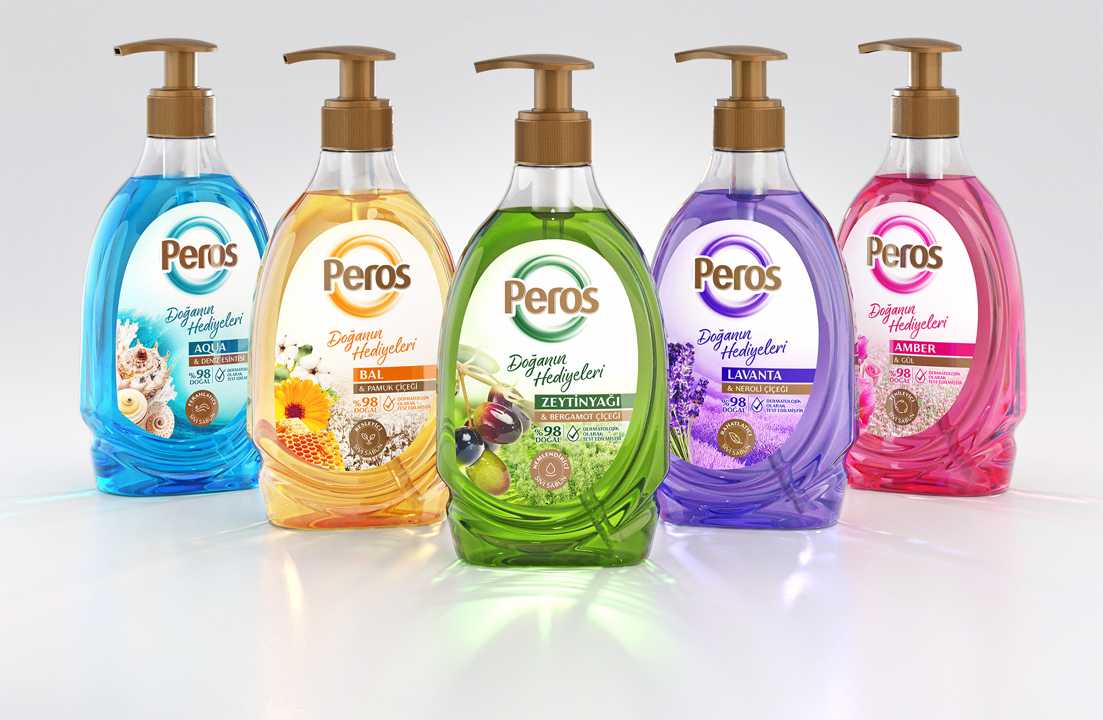
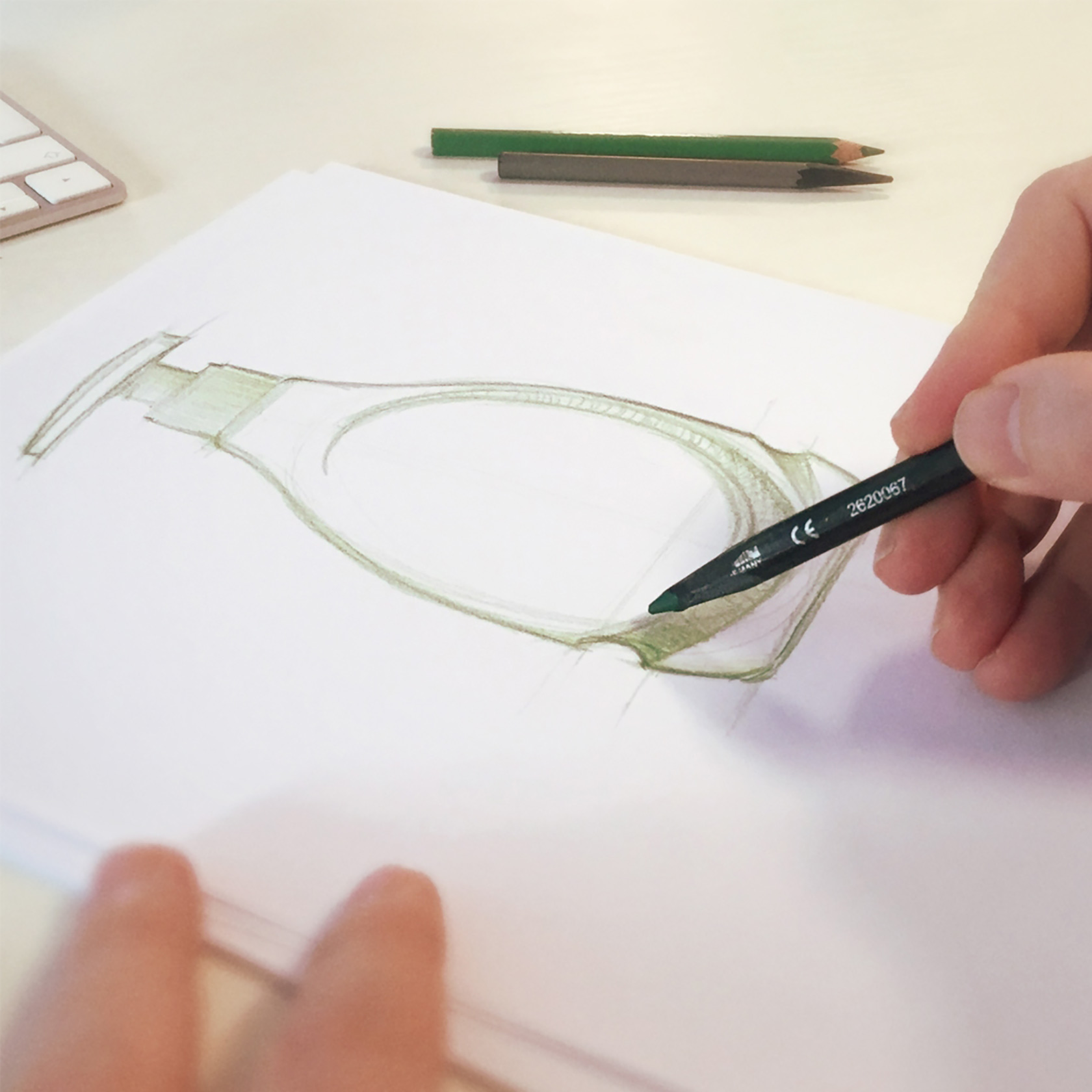
The elliptical form of its shape, the water waves surface and colors not only create a spacious and bright packing but they also try to develop a design language that targets to inspire special feelings such as cleanliness and purification.
The design language created by the inspiration provided from the water waves was based on the elliptical form. Above it can be noted that the simple surfaces advancing towards the bottom are turning into surface shapes imitating the waves of water. These surface movements were planned so that the front and back sides are identical. In this way it provided the opportunity to use efficiently the both sides of the bottle during the labeling and cap fixing stages of production. The graphic and visual elements that are consolidating the color and scent of the liquid contents were arranged on the label on white background. The color integration obtained in this way served the purpose of creating a spacious and bright packing. The usage of the pump color also on the label, for the logo and contents in the same way for all the varieties in the liquid soap series, has consolidated the family emphasis. . . . .


CREDIT
- Agency/Creative: designVENA
- Article Title: Peros Liquid Soap Packaging Industrial Design (Pet Bottle)
- Organisation/Entity: Agency
- Project Type: Packaging
- Project Status: Published
- Agency/Creative Country: Turkey
- Agency/Creative City: ISTANBUL
- Market Region: Asia, Europe, Middle East, Global
- Project Deliverables: 3D Art, 3D Design, 3D Modelling, Brand Redesign, Creative Direction, Design, Industrial Design, Packaging Design, Sketching, Structural Design, Surface Design, Visualisation
- Format: Bottle
- Substrate: Plastic
- Industry: Health Care
- Keywords: #industrialdesign #design #3ddesign #structuraldesign #bottledesign #surfacedesign #productdesign #packaging #packagingdesign #designvena #liquidsoap #cosmetics #beauty
-
Credits:
Bottle Industrial Designer: Erkan SAHIN
Bottle Industrial Designer: Serhan GUZELDEREN
Label Design: Orhan IRMAK


