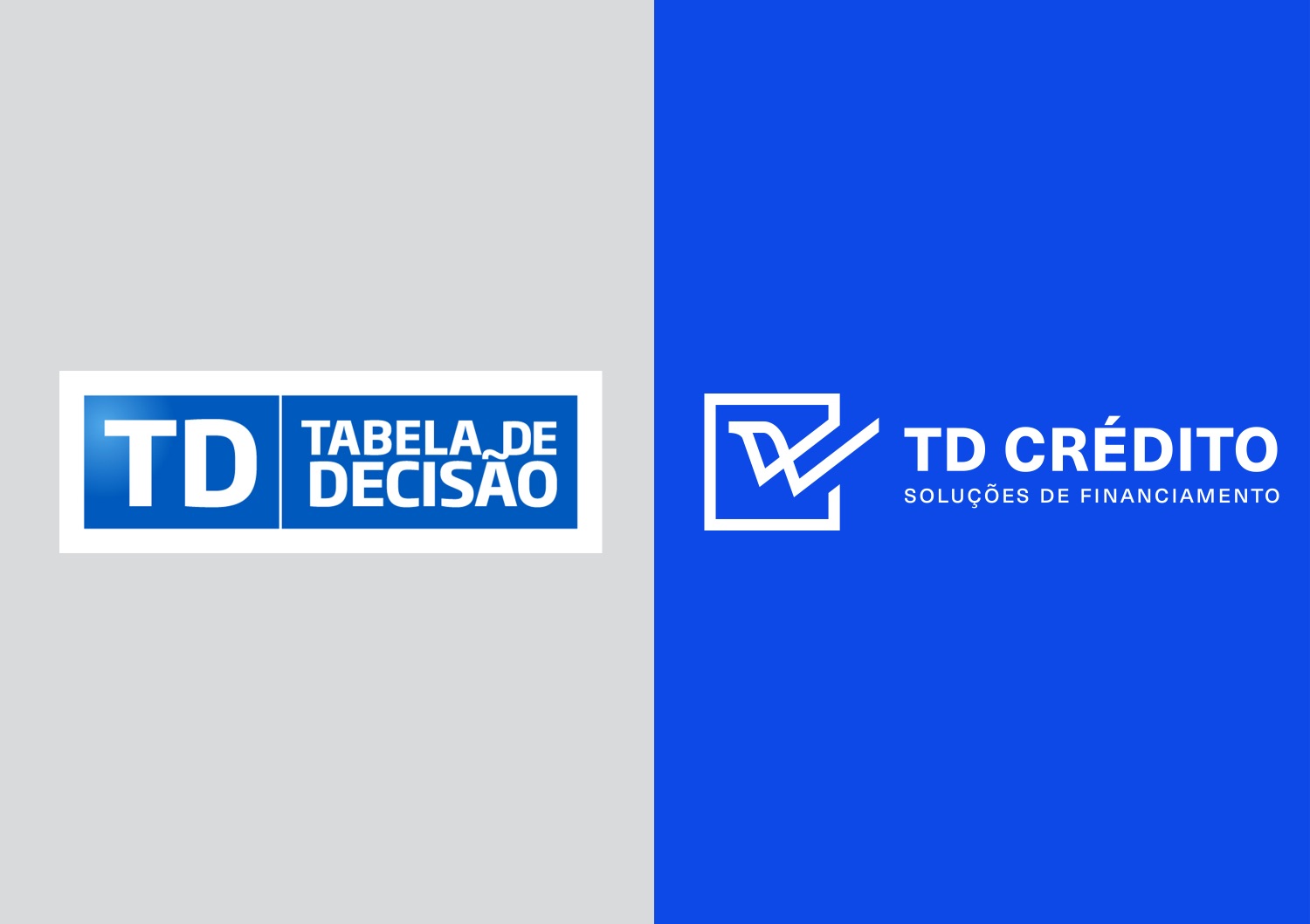
Our client came to us with a need to reposition their company and the way they communicated. They needed to affirm its positioning in an extremely competitive market dominated by large global companies. This rebranding challenge came to us with a specific client need to evolve their communication while still mainting the brand recognition they had.
The brand strategy was defined from the unique way they did business and the way they focused on their client’s goals and dreams, going above and beyond for them. We worked closely with our client and took that into the brand strategy and subsequently developed the verbal identity (creating a brand manifesto and all the brand language that aimed to be informal – explaining complex financial concepts in easier terms and common language), visual identity, communication touch-points and brand activation.
The previous logo focused on the name “Tabela de Decisão” which translates to “Decision Chart” in english. Our goal was to create a natural evolution for the brand name and logo.
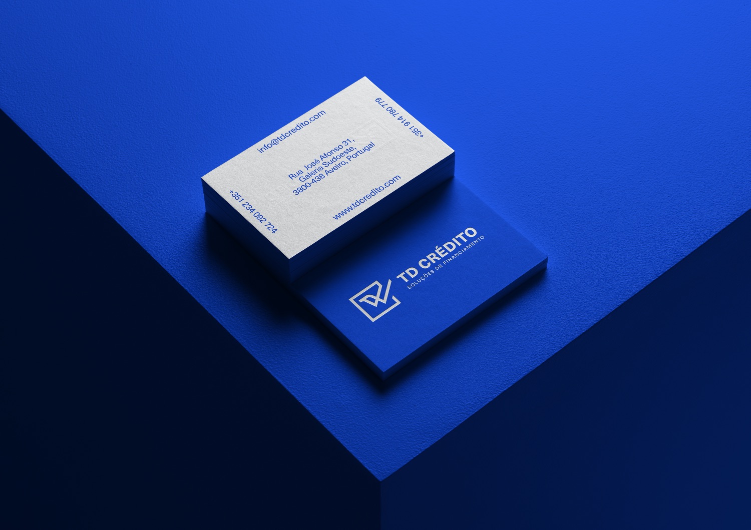
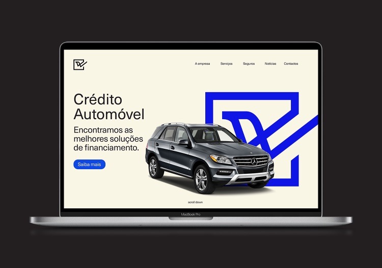
The symbol created visually reflects the purpose of the brand: supporting and advising people in accessing credit, helping them to make the best decision to achieve their dreams. Through a continuous line, which represents the lasting relationships that the brand builds with its customers and partners, the logo focuses on the design of a stylised bird appearing inside a decision box, giving wings to the decision making process. This way, we evolved the previous brand name into a symbol that seamlessly interacts with the developed verbal component of the brand, emphasising the idea of “saying yes”/”deciding” and “ticking/checking the box” of accessing credit and other financial services.
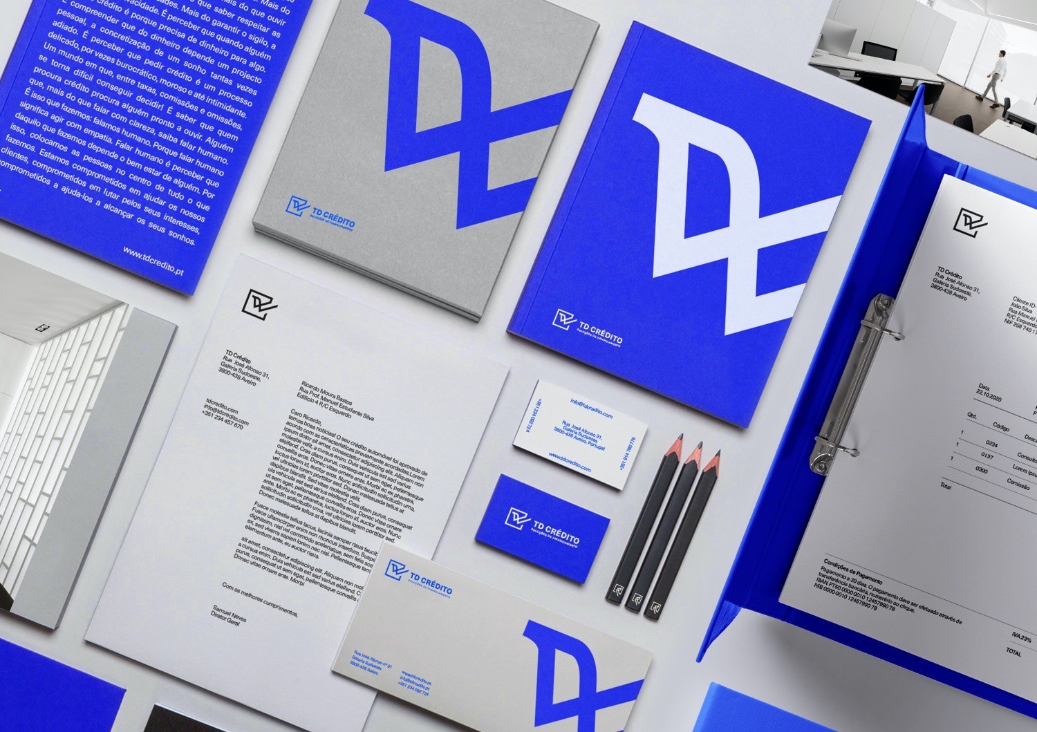
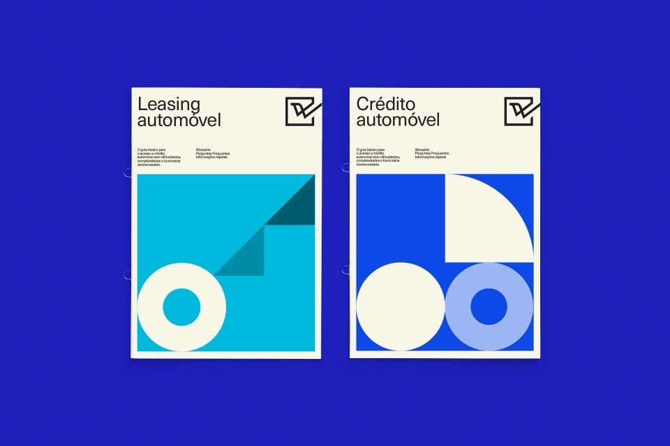
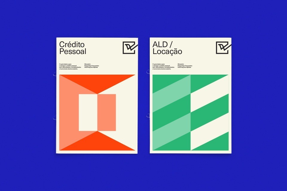
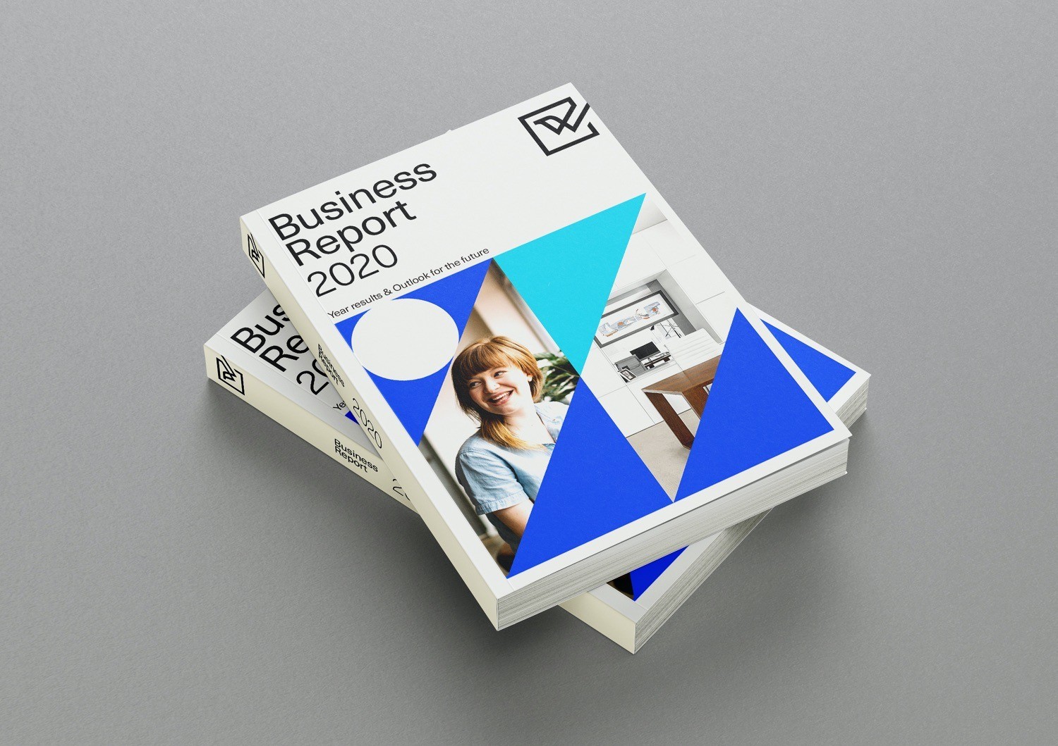
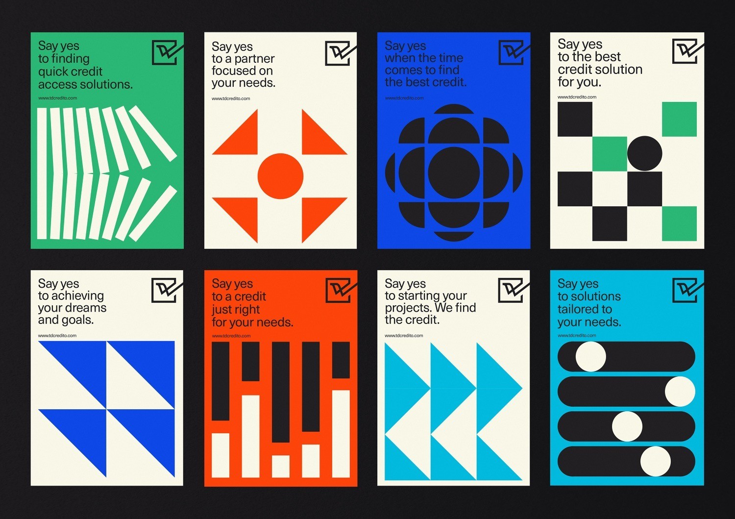
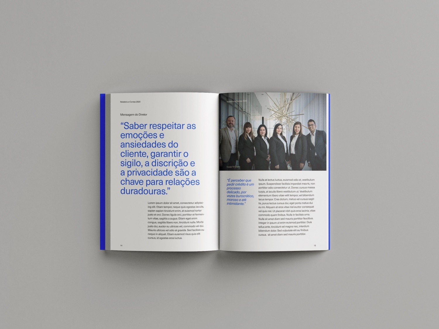
Alongside the logo, we developed a dynamic graphic universe base on simple geometric shaped illustrations that aimed to make the financial concepts easier to understand. The minimalistic layouts – made with a simple formula of having a square space available for the graphic illustration and imagery – quickly made all the print materials easily recognisable in every context. The graphic universe was created to have a simple system that would allow the brand to grow and always have the ability to surprise. Using flat geometric shapes mixed with photography made impactful and successful materials.
The verbal component of the brand was very important to make every touchpoint coherent. The “check-box” brand symbol worked together with the illustration and copywrite, making every touchpoint consistent.
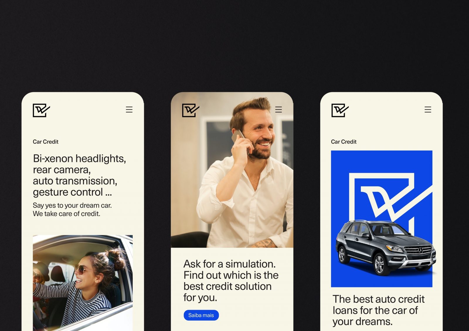
With a carefully well-thought activation plan that ranged from social media strategy, website and app design, corporate collaterals, office design and merchandising, to a national print campaign the renewed brand identity and design system quickly gain fans all over the market place, giving our client’s company the necessary boost to enter new markets and becoming a national reference for its financial services.

CREDIT
- Agency/Creative: Super. Brand Consultants
- Article Title: TD Credito – Wings to Your Investment by Super. Brand Consultants
- Organisation/Entity: Agency
- Project Type: Identity
- Project Status: Published
- Agency/Creative Country: Portugal
- Agency/Creative City: Aveiro
- Market Region: Europe
- Project Deliverables: Brand Design, Brand Identity
- Industry: Financial
- Keywords: WBDS Agency Design Awards 2021/22
-
Credits:
Creative Director: Laura Moreira
Strategy Director and Lead Copywriter: João Magalhães


