The bella vita in every crust and crumb.
Crosta & Mollica’s popularity had grown due to its stand-out pack design and differentiated product quality – despite many of its buyers being unable to recall its brand name. Through establishing a true brand proposition and communicating it via an integrated campaign, Crosta & Mollica is quickly becoming a modern, Italian cross-category icon.
The Challenge
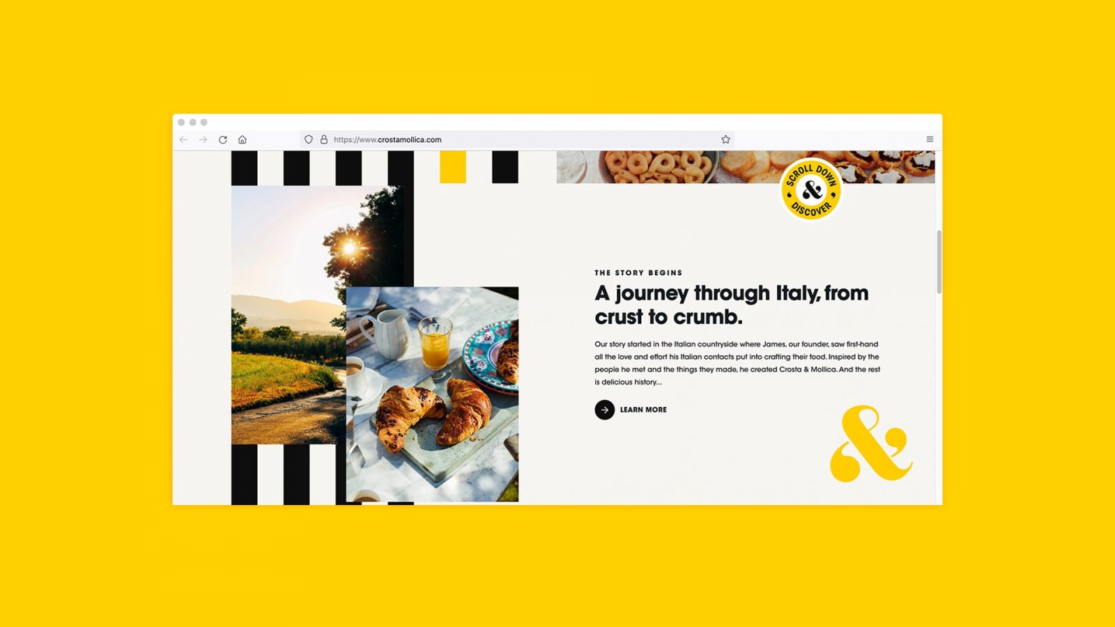
British brand Crosta & Mollica began in the Italian countryside, when its founder was inspired by the effortless and unhurried joy that came from the love that Italians put into crafting their food. The team scour the lengths and breadth of the country in search of authentic, artisanal and regional Italian specialties that deserve to be in the kitchens and on the tables of food-lovers everywhere. And it is because of this dedication and commitment to authentic Italian products, that the brand has risen from challenger to major player in just a few years.
However, despite impressive sales and rave reviews, surprisingly few consumers can actually recall the brand name (instead referring to it as ‘the stripey brand’), or understand its authentic provenance. So, in a world full of fake or clichéd Italian brands, there was an opportunity for Crosta & Mollica to own something authentic, yet contemporary, and give consumers a taste of the real Italy across multiple categories.
The Objectives
To grow the brand in line with ambitions, Crosta & Mollica needed a cohesive creative strategy and suite of assets from which to plan its major investment in communications and activation. Our role was to shift Crosta & Mollica’s product-led approach to a brand-led one, instead communicating its unique proposition to drive emotional engagement with its consumers.
The Insight
Crosta & Mollica’s strength is its attention to detail in sourcing the highest quality products from all over Italy. When people try their products, they fall in love with them and love sharing them with their friends, over drinks or an impromptu pizza. But, people don’t associate Crosta & Mollica with Italy or even know that the name means ‘crust and crumb’ in Italian.
Our research amongst non-buyers identified several tensions which led us to our consumer truth – people just want an effortless, authentic Italian experience without having to leave the house. People want to be instantly transported to their idea of Italy.
The Idea
‘The modern bella vita… in every crust and crumb’ became our revised brand proposition, and knowing that this can mean different things to different people, we established three creative principles to drive the brand-led consistency that was needed. But we allowed scope to dial them up and down to authentically convey aspects of the Crosta & Mollica brand across different media:
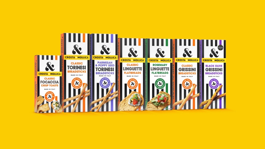
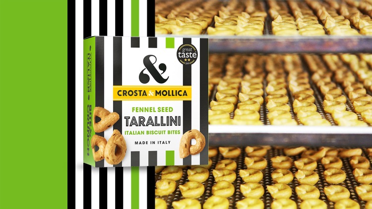
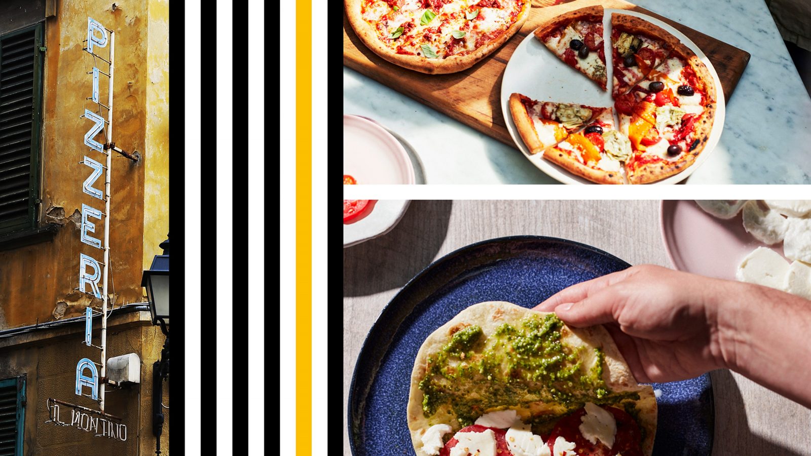
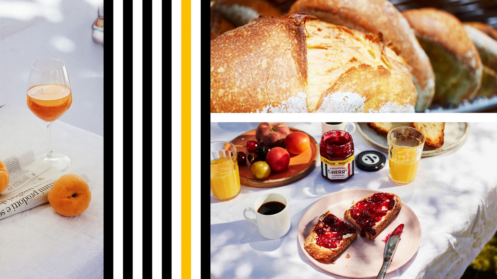
Bold contrast – Embracing what the brand is known for and, up until now, its most distinctive asset – it’s contrasting black and white stripes.
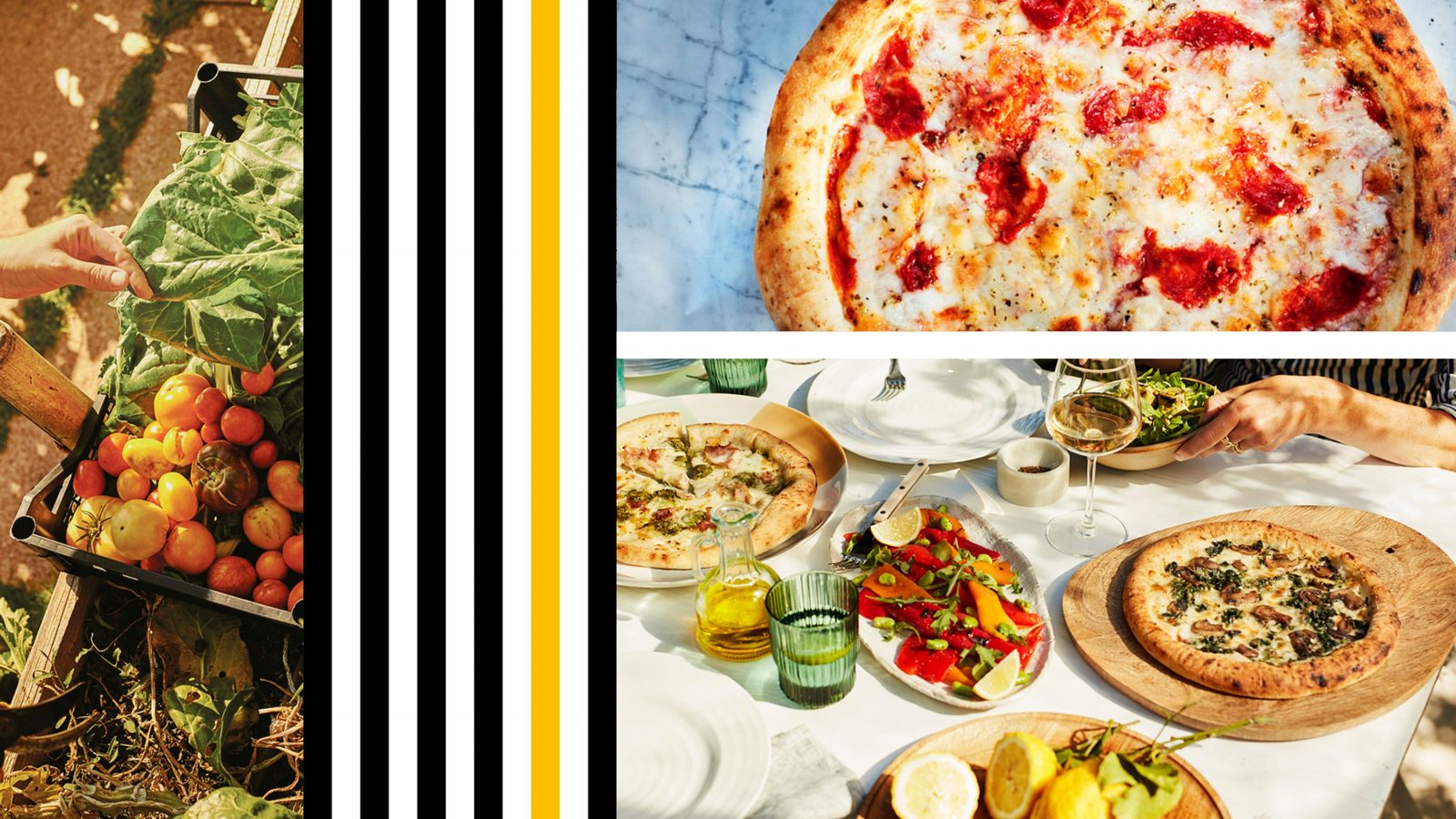
Beautiful detail – The exacting care in everything Crosta & Mollica does. The craft and simplicity.
Effortless radiance – The transportive nature of the bella vita.
The Execution
Initially we made subtle changes to evolve the brand and make its distinctive assets work harder, including amplifying the ‘&’ and creating clear photography guidelines to reflect and showcase the effortless radiance of Italy.
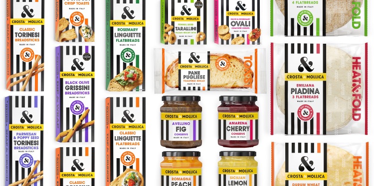
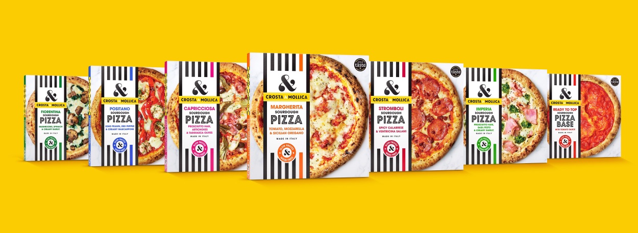
Packaging – We established a clear system for the colour and number of stripes on pack, as well as using them to form a holding shape for clear product information. And to dial up the beautiful detail we switched to a more modern and relaxed overhead photography style. ‘Made in Italy’ was brought into the product names to upweight its importance and iconography was developed to highlight key details and product truths, such as ‘slow proved’ and ‘twice baked’.
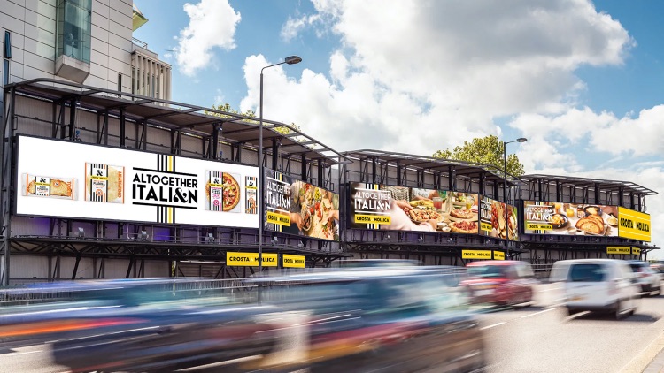
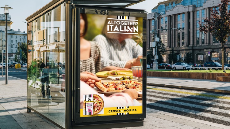
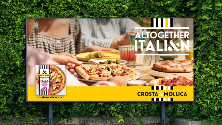
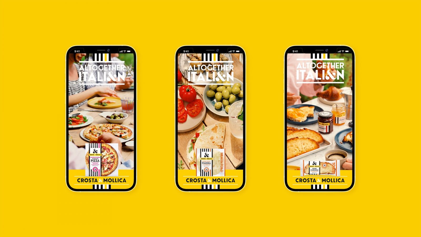
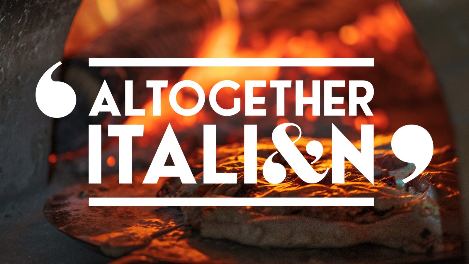
Summer campaign (OOH supported by digital) – Launching at a time when people were starting to plan gatherings after having been apart for so long, our ‘Altogether Italian’ campaign celebrates being with family and friends once more, something which is also quintessentially Italian. It is also founded on the product truth – 100% ALL Italian. The campaign is brought to life through the ‘effortless radiance’ lens, and is a summation of everything about Crosta & Mollica and its view of Italy.
TVC – For the brand’s first foray into television, our advert continues where the OOH campaign left, transporting viewers straight to Italy and capturing the true nature of the bella vita. Shooting with an Italian director and entirely Italian crew, ensures the integrity of the piece.
The Impact
Crosta & Mollica’s unified aesthetic and unique tone of voice works seamlessly across retail and communication channels, driving engagement, trial, loyalty, and saliency. But most importantly, consumers tell us that the brand transports them to Italy and impressive growth numbers suggest that it’s becoming a cross-category icon.
CREDIT
- Agency/Creative: Bluemarlin
- Article Title: Crosta & Mollica Integrated Creative Campaign by Bluemarlin
- Organisation/Entity: Agency
- Project Type: Campaign
- Project Status: Published
- Agency/Creative Country: United Kingdom
- Agency/Creative City: Bath
- Market Region: Global
- Project Deliverables: Branding
- Industry: Food/Beverage
- Keywords: WBDS Agency Design Awards 2021/22
-
Credits:
Strategy: Dan Monteith
Creative Director: Tony Fox
Design: David Hodgson
Design.: Joanne Pittard
Design.: Josh White
Visualisation: Simon Thomas
Artwork: Steve Gordon
Account Direction: Layla Kammeier
Account Direction: Charlotte Oggier
Owner & Director, Crosta & Mollica: James Orr
Marketing Director, Crosta & Mollica: Paul Vita
Digital & Comms Marketing Manager, Crosta & Mollica: Ben Hyde-Hart


