Branding the game-changer of movies
Kind has created the identity and overall branding for White Rabbit – a company set to revolutionise how the world streams movies and series. White Rabbit’s international venture will challenge the major corporate film streaming companies, while at the same time fighting the pirate industry. With full transparency around financial distribution, and more money back to those who actually produce the movies, White Rabbit takes on both the role as the challenger, the rebel and the responsible hero in the future marketplace.
White Rabbit is a browser extension that enables people to pay for content from any movie streaming site they wish to use. For the viewer, this means an end to multiple subscriptions, more choice and better quality – all legal and transparent. For the film industry, it means they get their fair share. It is a disruptive product, with a responsible core.
This was important to emphasize both with the naming, communication, and branding. The result is a suitably edgy identity, which targets film fans and conveys the sense that White Rabbit is here to shake things up for the better.
Named after Lewis Carroll’s White Rabbit from the book Alice’s Adventures in Wonderland. The rabbit appears in the very beginning of the book, muttering “Oh dear! Oh dear! I shall be too late!”, he jumps into his rabbit hole and Alice follows him down into Wonderland.
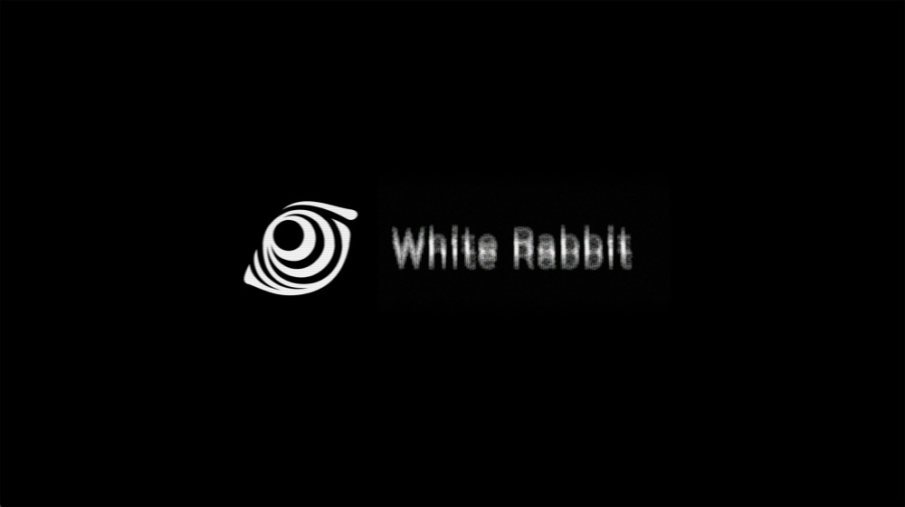
Take a trip with White Rabbit and discover a world of entertainment. For the brand, the psychedelic story of the White Rabbit is the key to the visual identity. It all starts with the brand symbol; a rabbit eye that also is a portal within. A graphic 3D vortex is a supporting element, that acts as a loop to another dimension. The palette is unapologetically black and white. The use of large black surfaces creates a base for the brand, with white text and visuals on top. The communication is both responsible and rebellious. Informative, but disobeying. Ordered, but unexpected.
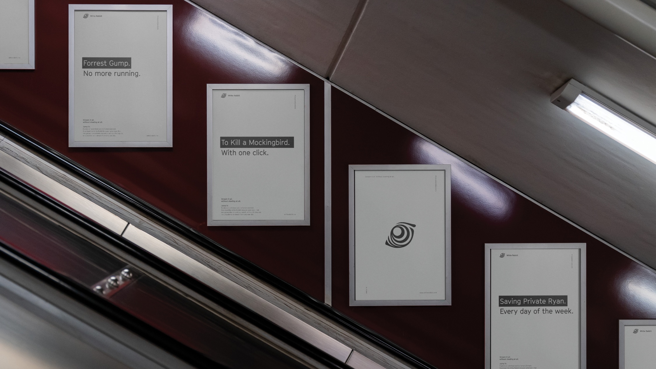
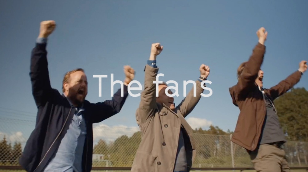
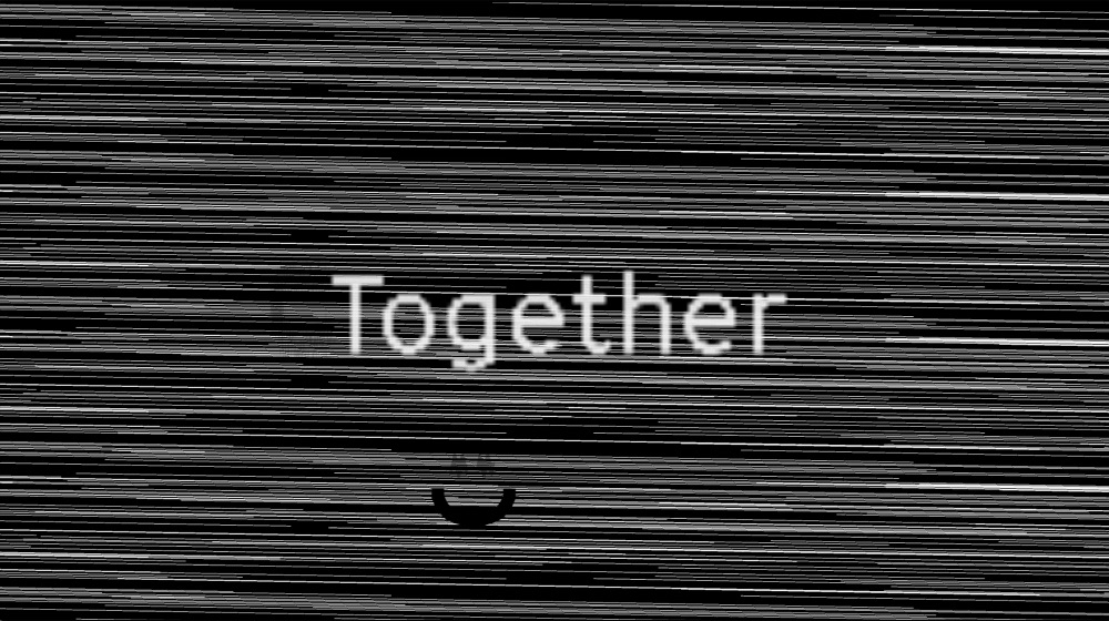
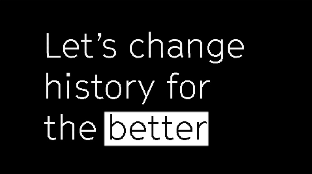
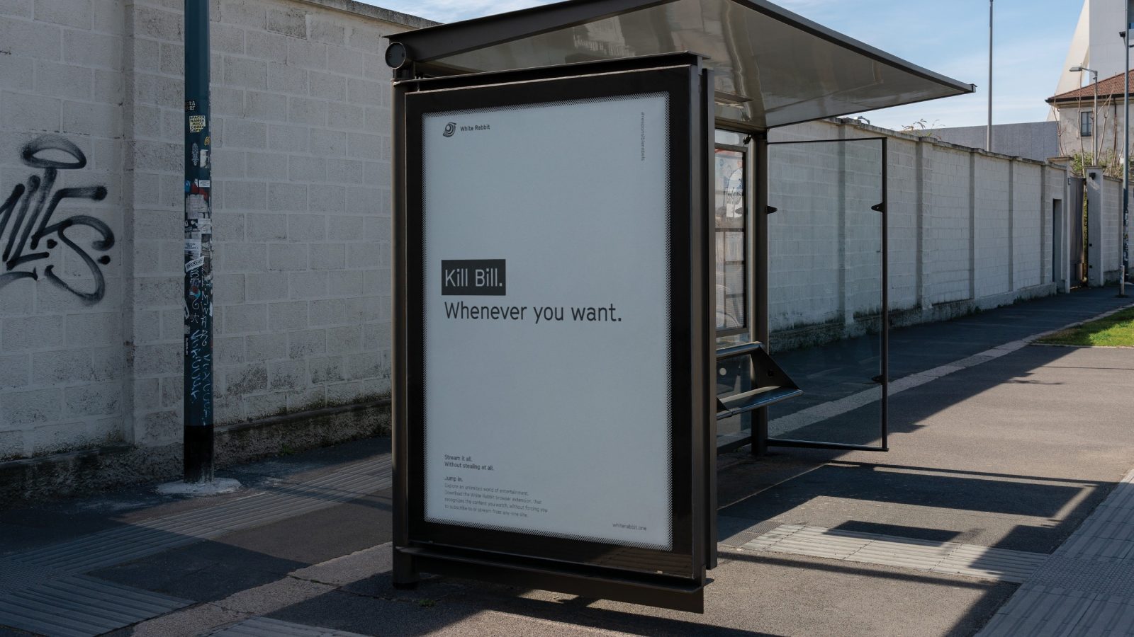
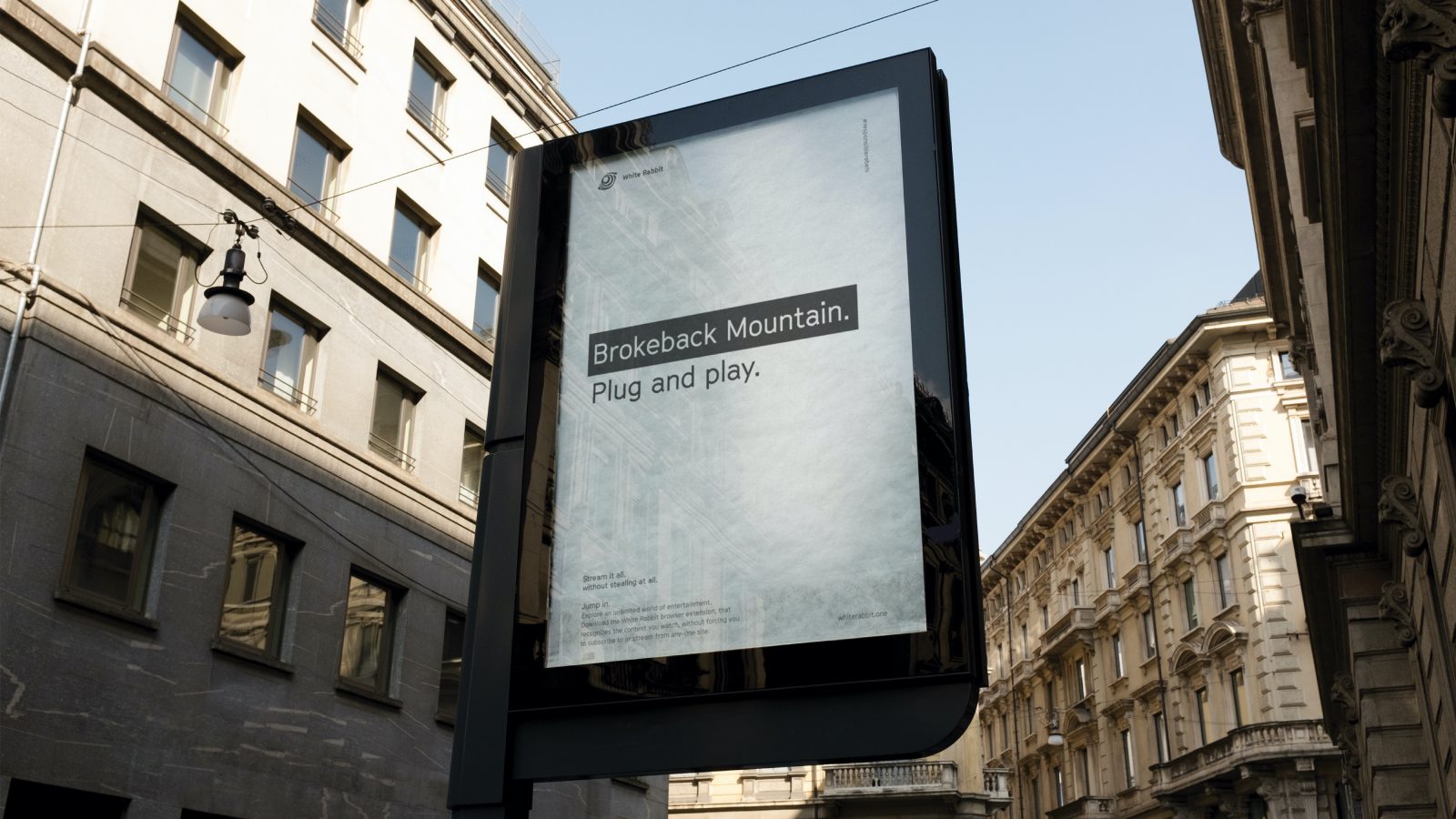
A communication campaign was created for the brand release, as well as an short explainer film. It emerged online on surfaces like Facebook, Instagram, Reddit and White Rabbits own website. We commissioned a voice that sounded like it came from a movie trailer. It balances short, cheeky and relevant movie clips with text slides that glitches. The animation consists of disruptive elements, glitches that are blurred, pixelated, and jagged as well as inverted boxes also come and highlights the key words within a text.
Film references is used to bond with the common film-lover, and to create a dynamic, recognizable, and playful level that is easily adaptable to new film titles. The brand also uses call to actions like the slogan ‘Jump In’ and main ‘Stream it all, without stealing at all’. This is to engage the viewer and make them feel a hyped urge to join in on the fun. Be a rebel with a conscious – stream it all, without stealing at all.

CREDIT
- Agency/Creative: KIND
- Article Title: White Rabbit Graphic Design for Moving Image by Kind
- Organisation/Entity: Agency
- Project Type: Graphic
- Project Status: Published
- Agency/Creative Country: Norway
- Agency/Creative City: Bergen
- Market Region: Global
- Project Deliverables: Graphic Design
- Industry: Entertainment
- Keywords: WBDS Awards, Agency
-
Credits:
Creative Director: Tom Emil Olsen
Design Director & Senior Designer: Knut Harald Longva
Senior Designer: Carl Bugge
Designer: Emil Olsen
Senior Designer: Bjørn Ivar Thomassen
Photographer: Christoffer Meyer
Strategic Brand Consultant: Thomas Danielsen
Designer: Johannes Blomgren


