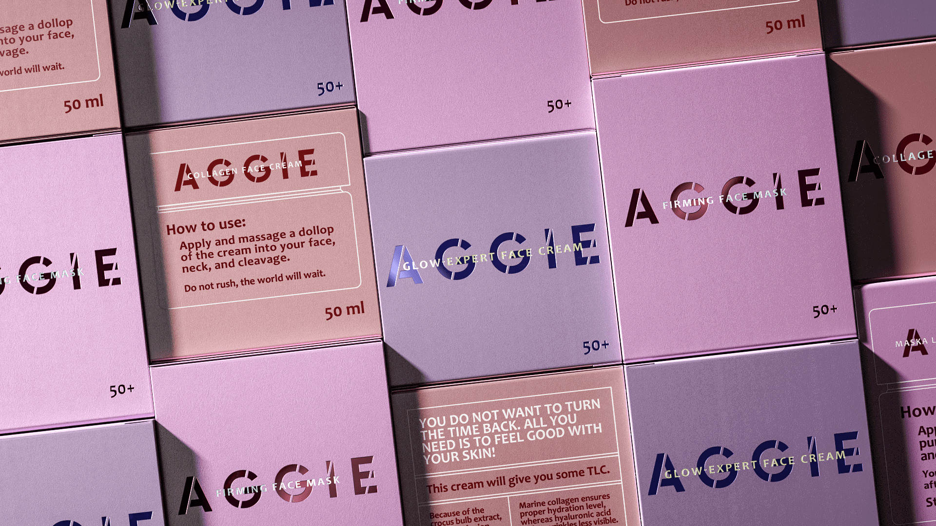
PG Reforming combined minimalism and catchiness in cosmetics packaging design.
Task: to develop a packaging design for anti-aging cosmetics for the EU market.
Decision:
We often meet the stereotypical opinion, that female beauty fades and women become more passive over time. But in fact, many women lead an active lifestyle, not paying attention to the years: they go in for sports, go to parties, travel, etc. They are cheerful and cheerful, and their age does not bother them at all. For such women, Aggie cosmetics were developed.
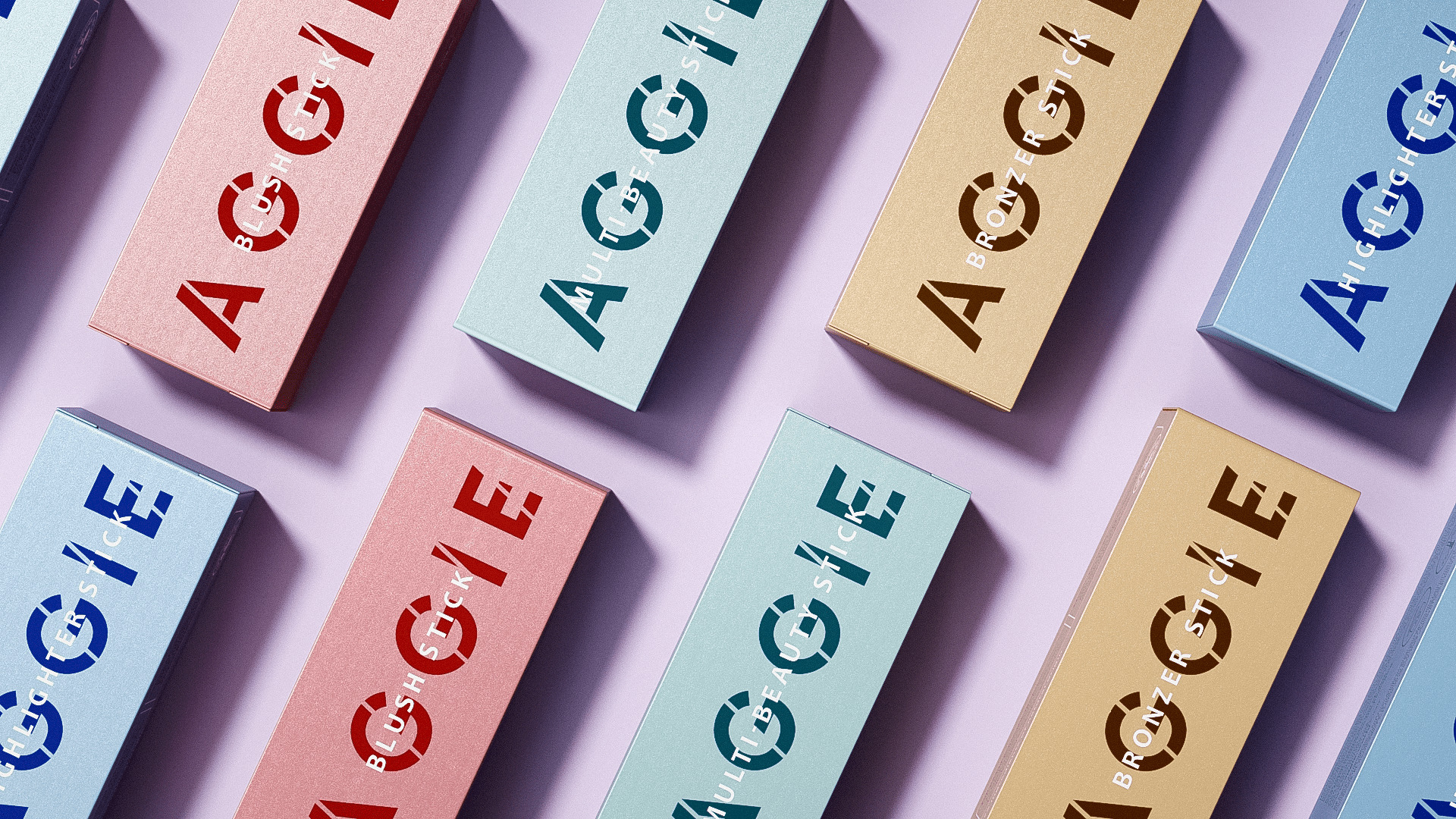
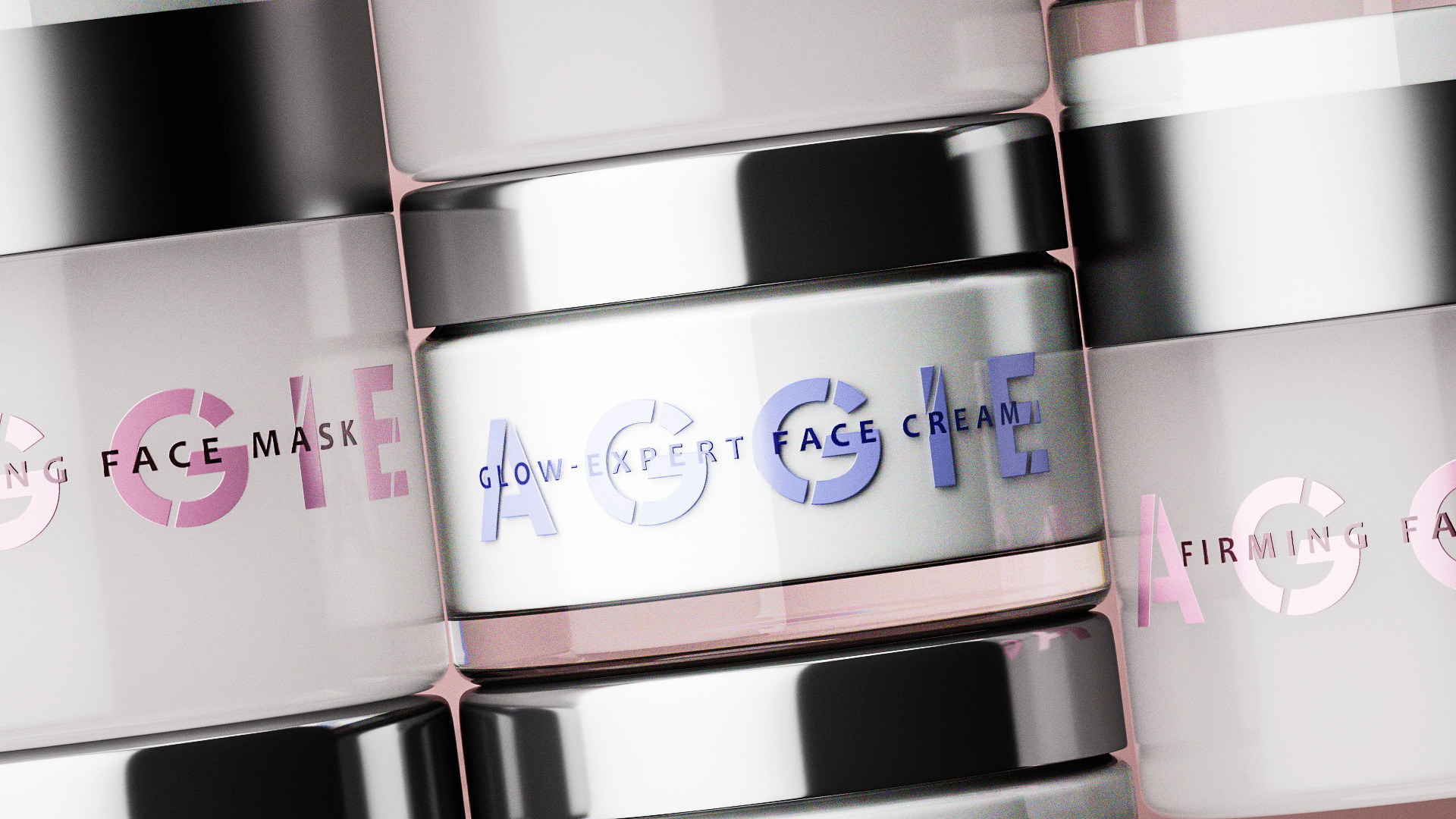
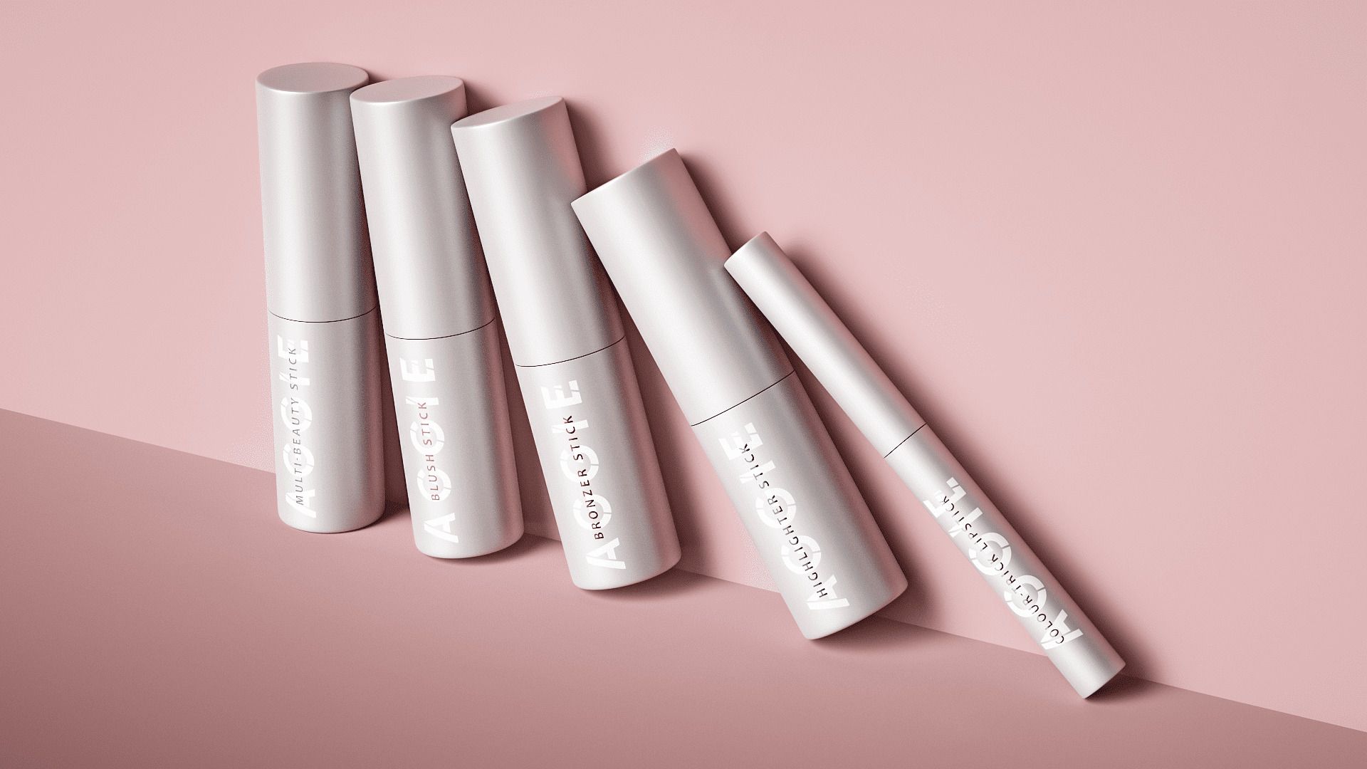
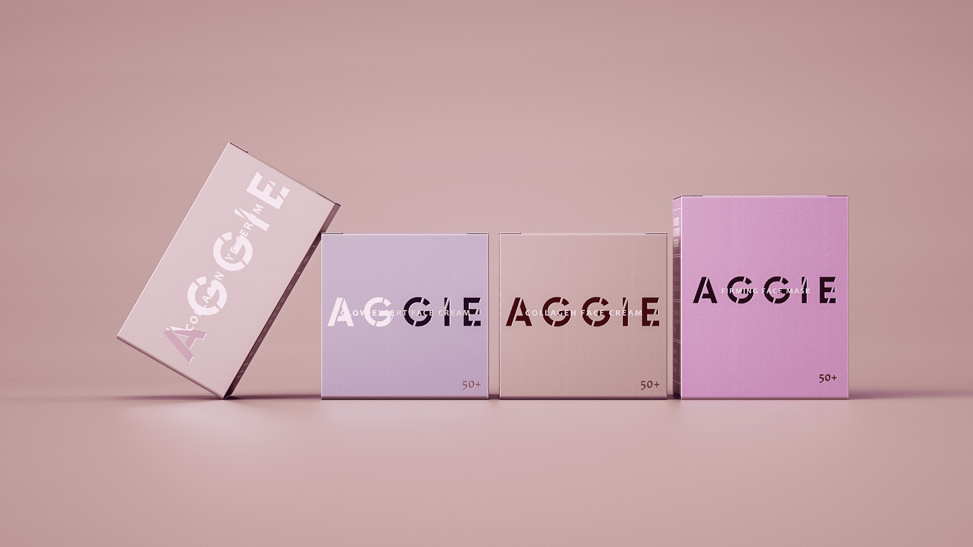
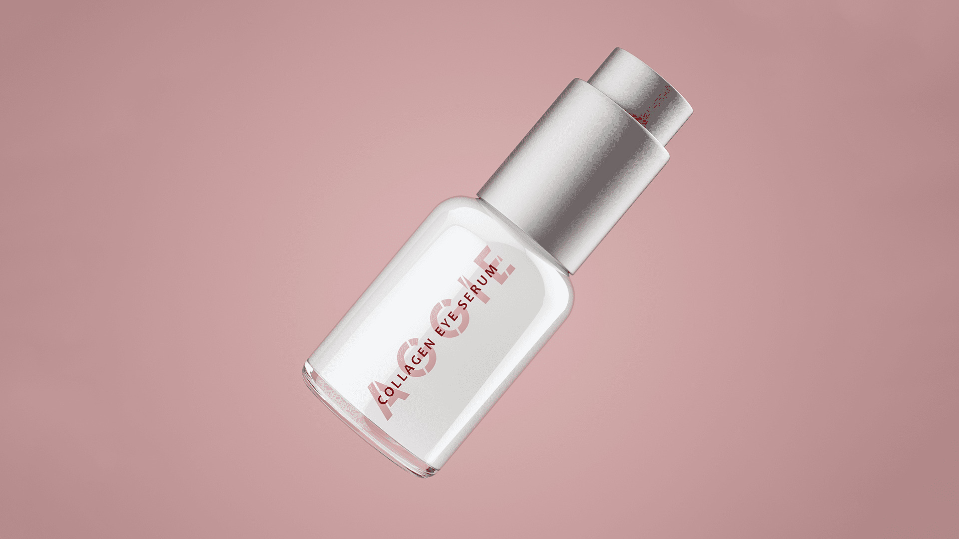
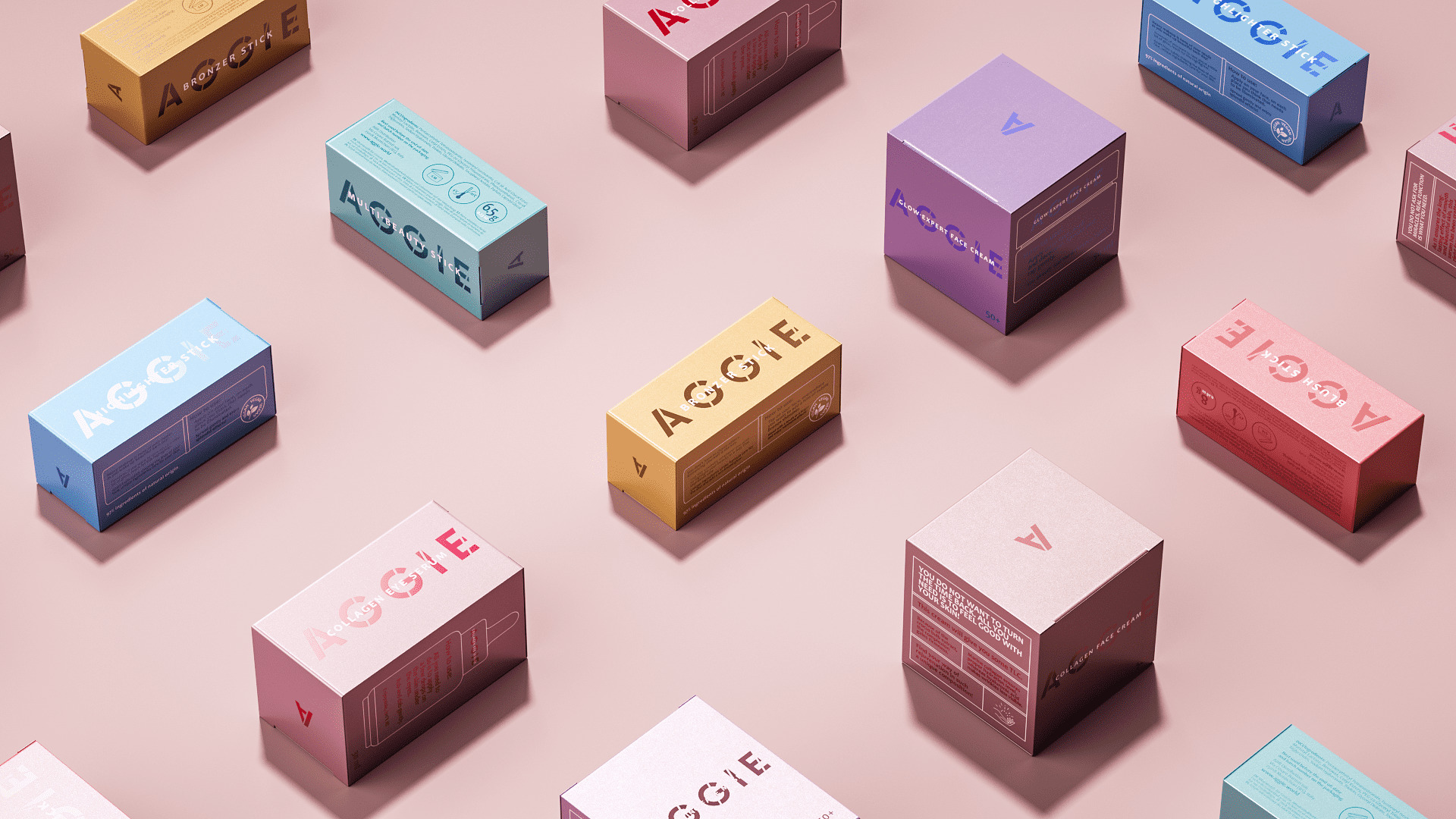
When designing the packaging, PG team combined sophistication and minimalism with brightness. The key message of the brand’s visual identity: elegance, confidence, aesthetics and beauty. At first, the packaging seems simple: a laconic logo, a large brand area, but the color scheme (rich and noble color palette that realizes the differentiation between products) and the non-standard material solution (holographic packaging) make the box or tube of cream shine and sparkle.
This solution looks noble and simple, calm enough and at the same time stands out on the shelf.
PG Reforming combined minimalism and catchiness in cosmetics packaging design
Task: to develop a packaging design for anti-aging cosmetics for the EU market.
Decision:
We often meet the stereotypical opinion, that female beauty fades and women become more passive over time. But in fact, many women lead an active lifestyle, not paying attention to the years: they go in for sports, go to parties, travel, etc. They are cheerful and cheerful, and their age does not bother them at all. For such women, Aggie cosmetics were developed.
When designing the packaging, PG team combined sophistication and minimalism with brightness. The key message of the brand’s visual identity: elegance, confidence, aesthetics and beauty. At first, the packaging seems simple: a laconic logo, a large brand area, but the color scheme (rich and noble color palette that realizes the differentiation between products) and the non-standard material solution (holographic packaging) make the box or tube of cream shine and sparkle.
This solution looks noble and simple, calm enough and at the same time stands out on the shelf.
CREDIT
- Agency/Creative: PG Brand Reforming Company
- Article Title: Minimalism and Catchiness in Cosmetics Packaging Design Aggie
- Organisation/Entity: Agency
- Project Type: Packaging
- Project Status: Published
- Agency/Creative Country: Poland
- Agency/Creative City: PG Brand Reforming / Warsaw
- Market Region: Europe
- Project Deliverables: Brand Creation, Brand Design, Branding, Graphic Design, Logo Design, Packaging Design
- Format: Box, Pot
- Substrate: Plastic, Pulp Carton
- Industry: Health Care
- Keywords: cosmetics beautydesign minimalism skincare
-
Credits:
creative director: Witalis Jackiewicz


