Packaging Design Creation
The worlds best gin, ready to drink – Bareksten by 7 Fjell (Ready to drink) is a love child born of the combined effort of Bergen’s two leading hand-crafted manufacturers in beverages: Bareksten Botanical Spirits and 7 Fjell Bryggeri. KIND has created both brands and has now created the design for their joint venture.
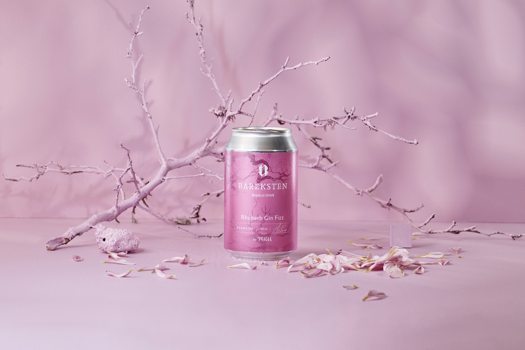
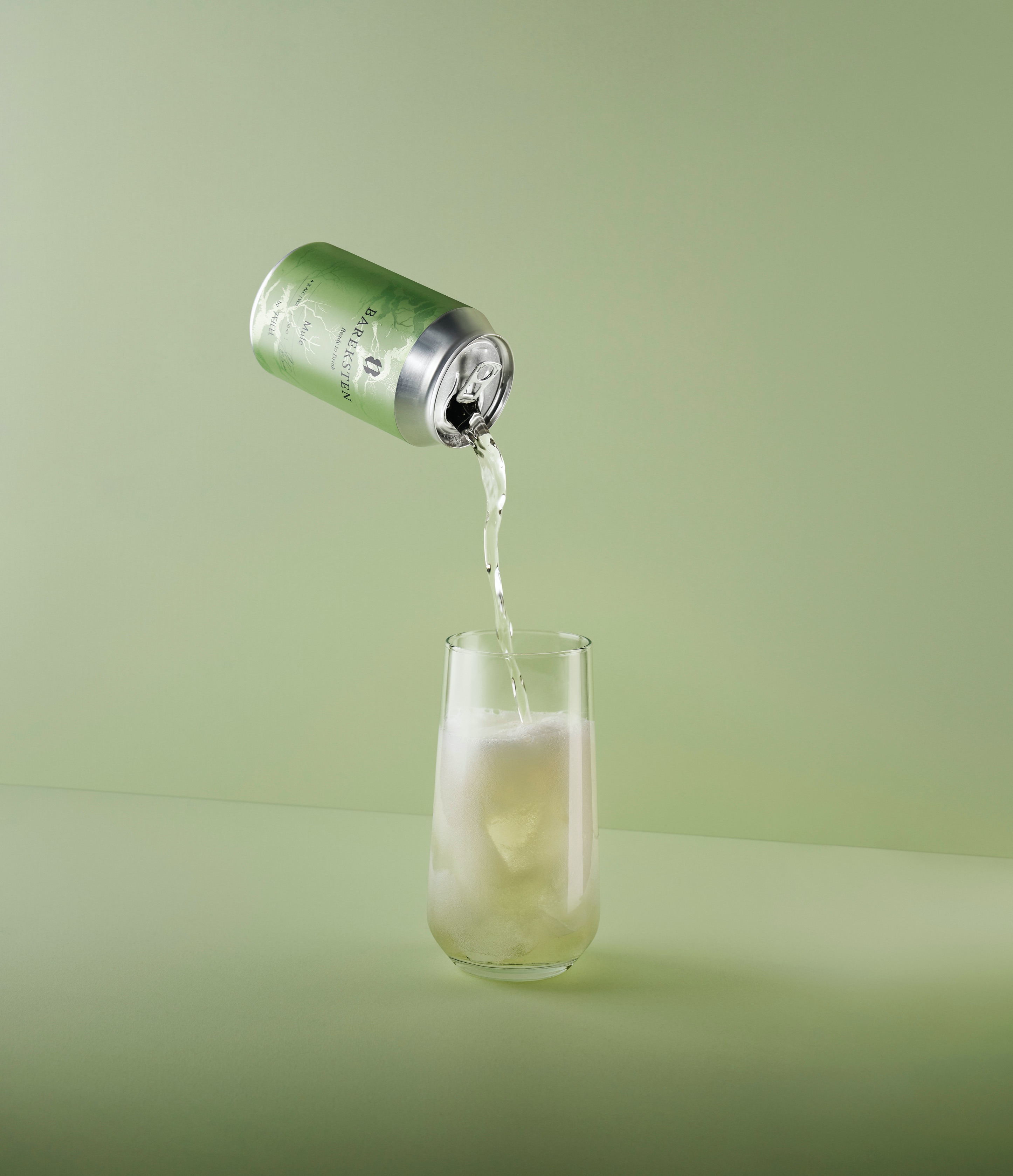
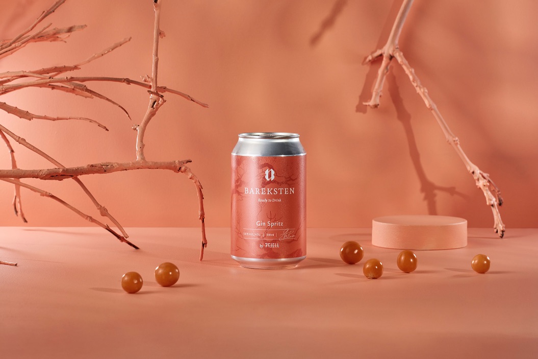
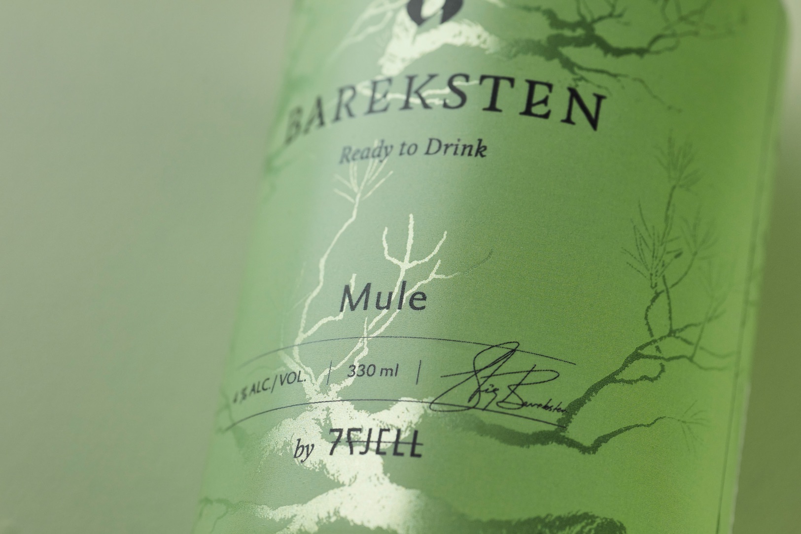
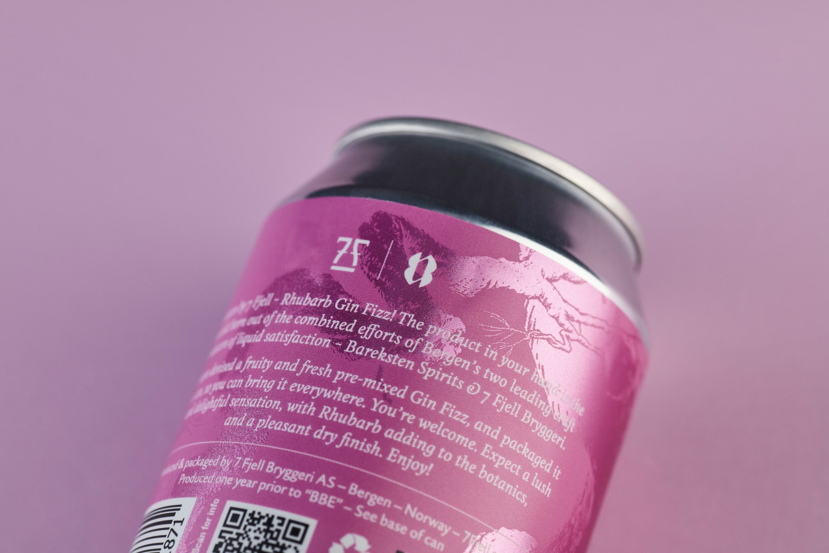
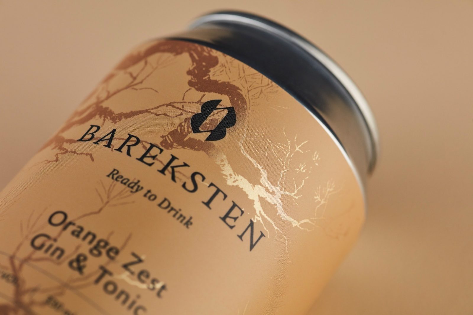
The goal of the series is to make refreshing ready-mixed long drinks in cans, which can be taken and enjoyed anywhere. The series consists of Rhubarb Gin Fizz, Orange Zest Gin and Tonic, Gin Mule, and Gin Spritz.
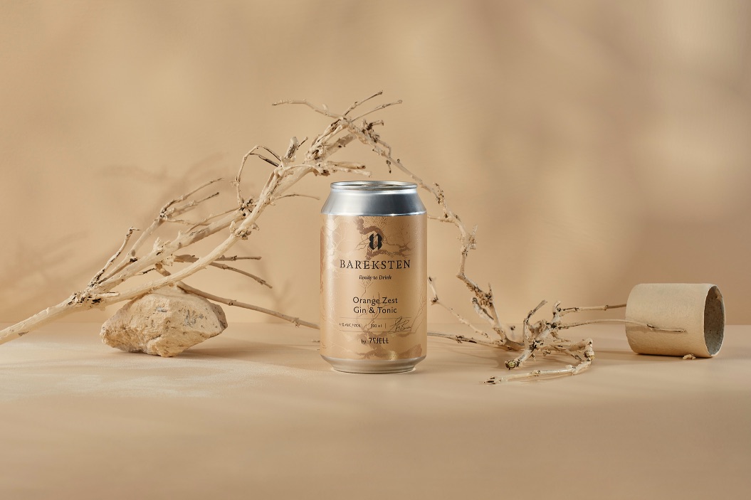
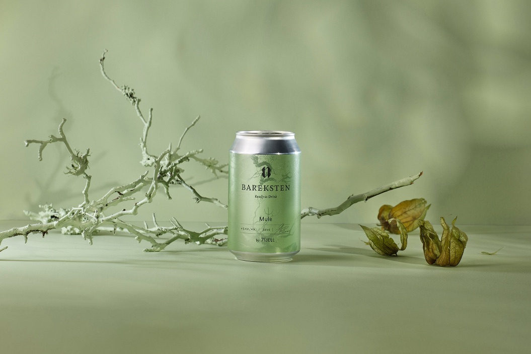
The new design for Ready to Drink is intended to unite elements from the established brands into a completely new expression. It was important that the product convey quality and good craftsmanship, while at the same time feeling light, accessible, and reflects the focus on freshness through the use of a clear, light colour palette.
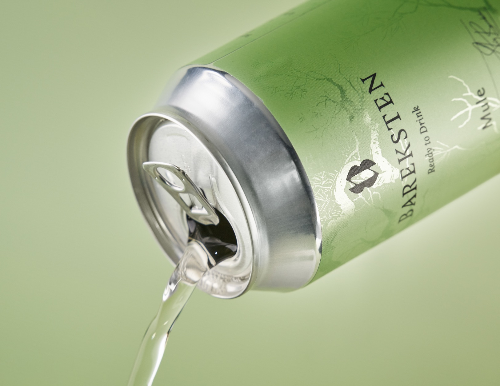
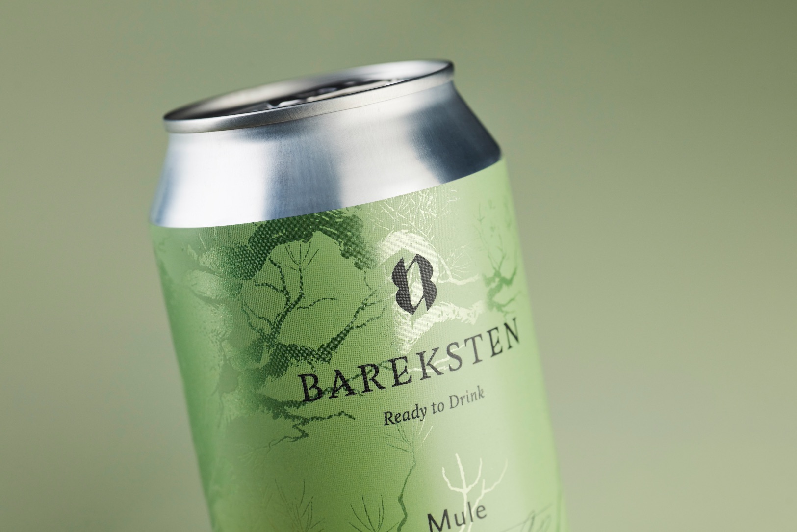
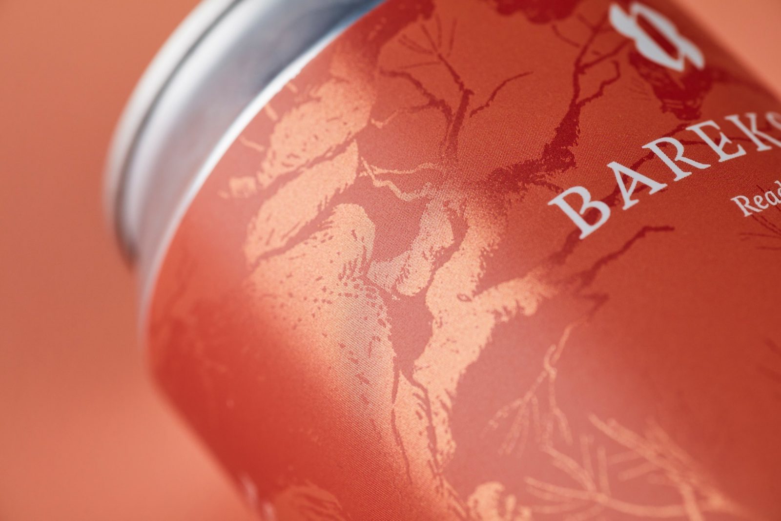
Bareksten is the main producer of the product, therefore Bareksten’s ambigram and logotype is in the centre of the design. The can is adorned by an illustration of an ancient Norwegian forest landscape. This is an element from Bareksten’s main product line. The design is printed on a chrome-plated label, and the illustration is stamped through, which gives it a shine.
This elegant metallic effect creates an exciting expression that varies depending on how the light is reflecting on the box. This element connects the expression of Bareksten by the 7 Fjell series together with the rest of 7 Fjell Brewery’s range.
The result of the collaboration – pre-mixed quality cocktails in refreshing aesthetics combine the quintessence of both brands and are a perfect response to the needs of the ever-growing ready-mixed cocktails market.
Photography for Packaging Design
The new design for Ready to Drink is intended to unite elements from the established brands into a new expression. It was important that the cans conveyed quality and good craftsmanship, while at the same time feeling light and accessible. The skeleton forest that adorns the Bareksten spirits also adorns this, but the dark mystic that Bareksten have, has been put aside through a colourful palette. The lighter colours give the product a refreshing feel and a unique look.
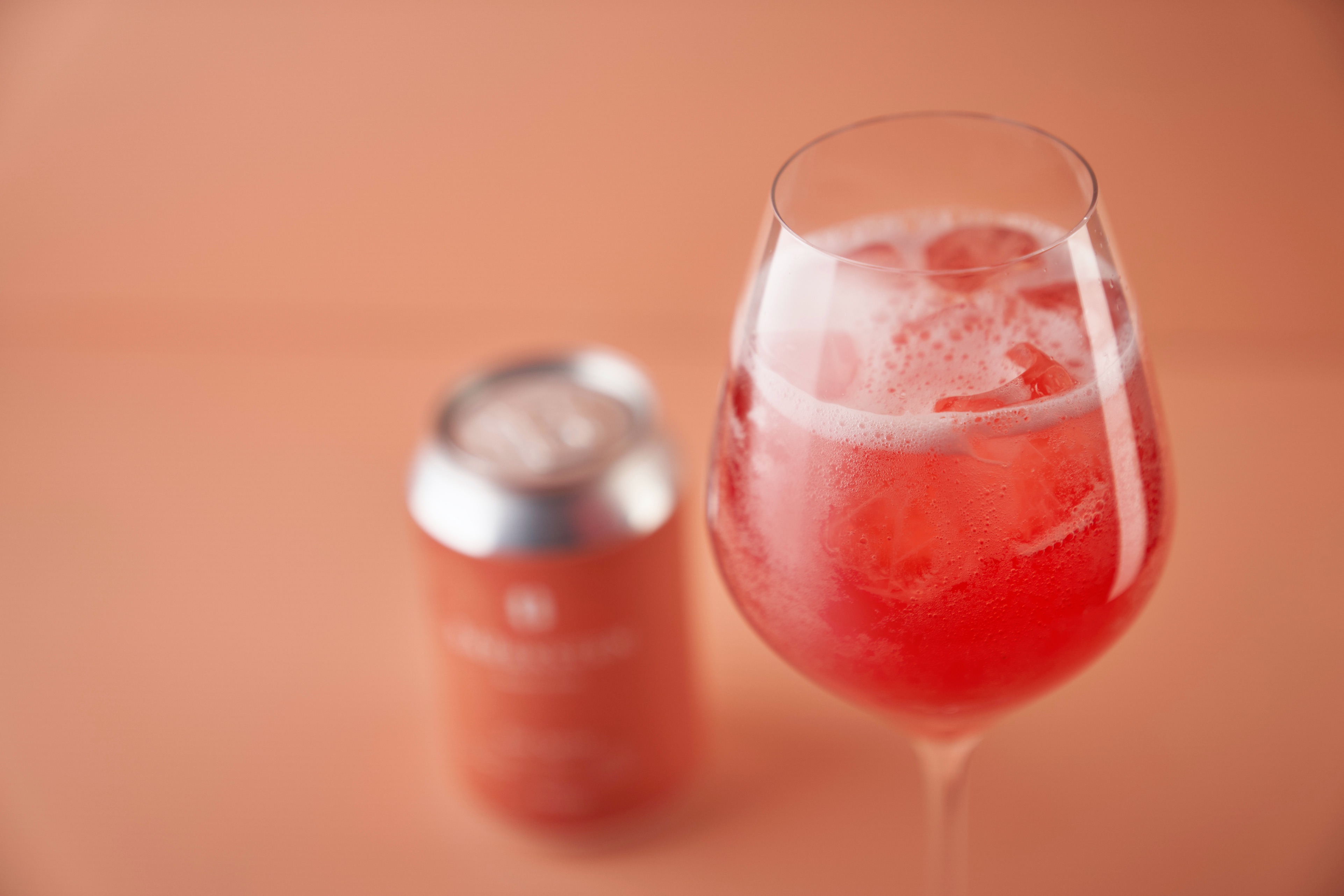
Through the photography we wanted to capture the close connection to 7Fjell and Bareksten, while also showing Ready to Drink as its own product. From Bareksten we borrowed natural elements and branches, and from 7Fjell we borrowed the styling of having the background in the same color as the product. By combining the two and using the fresh color palette we ended up with something distinct.
The images are lit in a way that brings out and highlights the fine details of the metallic foil, and gives the images a clean, fresh look. For the can lineup the light has also been carefully set to create dramatic shadows on the background that refers to the illustrations on the cans, while giving the environment another level of depth.
The photos ends up being a mix of both worlds, resulting in a fresh photo style for a refreshing product.
CREDIT
- Agency/Creative: KIND
- Article Title: Bareksten Ready to Drink Photography and Packaging Design by Kind
- Organisation/Entity: Agency
- Project Type: Packaging
- Project Status: Published
- Agency/Creative Country: Norway
- Agency/Creative City: Bergen
- Market Region: Global
- Project Deliverables: Packaging Design, Photography
- Format: Can
- Substrate: Metal
- Industry: Food/Beverage
- Keywords: WBDS Agency Design Awards 2021/22
-
Credits:
Creative Director: Tom Emil Olsen
Design Director & Senior Designer: Knut Harald Longva
Senior Designer: Agnieszka Gawlik
Photographer: Christoffer Meyer
Photographer: Isak Theodor Norum
Project Manager: Beate Myren Romslo


