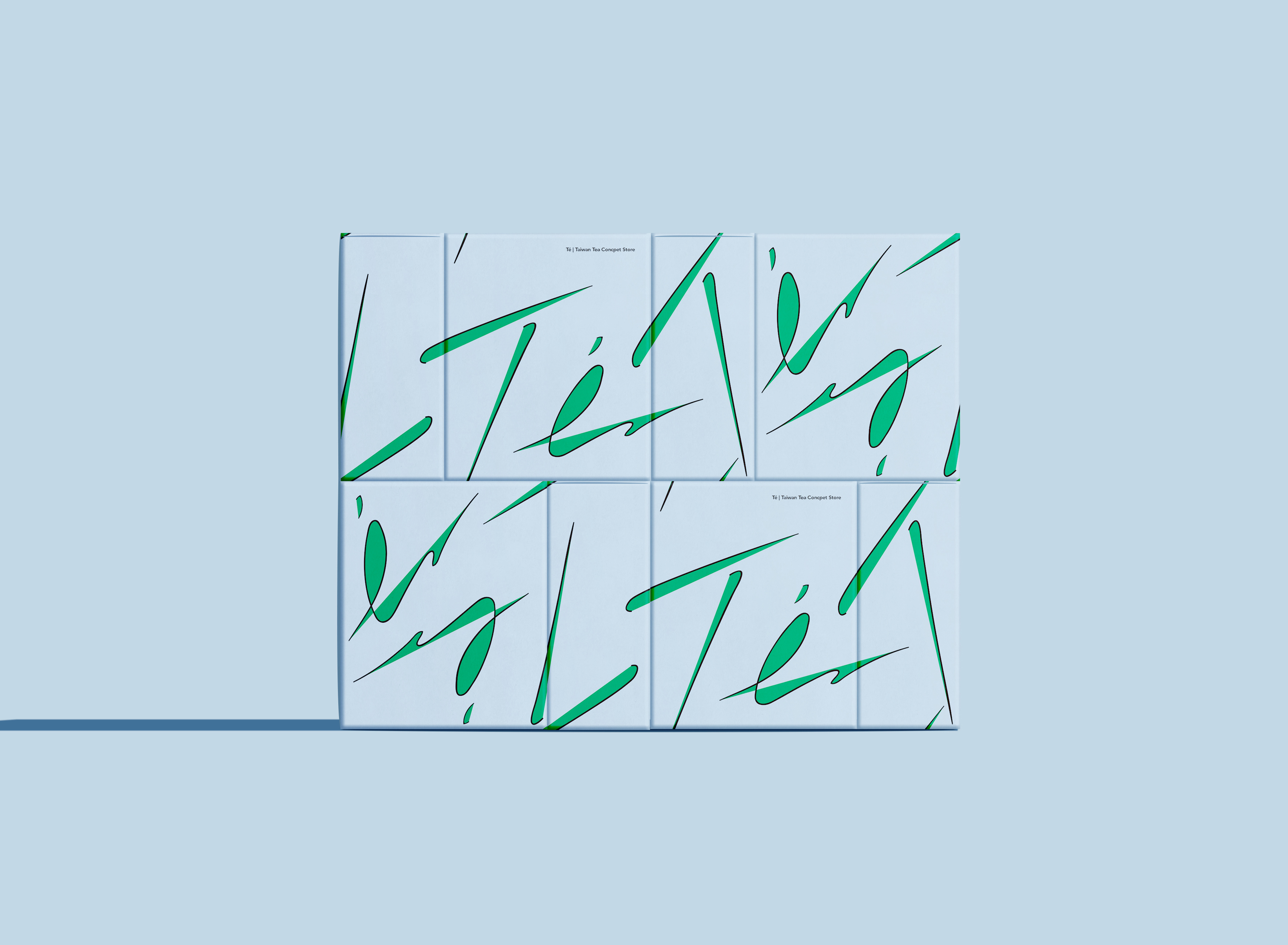
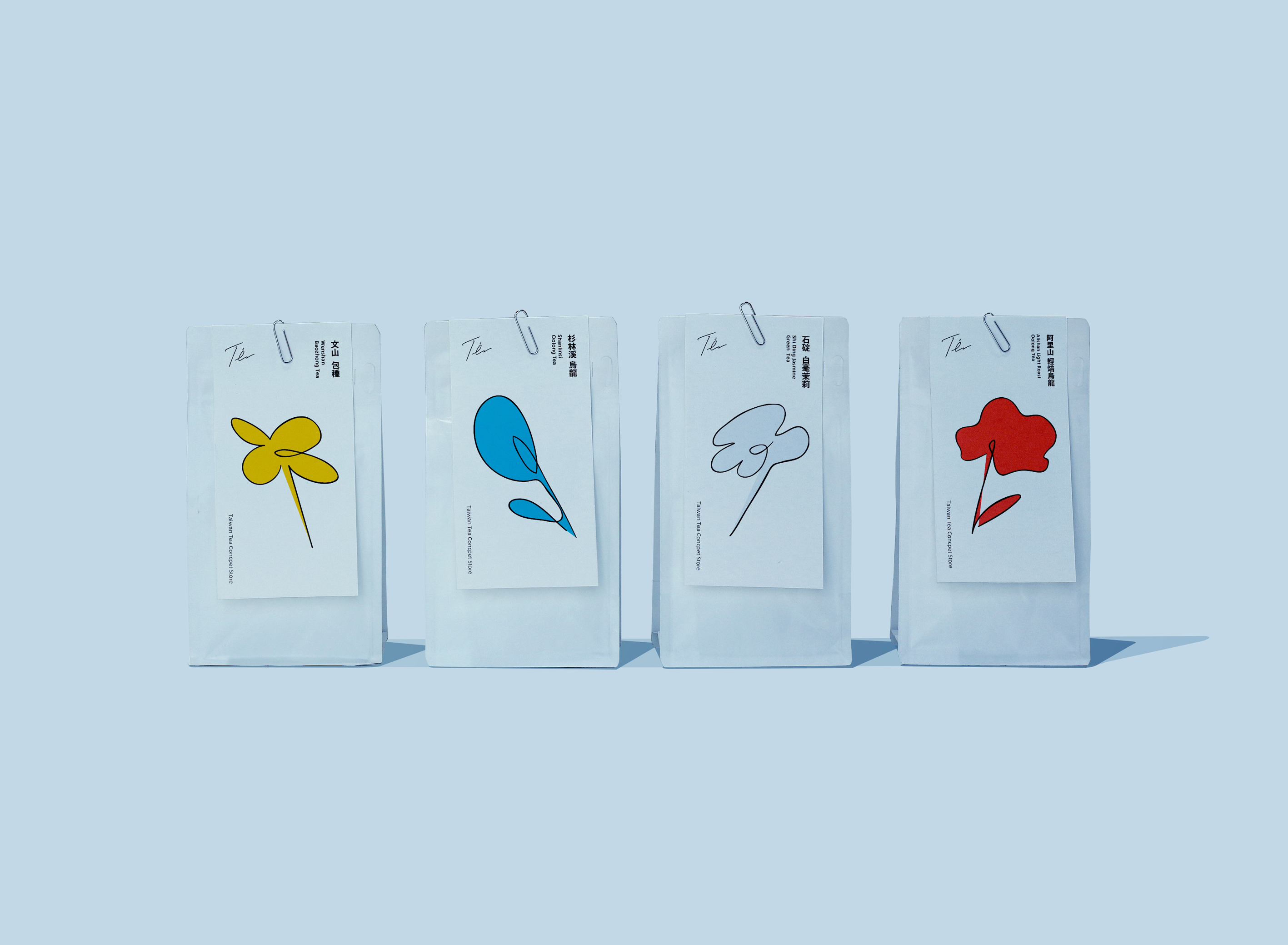
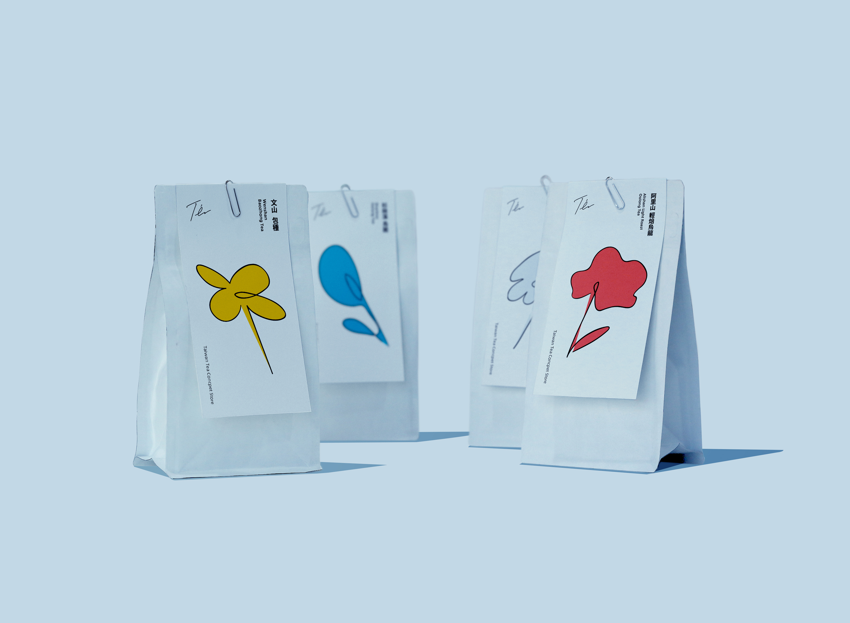
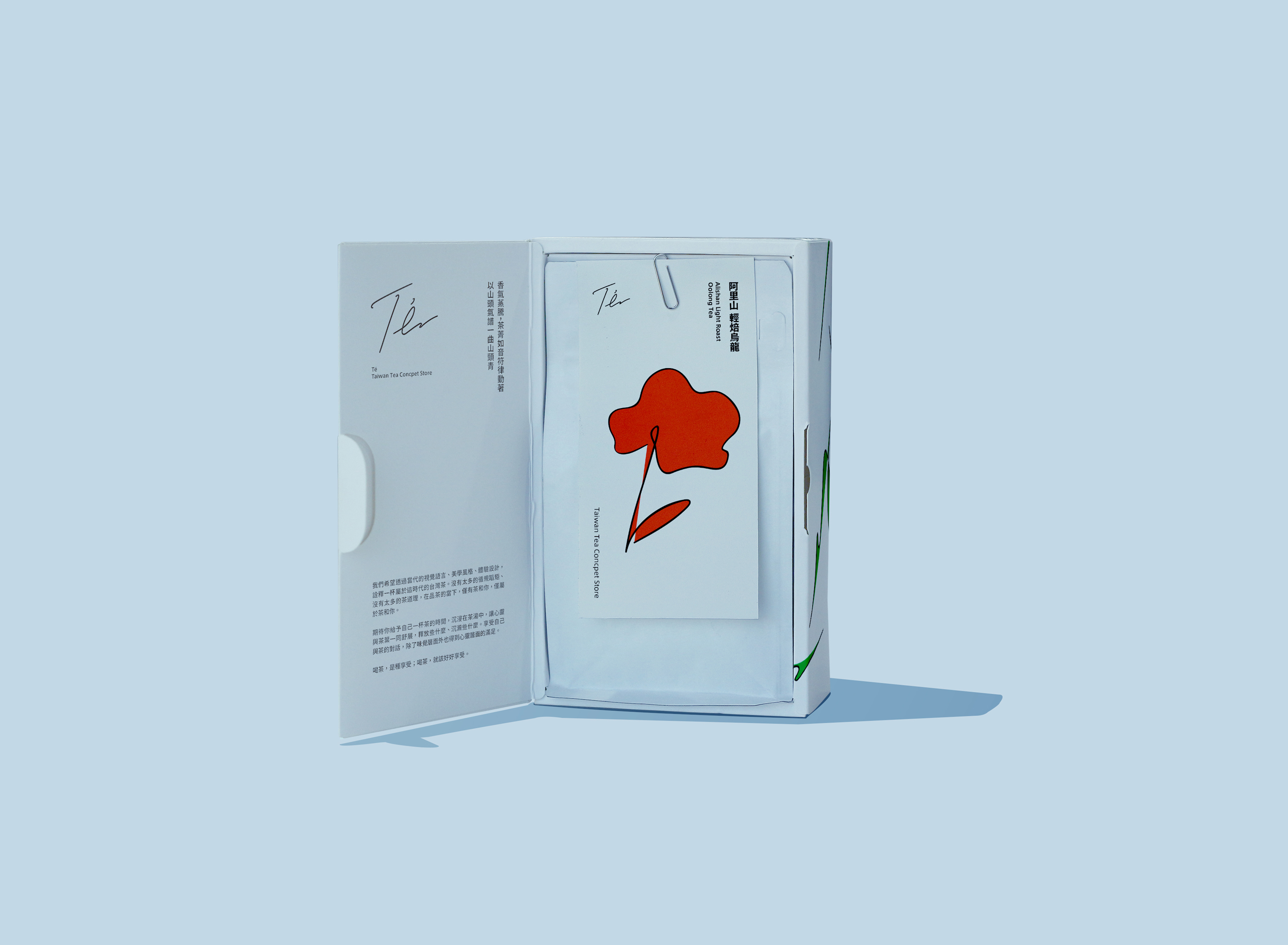
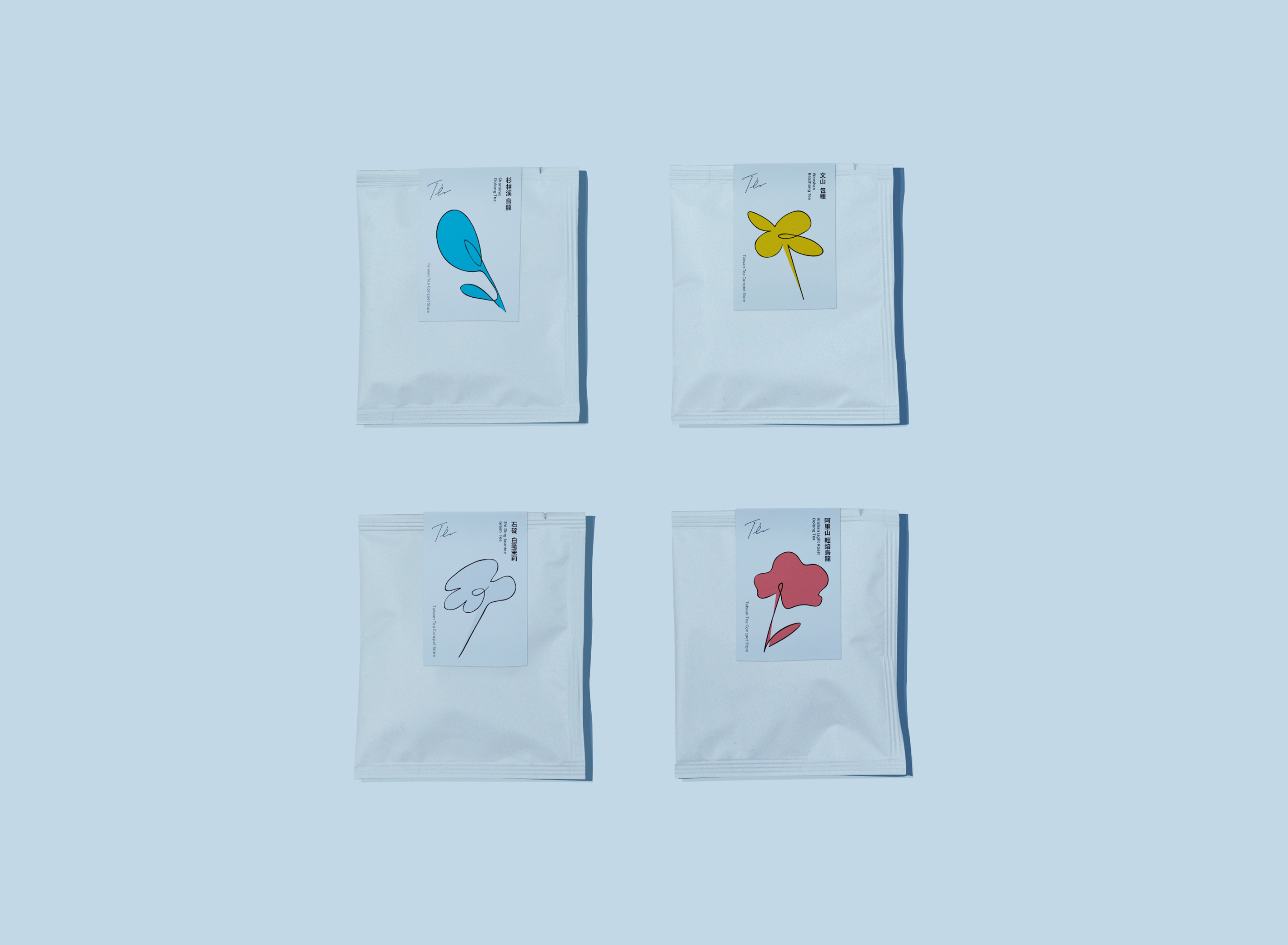
The culture of tea is an important thing worthy of respect and a long history for the Chinese world, but with the changes of the times, drinking tea (Chinese-style tea) gradually represents the interest of old fashion, expensive, and old people for young people. We hope to interpret a cup of Taiwanese tea through contemporary visual language, aesthetic style, and experience design. There are not too many tea-drinking rules and technological procedures, and will not use a lot of design arrangements and text descriptions to tell you how noble and rare a cup of tea is, but I hope you will enjoy yourself and a cup of tea while you are tasting tea. In addition to taste, you can also get spiritual satisfaction.
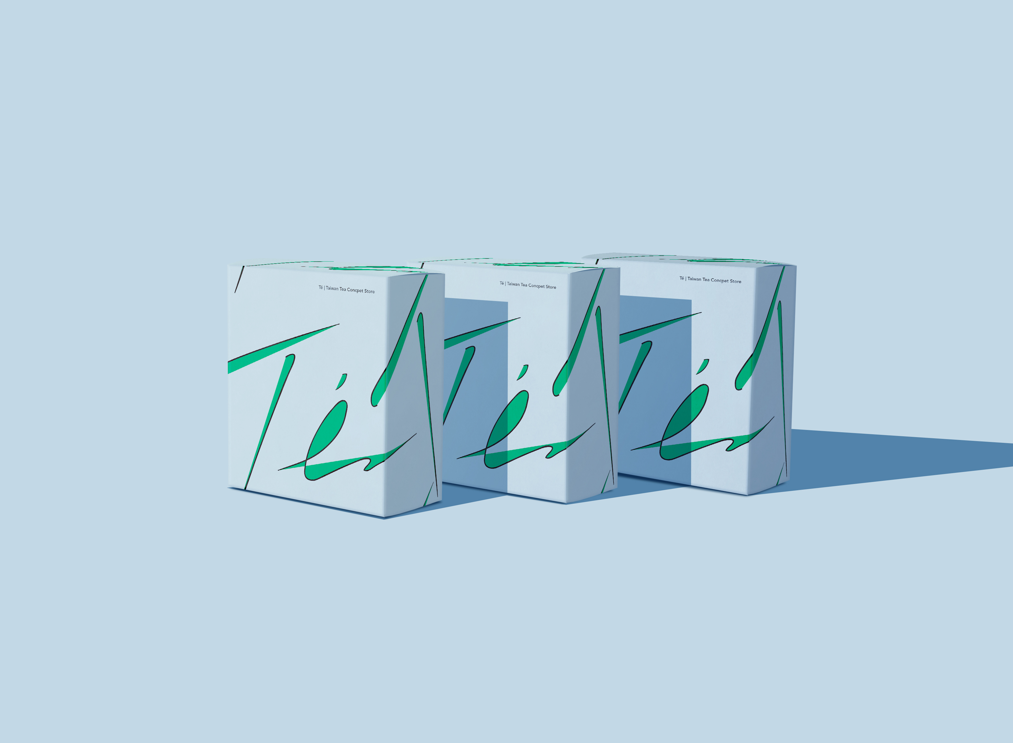
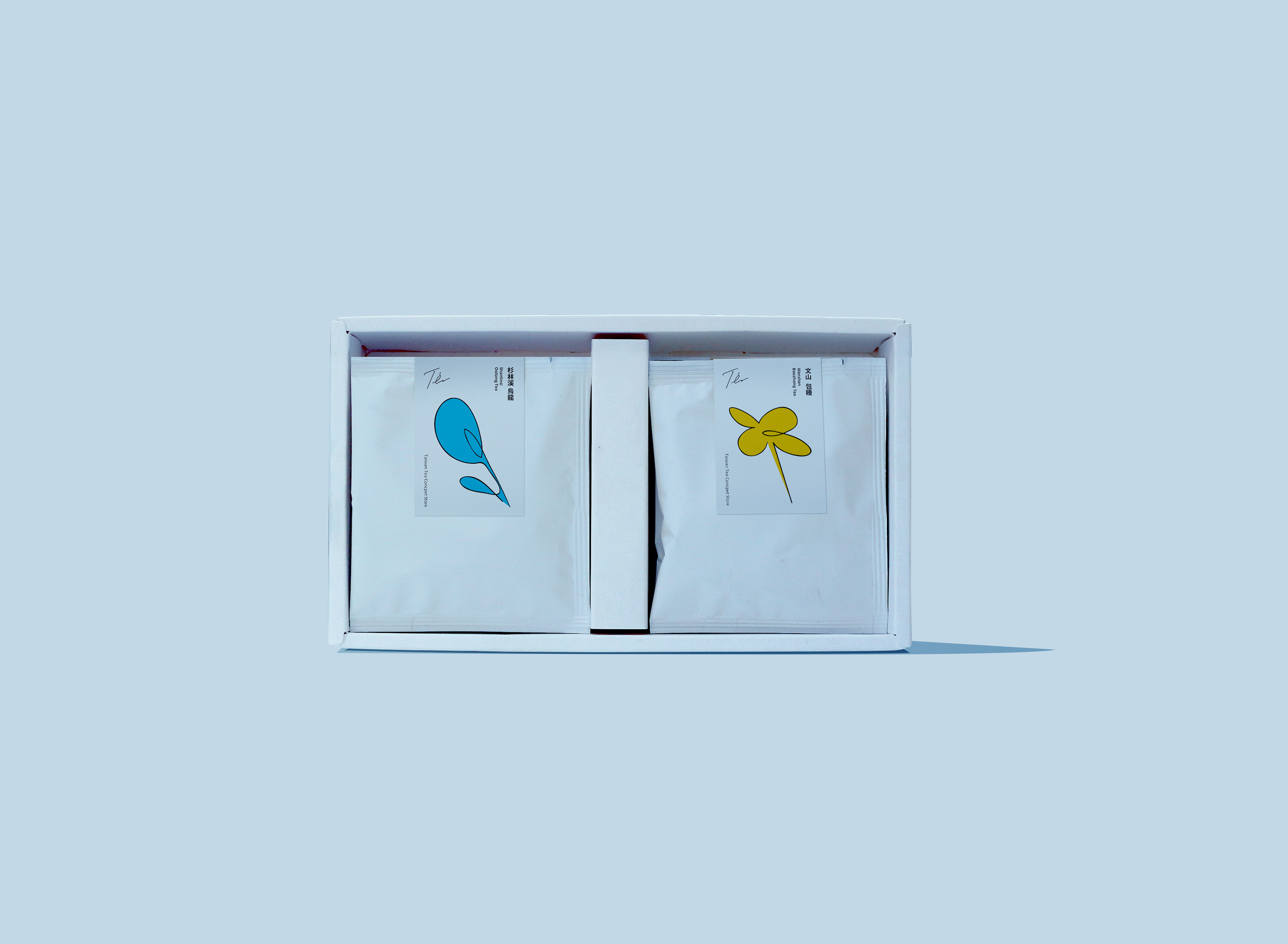
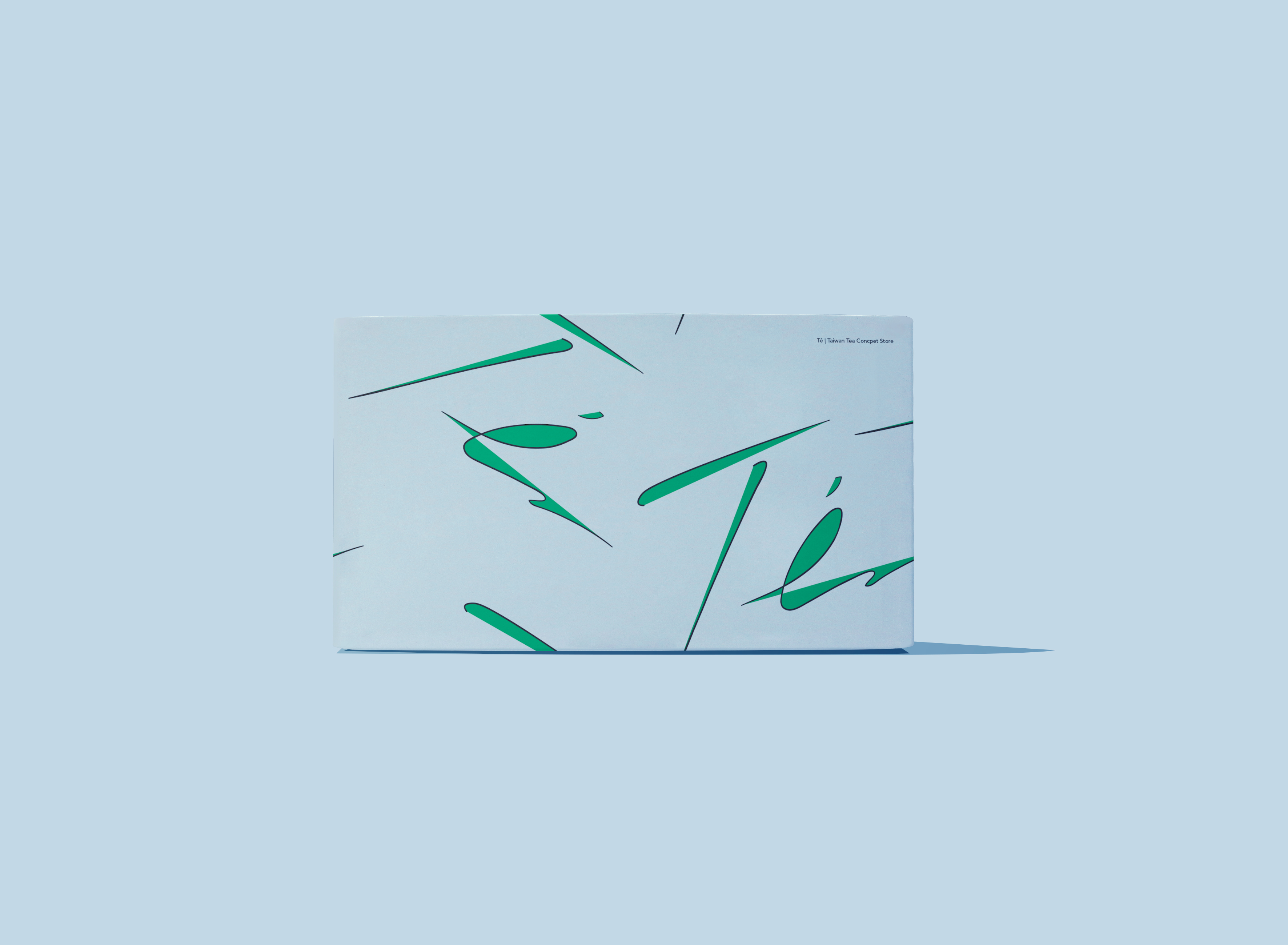
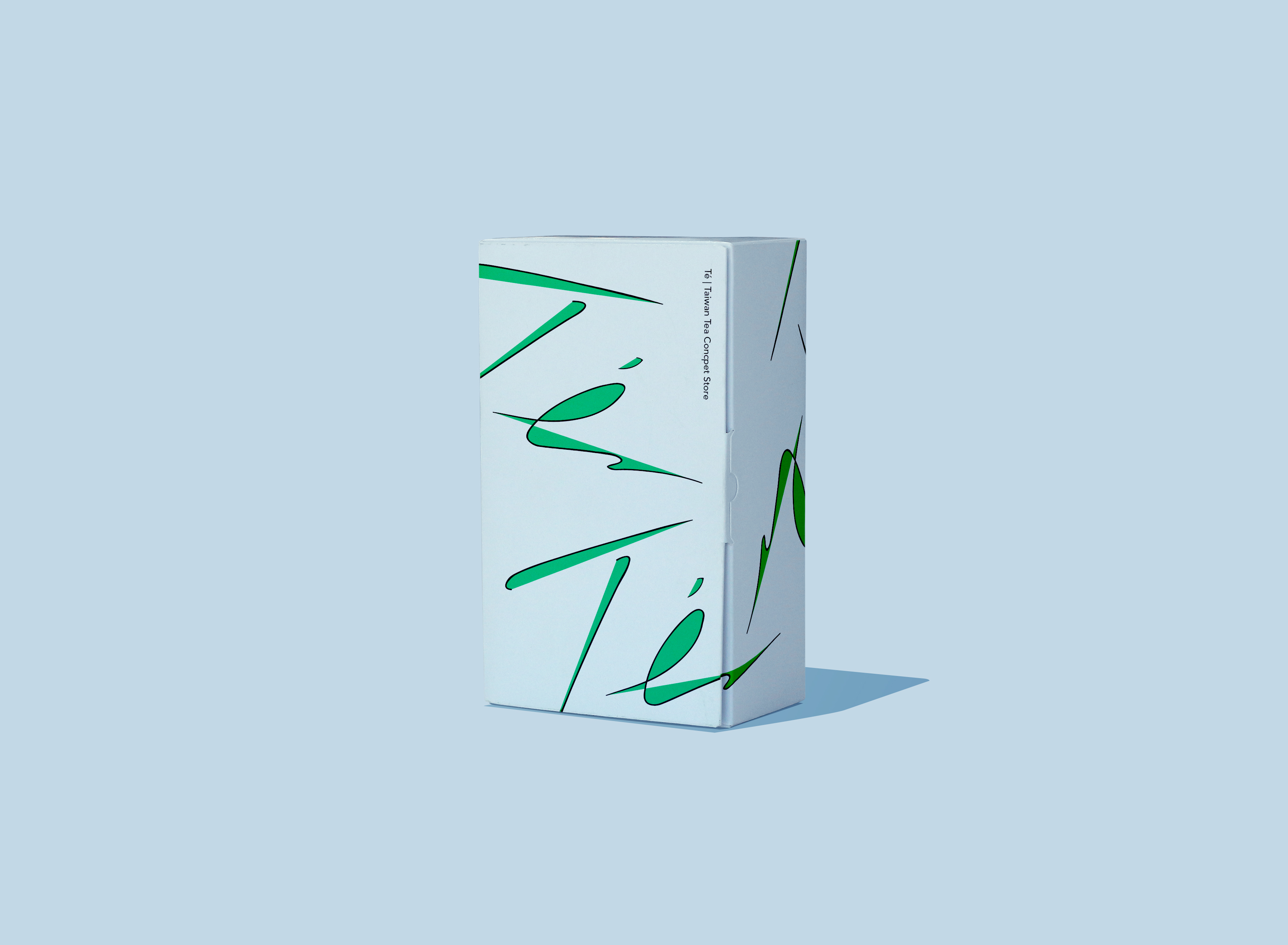
The design concept comes from the “Panning (or Pan-firing)” in the tea making process. Panning is an extremely meticulous process that determines the quality of the tea after it is made, and its success or failure depends entirely on the sharpness and experience of the tea master. It is a high-level art that is difficult to mass produce. The tea leaves are stir-fried and matured in an iron pan. Like dancing notes, the aroma of tea leaves a charming flavor. The image expression simplifies the image of Panning and combines it with the brand logo. The overall design style is presented in a quiet, simple and textured way. It is hoped that the aroma of tea and the brand culture can be visually felt by consumers in the simplest and simplest way.
*Panning (or Pan-firing)
It is a special process for making oolong tea and green tea. The method of stir-frying is generally carried out by heating in a large iron pan, so it is sometimes called kettle stir-frying. After withering, shaking, and greening, the tea leaves are initially dehydrated and fermented, and the subsequent frying process is slowly heated in a large iron pan, with proper rolling action in the middle, so that the tea becomes a yellow-green color. In this step, the craftsmanship of the tea maker is tested and the taste of the tea is determined.

CREDIT
- Agency/Creative: Lung-Hao Chiang
- Article Title: Té | Taiwan Tea Visual Identity Design
- Organisation/Entity: Agency
- Project Type: Packaging
- Project Status: Non Published
- Agency/Creative Country: Taiwan
- Agency/Creative City: Taipei/Taiwan
- Market Region: Asia
- Project Deliverables: Art, Brand Identity, Brand Naming, Illustration, Packaging Design
- Format: Bag, Box, Pouch
- Substrate: Plastic, Pulp Board
- Industry: Food/Beverage
- Keywords: BEVERAGE, BRAND, BRANDING, COFFEE, IDENTITY, ILLUSTRATION, PACKAGING, TEA, BEER, LOGO,
-
Credits:
Art Director: Lung-Hao Chiang


