The brief for this student project was to create a brand identity for a new budget airline based in Japan. The brand needed to be versatile and flexible enough to be used across a variety of assets yet remain distinct and memorable.
I began this brief research on Japan and it’s many attractions, searching for a snippet of information or visuals that would inspire my brand concept. In my research I came across Toriis. Toriis are traditional Japanese gateways often found at the entrance to Shinto Shrines. The symbolism behind the gateways is that they are there to mark the transition from the mundane to the sacred, and it is this idea that the ‘Rii airways’ brand is built from.
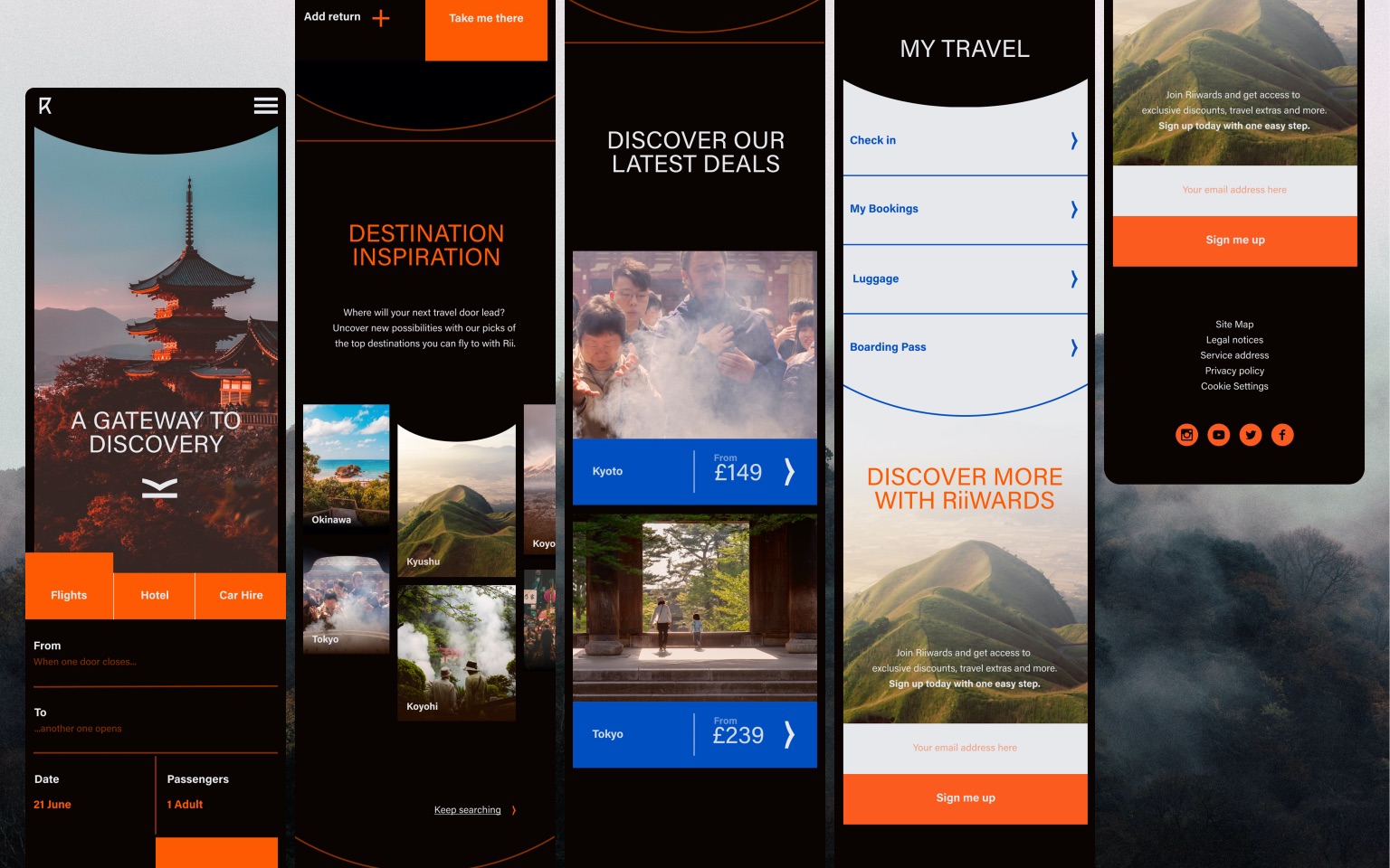
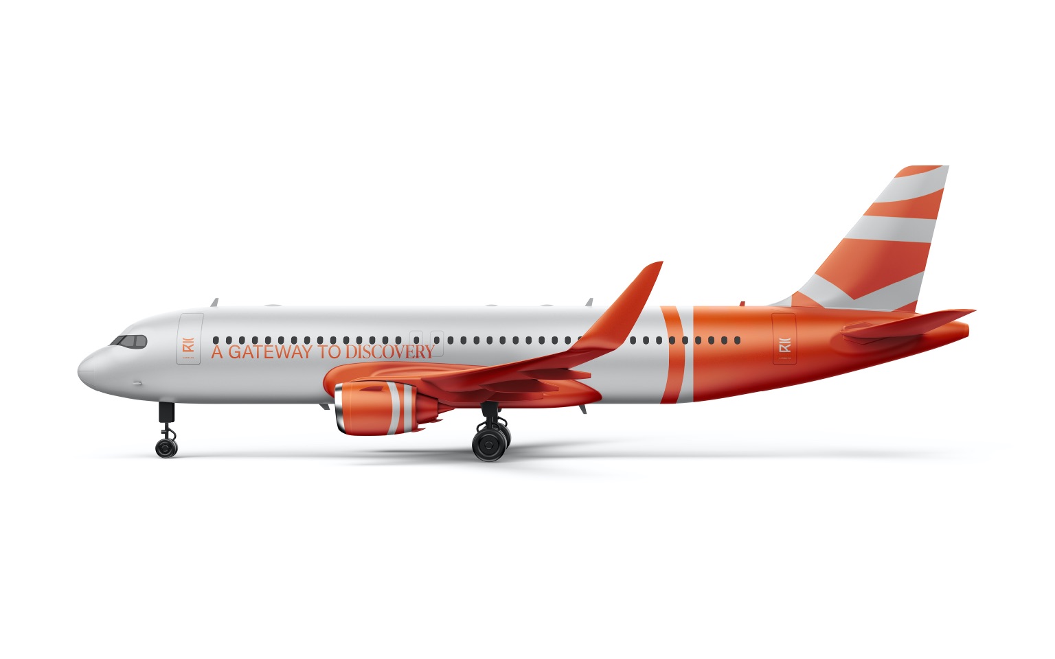
‘Rii airways’ is a brand new budget airline brand based in Japan offering ‘a gateway to discovery’, created for those who want to step away from the mundane and explore the contrasting regions of Japan.
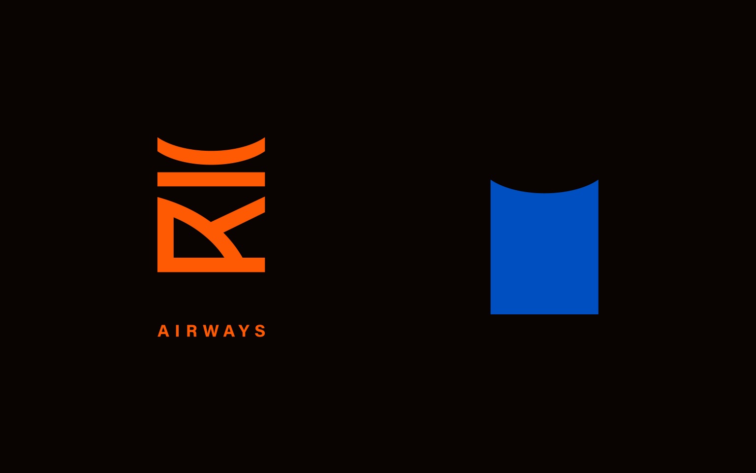
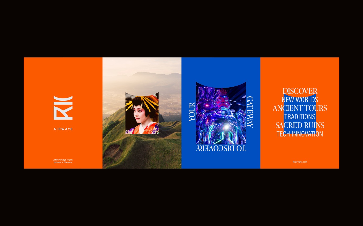
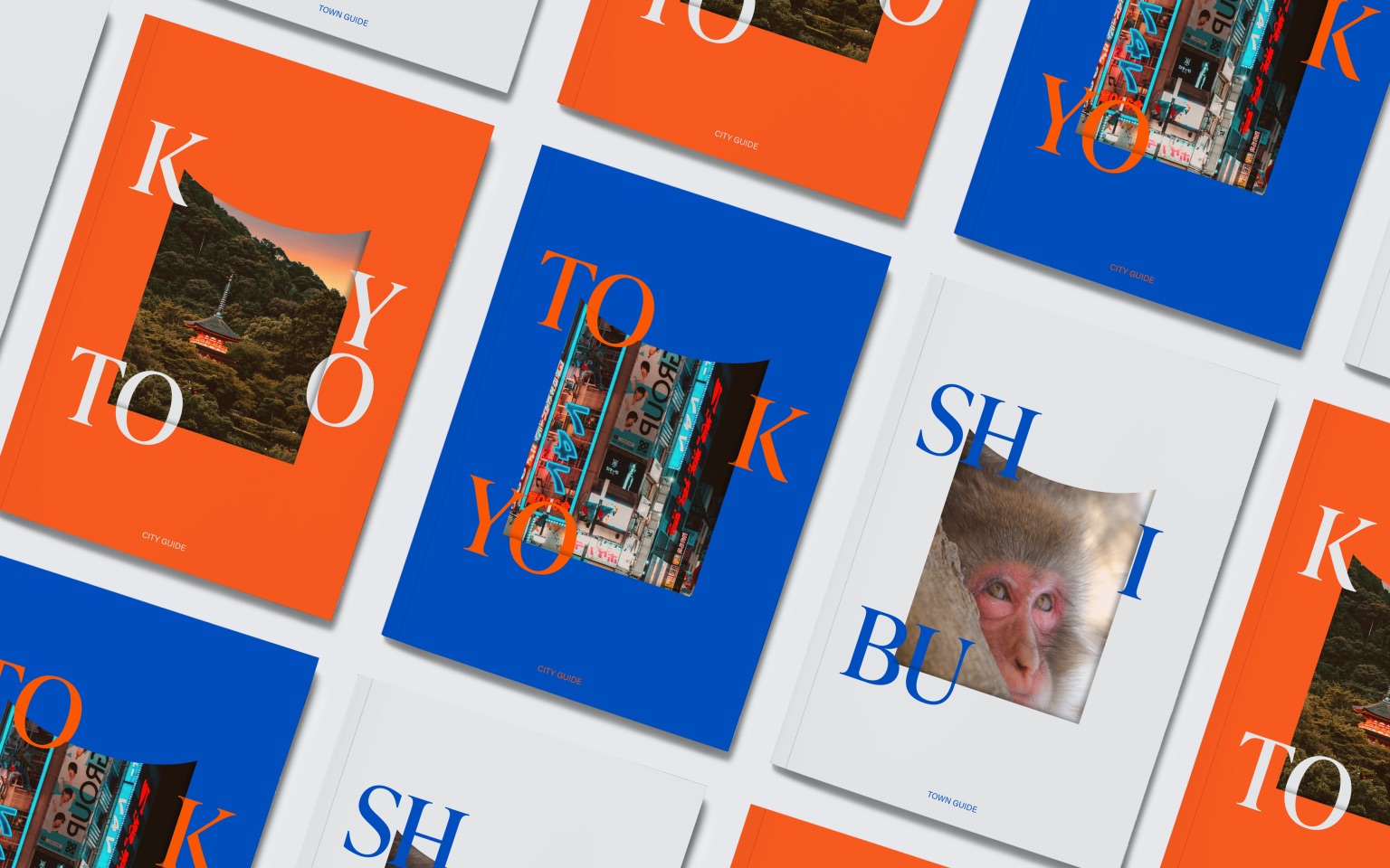
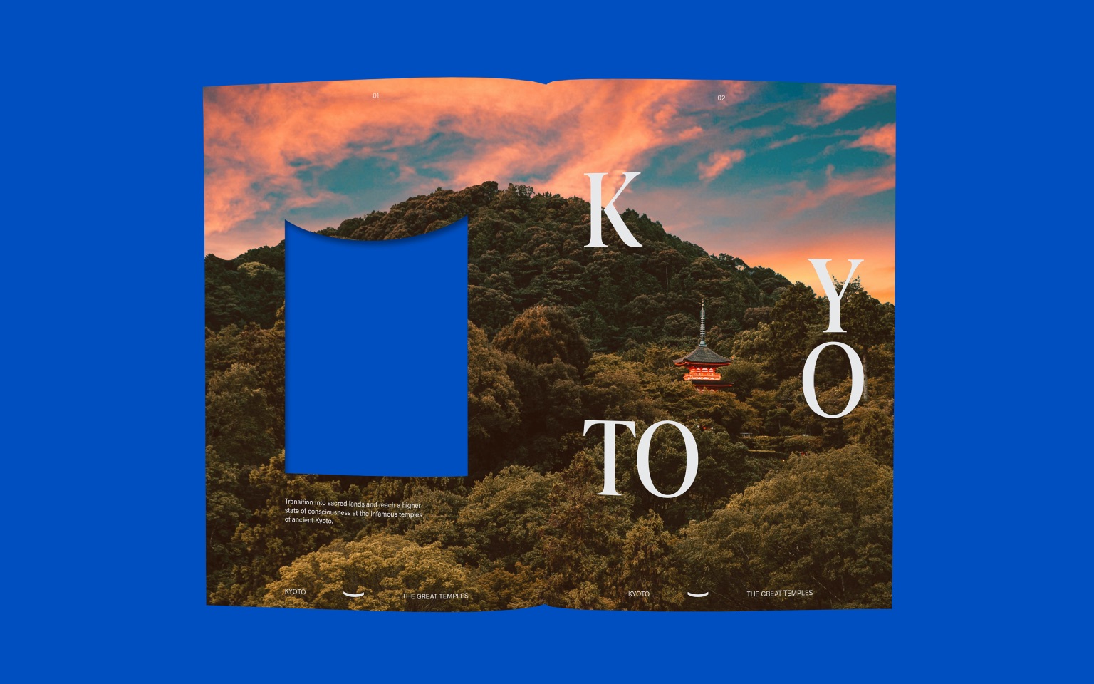
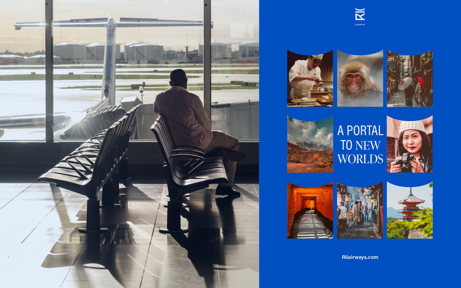
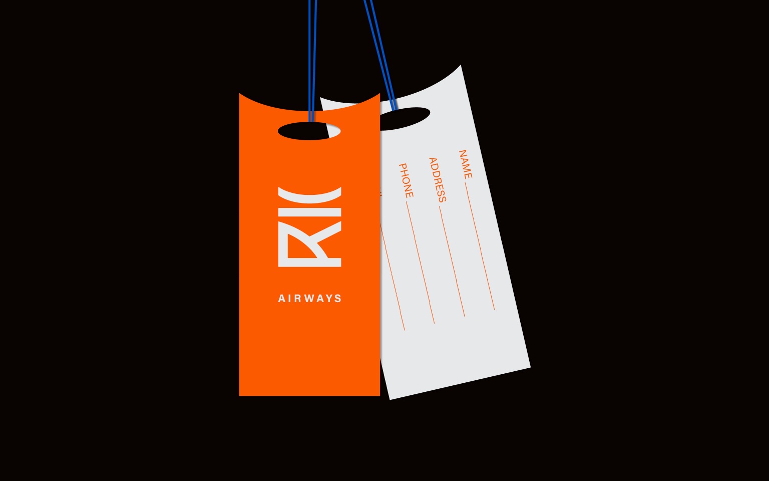
The brand name and logo mark are influenced by the naming and structure of Torii gate, with the logo mark reflecting the striking outline of the gates and concave top curve . The logo itself is very versatile and can be represented in various colours and simplified forms. A solid fill version of the logo mark is also used across the brand as a graphical element and framing device for images, copy and colour.
The main brand orange is chosen to reflect the traditional colours of the Torii gates, paired with a contrasting bright blue, this colour pairing helps communicate ideas of contrast and transition through the brand. An off white and orange-black act as balancing neutrals alongside the main brand colours.
The brand Identity is created to capture the idea of transition and the opportunities travel can bring. The transition is emphisised through the brand in the use of contrasting bold colours, juxtaposition of images using the framing device and through the use of a Serif and Sans serif pairing as the key brand fonts.

CREDIT
- Agency/Creative: Amelia Winney
- Article Title: Brand Identity Concept for Rii Airline
- Organisation/Entity: Student
- Project Type: Campaign
- Project Status: Non Published
- Agency/Creative Country: United Kingdom
- Agency/Creative City: Birmingham
- Market Region: Global
- Project Deliverables: Brand Identity
- Industry: Aerospace
- Keywords: WBDS awards, Student
-
Credits:
Educational Institution: Shillington -School of Design
Educator's Name: Shillington Education


