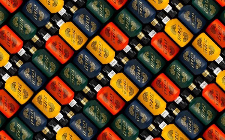
The briefing for the SEIRAS project involved the identity of a brand based on a ‘seira’. This is a basket made by plaiting a blend of sisal or nylon in circular form, like a round rug, with a hole in the middle. It is the main object used in oil pressing in traditional lagares. The SEIRAS lagar produces different types of olive oil: Virgin and Extra Virgin, Conventional and Organic. The intensity differs and they are all sold in different packaging, using the same graphic design but with a difference so consumers can tell them apart.
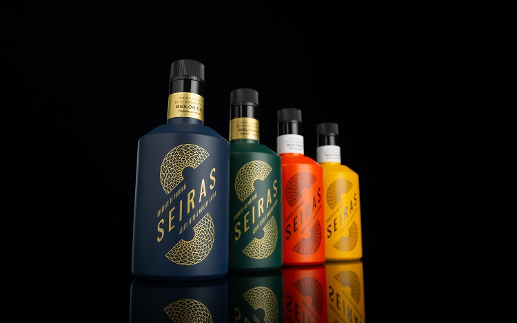
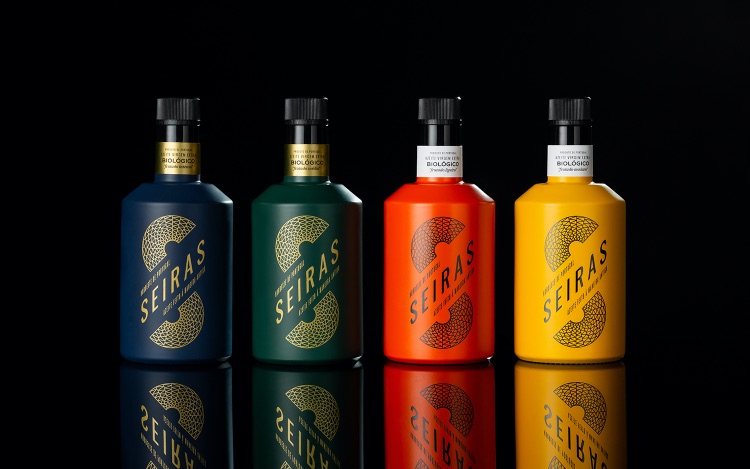
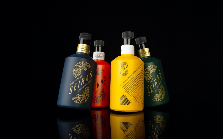
As regards the top range of the SEIRAS brand represented here, we designed and developed an approach that would trigger the consumer’s empathy through the design and the colour palette applied to the four bottles defining this group. It is a striking, modern and attractive image for a product employing traditional methods of olive oil production. Our client considers that the SEIRAS brand “enlivens this tradition”.
This range of olive oils is intended to reach a wider public that values the quality, origin and manufacturing process, while recognising the importance of the packaging design as a clear message regarding the type of product.
To execute and produce the supporting materials, namely painting and silkscreen printing, we worked closely with current market operators, which involved a number of tests and colour adjustments, as well as other details. The result fulfils the intended aims.
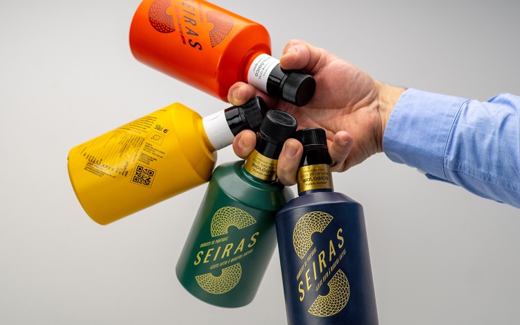
The all-over painting of the bottles, the colour palette, the use of silkscreen printing for the graphic elements and the type of bottle produced a result that individually and collectively was more striking and distinctive, adding value to the product image and above all to its position vis-à-vis other brands and packaging produced and sold by this make.
The materials used in this project are: a type of 500cl glass bottle available on the market, all-over painting of each bottle in different colours with a matte or opaque finish, the silkscreen printing used for the SEIRAS brand, with a tamperproof cap and a paper collar containing the remaining information.
Inspired by a visit to the working lagar, the process of creating the SEIRAS image “tasted” the excellent olive oil made there (at the time of the olive harvest and olive oil extraction), “stored” all the sensations and “captured” the bustle typical of such a place.
The creativity of this project lies in the design of the graphic brand: at first reading it is an S (the initial letter of the brand name) and at second reading it is the logotype. The fact that it is tilted emphasises the motion of the letter S and the weft of the seira basket design, creating a fluid, attractive brand.
SEIRAS was launched in November 2020. This collection of four different types of Organic Extra Virgin Olive Oil came on the market in February 2021, at the end of the olive harvest in Northeast Portugal.
CREDIT
- Agency/Creative: Mpfxdesign Lda.
- Article Title: Seiras – Olive Oil Made the Old Fashion Way by Mpfxdesign Lda.
- Organisation/Entity: Agency
- Project Type: Packaging
- Project Status: Published
- Agency/Creative Country: Portugal
- Agency/Creative City: Porto
- Market Region: Europe
- Project Deliverables: Packaging Design
- Format: Bottle
- Substrate: Glass Bottle
- Industry: Food/Beverage
- Keywords: WBDS Agency Design Awards 2021/22
-
Credits:
Photographer: Paulo Serra
Photographer: Joao Pinto Felix


