Studio Sly was tasked with undertaking a refresh for celebrated Melbourne artist Antoinette Ferwerda. Having grown her team, gallery and studio from being an independent artist to now supporting emerging artists and makers, we were charged with elevating the identity and brand to support this growth.
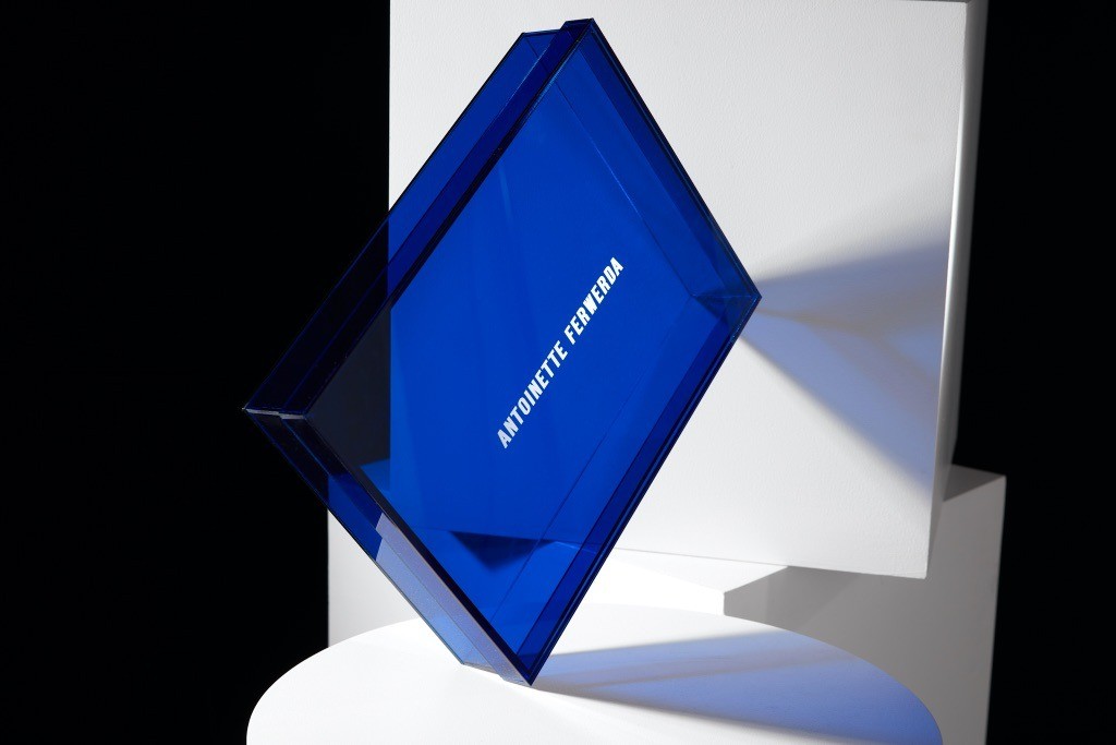
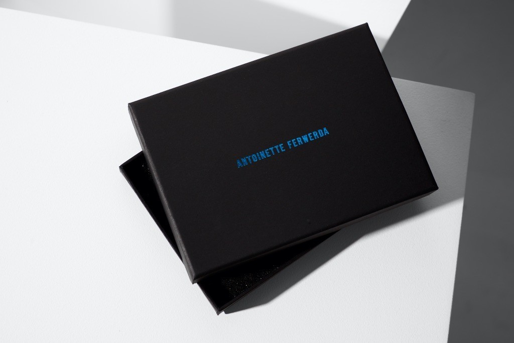
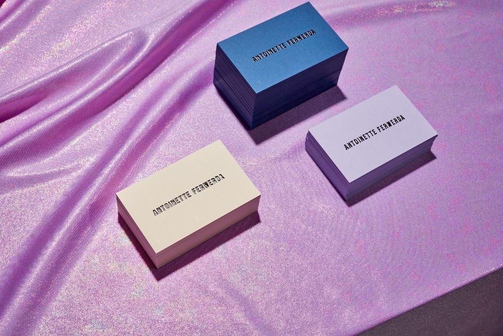
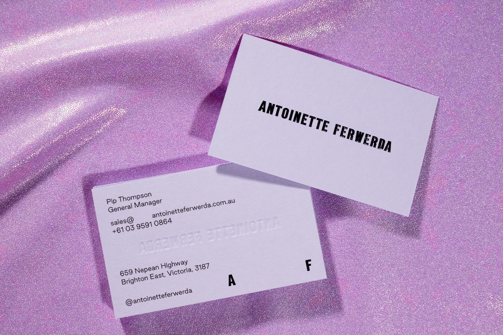
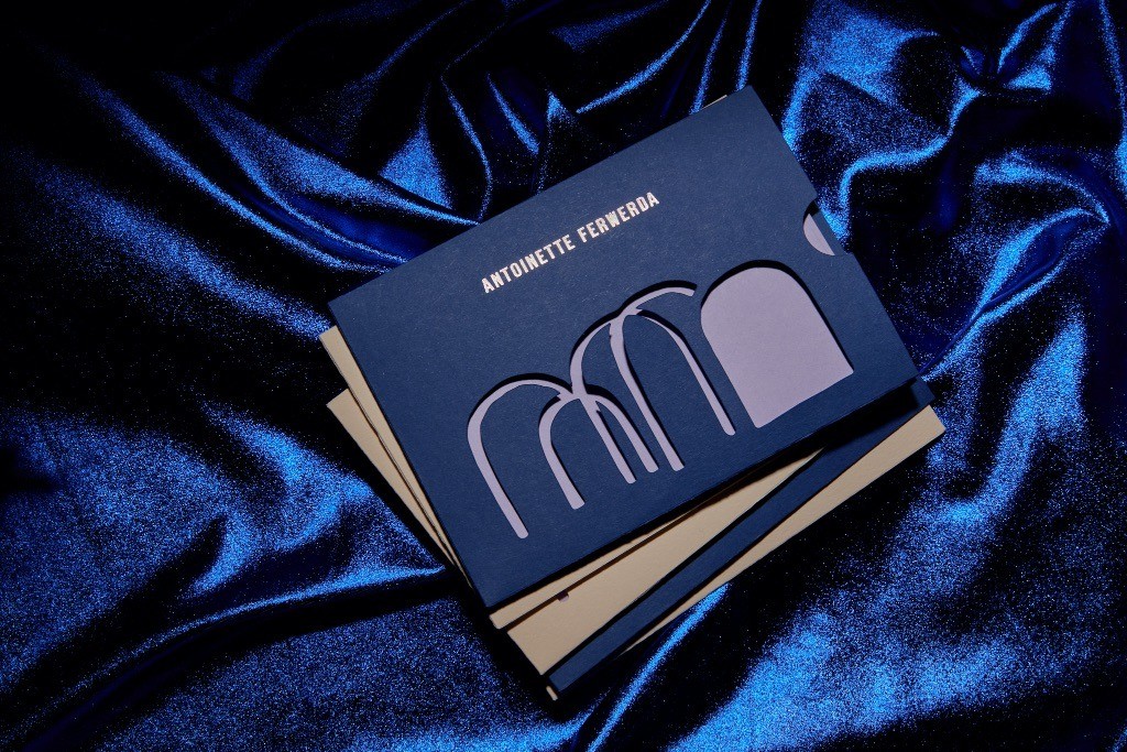
Antoinette’s signature palette of ultramarine blues, soft lilac and pancake tones have been injected into both print and digital touch points. Elements include a transparent acrylic stationery box, business cards across 3 paper stocks which feature black foil and foil emboss as well as black ink. The AF Gifting range was designed to celebrate one Antoinette’s unique style as well as give a unique experience. Using her signature arch elements from her Rose Gold Hills artwork these shapes were then die cut from a sleeve to reveal a gift card within. Vivid blue velvet debossed ribbon and kraft black gift boxes round out the gift experience with a hint of blue metallic foil. Weighty and condensed letter forms were used to display the confidence of the brand whilst allowing the artwork to tell the story first and foremost.


CREDIT
- Agency/Creative: Studio Sly
- Article Title: Antoinette Ferwerda Branding by Studio Sly
- Organisation/Entity: Agency
- Project Type: Identity
- Project Status: Published
- Agency/Creative Country: Australia
- Agency/Creative City: Melbourne
- Market Region: Global
- Project Deliverables: Brand Redesign
- Industry: Health Care
- Keywords: WBDS Awards, Agency
-
Credits:
Photographer: Shelley Horan


