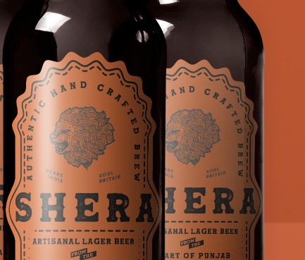
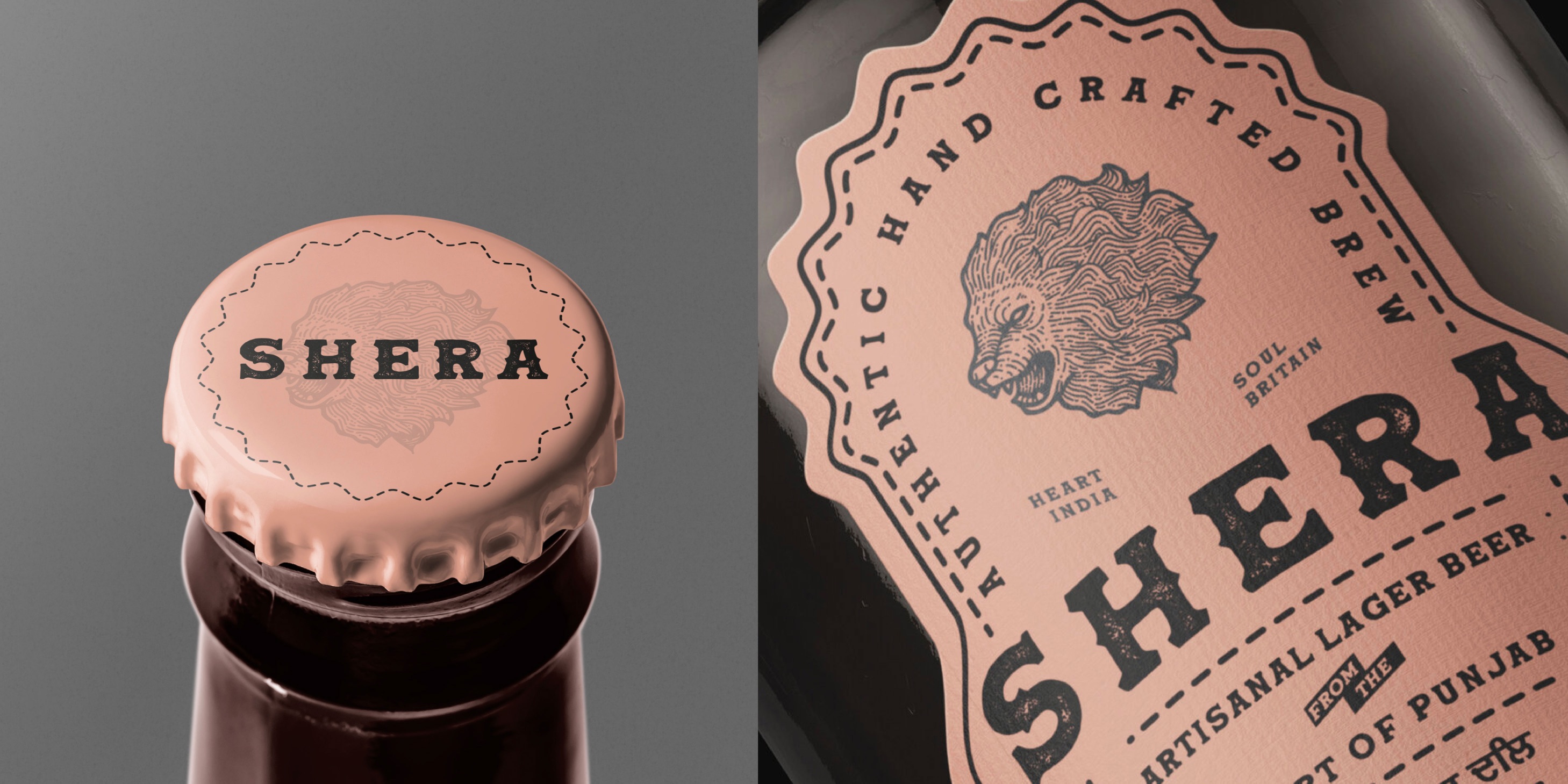
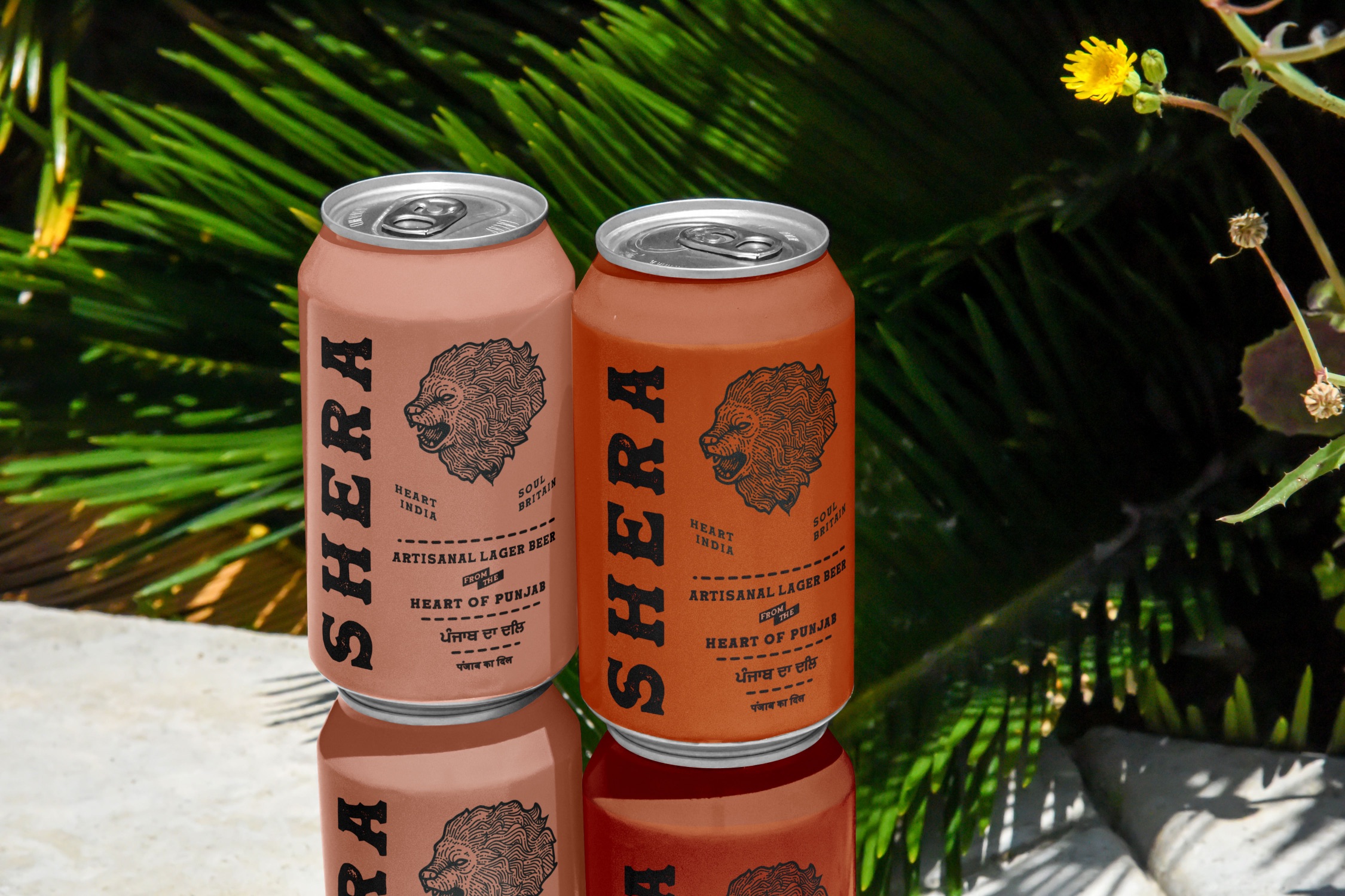
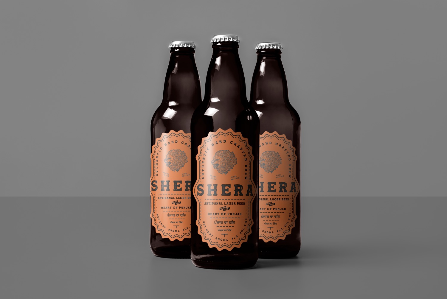
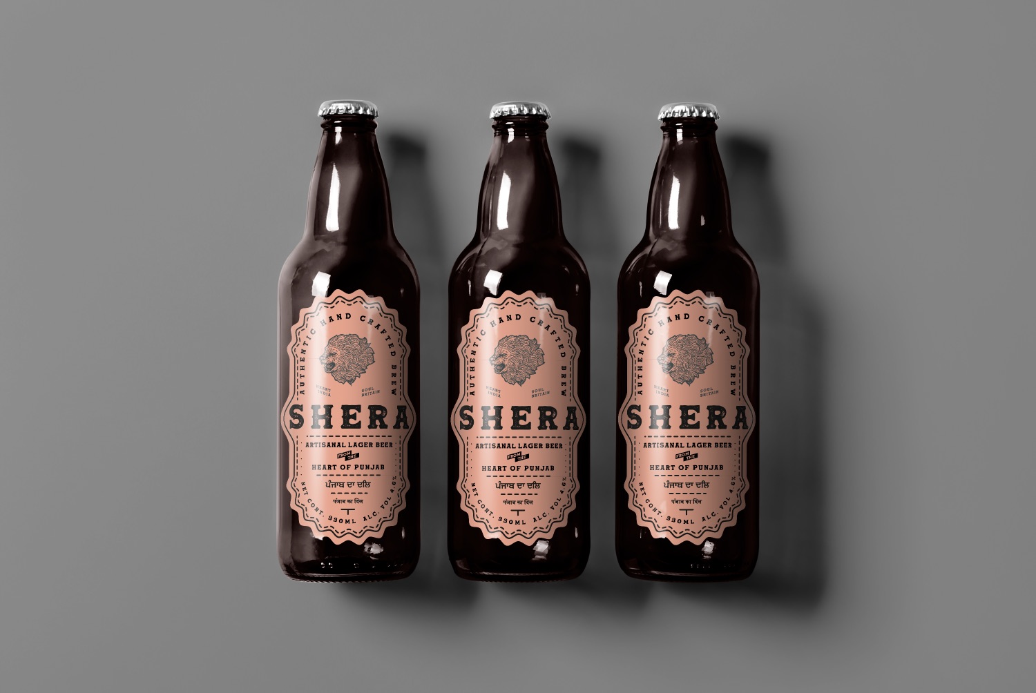
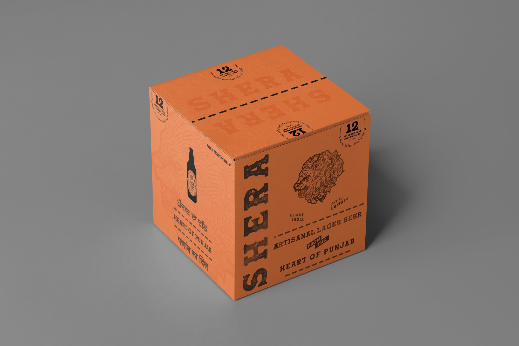
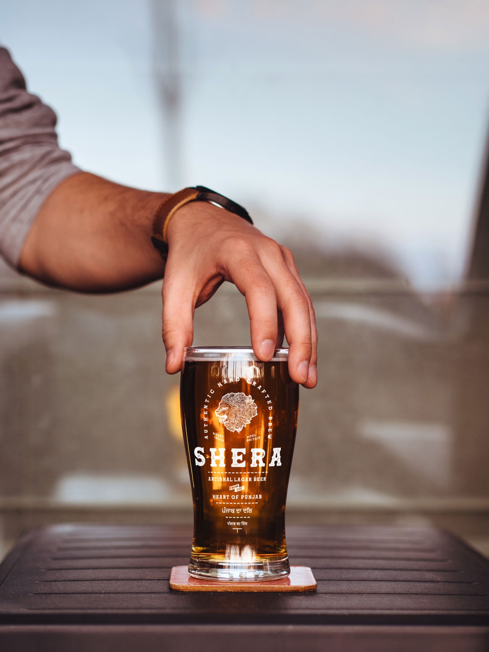
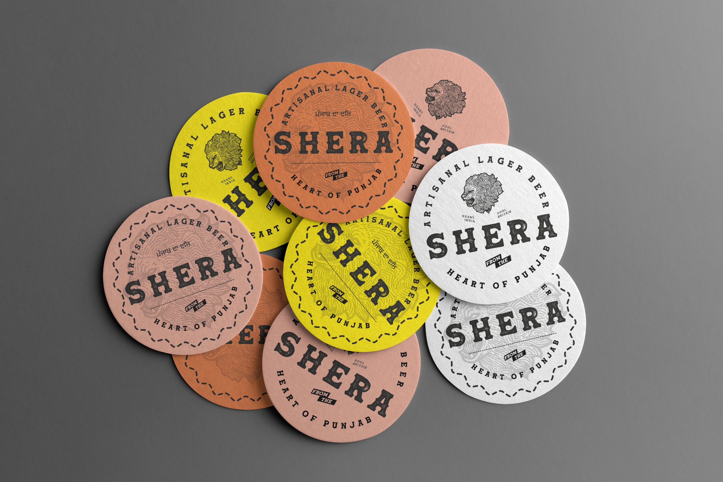
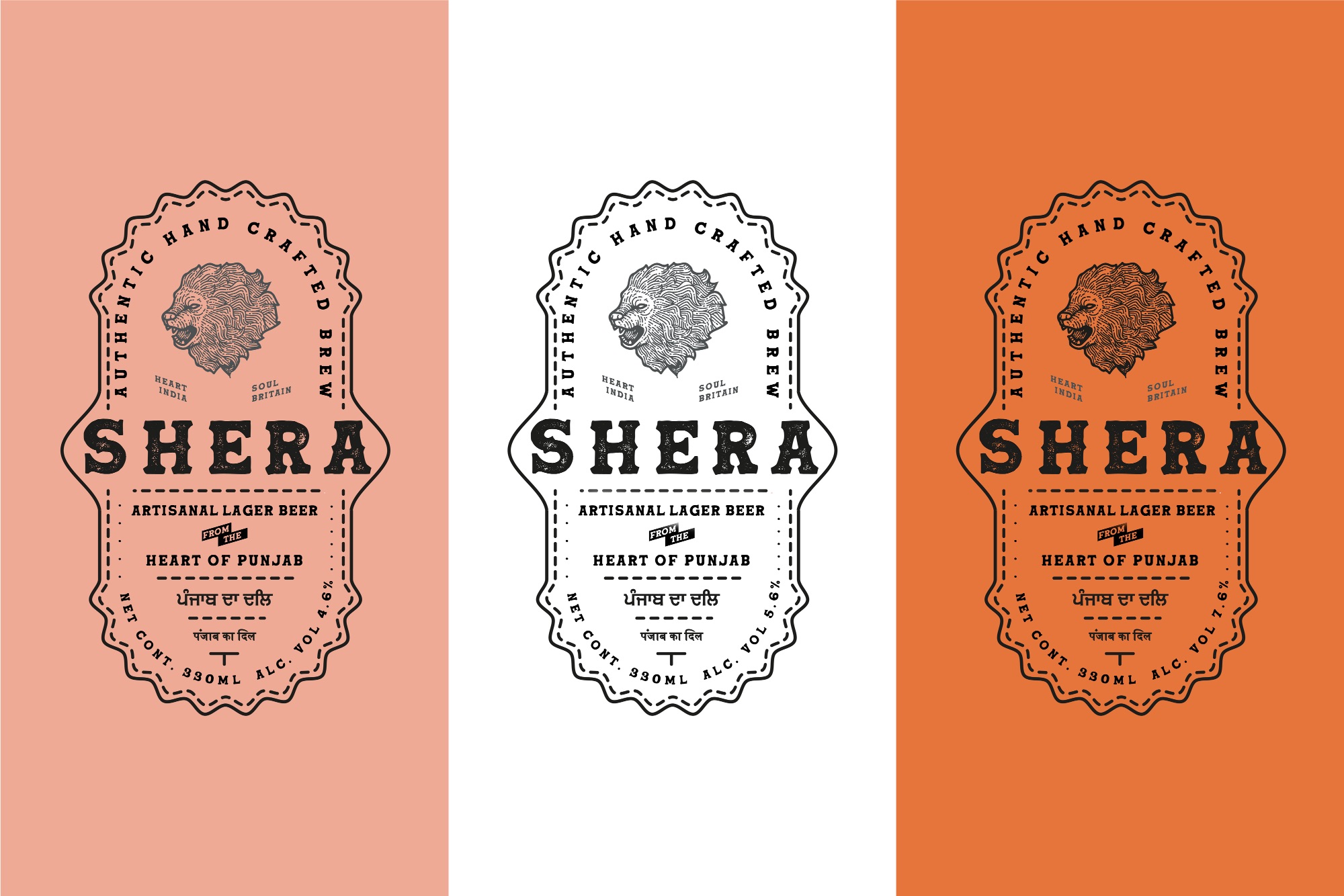
Complementing the Palette of the Pind with the authenticity of Artisanal Lager. We made sure that, this message was conveyed effortlessly in our designs. To give the brand its raw tableau we combined its rooted-in-rural appeal with a clean design.
Shera as a brand reflects the rawness and the boldness of the Pind, the wholeheartedness of Punjab, but, with a tinge of Brixton breweries vibe . We wanted to keep the essence of the same alive even in the packaging and labeling throughout.
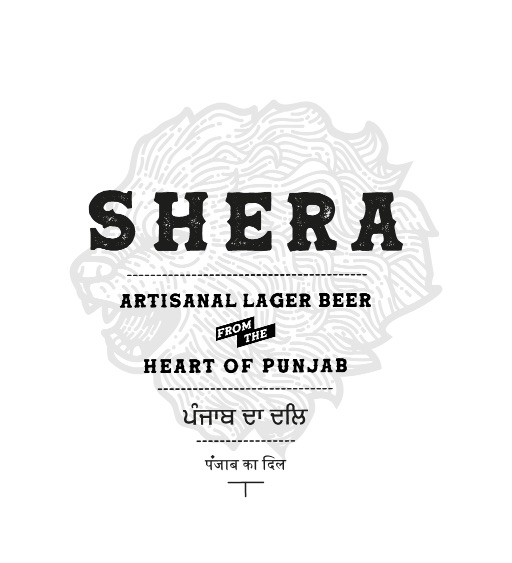
The amalgam of the verbal and the visual in the overall packaging including different languages reflects the authenticity of the brand. The play of Indian heart and Britain soul is backed up visually by the soft colors and raw typefaces.
CREDIT
- Agency/Creative: The Neat Trick
- Article Title: Shera Artisan Larger Packaging Design by The Neat Trick
- Organisation/Entity: Agency
- Project Type: Packaging
- Project Status: Non Published
- Agency/Creative Country: India
- Agency/Creative City: New Delhi
- Market Region: Global
- Project Deliverables: Packaging Design
- Format: Bottle
- Substrate: Glass Bottle
- Industry: Food/Beverage
- Keywords: WBDS Agency Design Awards 2021/22
-
Credits:
Design Agency: The Neat Trick
Creative Director: Shubham Toran
FEEDBACK
Relevance: Solution/idea in relation to brand, product or service
Implementation: Attention, detailing and finishing of final solution
Presentation: Text, visualisation and quality of the presentation


