Challenge
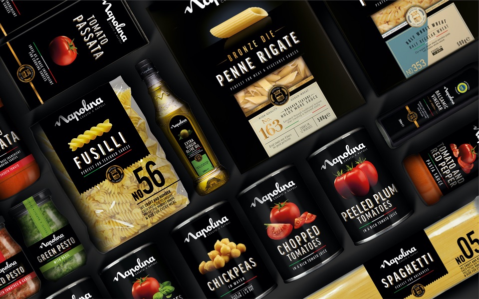
With a range of over 140 products in its portfolio, Napolina was the brand leader across many of its key products, and the sixth biggest canned and ambient brand by value. However, in a commoditised market, it was being squeezed by own-label – seen by many as a store-cupboard brand and not a credible expert at a category level.
With its new brand proposition of ‘for the love of Italian food’, Napolina asked us to inspire consumers to create authentic Italian meals with the best quality ingredients through the creation of a revised design look and feel across its brand world – thereby justifying the price premium over own label and retaining its position as No. 1 brand across multiple categories.
Insight
In a world where things are complicated a lot of the time, simplicity is a notion that is celebrated, which is particularly true in Italian cuisine. A handful of the finest ingredients, effortlessly put together with love and flare always produces the best results.
Idea
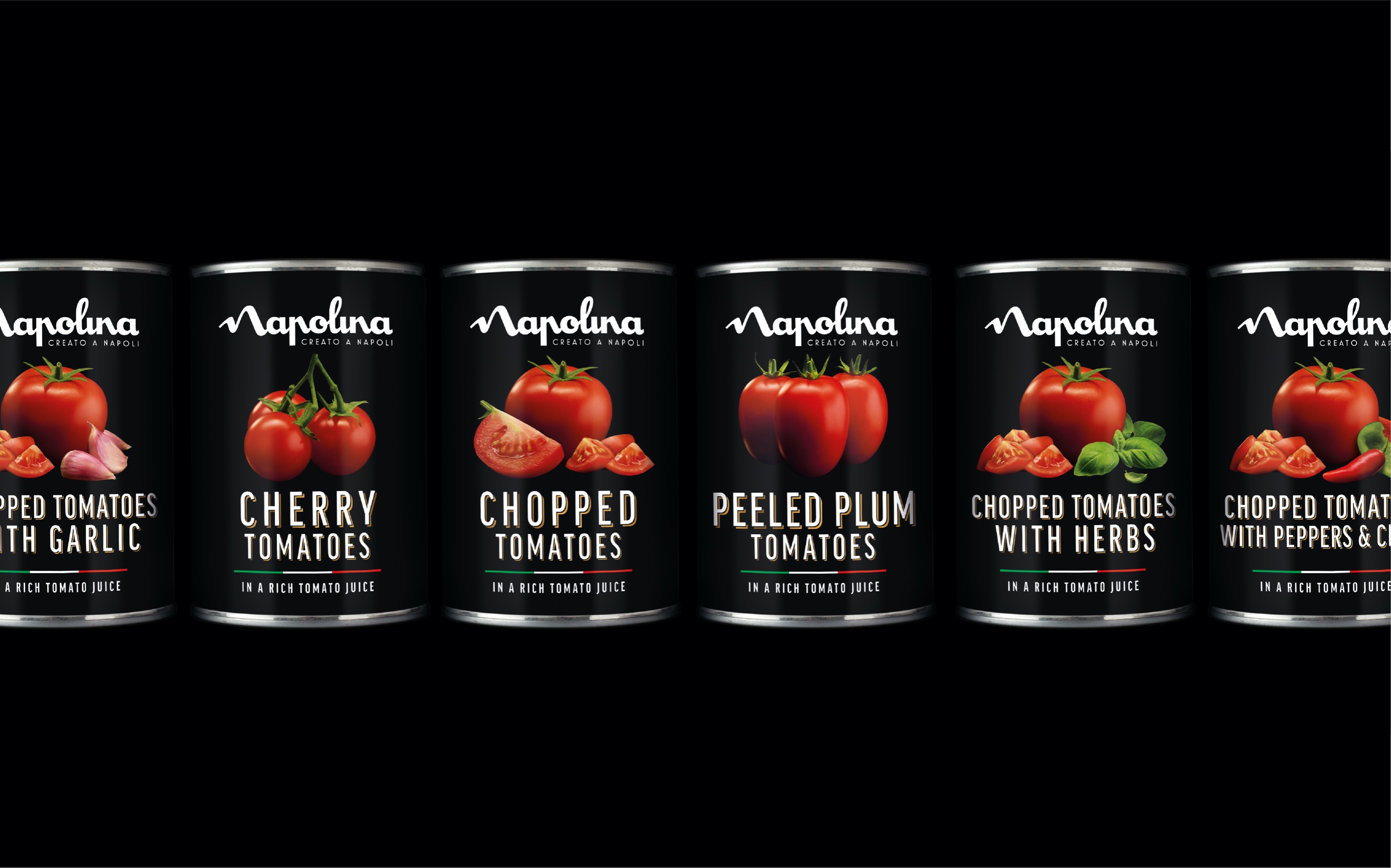
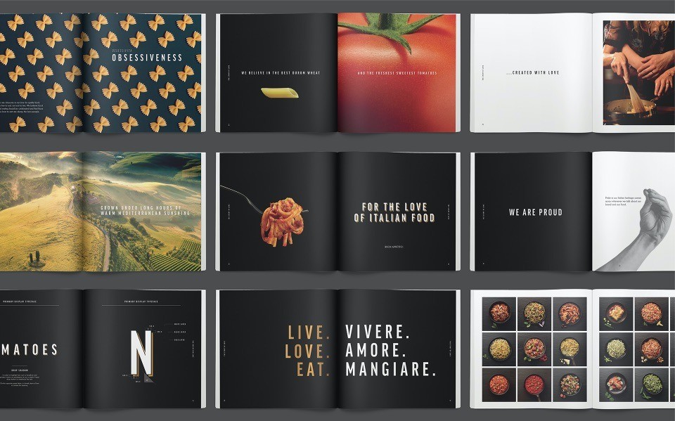
Inspired by the ‘less is more’ philosophy, we crafted a minimalist, category-leading visual brand identity system that is reflective of the love and quality that’s inherent in the products themselves. And one that allows a cohesive brand experience but flexibility to work hard at a category level.
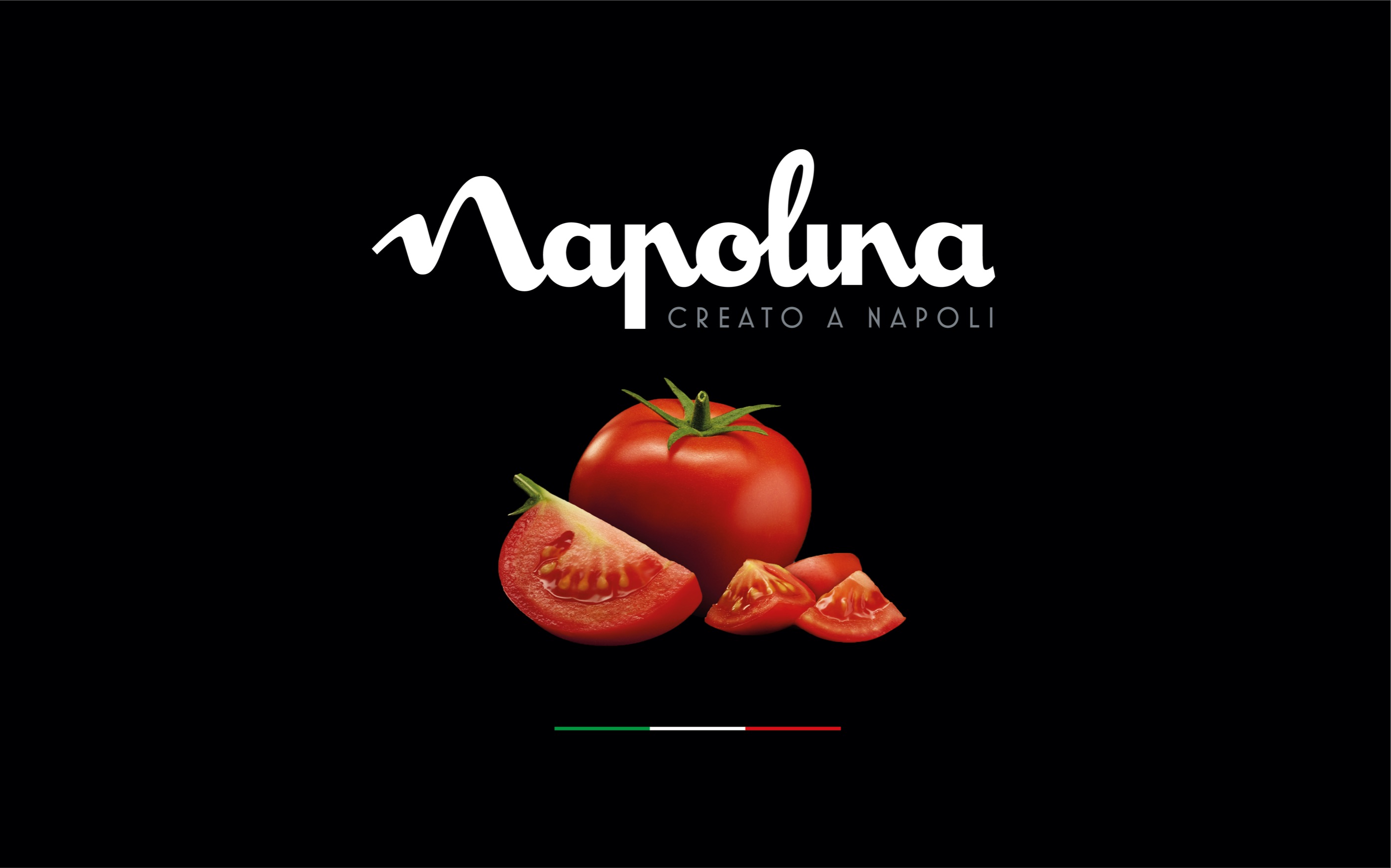
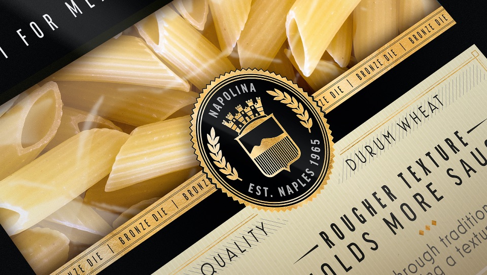
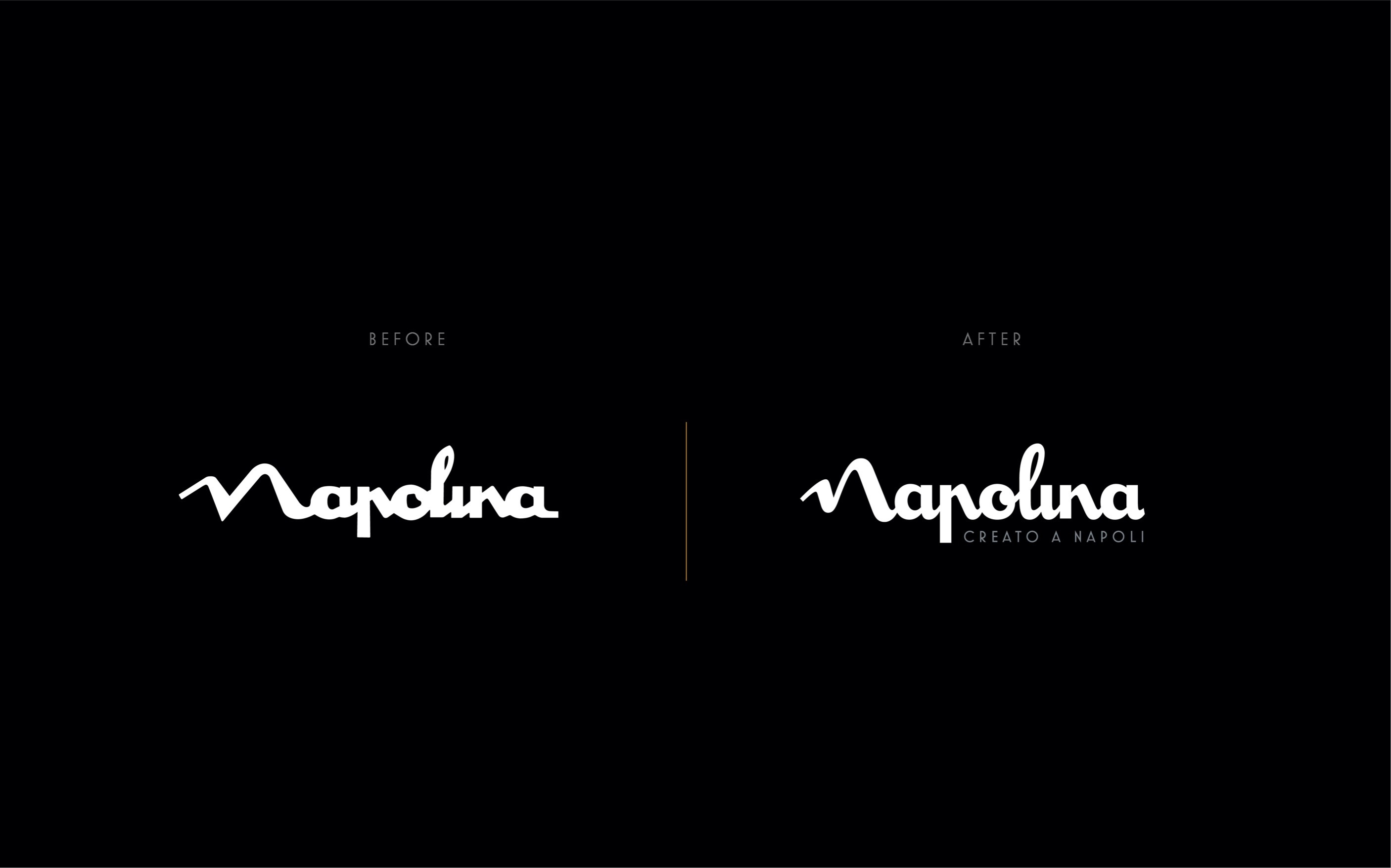
We re-crafted the brand mark to improve legibility, where the ‘N’ takes on the form of the silhouette of Napoli’s Mount Vesuvius, emphasising its Italian heritage and providing an authentic and ownable asset to be leveraged across brand communications.
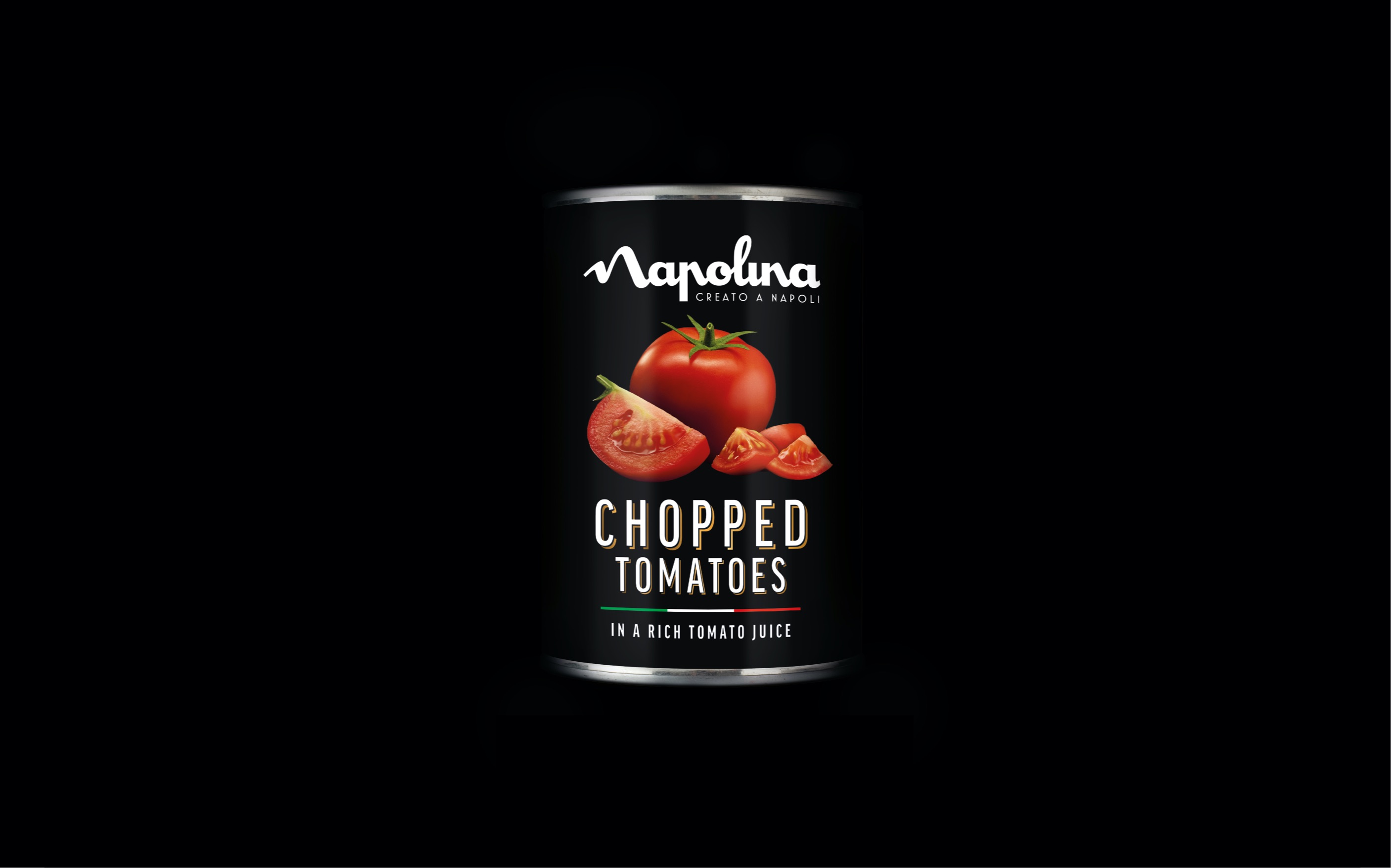
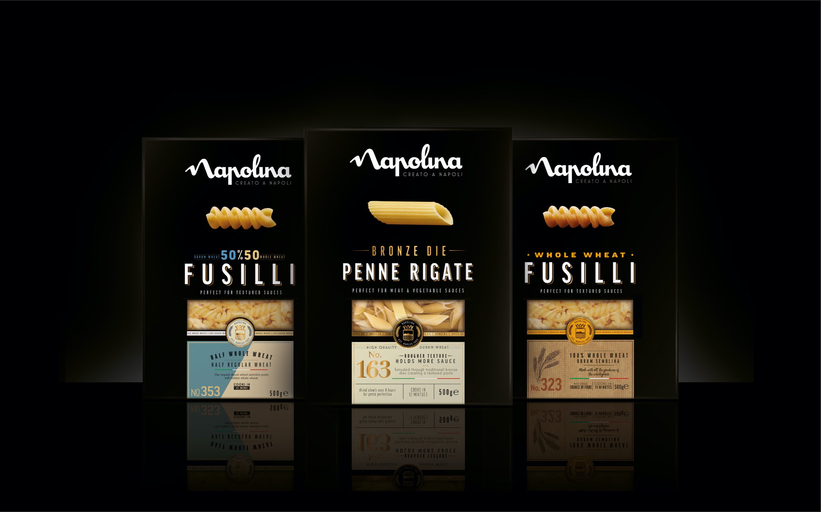
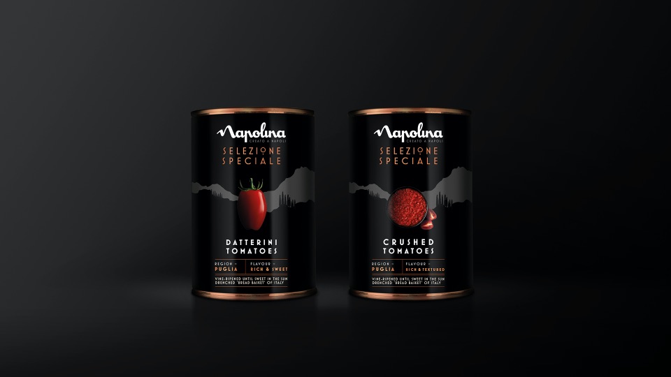
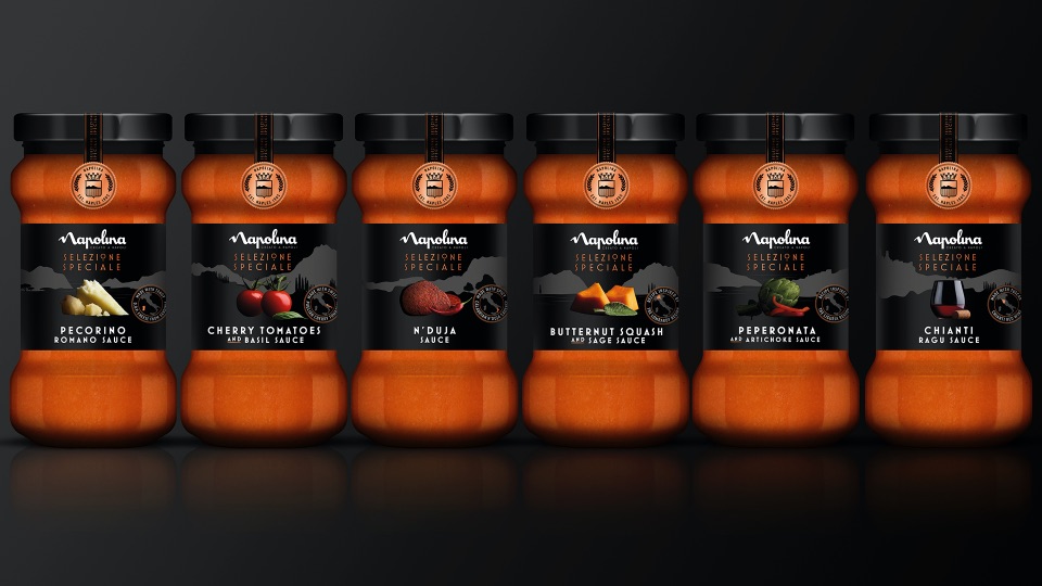
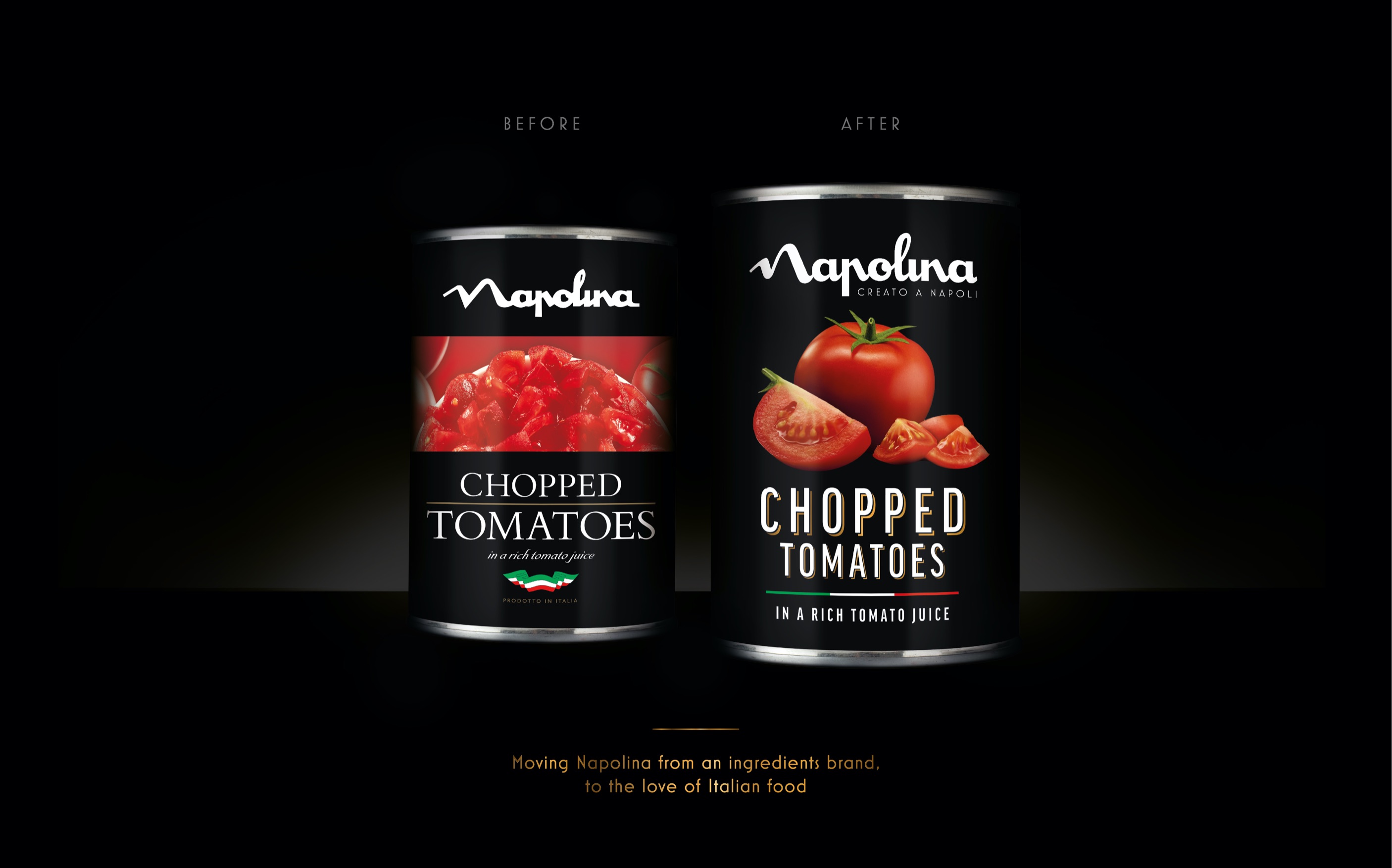
On pack we created a stripped back, elegant and consistent architecture that would create cohesion across a range, and relevance at a category level. Stylish, proud and confident photography heroes the quality of the ingredients while the immediately recognisable black canvas builds brand equity and reinforces the premium positioning.
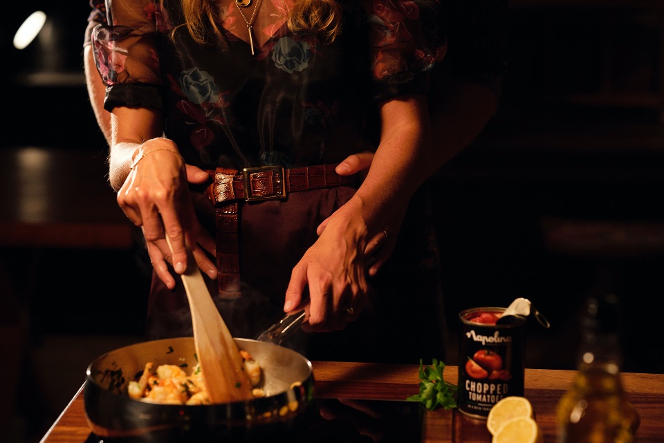
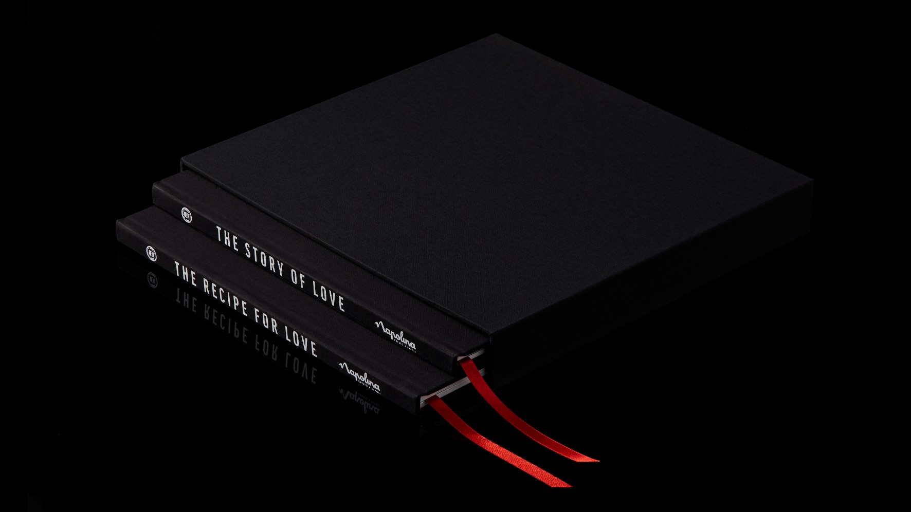
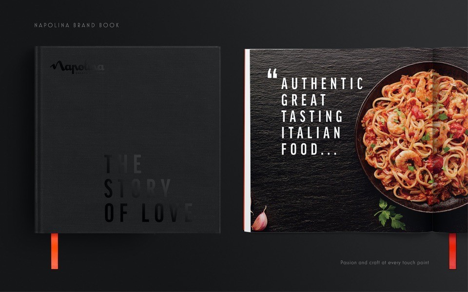
And our brand comms bring ‘for the love of Italian food’ to life in a compelling way, subtly incorporating the brand equities with its black (or dark) background and emphasis on the quality ingredients.
Impact
Our portrayal of effortless Italian style inspired consumers to choose Napolina over own-label to create simple, quality meals for their loved ones. Household penetration, brand awareness, consideration and preference all significantly increased in under six months, and it was the UK’s fastest growing food brand in 2019.
• No. 1 cooking brand, with record share in tomatoes and pasta.
• +2m new consumers added to the brand.
• £22m added to the category.
CREDIT
- Agency/Creative: Brandon
- Article Title: Napolina Reclaiming Its Position as a Desirable Category Leader by Brandon
- Organisation/Entity: Agency
- Project Type: Packaging
- Project Status: Published
- Agency/Creative Country: United Kingdom
- Agency/Creative City: Manchester
- Market Region: Global
- Project Deliverables: Packaging Design
- Format: Bag, Box, Can, Jar
- Substrate: Glass, Metal, Plastic, Pulp Board, Pulp Carton
- Industry: Food/Beverage
- Keywords: WBDS Agency Design Awards 2021/22
-
Credits:
Design Agency: Brandon


