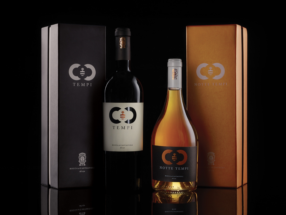
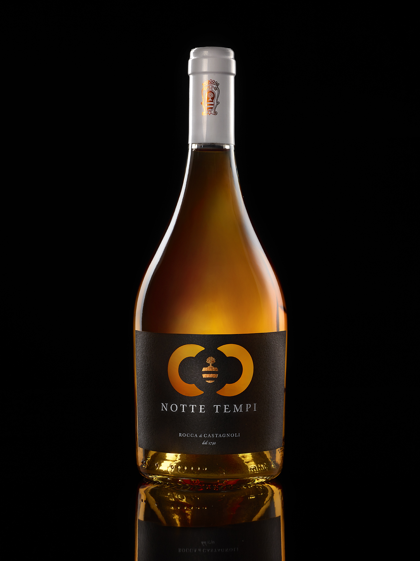
Background: Tempi and Nottetempi are two premium wines made by Calì Estates a company which was born in the 80s thanks to the passion for the land and the good wine of the Calì family. Since then this family has been constantly involved in the conservation and emprovement of the territory and the wines. Tempi and NotteTempi represent the highest level of quality made by the company and are dedicated to its long history inside the heart of the most important area of the Chianti incorporating the tradition of ancient natural winemaking methods with modern technologies and knowledge.
The strategy: the heart of the project is the Best Quality, it is the perfect balance between tradition and modernity, for those who are willing to make an effort to achieve it. It is a refined, elegant, sophisticated quality, dedicated to those who know how to value a particularly important commitment on the part of the company. In fact, from the very beginning of their conception, these wines were designed for true connoisseurs. Every choice, from the field to the vine, from the cultivation to the times and methods of harvesting to the methods of winemaking was made to reach a unique, unrepeatable essence.
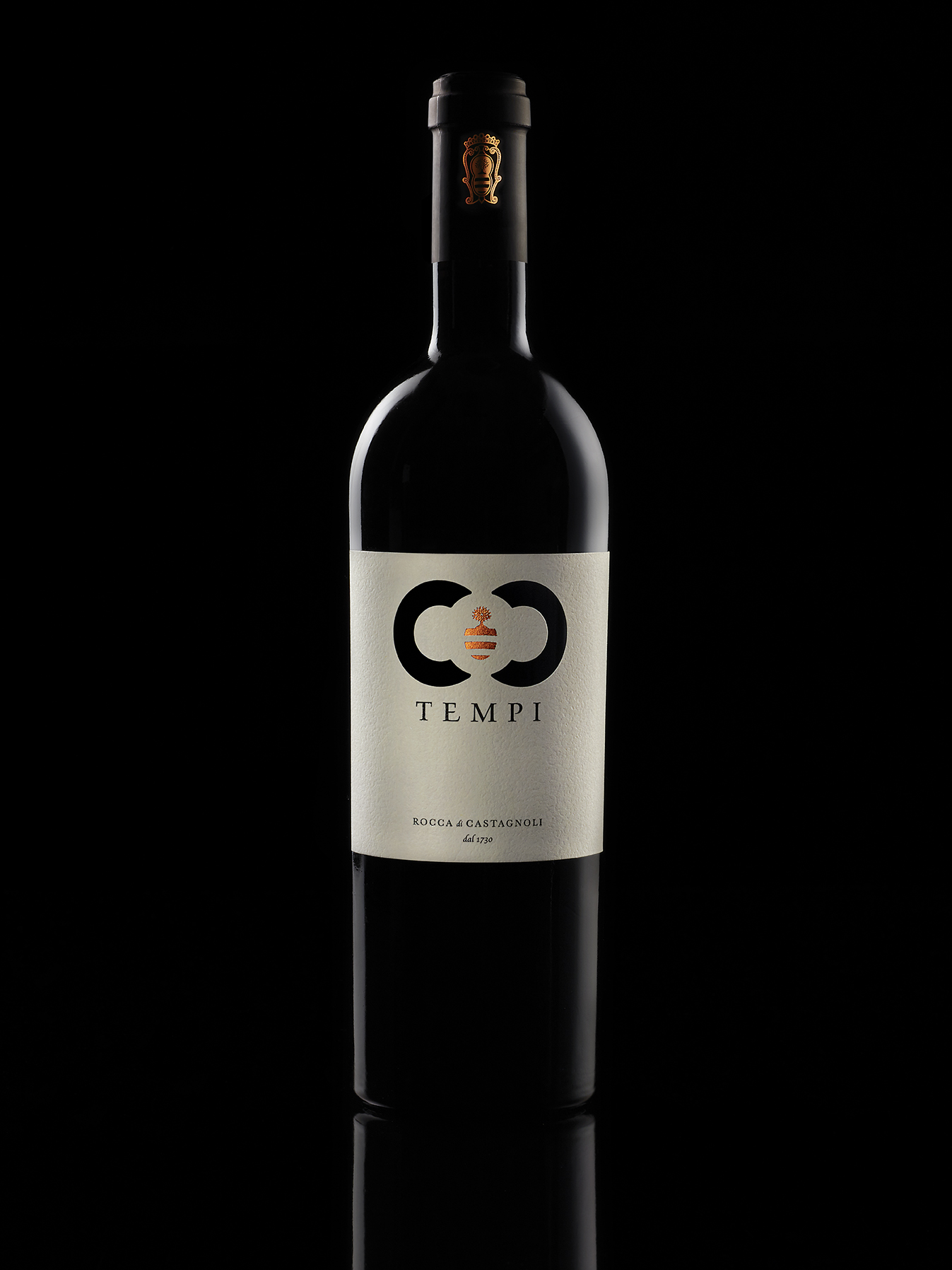
The project: The name Tempi was born from Ferdinando Marzimedici who at the end of the 1700s for the love of the Rocca changed his surname to Tempi, a choice that allowed him to inherit your estate and be among the first to make it prosper. The concept linked to time was born from his surname and the intention to celebrate his passion.
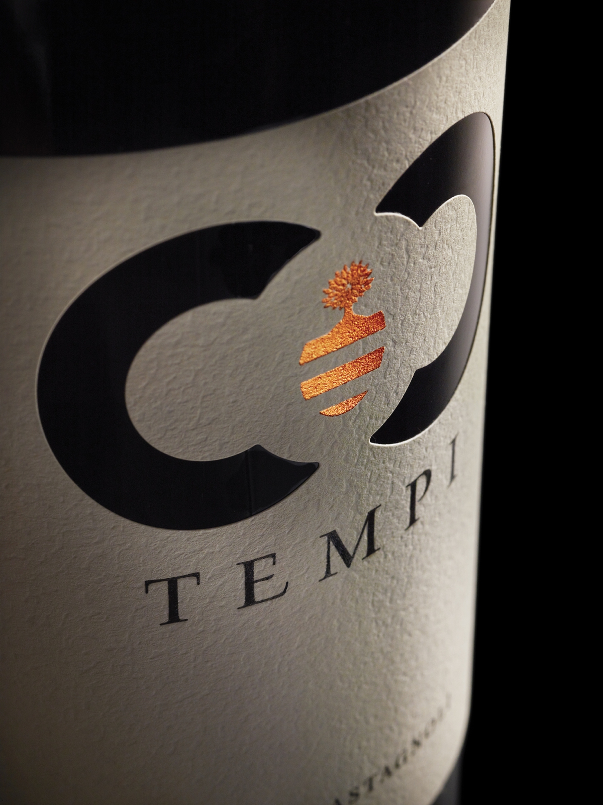
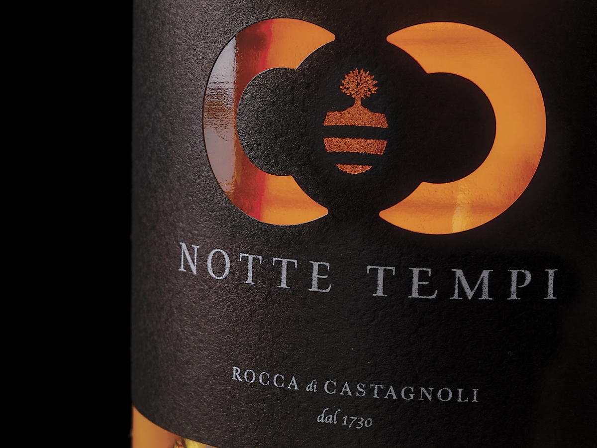
The symbol that was created aims to convey three very important meanings for the company and entrepreneurs:
1) comes from the sign of infinity that unites past, present and future in a unicum. Infinity relates to the concept of time and therefore Times.
2) Secondly, the central element, printed in bronze foil and the heart of the coat of arms of the Rocca di Castagnoli, highlights two C’s, one of which is upside down. They are a tribute to the Chianti Classico area where the Rocca di Castagnoli stands.
3) Finally, the C is the initial of the Calì family that for forty years has been carrying on the hard and wonderful work of the winemakers producing wines of great quality and character.

CREDIT
- Agency/Creative: NEOM
- Article Title: Tempi and Nottetempi Premium Wines Packaging Design
- Organisation/Entity: Agency
- Project Type: Identity
- Project Status: Published
- Agency/Creative Country: Italy
- Agency/Creative City: Teolo
- Market Region: Europe
- Project Deliverables: Brand Naming, Branding, Packaging Design
- Industry: Food/Beverage
- Keywords: wine branding packaging identity
-
Credits:
Partner: Stefano Giuseppe Dell'Orto


