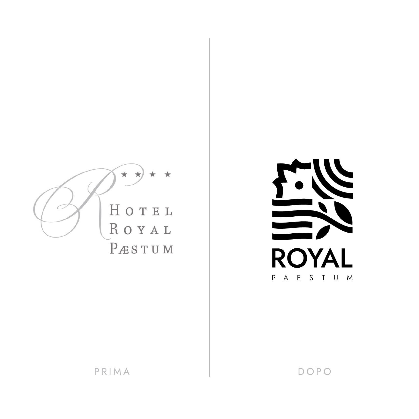
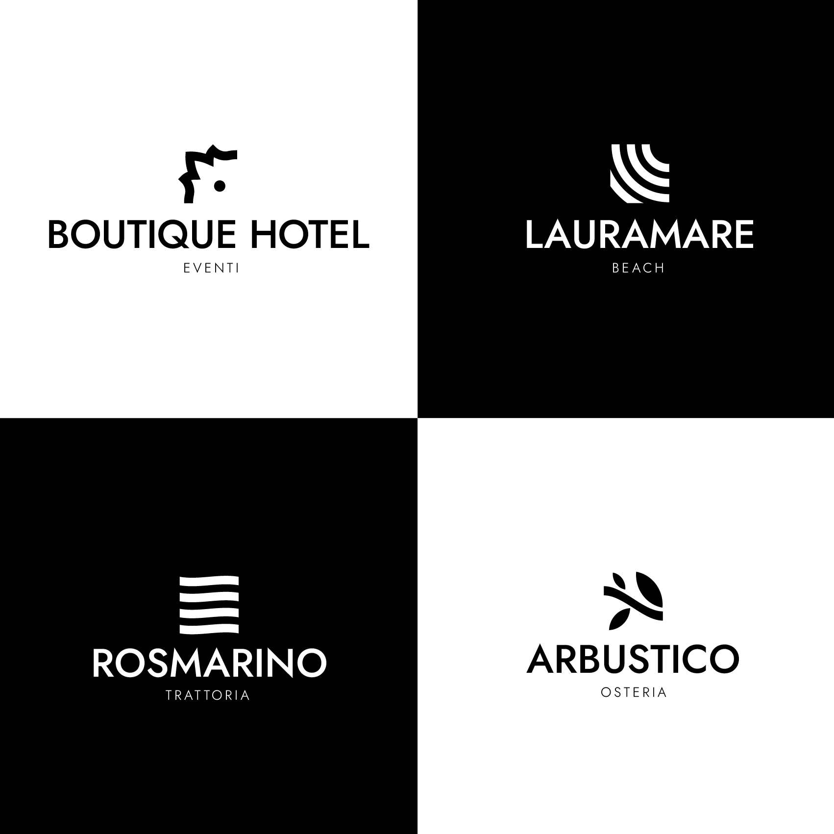
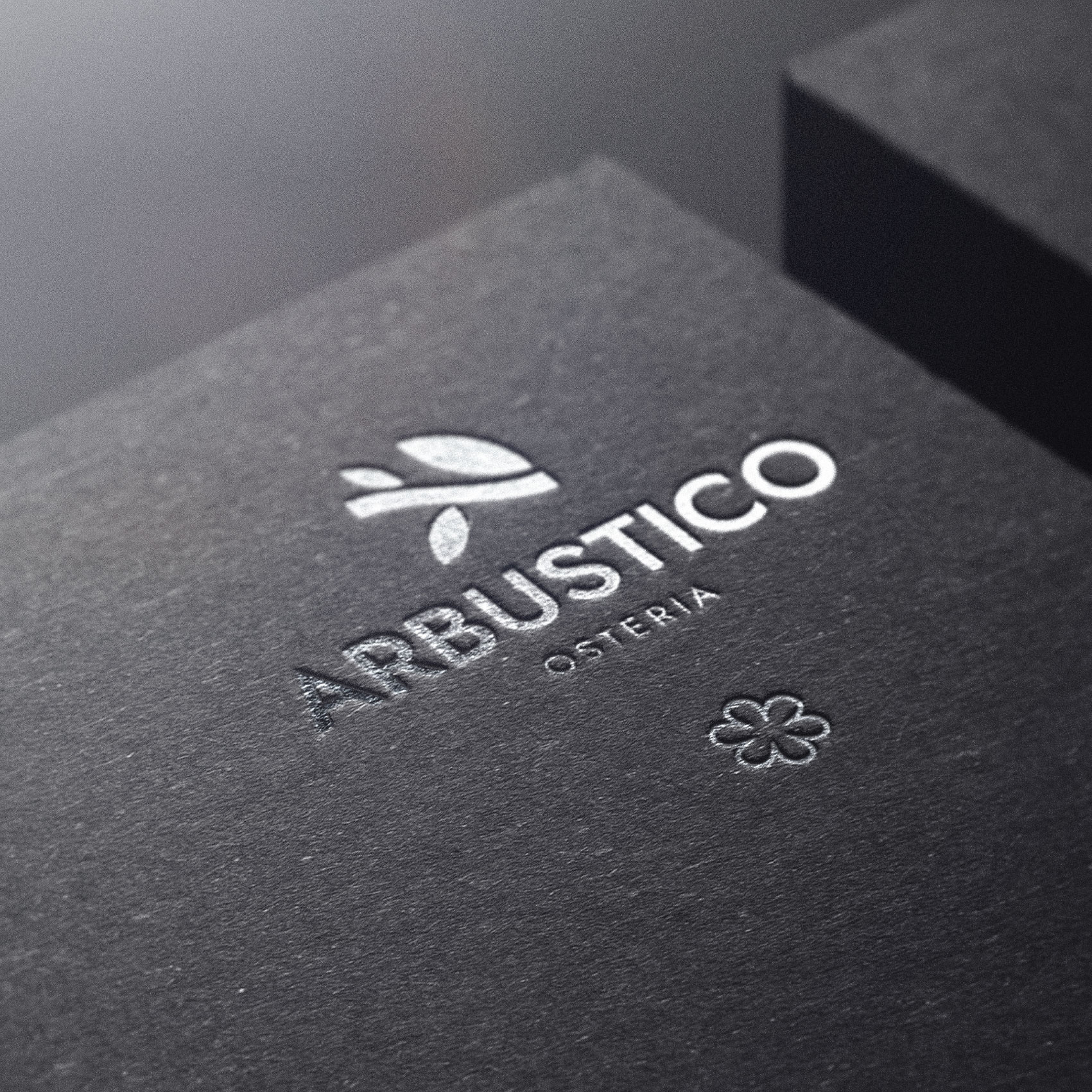
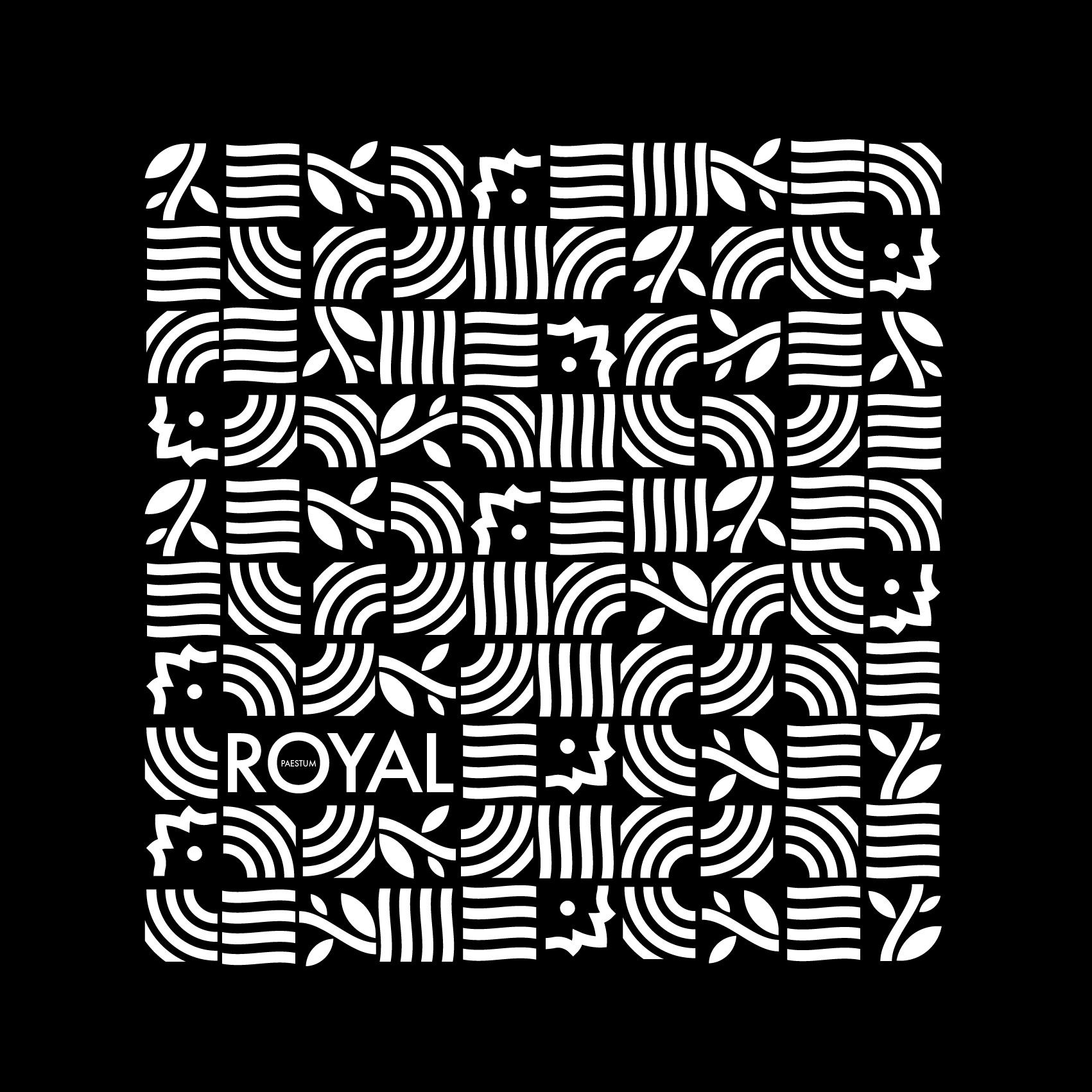
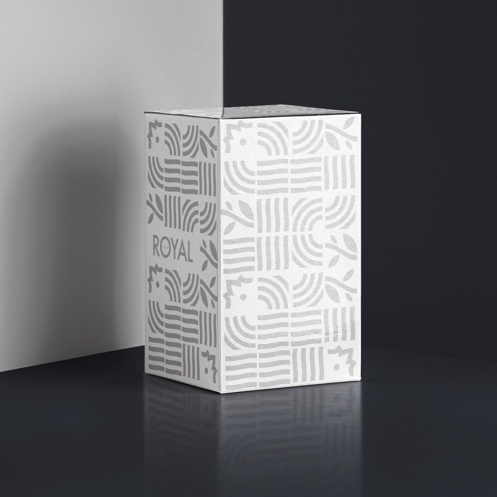
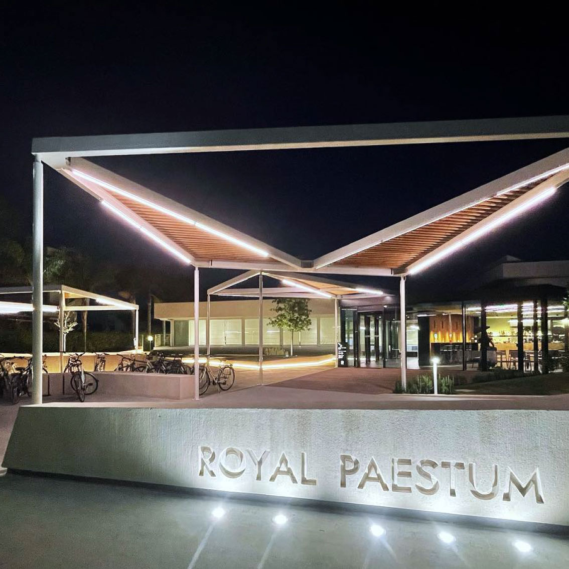
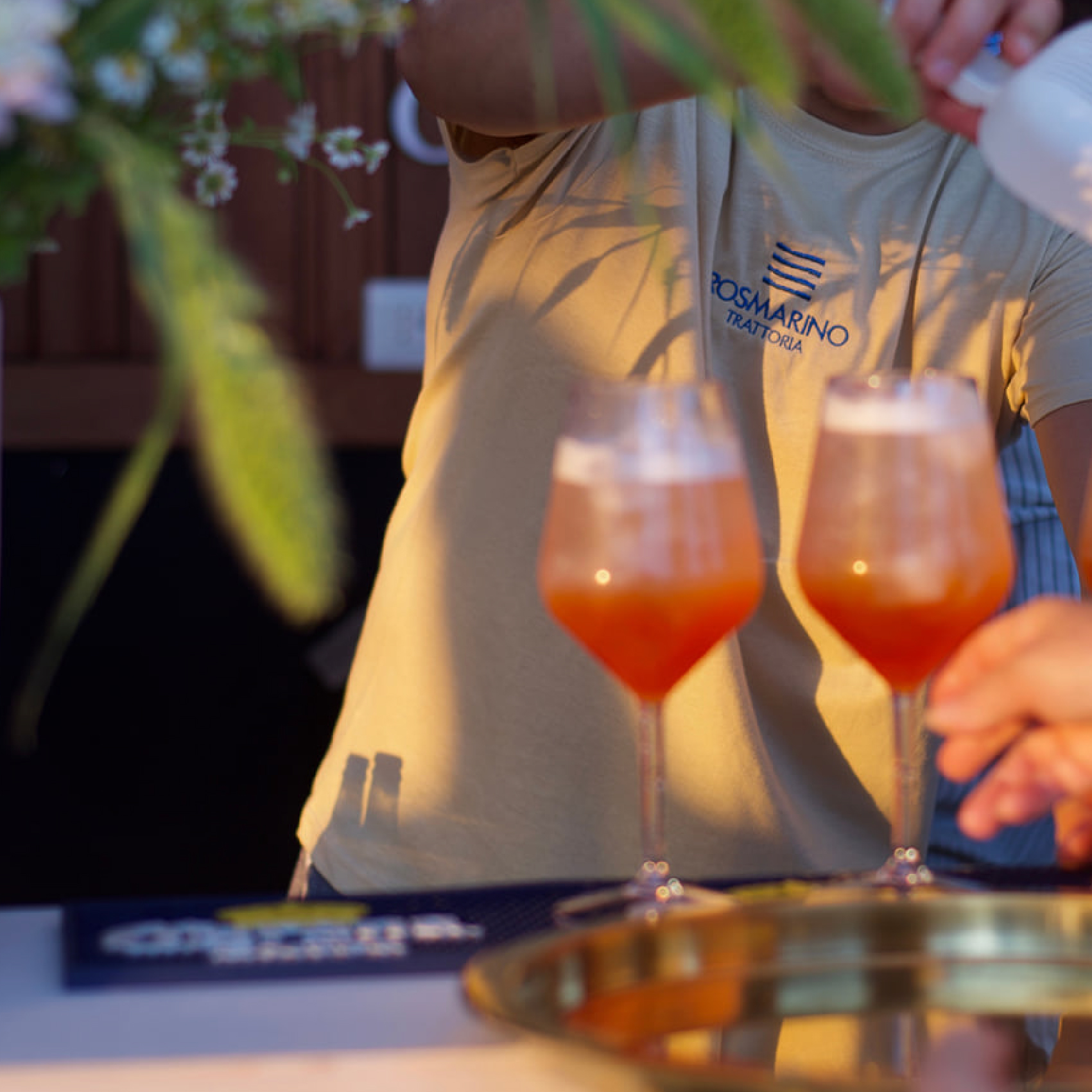
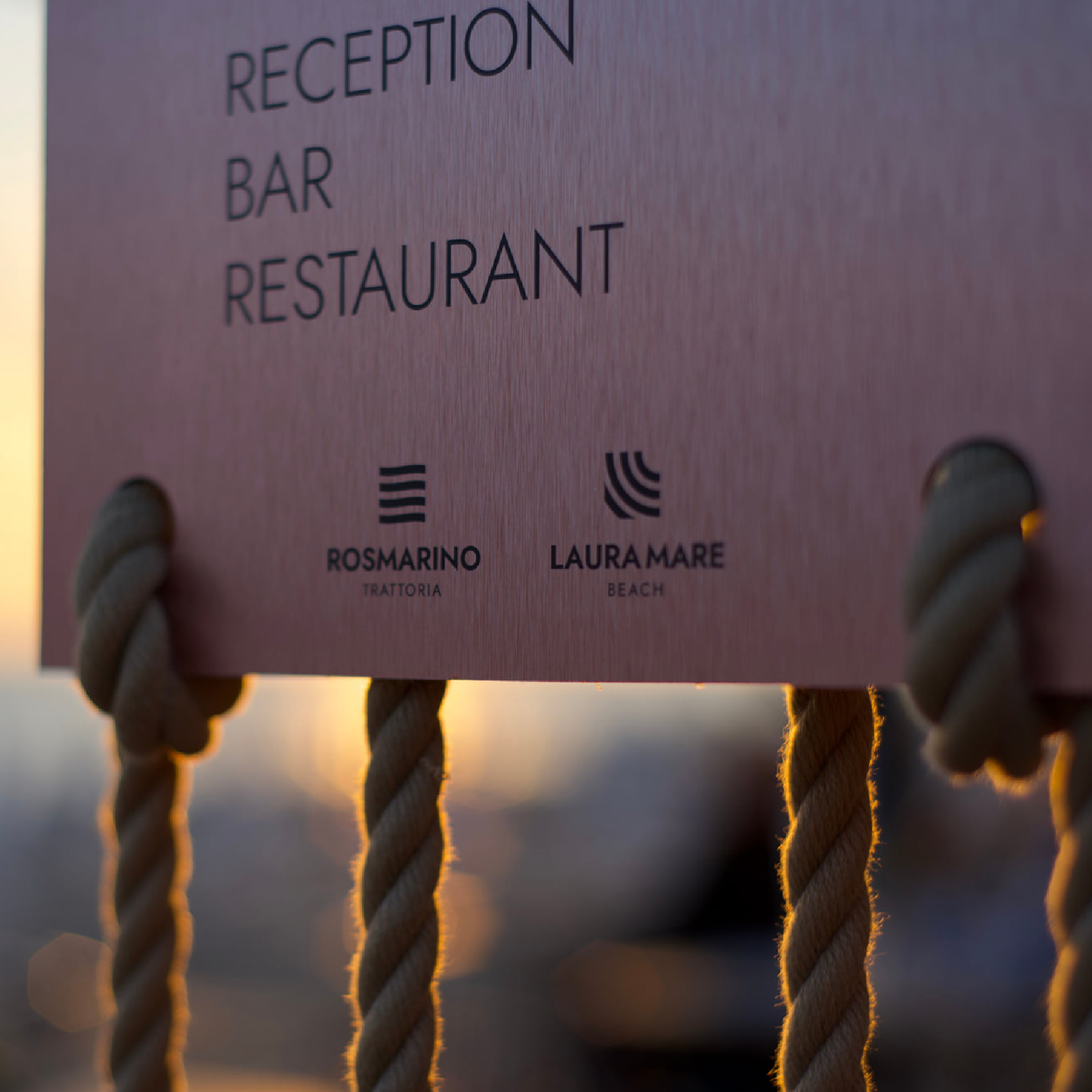
For the Hotel Royal in Paestum, a small town in southern Italy, near Napoli and Salerno, home of Magna Grecia, (place where classical culture and art have had deep roots and have evolved over the centuries) we took care of redesigning the entire image, being inspired by the multiple forms of Cilento, its nature and its elements. The pomegranate symbol of fertility and prosperity, like the land where its history is born, rich in past, adventures, myths and legends, the waves of the sea and its perpetual motion, the rays of the sun, warm and welcoming, the myrtle , rosemary and strong and tenacious shrubs that resist bad weather with stubbornness. That same stubbornness that also characterizes Royal’s soul, stubborn and refined, never banal, with One Michelin Star restaurant inside, the Osteria Arbustico. The logo is therefore divided into four parts, which decline different aspects, four faces, four environments, four souls, four targets, but which are all part of a single large family. A brand in motion, a pattern of emotions that are easy to read and assimilate, with a strong yet simple impact.
The use of colors was used to a minimum, almost canceled, preferring spot colors and textures to compose the entire coordinated image, letting the individual brands and their whole speak for themselves.
Letting the colors of nature speak and all it has to offer.
A project we fell in love with, curated by our Art Director Manuele Altieri, which allowed us to give life to the creative idea.
CREDIT
- Agency/Creative: mócrea
- Article Title: Hotel Royal Paestum Brand Design by mócrea
- Organisation/Entity: Agency
- Project Type: Identity
- Project Status: Published
- Agency/Creative Country: Italy
- Agency/Creative City: Salerno
- Market Region: Europe
- Project Deliverables: Branding
- Industry: Food/Beverage
- Keywords: Restaurant Hotel SPA
-
Credits:
Art Director: Manuele Altieri


