Andreea Bora – Žufánek redesign
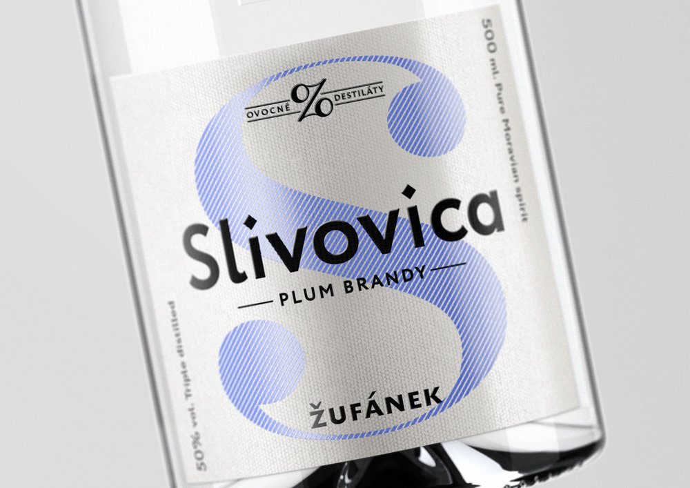
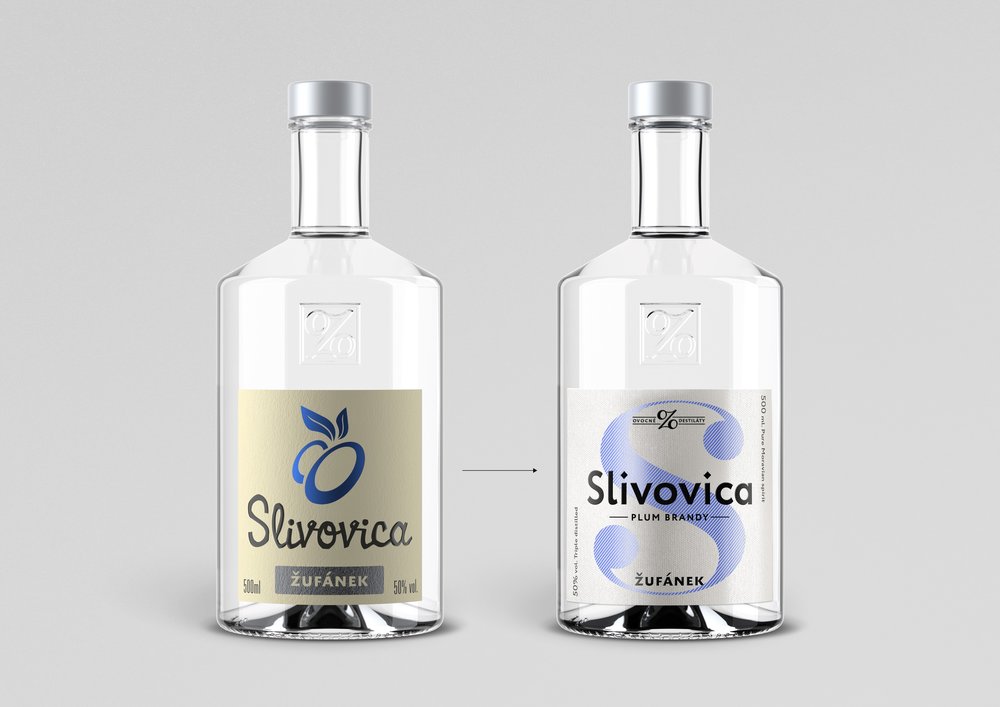
“ Žufánek is a brand of spirits well known and beloved in the Czech Republic. Introduced in 2002, the design of the fruit brandies and liqueurs had not changed significantly from their initial simplicity: an abstracted illustration of the fruit, the name of the product in a handmade “woodcut” font and the name of the brand. The quality of the product was not reflected in the label anymore and this “traditional label” became the industry standard for fruit brandies in the Czech Republic. Since Žufánek is the no. 1 brand in the country for this category, it was time for a change, and so it leads the way again with a complete redesign of its brandies and liqueurs range.
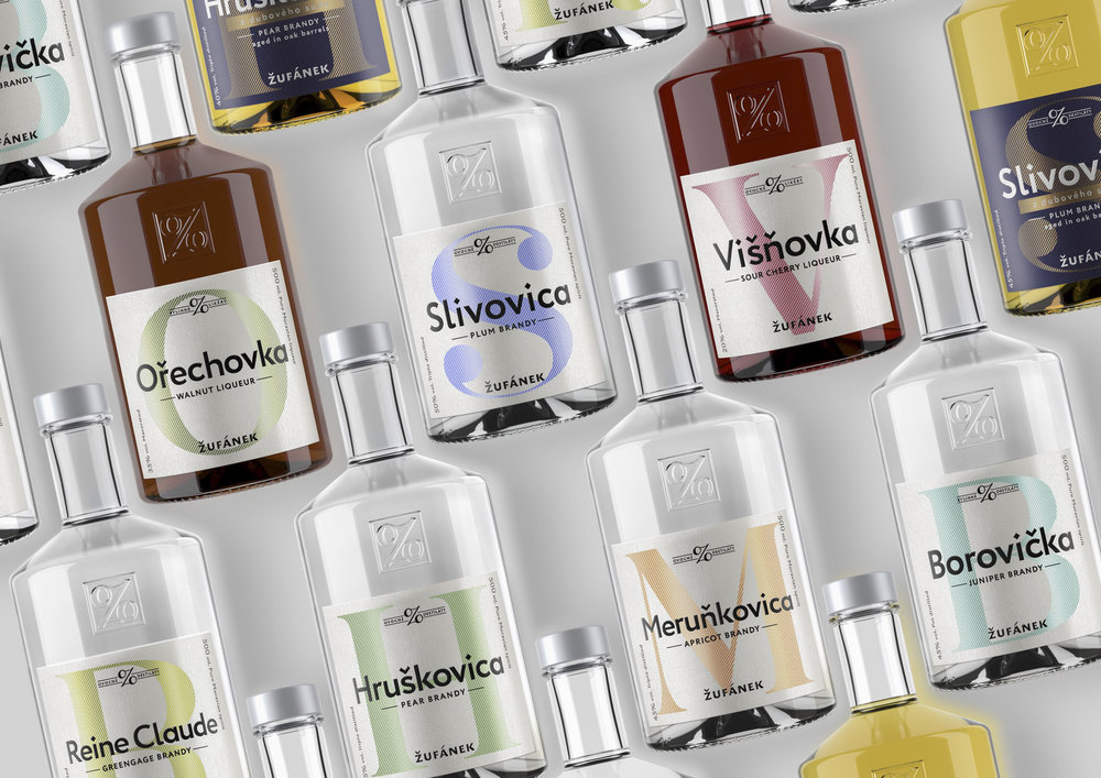
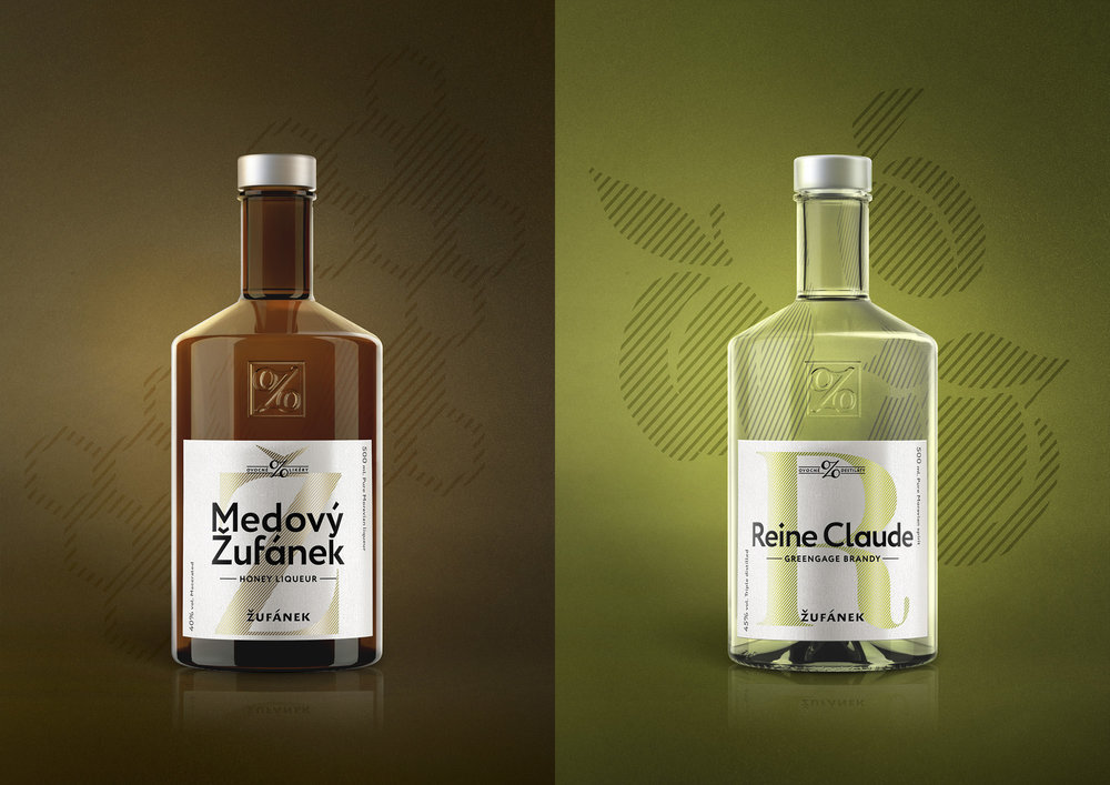
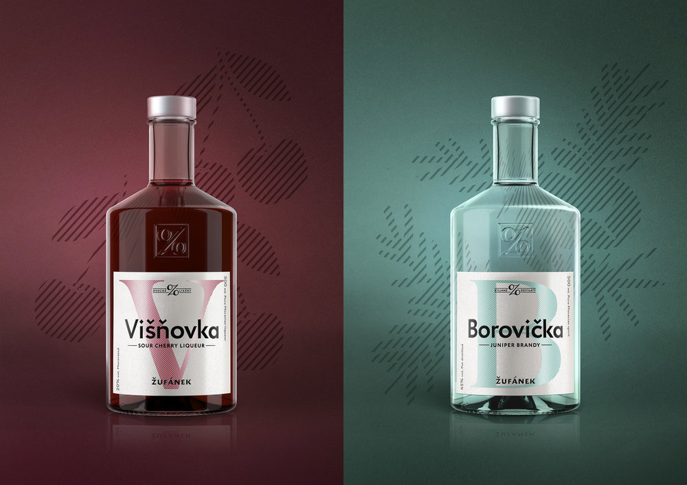
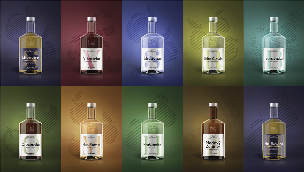
The new labels are therefore a more modern, more premium version of the same idea of abstraction. But this time we are taking it even further, so the signifier for each flavor becomes the initial of the product name instead of the illustration of the fruit, therefore creating a new alphabet of alcohol. The new labels have a system of information that gives the consumer more details about the product, including a category denominator on the top, production process on the left and english translations of the product names.
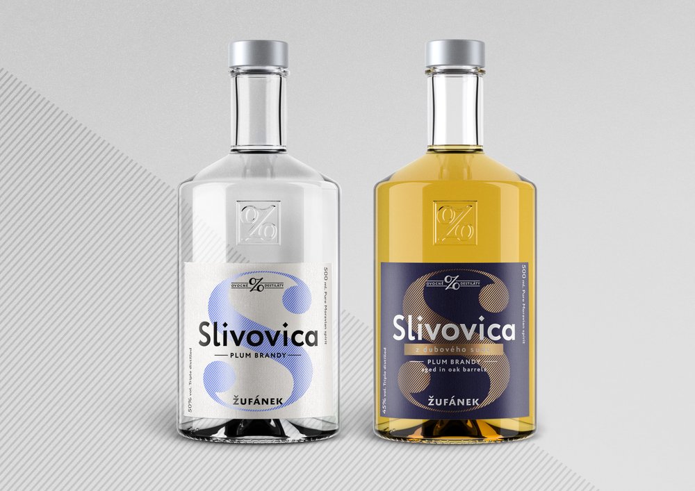
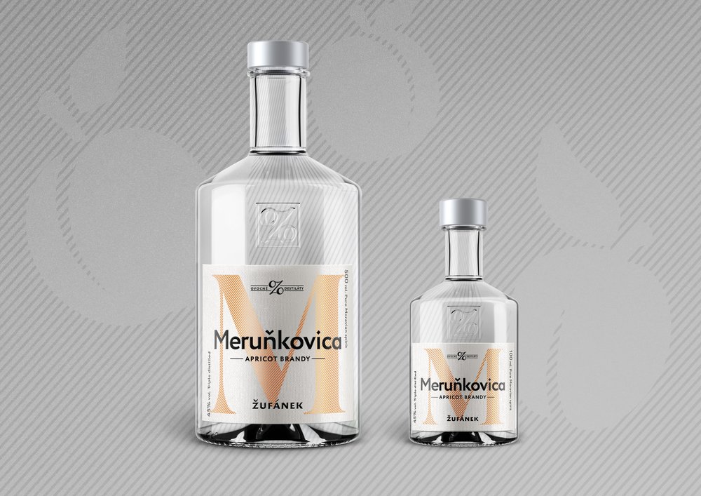
The redesign included the development of labels for new, 100ml bottles, as well as the re-thinking of the differentiation between the basic fruit brandy and the more premium, oak barrel aged fruit brandy.”


CREDIT
- Agency/Creative: Andreea Bora
- Article Title: Creating Brand and Packaging Design of well known Spirit and Beloved in the Czech Republic
- Organisation/Entity: Freelance Commercial / Published
- Project Type: Packaging
- Agency/Creative Country: Czech Republic
- Market Region: Europe


