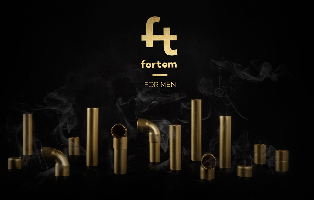
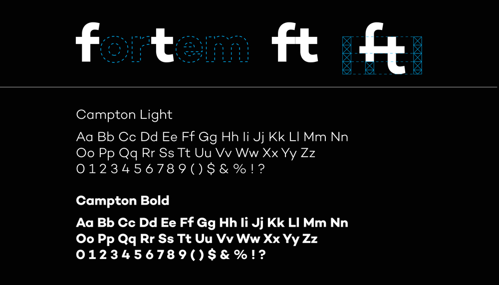
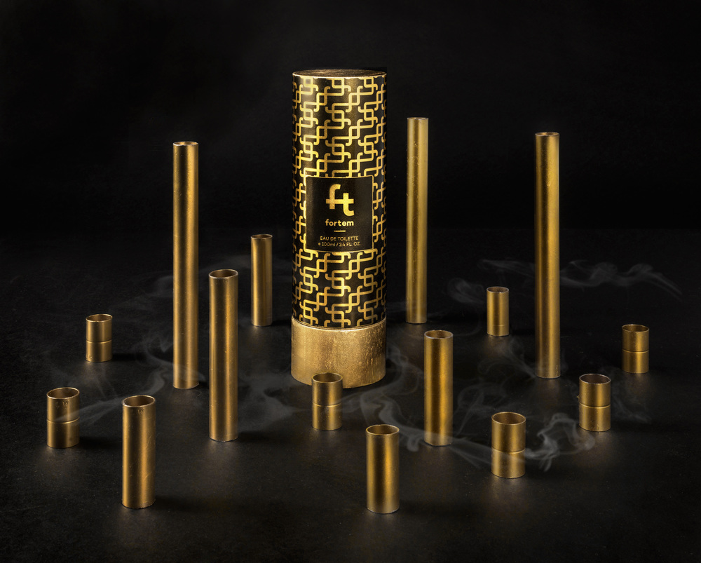
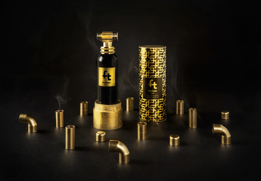
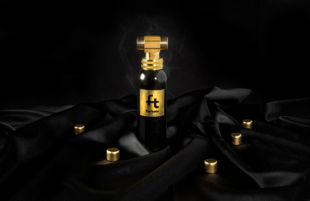
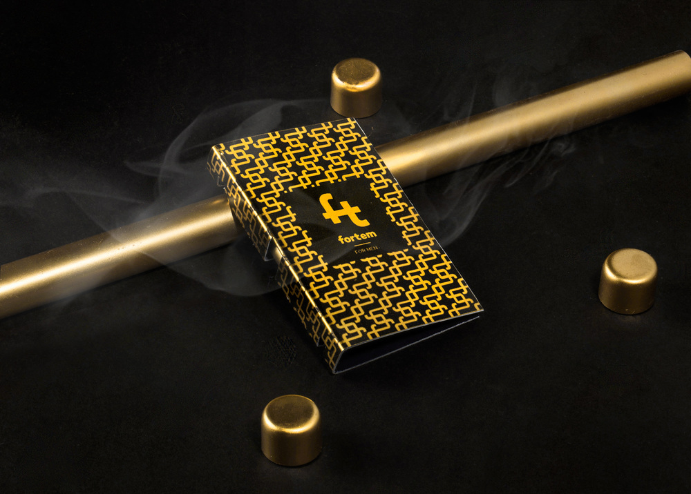
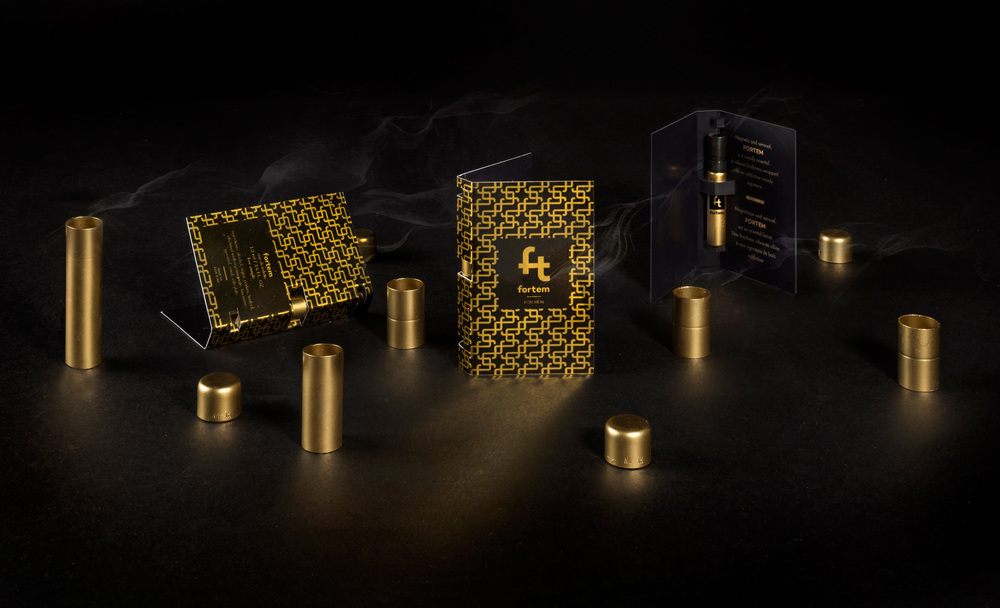
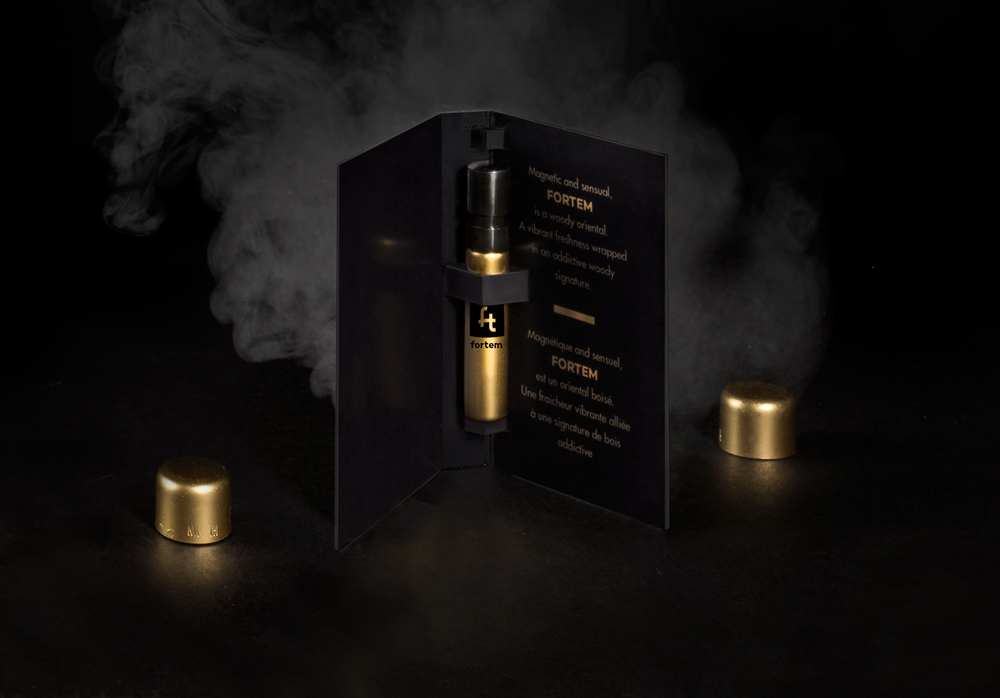
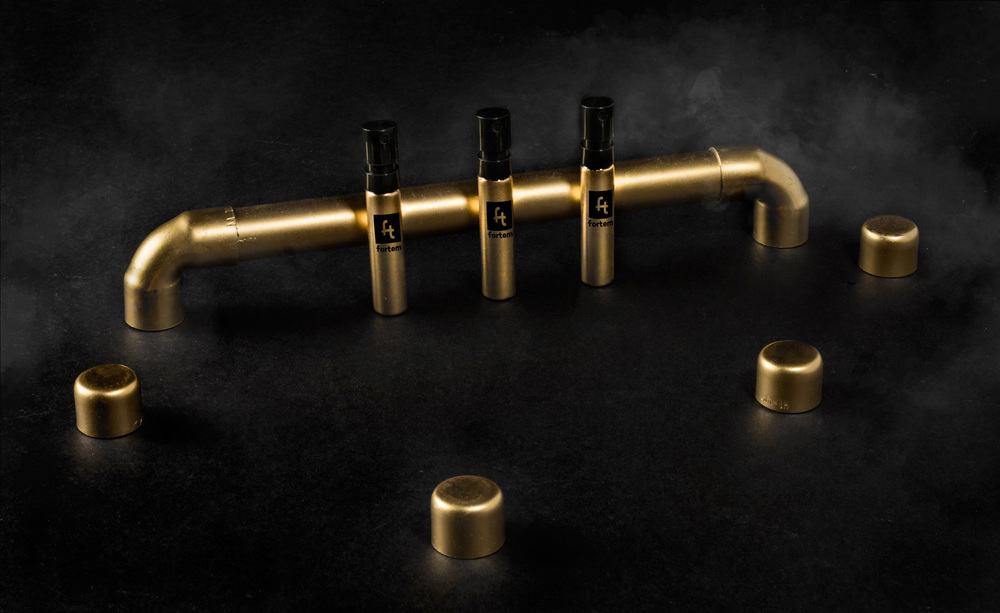
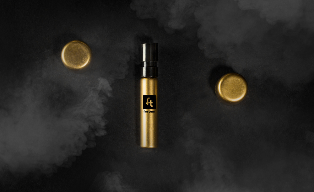
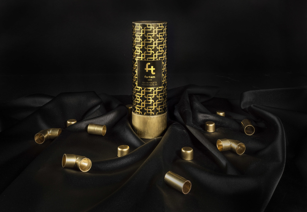
“The challenge: The challenge is to create a luxury perfume packaging from an unconventional object. The object could be anything that is opposite of luxury. The design would be the bridge between the unusual material of the object and the product. Together, the visual images and choice of material should portrait a complete personality of the product.The story: Fortem bottle stands out with its unique cap, a piece of copper piping.The cap instantly grabs the consummers’ attention and provokes masculinity. On the same note, the brand name Fortem means “strong” in Latin. Created from the “f” and “t”, the clean and bold logo type reflects not only the manly look and feel but also the fluidity of the piping. It is a carrier for the consumers’ imagination of strong, bold, capable men. From branding to packaging, the design is a carrier for the consumers’ imagination of strong, bold, capable men.”



CREDIT
- Agency/Creative: Dang Vo / Yen Vy Vo
- Article Title: Dang Vo / Yen Vy Vo – FORTEM (Student)
- Project Type: Packaging
- Format: Tube
- Substrate: Glass


