Witch has helped keep skincare naturally clear for more than 50 years and offers a wide range of trusted products to help tackle blemish issues at every stage of their development.
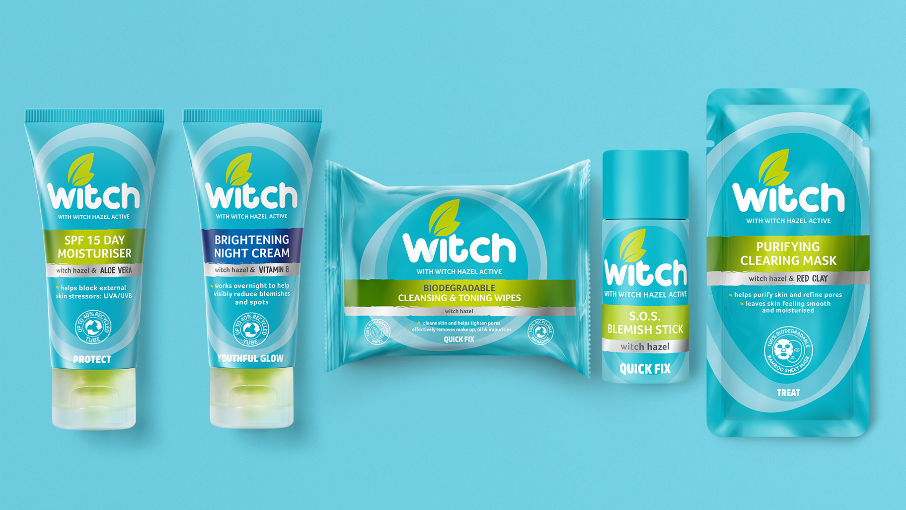
The extensive Witch range offers a holistic skincare regime helping protect your skin from environmental aggressions, provide quick fix solutions, treat skin and give a youthful glow. Their unique skincare routine is carefully crafted to provide solutions for blemish issues, day and night.
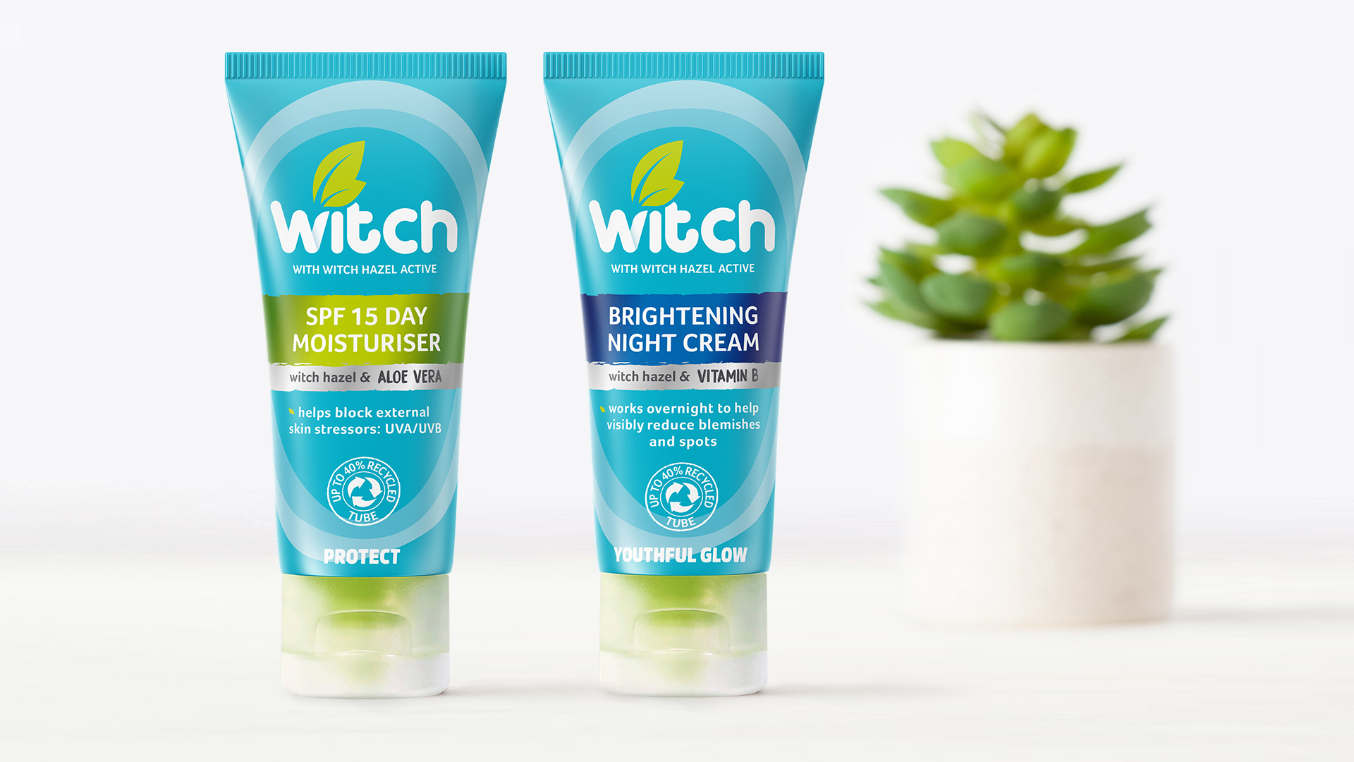
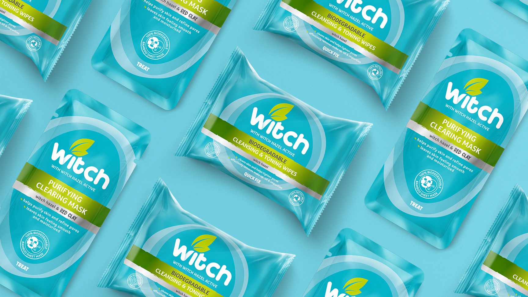
As Witch has now introduced 4 clear segments to the range to address all needs of blemish-prone skin, it was time to refresh the packaging design. With sustainability at the heart of the strategy, recyclable and recycled packaging solutions, reduced packaging and biodegradable materials have been used to ensure Witch is kind to the planet as well as your skin.
In order to create the packaging design for this iconic brand, Witch sought the help of London based packaging design studio, Slice Design. Slice was tasked with designing the packaging, creating a robust architecture that can span a wide range of products and developing exciting branding that jumps off the shelf and spreads the positive Witch message that you should embrace your individuality even with skin imperfections, how they call “the Witch way”.
Based on a creative brief of “Mother Nature’s Best Kept Secret” Slice rooted the brand as experts in skincare who combine science with Mother Nature’s best-kept secrets to tackle blemish issues at every stage of your development.
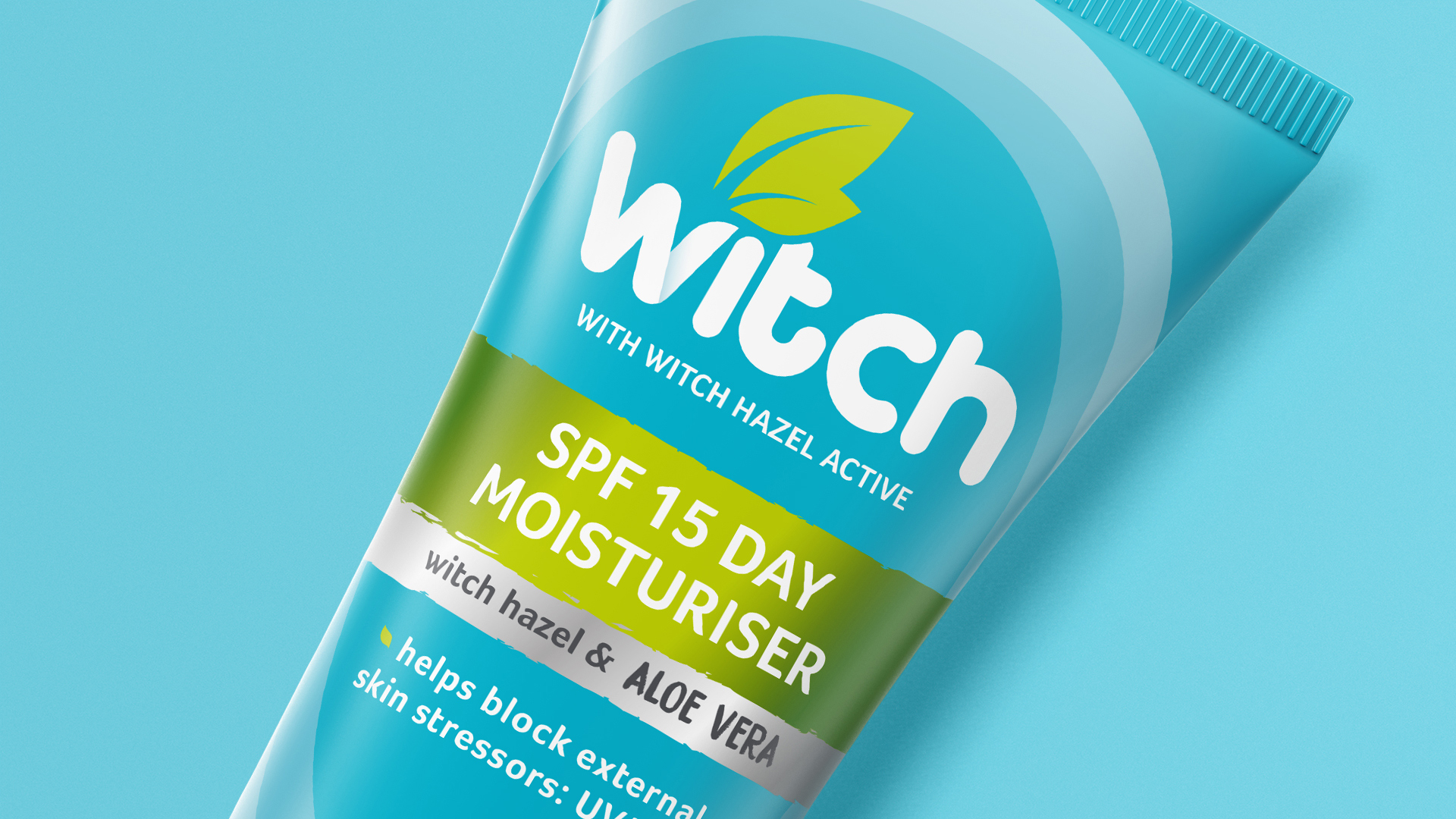
The iconic Witch brand colours were retained to ensure customer recognition with the fresh new packaging and segments were introduced onto the front of the pack to help navigate the range. The packs feature new iconography to promote sustainability and explain ‘how to use’ the product for clear communication and expert advice.
Be kind to your skin and be the best version of yourself, naturally!
Agency Comments (Alan Gilbody, Founder & Director) – Alan Gilbody at Slice Design Limited helped to explain some of the design features on pack. “Witch stands for natural, expert skincare with a history or using Witch Hazel as a core ingredient for over 50 years so it was important the pack designs showcased its unbeatable power and multitude of benefits. The background uses amorphous circles to help cue naturalness, skin layers and protection, reiterating Witch as an expert in skincare.”
Stefano Larghi (Brand Marketing Manager) – “Slice are a really trustworthy and professional company. They took care of our Witch brand relaunch and understood from the beginning our need and the essence of the brand. This has led them to provide us with a great concept. They are really a great team to work with, we have been always been very pleased with the outcome!”


CREDIT
- Agency/Creative: Slice Design Ltd
- Article Title: Slice Design Creates New Packaging Design for Witch Skincare
- Organisation/Entity: Agency
- Project Type: Packaging
- Project Status: Published
- Agency/Creative Country: United Kingdom
- Agency/Creative City: London
- Market Region: Europe
- Project Deliverables: Brand Design, Brand Redesign, Packaging Design, Packaging Guidelines
- Format: Tube
- Substrate: Plastic
- Industry: Retail
- Keywords: Witch, Skincare, Witch Hazel, Beauty
-
Credits:
Packaging Agency: Slice Design Ltd


